Starting Fresh A Houston couple pares back while elevating the essentials - Chandos Interiors
←
→
Page content transcription
If your browser does not render page correctly, please read the page content below
Starting
                  Fresh
                 A Houston couple pares back while
                     elevating the essentials.

                          W R I T T E N BY C H R I S T I N E D E O R I O
                    P H O T O G R A P H Y BY C L A U D I A C A S B A R I A N
                       FOR JULIE SOEFER PHOTOGRAPHY

                                                                               Architecture: W. Travis Mattingly, Architectural Solutions, Inc. Interior Design: Chandos Dodson Epley, Chandos Interiors
                                                                                                                                                Home Builder: Brian Thompson, Thompson Custom Homes

LUXESOURCE.COM
F or many people, the passage
of time coincides with the
accumulation of possessions—
and places in which to
keep them. Bibbi and Tom
Anderson had happily ridden
that trajectory for years,
filling their Texas homes with
treasured collections of art and antiques. But
as they embarked upon a life chapter as empty-
nesters, they chose a different path: building a
Houston home with just enough room to meet
their needs and reflect their elevated tastes, honed
emphasize the room’s inviting warmth, while large
steel windows flood the space with light. “She
particularly requested northern light,” Mattingly
says, “and as a bonus, we got her southern light
and a view of the backyard and pool.”
The owners’ love of art is equally evident
in other rooms. “They have an extensive
collection,” Epley says, “and we spent several days
determining where all of their beloved works
would hang.” Some pieces were placed specifically,
like the still life commissioned to conceal the
family room’s wall-mounted television while
complementing chairs upholstered in soft blue-
during Tom’s years as co-owner of a luxury real green velvet. Other works found their places after
estate company and Bibbi’s career as an artist. the rooms were complete. “I always tell clients
“This project was about paring their lives back that placing art is like a dress fitting,” the designer
and having fewer things,” explains designer explains. “Things may need to be moved and
Chandos Dodson Epley, a longtime family friend changed based on how they look in the room.”
who joined architect W. Travis Mattingly, builder Epley took a similarly intuitive approach when
Brian Thompson, whose project manager was composing each room’s design details, which
Bobby Lawton, and Moss Landscaping in creating represent a range of styles. “We chose to have the
a custom residence complementing the clients’ bones be traditional,” she says, “but then went in
new outlook and fresh, serene surroundings. with more modern plumbing and lighting for that
However, while the owners may have been juxtaposition.” Bibbi joined the hunt for clean-
willing to part with some of their furnishings, lined contemporary furnishings and patinated
they had no plans to dial back the pursuits of antiques, always taking the designer’s feedback
their passions, including woodworking for Tom, to heart. “Bibbi has great taste,” Epley notes, “so
painting for Bibbi and hosting lively gatherings. it was really about editing her choices so the end
That meant the house would need a dining room result was what we had envisioned.” And that was
that could accommodate 12 guests, an outdoor often something quite daring: black-lacquered
kitchen with a wood-burning pizza oven, a library walls, a pink-ceilinged dining room with a
wood shop for Tom and a studio for Bibbi, not to tortoiseshell faux-painted silver-cupboard door,
mention bedrooms for visitors and an outdoor horse-legged stools gathered alongside the kitchen
pool. “We gave that input to Travis, who molded it island, or an illuminated, marble-clad bathtub.
into a livable floor plan,” Bibbi says. “We were able To ground all that freshness, Epley employed
to utilize every buildable space in this house and organic textures such as reclaimed ceiling beams
on this lot, which is not immense.” for the kitchen and family room, white-oak
That’s not to suggest concessions weren’t made. paneling in the breakfast room, an antique Empire
By the time Mattingly positioned the main-floor chest-turned-vanity for the powder bathroom and
living areas, main bedroom suite, loggia, pool and antique louvered shutters on the loggia. “I wanted
wood shop, “There just wasn’t any footprint left to mix modern touches with elements that have
for my studio,” Bibbi recalls. “So I pouted awhile, a bit of age,” says the wife. Adds the designer:
but Travis said, ‘Trust me, I will make your studio “And that’s what made the transitional style
a place you’ll never want to leave.’ ” Located on work—giving it a little patina so those modern
the second floor, the resulting 440-square-foot touches don’t feel too cold.” For the happy owners,
space features a limestone fireplace displaying that balance creates a space that’s as beautiful to
Bibbi’s artwork on tiers of integrated shelves. inhabit as it is to view. “The goal was something
Reclaimed-wood ceiling beams and porcelain fun and open to have people in,” Tom says, and
floor tiles masquerading as timeworn stone pavers the result is just that. “It is a real home.”
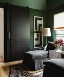
Walls painted Sherwin-Williams Roycroft Bottle Green make for a cozy media room featuring
jet-black barn doors designed by Chandos Interiors and built by Thompson Custom Homes, which
complement art by Stephanie Wheeler. Lee chaises flank an accent table from Area.
LUXESOURCE.COMThe library features a marble
fireplace and walls in lacquered
black paint by Fine Paints of
Europe from Boxwood Interiors.
Elsewhere are built-in shelves
with custom brass detailing by
Peck & Company, a Schumacher
wallcovering on the ceiling and
a Jonathan Adler chandelier.
The abstract painting is by Alexis
Portilla; the figurative work is by
Michael Carson.
LUXESOURCE.COMAbove: Sherwin-Williams Riverway brightens the bar area with its custom cabinetry, brass-and-glass
shelves fabricated by Peck & Company and a metallic raffia wallcovering by Donghia.
Opposite: White oak appears on the breakfast room floors and paneled walls, from which hang
a verdant painting by Jim Hill and a work by Bibbi Anderson from Anarte. The plaster Vincennes
chandelier by Bourgeois Boheme Atelier was the final piece selected for the home.
LUXESOURCE.COMRight: Doors with a wood
herringbone pattern designed by
Chandos Interiors featuring brass
knobs from Hollywood Builders
Hardware open to a spacious
second-floor art studio. Porcelain
floor tiles from Pomogranit-ADR
resemble timeworn stone pavers.
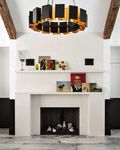
Opposite: A limestone fireplace
with a custom two-tiered mantel
warms the art studio. Framed by a
pair of reclaimed wood beams, the
Arteriors Vaughn chandelier adds
drama with its substantial scale
and glowing bronze finish.
LUXESOURCE.COMRight: The main bathroom’s
Calacatta Extra tub surround and
countertops from Walker Zanger
and Calacatta Daniele flooring from
Ann Sacks blend with plastered
walls in Sherwin-Williams Whitetail.
The chandelier from Circa Lighting
adds glamour.
Opposite: An antique French
commode from Memorial Antiques
& Interiors—topped with Kelly
Wearstler’s Phoebe Stacked table
lamp for Circa Lighting—imparts
warmth in the main bedroom.
Custom Matouk linens from
Longoria Collection dress the bed.
LUXESOURCE.COMYou can also read


