ALL TOGETHER NOW REHAB FITS MULTIPLE GROUPS INTO PARISH HOUSE - ALSO INSIDE: STANLEY TIGERMAN ISN'T DREAMING 16 VOA'S TOWERING ACHIEVEMENT 30 HOW ...
←
→
Page content transcription
If your browser does not render page correctly, please read the page content below
ALL
TOGETHER
NOW
REHAB FITS MULTIPLE GROUPS INTO PARISH HOUSE

ALSO INSIDE:
STANLEY TIGERMAN ISN’T DREAMING 16
VOA’S TOWERING ACHIEVEMENT 30
HOW DEPAUL FOUND ITS GROUNDS 38

                                     www.aiachicago.org   jan | feb 2012
GROWING COMMUNITY CENTER’S CHURCH REHAB
SERVES MANY PURPOSES
By Laurie Petersen
E
MPTY CHURCHES AND SHUTTERED PAROCHIAL SCHOOLS ARE
SCATTERED THROUGHOUT CHICAGO’S NEIGHBORHOODS.
Meanwhile, day care centers, community organizations and charter schools
are searching for facilities. Could this be divine providence?
Concordia Place is a success story that illuminates both the challenges and
the rewards of such undertakings. Concordia Lutheran Church in the North
Center neighborhood was seeking to expand its very successful early childhood
program. A church complex about a mile southwest in Avondale was on the market,
and the neighbors did not want it razed for condos. Renovating the buildings and Images courtesy of Holabird & Root
constructing an annex resulted in an expansion of mission and program: Concordia
Place now serves a multi-age population from babies to senior citizens.
The property featured an unusual set of structures. St. Veronica Parish was
founded in 1904 and a year later dedicated a combination church-school building at
3300 N. Whipple. What looks like a three-story brick-and-limestone school actually
contained a sanctuary on the ground fl oor, classrooms on the floor above, and a large
community hall on the third floor. Gone was an old wood-frame convent in a wood-
frame penthouse above it all; it was destroyed by fi re years ago.
Chicago cultural historian Tim Samuelson says that this building type was not
uncommon in the Chicago Archdiocese during the period. He notes that “it was a good,
34 ChicagoArchitect jan | feb 2012Lit up at night, the
annex (left) is set up
for a community event
and glowing like the
neighborhood beacon it
has become. During the
day, the interior space is
used for children’s large-
motor activities.
Three buildings contribute
to the complex (top right).
At left is the red brick
Schlacks-designed rectory,
rehabbed in an earlier phase
of work. The St. Veronica’s
church/school building is at
right, and the annex is at
back. Together, they enclose
a courtyard that is used for
both school and community
events, including a farmers’
market run by the after-
school teens.
The site plan (bottom right)
shows the three buildings
(in yellow): rectory on left,
church/school on right,
annex pulled to the back
of the site between the
two older structures. A
playground for preschool
children is left of the annex,
and a fenced play area for
toddlers is tucked to the
right of the school building.
Images courtesy of Holabird & Root
pragmatic Chicago-style solution.” wondered what to do with the third floor. With the help of consultant
The combination church-school building may now be the most Laurel Lipkin, they surveyed the community and found that because
readily adaptable of church properties, as it has no bell towers, large of gang activity, teen programs would be welcomed. There was also
rose windows or tall, voluminous naves. And the lack of the typical a large population of seniors and non-English-speaking adults. So the
church basement means the main level is usually just a step or two “bonus space” of the third floor would house a more comprehensive
up from the sidewalk, making ADA compliance easier to achieve. The program, a community center. In addition to licensed childcare and
principal design quirk of the St. Veronica’s building was the slope of preschool programs, Concordia Place’s offerings include after-school
the first floor toward the back wall where the altar was located. and summer camp programs for ages 6 to 12, leadership
In contrast to the modest church-school structure, the rectory, development for teens, English classes for adults and wellness
built a decade later, is an imposing red-brick Tudor design by noted programs for seniors.
ecclesiastical architect Henry Schlacks. The archdiocese closed Architects Holabird & Root were charged with meeting all the
both church and school and sold the property to the city of varied programmatic needs while preserving historic exteriors. Careful
Chicago in 1989. For a time, it was used as overfl ow space for site planning made use of every square inch of the property. “We
nearby Carl Von Linne School, but by 2001 it was vacant and wanted to get as much space as possible for the kids to play but also
suffering from vandalism. make a welcoming gesture to the public,” says project designer Maria
When Concordia Lutheran purchased the property that year, Segal. A single-story annex replaced a decrepit 1950s addition. Its
leaders of the group knew that the first two floors of the church- colors and materials—soft red and light sage green composite
school building would be perfect for their early childhood and cement panels—mediate between the red brick rectory and the
preschool program. But according to Reverend Nicholas Zook, they yellow brick church-school building. Siting the annex at the back of
ChicagoArchitect jan | feb 2012 351
the lot created a courtyard that is now used for both school and first floor classrooms: alternating windows were changed into doors,
community events, including a farmers’ market run by the after- and small square windows were punched into the walls below the
school teens. sills of the remaining windows.
The high-ceilinged annex is used for children’s large-motor The interior of the church-school was gutted except for a stairway
activities as well as banquets, community meetings and worship in the southeast corner. Folding wooden doors that divided a large
services. Extensive glazing provides a visual connection to the room on the third floor were reused for the same purpose. Another
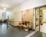
outdoors and makes it glow during evening events. A playground for compromise was reached with the second-floor hallways, which IHPA
the preschool children is just south of the annex, and a fenced play wanted to be as wide as they had been originally. To meet this
area for toddlers is tucked into the north part of the site, offering directive, yet gain much-needed classroom space, Holabird & Root
direct access from those classrooms. bumped out bays into the hallway and then took advantage of the
The church complex is rated orange—meaning it possesses configuration to incorporate hall benches.
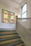
significance to the community—on the Chicago Historic Resources The archdiocese had removed about half of the stained glass
Survey. Receiving state funds for the project triggered the windows before selling the property. Those that remained were
involvement of the Illinois Historic Preservation Agency. The original removed from the first-floor sanctuary and placed in back-lit frames in
wood windows were restored and double-glazed. A compromise was the historic stairwell and in the third-floor teen room, which can also
reached between IHPA’s directive to preserve all window openings serve as a chapel. Preservation of the glass was not required by the
and Concordia’s desire to change them into glass-paned doors for the IHPA but was done at the insistence of Rev. Zook, who “wanted to
36 ChicagoArchitect jan | feb 20121. To maximize daylight and views for the children, alternating windows of the
first-floor classrooms were changed into glazed doors, and small square
windows were created just above floor level. Activity areas are defined by
low walls, lofts, and changes in ceiling and floor treatments. The neutral
palette is a soothing backdrop for the children’s toys and activities.
2. To gain classroom space while meeting the IHPA’s requirement for
wide second-floor hallways, Holabird & Root bumped out bays and then
incorporated benches. Interior windows provide views into classrooms.
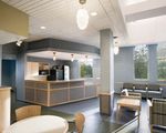
3. The skylit third floor café serves as a secondary lobby and multi-age
meeting space.
4. The stairwell is the only historic element of the otherwise gutted interior.
Back-lit stained glass windows were originally in the first-floor sanctuary.
2
3
4
show continuity with this place as an anchor in the community.” to the building’s success as a community center. Zook had wanted a
The interior materials palette is in neutral, soothing colors with grand first floor lobby, but it was not practical because that valuable
natural materials, such as birch plywood, used wherever possible. space was needed for classrooms, so instead, the project team
“That way the child brings the life and color to the spaces,” Segal created a great lobby upstairs. A pitched-roof skylight structure
says. She and the client were able to visit several other childcare provides abundant north light, and a café serves as a multipurpose
centers and found some common desires: maximization of natural space used at different times of day by seniors, adults and teens.
light, a scale that is appropriate for children and an abundance of New doors can close off the corridor to separate the licensed
storage spaces. Zook praises Segal for creating storage from preschool spaces from the community areas. Segal notes that this
otherwise useless space, which helps maximize the flexibility of the kind of mixed-use facility is a good model for the pooling of resources
rooms. He is also enthusiastic about the variety of lighting, including that is now often necessitated by tight budgets.
daylight, that is found throughout the building. Challenges during the process included the discovery of cast-iron
The child-appropriate scale was achieved despite high ceilings by columns, requiring the addition of a secondary set of them in steel.
breaking down the scale of the classrooms with alcoves, cubbies and Zook feels that the added costs of preservation were part of the
lofts. Activity areas are defined by changes in ceiling and floor organization’s “good faith relationship to the community,” which
treatments. Low, square windows provide views into adjacent includes former St. Veronica parishioners. Instead of being lost to the
classrooms as well as to the outdoors. wrecking ball, this former church serves a new organization’s mission
The third floor has an array of spaces whose flexibility has been key as a place “where all our neighbors can gather, learn and grow.”CA
ChicagoArchitect jan | feb 2012 37You can also read


