SUYING METROPOLITAN'S DEGREES OF ENCLOSURE
←
→
Page content transcription
If your browser does not render page correctly, please read the page content below
INDESIGNLIVE.SG                               #73 | APRIL | MAY | 2015

                                                                          S$10.00

I N T E R I O R S   A R C H I T E C T U R E   D E S I G N

                                            SUYING
                                     METROPOLITAN’S
                                        DEGREES OF
                                         ENCLOSURE

AAMER ARCHITECTS | ATELIER M BY CHEN & CHOI COLL ABORATIVE | MRS POUND BY NCDA
NIPEK | THE WORKING CAPITOL BY FARM, TAKENOUCHI WEBB & FOREIGN POLICY DESIGN
CASE STUDY | HOUSE
BREATHING
BOX
SUYING METROPOLITAN STUDIO CREATES A FINELY
ARTICULATED HOUSE IN KRANJI THAT BLENDS
MODERNIST INCLINATIONS WITH A TROPICAL SENSIBILITY.
Broad overhangs and filtering 95 | CUBES 73 INDESIGNLIVE.SG
screens equip the house for its
tropical context, and allow it to
be opened up to the viewCASE STUDY | HOUSE
Te x t » Narelle Yabuk a
Photogr aphy » Edwa r d Hendr ick s
“This kind of site is very hard to come by,” says
Edmund Ng of Suying Metropolitan Studio as
we look out from the upper terrace of a semi-
detached house in Kranji designed by his office.
The house faces a forested reserve – the military
training zone around the Mandai Camp – and at
times the sounds of the firing range overtake the
babble of birds that populate the canopies of trees
immediately across the street.
This rare and valuable view just happens to
face west, however, which raised the problem of
how to enjoy the green aspect through ample
openings while preventing the overheating of the
interior. Ng’s solution, essentially, was to moderate
and articulate the edges of the house, translating
his modernist-inspired architectural form into a
breathing, shaded tropical filter.
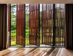
An extensive screened facade was developed for
the western side of the house, with batons of dense,
hardy ironwood in a staggered arrangement. Much
of this facade is operable, with the batons encased
by inconspicuous steel frames. “Because of the
detailing, it’s difficult to see where each operable
screen begins and ends. We achieved a nice
uniformity across the facade,” says Ng.
Gaps between the batons filter the sunlight
as it enters the house, and preserve glimpses of
green even when the operable screens are closed.
A secondary layer of heat defence is provided by
interior curtains, and rain is abated by sliding glass
doors. Broad overhangs allow for deep shade and
rain protection.
The moving screens are grouped and operated
in trios by hinged connecting arms. Manipulating
them reveals their sheer weight and turns the
process of opening up and closing down the house
into an experience that emphasises physical effort
and time. A very different experience would have
Left: The entry sequence Right: The living and dining 97 | CUBES 73 INDESIGNLIVE.SG
delivers one from the car area can be fully opened
porch, between two water up to the pool, with the
bodies, and on to the perimeter fence creating
concealed front door a courtyard-like atmosphereCASE STUDY | HOUSE
1ST STOREY PLAN
3RD STOREY PLAN
2ND STOREY PLAN
ATTIC PLAN
14 17 17
15
13 12 23
deck
11 18 18
24
16 18
16 17
18
9
10
26
8 lift lift lift
19 22
5
20 18
7 16 18 25
4 21
800
6 17
3
2
100
1
_ _ _ _
1ST STOREY PLAN 2ND STOREY PLAN 3RD STOREY PLAN ATTIC PLAN
been had if electronically operated rolling screens
(for example) had been installed. The act of
manipulating the weighty screens provides a poetic
reminder of context – of the view that is partaken,
and of the rhythms of the weather.
It was fortunate for Suying Metropolitan Studio
that their client was also the builder of the house. The
owner has provided repair services and undertaken
A&A work for some twenty years, and is now
venturing into the construction market. Says Ng,
“The house couldn’t be too complicated and difficult
to build, yet it needed to be iconic. We created a clean
and simple house that is nicely articulated but quite
straightforward in structural terms.”
Ng and his team designed the “tidy and
controlled” facade with a clear separation of each
component. “Everything is isolated and separated,”
he explains. “Whatever is metal is black. If it’s
white, it’s a plaster finish. Timber elements are
expressed clearly. Each material is in its ‘natural’
state,” he elaborates. “The owner was very clean _
with the details. He didn’t dilute details for speed, LEGEND
THE ACT OF MANIPULATING THE WEIGHTY ease or cost savings. He challenged himself to build 1 Car Porch | 2 Reflection Pond | 3 Pool | 4 Entrance | 5 Foyer
| 6 Guest Bathroom | 7 Guest Room | 8 Lift | 9 Dining/Lounge |
a beautiful, iconic house.”
SCREENS PROVIDES A POETIC REMINDER OF The approach of articulating elements extended
10 Dry Kitchen | 11 Wet Kitchen | 12 Helper’s Room | 13 Powder
Room | 14 Shower | 15 Deck | 16 Bedroom | 17 Bathroom | 18
CONTEXT – OF THE VIEW THAT IS PARTAKEN, to the car porch shelter and – in spatial terms – to Walk-In Wardrobe | 19 Living/Lounge | 20 Master Lounge | 21
Master Bathroom | 22 Master Bedroom | 23 Junior Master
the entry sequence. “There’s a considerable change
AND OF THE RHYTHMS OF THE WEATHER. in ground level from one end of the site to the
Bedroom | 24 Junior Master Bathroom | 25 Roof Terrace | 26
Multipurpose Room
Left: The lift and stair Right: The vivid green view 99 | CUBES 73 INDESIGNLIVE.SG
core serves as a conduit can be enjoyed whether the
for light, which flows operable screens are open
between floors unhindered or closed
by glass balustradesother, so we tiered the car porch roof to break
down the scale. It steps down to a more human “EVERYTHING IS ISOLATED AND SEPARATED. EACH
scale,” explains Ng.
“We created a feature wall so the parked cars MATERIAL IS IN ITS ‘NATURAL’ STATE.”
remain separated from the interior,” he continues.
This assisted in the creation of a sequenced entry » Edmund Ng
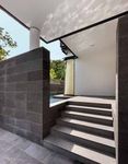
experience. “From the gate, you first engage with
this feature wall, then you walk beyond that and
find water on both sides – the fish pond and the
swimming pool. Then you enter a large foyer space
– a sanctuary with the sound of water,” he says.
A layered approach was also applied to the
living space. Explains Ng, “Because of the slope,
at some points the road level is higher than the
living space. So we had to artificially create a
private environment. The pool area is almost like
a courtyard, and the sound of the cascading water
masks the noise from the road.”
The finely articulated vision was extended to the
more utilitarian aspects of the house. A triangulated
form on the top level, for example, conceals the
air conditioning compressors from the view of the
neighbours and acts as a vent.
At night, the neighbours’ experience of the house
dramatically alters. As light emanates outwards
through the staggered ironwood screens, the portions
of solid wall become more apparent. Says Ng, “The
box form of the house begins to disintegrate into the
purity of the elements themselves.” «
KRANJI HOUSE
DESIGN FIRM Suying Metropolitan Studio Pte Ltd
PROJECT TEAM MEMBERS Edmund Ng (Architect),
JR Ricafrente
BUILDER AC Creative Pte Ltd
C&S ENGINEER KKT Consultants
TIME TO COMPLETE 15 Months
TOTAL FLOOR AREA 700.4 sqm
SUYING METROPOLITAN STUDIO PTE LTD
(65) 6297 9797
The precisely articulated
facade allows each
material and surface to
be read distinctlyYou can also read


