A VICTORIAN TOWNHOUSE - Design ideas - Todhunter Earle Interiors
←
→
Page content transcription
If your browser does not render page correctly, please read the page content below
DECORATE design ideas

                                                                       Design ideas

                                               A VICTORIAN
                                               TOWNHOUSE
                      This house in west London has been thoughtfully reconfigured by Todhunter Earle Interiors to
                    accommodate a family with young children, as well as their growing collection of antique ceramics
                     and artworks. CHRISTABEL CHUBB highlights the key design elements and decorating decisions

                                                                         KITCHEN
                 Originally in the central part of the house, the kitchen was repositioned at the front by Flower Michelin Architects, allowing
              natural light from the west-facing windows to flood into the room. Original features such as the chimneypiece were left untouched,
PAUL MASSEY

                 respecting the house’s Victorian origins. Having open shelves rather than wall-mounted cabinets enhances the sense of width
                in quite a narrow room, and a seat built into the bay window helps to make the most of every bit of space. flowermichelin.com e

                                                                                                           HOUSEANDGARDEN.CO.UK AUGUST 2021 000
DECORATE design ideas DECORATE design ideas
[4] DINING ROOM
This sits between the kitchen and morning room. The combination
of concealed and exposed storage allows the owners to display
pieces collected on their travels on shelves behind fluted glass
doors, with space for small appliances in the cupboards below.
The custom-built cabinetry does not reach the ceiling, which
emphasises the height of the space and gives the space an airy
feel. The rug helps to define this as a room in its own right and
stops it feeling like a passageway between the adjoining rooms.
The steel chandelier is from Howe. howelondon.com e
1 2
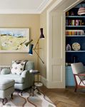
[1] MORNING ROOM 3
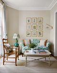
The opening between this room at the back of the house and the
adjoining dining room (opposite) was enlarged, so more natural
light can reach what could have been a dark space. This idea has
been used throughout the house. As Laura King, the lead interior
designer on the project, explains, ‘This creates a greater sense
of space and flow, without making the rooms open plan.’ Walls
in Paint & Paper Library’s ‘Sand III’ provide a calm, pale back-
ground for a set of botanical prints and a David Seyfried sofa,
covered in ‘Gonfaloniere’ linen in grass by John Stefanidis from
Tissus d’Hélène. paintandpaperlibrary.com | davidseyfried.com
johnstefanidisfabrics.com | tissusdhelene.co.uk
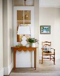
[2] MORNING ROOM
On the other side of the room, a new internal window allows day-
light to reach the stairs and landing, and frames a view of the
wallpaper in the downstairs loo beyond. The fanlight above it
gives the impression of a higher ceiling. Adjacent to this wall,
double doors provide another entrance to this part of the house.
[ 3 ] C L OA K R O O M
Panelling was added below Pierre Frey’s ‘Mojito’ wallpaper and
painted in Farrow & Ball’s ‘Green Smoke’, as was the shelving on
the back wall (seen in the mirror), which helps unify the space. A
rattan-framed mirror from The Decorative Antiques & Textiles
Fair makes the room appear to be larger than it is and provides
decorative detail. There is no natural light, but ‘Swan Neck’ wall
lamps from Pooky and a ‘Dodo Egg’ pendant by Beata Heuman
PAUL MASSEY
provide a warm, atmospheric glow. pierrefrey.com | farrow-ball.com
decorativefair.com | pooky.com | beataheuman.com e
000 AUGUST 2021 HOUSEANDGARDEN.CO.UK HOUSEANDGARDEN.CO.UK AUGUST 2021 000DECORATE design ideas DECORATE design ideas
1 2 4 5
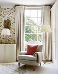
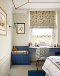
3 [ 1 ] D R AW I N G R O O M [4] CHILDREN’S BEDROOM 6
Once again, an opening was enlarged – this time on the first floor Throughout the house, bespoke joinery was crucial for making the
– to create an L-shaped room, which now houses a formal sitting most of the space, with many of the pieces designed to be dual
room and a large study. Timber panelling in a style consistent purpose. The boys’ bedroom has a custom-built desk and seating
with the Victorian architecture of the room was used to make a area with storage below for toys, all in Paper & Paint Library’s
feature of the opening itself, and other original period features, ‘Blue Blood’. ‘It’s very important to have a space for everything,’
such as the skirting and cornicing, were restored by specialists. says Todhunter Earle co-founder Kate Earle. A George Spencer
An eye-catching, mid-century-inspired ‘Wormhole 03’ brass floor Designs ‘Wide Straight Edge Braid’ was used to create the illusion
lamp by Bronzetto is positioned in a corner beside a ‘Hartfield’ of a higher ceiling. paintandpaperlibrary.com | georgespencer.com
armchair and ottoman from Arlo & Jacob, providing an ideal spot
to relax with a book. ilbronzetto.com | arloandjacob.com [ 5 ] P L AY R O O M
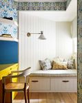
A tricky corner in this room on the lower-ground floor has been
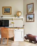
[2] STUDY transformed into a reading nook with drawers underneath. Ideal
On one side of this east-facing room is a desk with a shelf above it, for homework, the desk was made to fit the space and the wall is
which were both custom built to fit the space with its distinctive partly clad with cork covered in blue ‘Milano’ wool flannel from
angles. The walls are painted in ‘Tawny’ from Edward Bulmer Clementine Oliver, for use as a pinboard. The wallpaper is from
Natural Paint, a timeless beige that was chosen for the way it Trustworth Studios. clementineoliver.com | trustworth.com
works well in different lights. A rattan chair brings a natural, tex-
tured element to the scheme, while the owners’ decorative leather [6] MAIN BEDROOM
hippo adds a fun, quirky touch. edwardbulmerpaint.co.uk Ample storage here is provided by built-in wardrobes, which stop
just short of the ceiling in order to make the walls of this bedroom
[3] INFORMAL SITTING ROOM feel taller. The cornicing is interrupted above the window to
In this lower-ground room, which doubles as a spare room for create space for a pole with full-length curtains. The wallpaper is
guests, internal windows and a glazed door separate the space Cole & Son’s ‘Hummingbirds’ and the bespoke chest is from
from the hallway. This brings as much natural light as possible Howe. The owners’ armchair from Kingcome Sofas has been
PAUL MASSEY; ANNA STATHAKI
into an area that would otherwise be quite dark. Walls in warm re-covered in Namay Samay’s ‘Lerio’ in sterling. cole-and-son.com
‘Buff ’ and woodwork in ‘Milk White’, both from Edward Bulmer howelondon.com | kingcomesofas.co.uk | namaysamay.com m
Natural Paint, contribute to the airy feel, and a sofa bed in a rich Todhunter Earle Interiors: todhunterearle.com. This project
yellow brushed linen-cotton from Sofa.com can be converted is featured in ‘Modern English: Todhunter Earle Interiors’
easily for guests. edwardbulmerpaint.co.uk | sofa.com (Vendome Press, £50), published in September
000 AUGUST 2021 HOUSEANDGARDEN.CO.UK HOUSEANDGARDEN.CO.UK AUGUST 2021 000You can also read


