Visualizing data LESSON IDEA - ART & DESIGN MATHS - Procreate
←
→
Page content transcription
If your browser does not render page correctly, please read the page content below
LESSON IDEA

Visualizing data
  ART & DESIGN   MATHS   SCIENCE

Learn with
Lesson ideas
     Use these Lesson Ideas to spark your imagination for
using Procreate in the classroom. Feel free to take them further
                   and make them your own.

                   Created August 2021 in Procreate 5X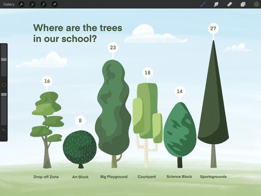
Visualizing data

Communicate your research in a way
that’s meaningful and engaging by
creating graphic data visualizations
to share with the whole class.

All you need is an iPad
and the following apps:

       Procreate

       Numbers

Educational Value
Students will formulate a research question,
gather data, and create an appropriate
graph to discover trends and patterns
within their dataset.

Students will understand the roles of
scientific charts and graphic visualizations
in scientific communication.

Students use digital technologies
and creative processes to aid
scientific understanding.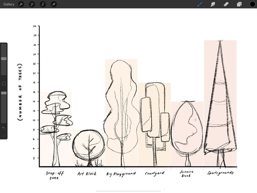
In this guide   1    Be the researcher

                2    Drawing a graph

                9    Visualizing your data

                15   Take it further
Be the researcher 1.
Formulate your
research question
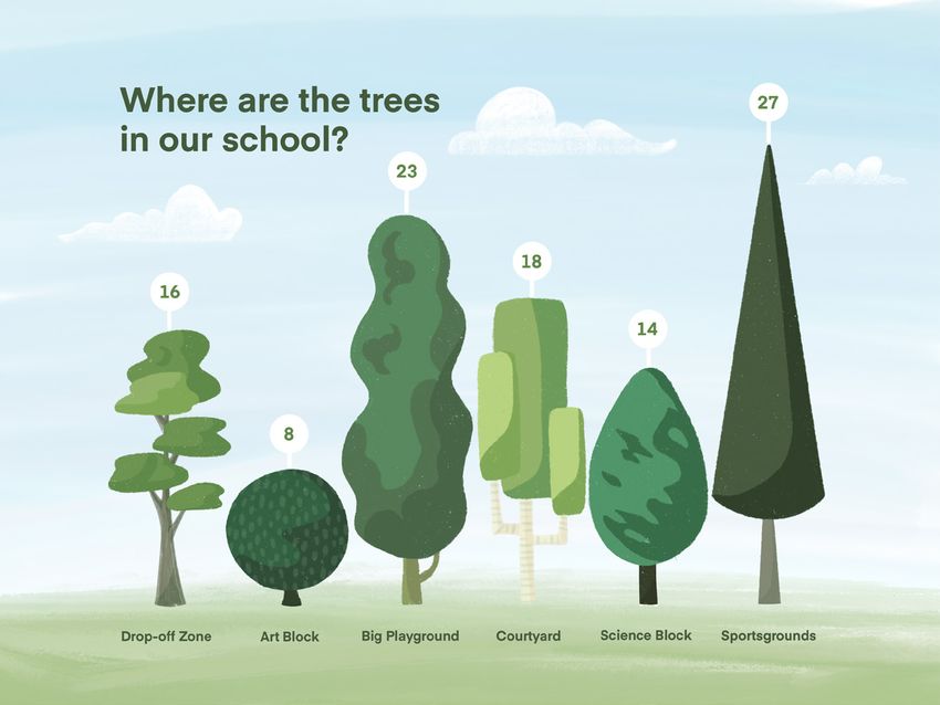
What is it that you’d like to discover or learn?
(e.g. Which parts of our school have the
most trees?)
What are your variables (the things you
are measuring) and how will you measure
them? (e.g. Numeric variable: Number
of trees, Categorical variable: Zones of
the school)
Gather your data
Use Numbers to document your raw data
into a table as you count or measure.
Numbers
Drawing a graph                                                                              2.

Bars, lines, and pies
Graphs and charts are a great way to
communicate the meaning or trend
behind the data, that otherwise would
just be a list of numbers that’s hard
to understand.
Work out what kind of data you’re working with
and choose what kind of graph you will create.
For example, if you’re working with discrete data,      PIE CHART                BAR GRAPH
you might like to create a bar graph, or a pie chart.
If you’re working with continuous data, you might
like to create a line graph.

IN THIS EXAMPLE...
The example in this lesson idea will demonstrate
a bar graph, but the tools covered can be used to
assist you to make any kind of chart or graph.

                                                                    LINE GRAPH
3.

Create a canvas
  In your Gallery tap the + icon to create
  a screen-sized canvas.

  Tap the wrench icon to open the
  Actions menu.

  Tap Canvas, and toggle on Drawing Guides.

  Tap Edit Drawing Guide.
4.

Drawing Assist
Toggle on Assisted Drawing in the
bottom-right corner of the screen.
                                                     CHANGE
This will act as a ruler so you can draw             GRID COLOR
perfectly straight lines along the direction
of the grid vertically and horizontally
You can also use the sliders to adjust the size of
the grid to best suit your data set, and opacity
and thickness so that it is more visible while
you’re drawing.
Tap Done to return to your canvas.
5.
                                                BRUSHES   LAYERS PANEL

Draw the axes
  Select the Brush tool and draw an X
  (horizontal) and Y (vertical) axis.

  Tap the two squares in the top right to
  open the Layers Panel.

  Tap the + icon to create a new layer.

  On this new layer, give your graph a title,
  and label each axis with your variables so
  your audience understand what data they
  are looking at.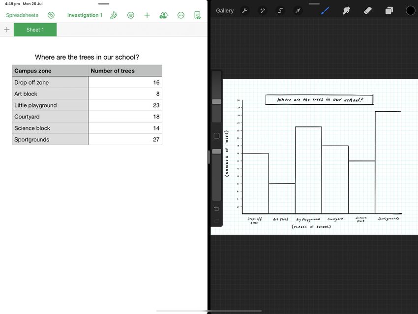
6.

Add a scale
  This show the units of measurement shown
  on the Y axis. In this example, it shows
  number of trees in intervals of 2.

  Then add the labels to your Y axis.
  In this example, this is the areas of the
  school grounds.
7.
                                                           LAYERS PANEL

Plot your data
     Tap + in the Layers Panel to add
     another new layer, then tap on it to open
     Layer Options.

     Tap Drawing Assist to turn it back on
     for your new layer.

     Now, referring to your Numbers document,
     and plot your data onto your graph.

MULTI-TASKING
You can use multi-tasking mode to have both
Procreate and your Numbers document open on
your iPad at the same time. To enter multi-tasking
mode, swipe up from the bottom of the screen to
open the Dock while in Procreate. On the Dock,
touch and hold the Numbers app. Then drag it off
the dock to the left or right edge of the screen.

                                                     Numbers
8. Nice one! Now you’ve got an accurate and scientific summary of the data that you have gathered. But what if you wanted to make it a little more engaging?
Visualizing your data                                  9.

Make it engaging
Being able to communicate information
in a meaningful and engaging way is an
excellent life skill – it allows you to take
complex ideas and data sets, and break
them down into something that anyone
can understand quickly and easily.
Use your chart or graph as a basis for a data
visualisation, so that you have both a traditionally
scientific, and a graphically engaging summary of
your data.

     In your Gallery, select and duplicate
     your graph file so you have two copies
     to work from.

     Tap your file name to rename them so you
     don’t get them mixed up while you work.
10. Group your layers Swipe right to select all of your layers, and tap Group. Tap to select your data layer, tap the N, and decrease the opacity by pulling the slider to the left. Then tap to select the whole group, and tap the + to create a new layer.
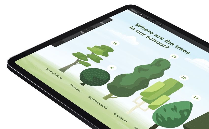
11.

Sketch your visuals
On your new layer, sketch out a plan for
your graphics.
Consider what kind of subject matter best
summarizes what your data represents. In this
example it’s quite simple because the units are
trees – you might have to be creative to come up
with an engaging visual representation of your data.
12.

Refine
Open the Layers Panel, and tap the +
to create another new layer.
Use an inking brush to refine your
illustration and add some color.

DRAWING TIP
Keep it simple – your illustration is there to help
explain the data, not make it more difficult to
see or read.
13.

Add detail
Use the text tool to add labels with key
information to your visualisation so that
you can hide your graph layers.

ADDING TEXT
Tap the wrench icon to open the Actions menu,
tap Add, and then Add Text to open the Text tool.
14.
Two ways to
communicate
Now you have both a technical and a
graphic representation of your original
set of data. Explain your observations to
your classmates.
     Which version do you think is
     more accurate?

     Which version do you think people would
     choose to read if they had a choice?

     Which version can you understand
     more quickly?

BOTH ARE IMPORTANT
Both ways of viewing data are important, but
they serve different purposes. A physicist
is unlikely to put an illustrative chart in their
published thesis, and a pedestrian is unlikely to
read a technical chart if it’s on the back of a bus
– context is everything!
Take it further 15. Run an analysis Write a summary sentence that explains the general trend you notice from your graph. Or use basic statistical methods to run an analysis on your original data set that can further illuminate the trends shown by your graphs. Different kinds of data Apply the process in this lesson to a different kind of data. There are many publicly available data sets online – see if you can apply the same visualization process to nominal, ordinal, discrete or continuous data.
Create
Artistic expression helps make
education meaningful, memorable
and fun. Find more creative lesson
ideas at education.procreate.art
To dive deeper into the full creative
potential of Procreate, see our
Handbook at procreate.art/handbook

Learn with
You can also read