SHINE ON BRIAN MCCARTHY'S SINGULAR TALENT FOR COMBINING LUXURIOUS FINISHES, REMARKABLE OBJECTS AND VIBRANT COLOR RESULTS IN A RADIANT NEW HOME IN ...
←
→
Page content transcription
If your browser does not render page correctly, please read the page content below
S H I N E ON
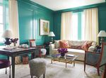
                                                                                                                                                               A custom Oushak featuring an unusual mix of yellows,
                                                                                                                                                  blue-greens, ivory and a peachy salmon became the starting point
                                                                                                                                                         for the living room’s palette, which, with the exception of a
                                                                                                                                                    dramatic Stephen Antonson end table, was kept dialed down “so
                                                                                                                                                    that we could dial it up in the dining room and the family room,”
                                                                                                                                                         says Brian McCarthy. The painting is by Jan-Ole Schiemann.

       BRIAN MCCARTHY’S SINGULAR TALENT FOR COMBINING
  LUXURIOUS FINISHES, REMARKABLE OBJECTS AND VIBRANT COLOR
        RESULTS IN A RADIANT NEW HOME IN PHILADELPHIA.
P R O D U C E D B Y C A R O LY N E N G L E F I E L D . W R I T T E N B Y D E B S C H WA R T Z . P H OTO G R A P H E D B Y M A X K I M - B E E .

                                                                                                                                                                                                                 85
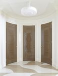
Architect Douglas Wright designed the circular antechamber
as a “landing spot” for guests. “The arched walls make for a more
welcoming, gracious space,” he says. McCarthy upped the quiet
drama with lacquered closet doors and a marble floor based on Sir
Edwin Lutyens’ design for the British Embassy in Washington, D.C.
Opposite: The wife’s love of color is on full display in the family
room, where an Alice Neel print hangs on the peacock-green walls.
B
rian McCarthy makes interior design sound McCarthy and Wright created an entirely new floorplan that
easy. Take, for example, how he describes the two improved circulation and more clearly separated the public and
seemingly simple objectives behind a project private spaces. Next, McCarthy began mapping out a strategy
on Philadelphia’s Rittenhouse Square: “It’s about for the progression of color and tone. “One of the first things
the clients’ lifestyle, and it’s really just about making something that I think about—it depends on how much a client likes color,
beautiful.” But as anyone who has seen his work can attest, to and the wife here really likes color—is light versus dark or
achieve the level of “beautiful” that McCarthy has in mind isn’t light, medium and dark,” he explains. “In my mind, I imagine
a straightforward matter. A former partner at the legendary firm the flow of the rooms and how I’m going to relate shapes of color
Parish-Hadley, the New York–based McCarthy is a student of as you move through space.”
design history who has a classicist’s appreciation for the interplay In many of the rooms, McCarthy relied on veteran
of light, form and color, and a deep sensitivity to the nature of decorative painter Mark Giglio to create the distinct visual
materials. His work is rich, dramatic and sensual, showcasing his experiences he sought. “Anything I can dream up, Mark can do,”
appreciation of art and artisan work and finishes, from bespoke says McCarthy. “And he’s constantly coming to me with new
furniture and marble floors to Venetian plaster walls. ideas and samples of things to get our brains abuzz.” In the living
Before he applied his trademark glamour to the 17th- room, Giglio used a stencil and Venetian plaster technique
floor apartment, McCarthy worked alongside architect (and to create a wavy pattern of alternating polished and matte white
frequent collaborator) Douglas Wright to give it a complete stripes, which helps the low ceiling appear higher. “You get
gut renovation. Built in the 1920s, the space boasted amazing this change of planes in the surface,” says McCarthy. In the dining
light and wide-open city views but had an awkward layout. room, Giglio’s polished red Venetian plaster walls are the mainIn the dining room, where the wall finish makes such a strong
statement, little art is required. Instead, the room gets interest
from its handcrafted pieces, including a custom wrought-iron
console table finished in patinated gold leaf, curtains hand-painted
by Japanese artist Maki Yamamoto and a patinated bronze
table base crafted by Patrice Dangel. Opposite: The iron bar,
inspired by 19th-century French campaign furniture, features a
brushed-marble countertop and mirrored marquetry backsplash.“
In the husband’s library, black cerused oak
It’s like throwing a cocktail party. You’re not going
paneling, featuring a square marquetry pattern and
bronze borders, floats above an alabaster-colored
rug, creating a solid, enveloping space that’s ideal for
to invite just lawyers or just decorators—you always
a retreat. The desk is in the style of Eugene Printz.
want to create an interesting conversation. It’s the
same with the partnering of furniture and objects.
”McCarthy’s attention to detail and love of special materials inform
every corner of the home. In the main bedroom, the bed is flanked
by panels of “watery mirror,” a type of very thin mirror that was popular
in the 18th century that provides a dreamlike, abstract reflection.
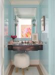
Opposite, from left: The powder room is fitted with a cantilevered
iron sink topped by two inches of seeded glass. McCarthy painted
the guest room a shade of apple green he once used in his own
kitchen, and tucked the bed into a niche to create a sense of safety.
“It’s like somebody is wrapping you up in their arms,” he says.
event. “You don’t have to fill it with art, because the strength going to invite just lawyers or just decorators because you always
of the color supports the architecture and creates volume on its want to create an interesting conversation,” says McCarthy. “It’s
own,” McCarthy adds. the same with the partnering of furniture and objects.”
From the velvety quiet of the antechamber to the dynamic McCarthy is quick to point out that this uniquely
elegance of the family room, every space in the apartment offers harmonious and beautiful home is a product not only of taste,
a distinct sensory experience in terms of colors, materials and but of teamwork. “We create a family of people that we work with,
surfaces, right down to the floor coverings. In fact, rugs and carpets including the contractor. Because if it’s not a cohesive, loving
were the starting points for the rooms. The palette and pattern group, it shows in the end,” he says, noting that he’s worked with
of each “led to the walls, which then led to the relationships of Giglio for some 25 years and with Wright for approximately 20.
color in these various rooms,” McCarthy explains. The contractor, Dixon Shay, was a newcomer in the McCarthy
While the clients’ taste leaned traditional, they also orbit, but was deemed “delightful” by the designer. “If I have to
wanted some modernity. To satisfy these twin urges, McCarthy work this hard and this closely with people, I’ve got to like them,”
brought together a mix of new and antique furniture in different McCarthy says.
styles, all of it uniformly trim and clean, from the Jean-Michel That same spirit of cooperation supported the entire
Frank–inspired parchment coffee table in the living room to the project. As McCarthy and his team were getting to know
Directoire bergères in the family room. To these, he added two the clients, the clients—who hadn’t previously designed a home
more of his signature flourishes: striking contemporary art and together—were also getting to know each other, a process
a wealth of dramatic handcrafted objects, such as the thalassic McCarthy found fascinating. “It speaks to the strength of their
pale green vase by Trish DeMasi atop the card table in the living relationship that they were able to speak very candidly to each
room and the Surrealist goat-legged stool by Marc Bankowsky in other and to us.” From start to finish, “it was just a very happy
the powder room. “It’s like throwing a cocktail party. You’re not experience for everybody,” he says. “This was a real success story.”The clients love blue, so McCarthy ran with the color in their bedroom, creating a glamorous, softly
tailored, all blue-and-white space. He upholstered the walls with a fabric that was custom-loomed to
ensure the pattern perfectly suited the proportions of the inset panel behind the bed. Then he topped
it all off with a light fixture by Margje Teeuwen and Erwin Zwiers that he first saw at the Rijksmuseum
in Amsterdam: “It’s just layers of paper. It’s the most floppy, fun kind of nothing, but it’s fabulous.”
95You can also read


