PROJECT 1: QFA REDESIGN - BONIFAZI 2021
←
→
Page content transcription
If your browser does not render page correctly, please read the page content below
BONIFAZI 2021
PROJECT 1:
QFA REDESIGN
CASE STUDY

The client I worked with to redesign their website is the Pacific Northwest Quilt and Fiber Arts
Museum in La Connor, Washington. This museum caught my eye when I was looking another
museum in La Conner that I had visited years prior and noted how terrible underdesigned it
was. The Pacific Northwest Quilt and Fiber Arts Museum sufferes from a very similar dilemma
as my original subject for this redesign project.

This museum is a spectacular place to view some of the best quilted and fiber work across the
state, even featuring pieces from across the country. I truly believe that this place is one of the
must -sees of La Conner. That being said, the audience they’ve snagged over the decades is
a tiny, niche group. The majority of visitors are eldery quilters, which is fine for business, but
not at all for the legacy of the museum. In order for the Pacific Northwest Quilt and Fiber Arts
Museum to reach the next generation, they need to modernize and rebrand FAST.
ORIGINAL
WEBSITE

  The site so far for the Pacific Northwest Quilt and Fiber Arts Museum (qfamuseum.org). From left to right; the home page, the exhiibits page, the announcements on the home page, and the ‘plan
  your visit’ page. After lurking around the site for a while, I learned that despite the demographics of their vistors, this museum’s website is optimized for smartphones.
ORIGINAL
USABILITY TEST

USER COMMENTS
“Too much information on the home page, the type is kind of small and narrow between lines.”

“The font is extremely big and makes it hard to read due to its size. It’s not pleasing to the eye.”                                               ORIGINAL
“The sizing is the only part I like and I don’t mind the font but some of the color choices create a lot of eye
strain, there is too much writing, and it doesn’t guide the eye well. A good example is the history page on
                                                                                                                                              WEBSITE RATING
desktop, it is legit kinda hard to tell which order the paragraphs are supposed to be read in.”

“There doesn’t seem to be a logo at all, just a title...”
                                                                                                                         SITE LOAD TIME:				                   2.5
“It is unclear what the logo is. Firstly, it would be better if you could click on a logo to return home rather than a
tab. Secondly, if the logo includes the arrow pattern then it blends into the background color sometimes which
                                                                                                                         ACCESIBLE TYPSETTING: 			            1.25
creates a weird optical effect.”                                                                                         LOGO: 						                            2
                                                                                                                         HOMEPAGE IS DIGESTIBLE QUICKLY: 		   1.75
“[The major headwinds] are clear and descriptive but again, WAY too big.”                                                CLEAR NAVIGATION: 				               1.75
                                                                                                                         NAVIGATION IS CONSISTENT: 		            1
“The major headers are fairly clear (although there are a lot, some are kinda wordy, and a few are a little              CLEAR HEADINGS: 				                 2.25
hidden) but the hierarchy of the secondary type is pretty wack. Also, the type treatment is super inconsistent.”
                                                                                                                         PAGE TITLES ARE SATIFSATORY: 		      1.75
“The museum and its content looks very dynamic and fun, but the website does need to be redesigned to better
                                                                                                                         STYLE/COLOR CONSISTENCY:			          1.25
present the works, especially during the quarantine, a museum could use their website as a platform for the              WEBSITE I EASY TO UNDERSTAND: 		      2.5
exhibitions.”

“It seems as though the website was made more for mobile viewers and not for desktop viewing, as all the titles,
descriptions, and pictures were massive on my laptop. Each section just on the home page takes up almost my
whole screen and makes it very hard to read and take in, and it takes a long time to scroll through the whole
thing.”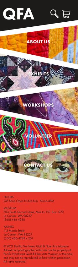
COMPETITORS

 The National Quilt Museum                                                                    Seattle Art Museum
 Simple but effective, the slideshow provides engagement. Navigation is easier to work with   For the audience of QFA, the navigation here might be a little too modern and abstract. But
 because the tabs are vastly condensed. This museum has a MUCH better logo than QFA.          the bright colors and large logo stand out strong to let the viewer know where they’re at.
 .

 The Burke Museum of Natural History                                                          Museum of Northwest Art
 Interactive experience with video running behind the page as the background. Bold and open   Simpler color scheme, not a perfect site by any means but the branding is more clear and
 message makes the website feel more personal. I would love for the QFA site to emulte this   concise.
 style.

PERSONAS

           Hannah McGill
           Pronouns: She/Her/Hers

           Age: 22

           Occupation: Full-time college student, working part time as a
           server

           About: Hannah is an outdoorsy spirit who often makes use of
           local hiking trails and parks. She’s trying to keep her head above
           water in erms of entertainment; money is a little tight and it seems
           like there’s barely any time in the day to get out and explore. She
           discovered the QFA museum on her way up tio Deception Pass
           with a few friends, so she’s decided to indulge curiosty and see
           what the site is like.

           Values: Creativity, Community, Nature

           Goals: Experience something new, learn more about local
           history.

           Demands: She wants to get through the website quickly and
           smoothly, theres no time to waste!

           Pain points: She has a very full schedule that she’ll have to plan
           around to visit, if the website is redundant and convaluted she’ll
           abandon the idea.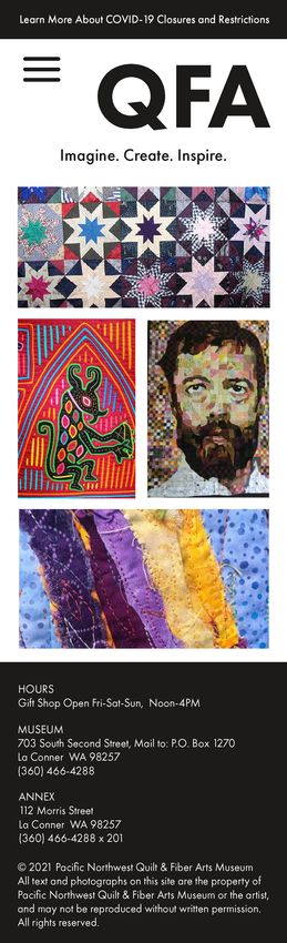
PERSONAS

           Edgar Lim
           Pronouns: He/Him/His

           Age: 74

           Occupation: Retired, formerly employed at USPS

           About: Edgar is a retired mailman who spends his sunset years
           with his wife Vera. His hobbies include building model ships
           and other projects that involve woodworking, and he enjoys
           video calls with his 3 adult children and their total (so far) of
           2 grandchildren. Vera adores sewing and quilting and Edgar
           loves his wife, which is how he finds himself on the QFA museum
           website.

           Values: Family, Creativity, Traditions, Community

           Goals: Have a fun outting with his wife, help her get connected
           with community members that share her passions, not falling
           asleep on a bench at the museum.

           Demands: Likes to print an itinerary so he doesn’t like lengthy
           multi-page goosechases, wants to know what the museum looks
           like driving up to it.

           Pain points: Knows technology well enough but takes a bit to
           get situated with a new website (still uses msn as his homepage),
           only browses the web on a desktop computer.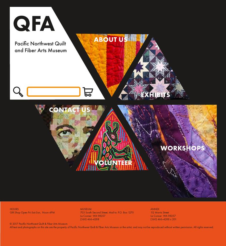
PERSONAS

           Alaia Dean
           Pronouns: They/Them/Theirs

           Age: 10

           Occupation: 3rd Grader, Multimedia artist!

           About: Alaia is a 3rd grade student who recently attended an
           “Artist’s Day Camp” at another elementary school in town.
           Needless to say, they LOVED it. They’ve got the bug for any
           and every type of art, and the craft of the month is quilting after
           reading The Patchwork Quilt with their teacher.

           Values: Fun, Creativity, Family, Community

           Goals: Learning more about sewing, getting inspiration for an
           upcoming poster project, having a fun day with dad!

           Demands: Schedule and ticket prices/shopping should be clear
           to show dad, more pictures to make the museum look cool!

           Pain points: Alaia has a high reading level but misunerstands
           sometimes due to their dyslexia, gets bored looking at massive
           swaths of text... All book and no pictures?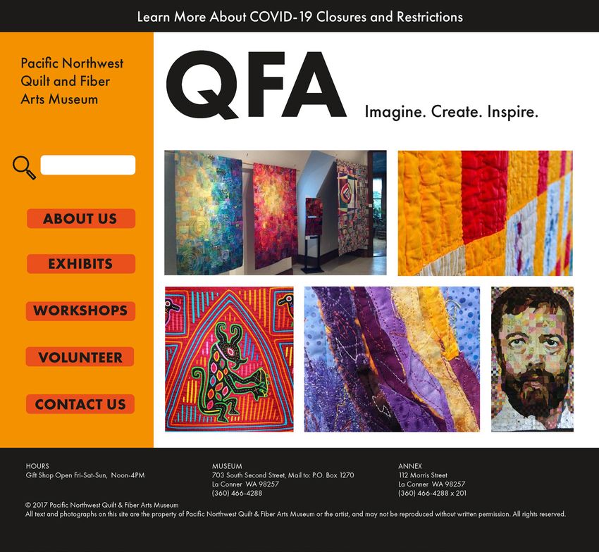
AUDIENCE

                                                                                          https://picrew.me/image_mak-
                                                                                          er/613816

So who makes up the audience here? The unique situation about this museum is that
anyone can be the audience. You can visit this museum on purpose as a lone traveler or
a teacher guiding students. You can wind up here on accident too, seeing as there are a
lot of places you can get to by driving THROUGH La Connor.

With that in mind, I wanted to make this more challenging than it needed to be by
making the goal audience people that don’t knoe anything about this place. My goal is
to make the website for this museum so cool and graphically appealing that everyone
will want to get a ticket and learn about the art of quilting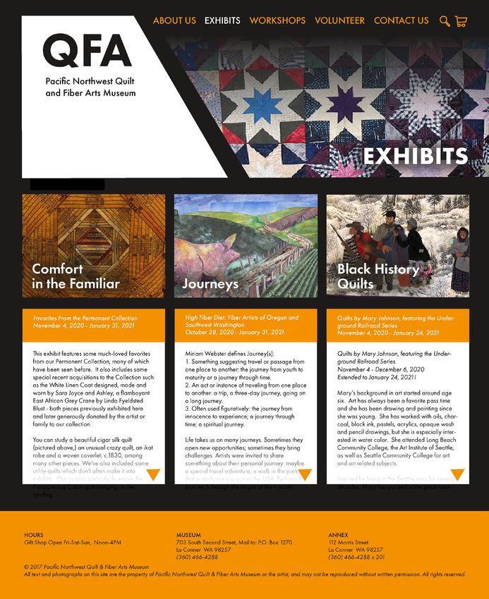
GOALS

BUSINESS GOALS                 BRAND GOALS                        USER GOALS

SELL TICKETS                   TEACH VISITORS                     BUY TICKETS

INDUCT NEW MEMBERS, PARTNERS   KEEP THE ART OF QUILTING FUN FOR   LEARNING ABOUT THE FUTURE QUILT
AND VOLUNTEERS                 THE NEXT GENERATION

RECIEVE DONATIONS              PRESERVING TRADITION FOR           LEARNING ABOUT THE PAST QUILT
                               HISTORICAL RECORD

                                                                                                      STRATEGY
                                                                                                     STATEMENT

                                                          The Pacific Northwest Quilt and Fiber Arts Museum
                                                          website needs to be redidgned so the user can more
                                                          easily browse for relevant information, the staff can
                                                          encourage a younger audience to learn and become
                                                          members, and the brand as a whole can preserve the
                                                          art and history of quilting.
SOLUTIONS

   Easy to navigate

   Consistent type treatment

   Information should be divided distinctly on pages, and not needlessly repeated everywhere

   The design needs to be bold and modern to appeaal to a younger audience

   Shift in title from Pacific Northwest Quilt and Fiber Arts Museum to QFA Museum (like the url)

   New logo
SITEMAP

    CALENDAR
                                          HOME
   BUY TICKETS

                 ABOUT US      EXHIBITS      WORKSHOPS      GET INVOLVED     CONTACT US

                 HISTORY      JOURNIES       FIBER FRIDAY    VOLUNTEER          EMAIL
                  STAFF     BLACK HISTORY      APPLIQUE       PARTNER           PHONE
                            COMFORT IN THE                    MEMBER       MAILING ADDRESS
                               FAMILAR                        DONATE
MOODBOARD In my redesign, I wanted to make the atmosphere of the website into a bold, modern, and confident art museum, without misleading the viewer or detracting for on the beauty of the pieces on display. In designing the hub on the main page, I looked to modular quilt patterns for reference.
WIREFRAMES

  I was really suprised when I recieved so much positive feedback for the purple wireframe. I think the hexagonal hub draws the viewer in and screams “QUILT” in their face. I deccided to discard the
  red wireframe after critiqu and move ahead with the “quilting hub”.
ITERATIONS 1
ITERATIONS 1
ITERATIONS 1
ITERATIONS 2
ITERATIONS 2
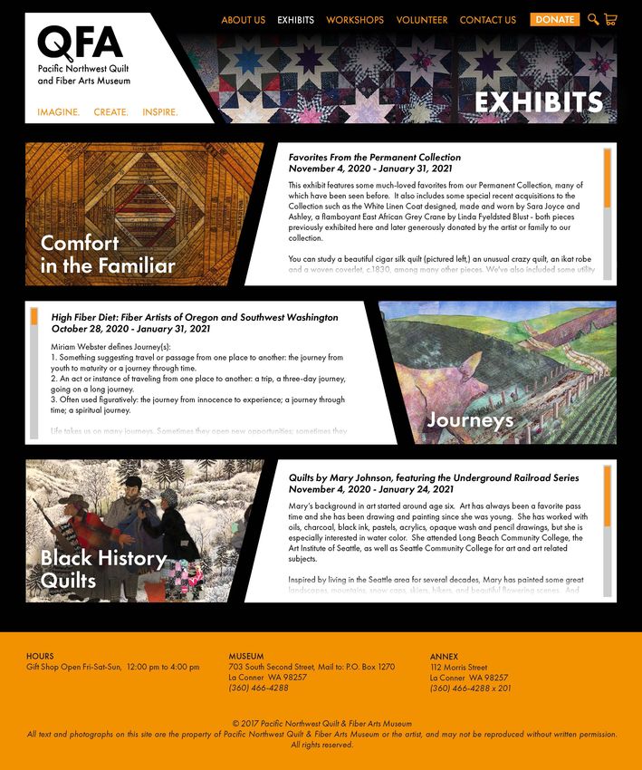
FINAL DESIGN
FINAL DESIGN
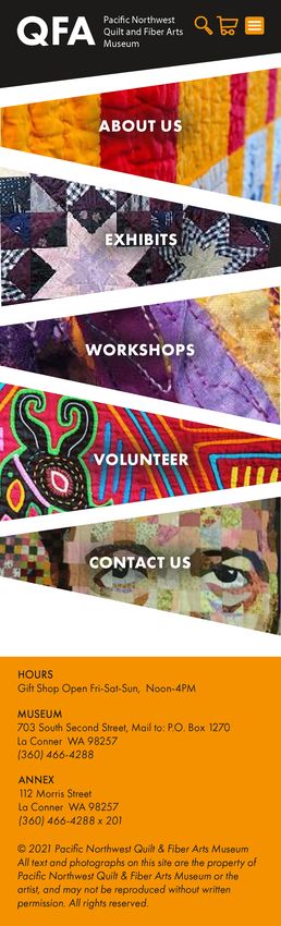
FINAL DESIGN

The mobile adaption for the QFA Museum site is one of the greater acheivements of this project. The
original website was clearly optimized for mobile (and poorly done at that) which made the desktop
site design fall flat. I put a lot of work into making sure that the mobile and desktops versions, wwhile not
twins, we cohesive enough to define the museums brand across platforms.
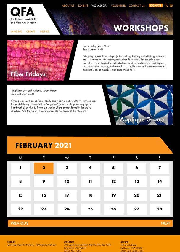
FINAL DESIGN

The finialized version of the mobile Exhibits page is far more effective
than the last! each patchwork banner features some of the work shown
in the exhibit name, and tapping on saud banners brings down a
dropdown description of the collection.
FINAL DESIGN
RESULTS

I’m really pleased with for far this project has come along! There’s always room for more updates, but I feel
satisfied overall with the result of all the different critiques and ideations. The “quilter’s hub” looks great and
serves as an interactive expeience that people seem to be really interested in. I think this redesign could
definetly stand up as a functioning website! However. I’m not sure if the client, the Pacific Northwest Quilt and
Fiber Arts Museum, would be interested in this new design. its boldness and modernity can be both its selling
points, and its downfalls.
You can also read