PACIFIC SCHOOL OF RELIGION - Brand Guidelines - Pacific School ...
←
→
Page content transcription
If your browser does not render page correctly, please read the page content below
PACIFIC
SCHOOL OF
 RELIGION

                        01.19.2021

            Brand Guidelines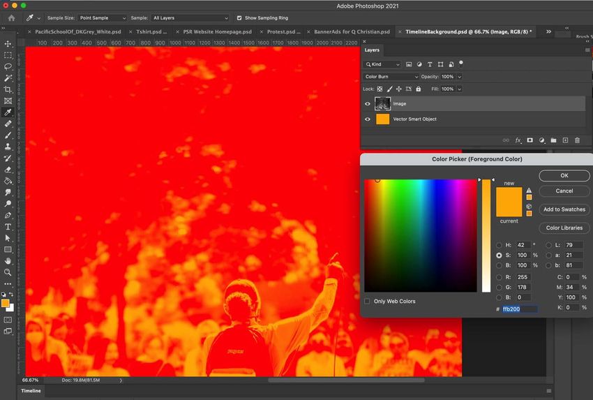
Our Story
“When you encounter deep resonance between who you are and how you are
called to serve, fear fades and freedom follows. And you can’t wait for others
to discover this same truth.”
This is the experience at the heart of our story. It’s as true today as it was at our founding. In
the 1860’s we worked alongside Chinese Christians to enfranchise recent immigrants even
as the Exclusion Act was fomenting anger. During the suffrage movement, we enrolled
women. We ministered to our own Japanese American students while they were imprisoned
in internment camps. We marched for civil rights in the 60’s and ordained our first LGBTQ
clergy members in the 70’s. We stood with Standing Rock and Black Lives Matter.
It is in our DNA to respect the wisdom of people pushed to the margins of society.
Whether they’re disenfranchised by religion or politics or power, we embrace them as mem-
bers of body of Christ—and stand with them as one. Because awakening a sense of agency
in others reminds us of the deep resonance we’ve encountered. It is our hope that the fear-
lessness and freedom that follow will continue to define our story for generations to come.
This is our story. This is who we are.
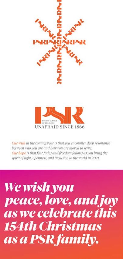
We are PSR—UNAFRAID SINCE 1866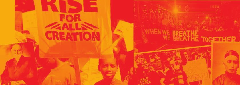
Brandmark

            Our brandmark
            represents the openness
            and intersectionality
            that make PSR unique.

                                      ®
Brandmark

            Our identity’s most prominent identifier is our brandmark. It is comprised of the intersecting
            letters the Pacific School of Religion’s acronym—PSR. There are other variations of the brand-
            mark, but this is the official expression.
Brandmark
Vertical
Configuration

                                                                              POSITIONED

                                                                                                     TOP EDGE
                                                                                           AGAINST
                                                        POSITIONED AGAINST

                                                                 LEFT EDGE

                                                                                                       PACIFIC
                                                                                                     SCHOOL OF
                                                                                                      RELIGION

               Vertical Brandmark                                            Vertical Brandmark Positioning
               This version of the brandmark visually                        The left edge of the vertical brandmark
               represents our commitment to pushing                          should be positioned at the top and left
               on the margins. The inset text should                         edge of the surface it occupies. When
               not be moved.                                                 bleed is required the left edge may be
                                                                             extended to allow for trim.

               PSR has been defined by its respect for the wisdom of marginalized people—and by our legacy of
               pushing against the limitations imposed by the dominant culture.
               The vertical version of our logo celebrates those two core values.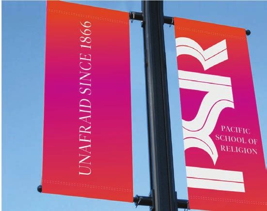
Brandmark
Additional
Configurations

                                                            P OSITIONED AGAINST
                                                             TOP AND LEFT EDGE

                  PACIFIC
                SCHOOL OF
                 RELIGION

                Vertical Brandmark Centered                                       Brandmark Right Aligned
                This additional vertical configuration can                         This version may be used in cases
                be used in narrow executions. Placement                           where the name in the official expres-
                should follow vertical placement                                  sion is too small to read. Where
                guidelines from previous page.                                    possible the logo should be placed up
                                                                                  against the margins in the upper left
                                                                                  corner of the field it occupies.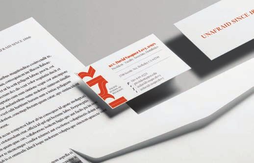
Tagline and
Brandmark
Configurations

                                                                           W ITH NAME

                Standalone Tagline                                      W ITHOUT NAME
                The tagline font is uppercase Tiempos
                Fine. The above artwork should not be
                altered. The tagline may be used as a
                standalone element, however it is                                       Tagline Brandmark Lockup

                recommended that it be used in                                          The tagline and brandmark lockups

                proximity to the brandmark or                                           should not be altered.

                institution’s name.

                From fighting for disenfranchised Chinese immigrants in the 1860’s to ordaining the first LGBTQ
                clergy in the 1970’s, PSR and it’s community have been standing up against the powerful and the
                status quo since our founding. Our tagline celebrates this heritage.
Missuses

           Don’t change the color of the brandmark   Don’t recolor the tagline

                                                      WELCOME BACK 2021
           Don’t crop the brandmark                   Don’t change the tagline

                                                         PSR
           Don’t move the elements of the logo        Don’t substitute the brandmark with text

           Here are some examples of how not to use our brandmark.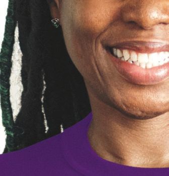
Taglinend Brandmark
Vertical Configuration

                 Vertical Positioning                       Tagline Brandmark Usage Example
                 This is the preferred arrangement of the   This example shows how the versatility of the brandmark and tagline
                 vertical brandmark and tagline.            and how they may be used together to make a striking statement.
Brand
Colors
P RIMARY C OLORS PMS 172 PMS 268 PMS Cool Grey 10
Our main color Our secondary This color us used
invokes a sense of color represents the for our name in the
urgency. richness of our various brandmark
heritage. configurations
C0 C0 C12 C81 C0 C0
M80 M80 M100 M100 M0 M0
Y95 Y0
Y95 K0 K0 Y12 Y Y0
K0 #f24f00 #c900a3 K2 K90 K70
#f24f00 #521c78 #333333 #656565
C12 C50
M100 M100
Y0 Y0
K0 K0
#c900a3 #9900ab
S ECONDARY C OLORS PSR Gradient 1 PSR Gradient 2 PMS 426
PMS172 -PMS246 PMS246 -PMS2592 This color us used in
This gradation can This can be used to place of black in
be used to fill the fill backgrounds. presentations and
brandmark For best results use digital executions.
For best results use the “picker” tool in
the “picker” tool in Adobe Illustrator to
Adobe Illustrator to access the formula.
access the formula.
2020 is the dawn of a new era; our color palette reflects the colors of this first light.Brandmark
Colors
P RIMARY
C OLOR PMS 172 P RIMARY
G RADIENT 1
B LACK W HITE ON
P RIMARY
G RADIENT 1Typography
Brand Typography Alternative Typography
D ISPLAY H EADLINE ASTRA INCLINANT, SED. HTML D ISPLAY ASTRA INCLINANT.
H EADLINES
T IEMPOS F INE L IGHT , A LL C APS , 20 PT ON 24 PT L EADING T IMES N EW R OMAN B OLD , A LL C APS , 20 PT ON 24 PT L EADING
H EADLINE Astra inclinant, sed obligant. HTML H EADLINES Astra inclinant.
T IEMPOS F INE L IGHT , 20 PT ON 24 PT L EADING T IMES N EW R OMAN R EGULAR , 22 PT ON 25 PT L EADING
S UBHEADS Astra inclinant, sed non obligant. HTML S UBHEADS Astra inclinant, sed non obligant.
T IEMPOS F INE B OLD 10 PT ON 14 PT L EADING T IMES N EW R OMAN B OLD 12 PT ON 14 PT L EADING
B ODY C OPY Id admodum reformidans eos, delenit percipitur ea per, ius latine HTML E MAIL Id admodum reformidans eos, delenit percipitur
fastidii ea. Sint suavitate eu mei, mucius gloriatur et has. Dictas ea per, ius latine fastidii ea. Sint suavitate eu
ocurreret at per, summo mediocrem ius ea, in sea ullum mazim mei, mucius gloriatur et has. Dictas ocurreret at.
tibique. Vel id error saepe definitiones, veniam ullamcorper has
TIMES N EW R OMAN R EGULAR 10 PT ON 15 PT L EADING
cu. Cum illum iracundia cut.
T IEMPOS F INE L IGHT 9 PT ON 14 PT L EADING
Id admodum reformidans eos, delenit percipitur ea per, ius latine
fastidii ea. Sint suavitate eu mei, mucius gloriatur et has. Dictas
ocurreret at per, summo mediocrem ius ea, in sea ullum mazim
tibique. Vel id error saepe definitiones, veniam ullamcorper has cu.
Cum illum iracundia cut.
T IEMPOS F INE L IGHT I TALIC 9 PT ON 14 PT L EADING
Tiempos can be downloaded and licensed here:
https://klim.co.nz/retail-fonts/tiempos-fine/carries a sense of urgency.
Tiempos is our font. It is a modern serif family for editorial typography. Tiempos takes the functional-
ity of Plantin and Times, gently updating it for contemporary use. It’s robust and clear, perfect for
economic and legible typesetting. It has a classic appeal, but made for modern executions.PSR Brand Example Stationary
Various
Uses

          S OCIAL I CONS

          Three color variations are provided for
          social media usage. The white logo on the
          gradient background is the preferred option.

          P REFERRED
          O PTION

          Each option is offered in three sizes
          They Can be downloaded Here:

          Facebook size 180 x 180 px
          Instagram size 1000 x 1000 px
          LinkedIn size 400 x 400 px

          PSR logo various uses.
Program Lock-ups
CLGS
BADÈ
CENTER FOR LGBTQ & GENDER STUDIES IN RELIGION MUSEUM OF BIBLICAL ARCHAEOLOGY
IGNITE
TEL
THEOLOGICAL EDUCATION FOR LEADERSHIP DISCOVER WISDOM, FIND PURPOSE. CREATE CHANGE.
These lockups are designed to allow the PSR brand and story to inform all the programs of the insti-
tution. Use these variations when the programs are representing PSR in an official capacity. Heritage
logos may continute to be used for specific uses, T-shirts, alumni communications etc.Program Lock-ups
CLGS
CENTER FOR LGBTQ & GENDER STUDIES IN RELIGION
BADÈ
MUSEUM OF BIBLICAL ARCHAEOLOGY
Official program logo lock-ups vertical
TEL
THEOLOGICAL EDUCATION FOR LEADERSHIP
IGNITE
INSTIUTE FOR WISDOM BASED LEADERSHIP“R” Campaign
For many, the “R” in PSR’s name con-
jures up negative connotations.
“Religion” is seen as a divisive political
and social construct more often used to
divide than unite. Rather than drawing
people together into communities of
faith, the tumult of 2020 finds nearly
one in five Americans identifying as
“spiritual, not religious.” This is a
number that couldn’t have been imag-
ined 60…40…or even 20 years ago. Pew
research counts the church’s negative
treatment of LGBTQ people, and overt
focus on political issues among the top
reasons people are leaving.
At PSR we see 2021 and beyond as an
opportunity. A chance to redefine what
the word “Religion” means for a new era.
The “R” campaign is the visual expres-
sion of what’s possible. It is an invita-
tion to rethink the value of belief in
terms of agency, activism, and aspira-
tion. Far from the drudgery of ortho-
doxy—religion can be a force for social
change, inclusion, and a revival of the
human spirit. This campaign begs you
to answer the question—what’s your “R”,
and what does it mean to you?“R” Campaign
Usage
“R” Campaign lock-up “R” Campaign lock-up Grey and “R” Campaign lock-up
Red and White on Black Red on White Dark Grey and White on Brand Image
This is the recommended version. PMS 172 Grey #656565 and PMS 172 Grey #333333 and White
and White.
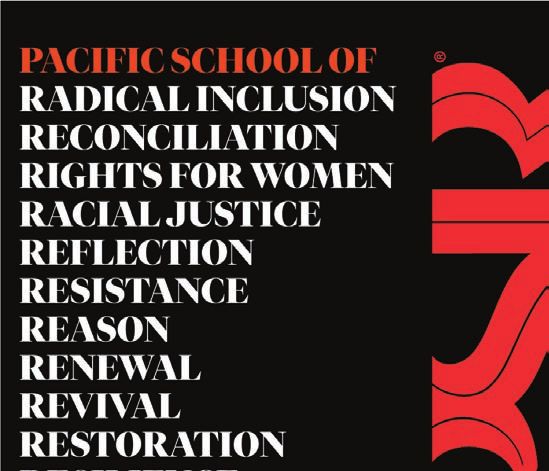
The “R” Campaign lock-up consists of the name, Pacific School of Religion and the twelve “R”
words. It can be used in three configurations. While the color combinations are variable depend-
ing on the application, the order and content of the “R”s should not be altered.“R” Campaign
Examples
Apparel Facebook Ad
Always choose the appropriate “R” Campaign lock-up for In this case the PSR Brandmark may be used without the Identifier,
the background. because Pacific School of Religion is in the ”R” Campaign lock-up.
Only one instance of “Pacific School of Religion is required.Photography
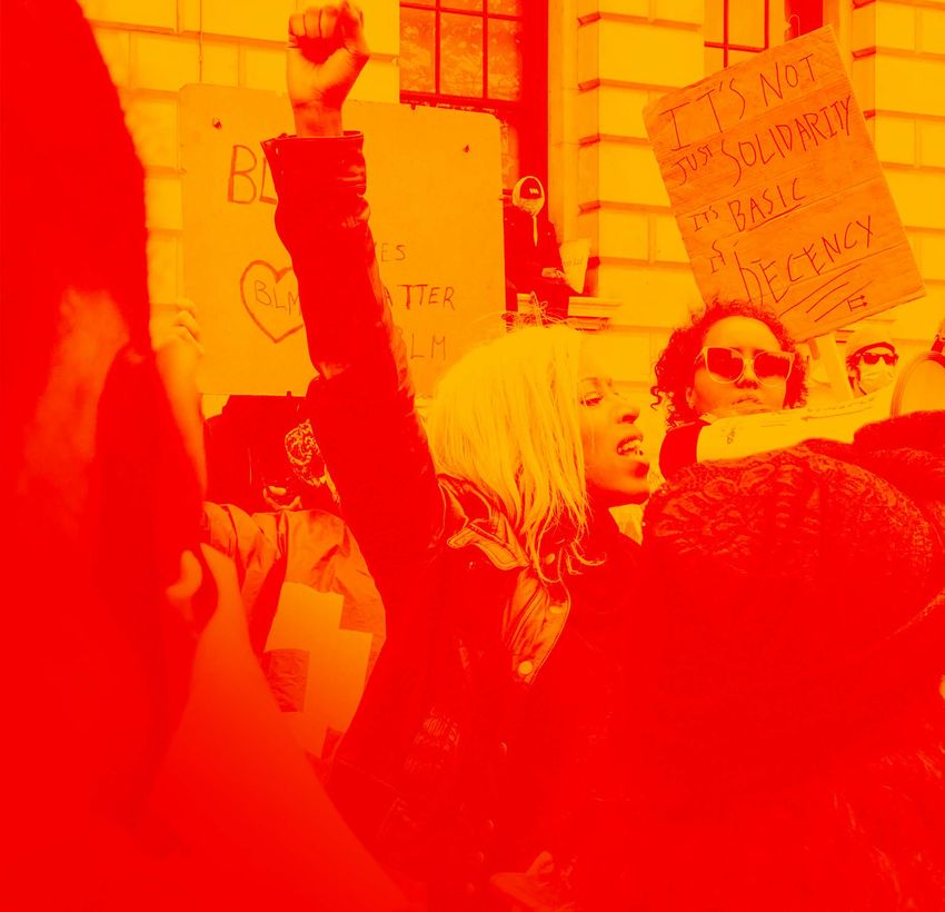
Photography is a critical element of our Identity. Our brand photography is styled to communicate
a sense of urgency. While our photos may have a retro quality, the content reflects the openness,
diversity and clarity of purpose that are consistent with PSR’s values.Photography
Examples
Montage
Montages can be created using photos
from existing PSR resources.
Montages are a great way to unify
disperate photographic sources, while
communicatin the excitement of our
Archive Stock
community.
PSR’s community is full of rich Unsplash.com is a valuable
resources. Our photography style resource for free stock photogra-
strips away distracting elements phy. The images are royalty free.
like color or texture to focus on the But take care to find images that
action at the heart of the image. support the PSR brand ethos.
Don’t overuse stock.Photography,
Creating the
Duotone
Duotone Start with a Black & White Image Create a Yellow Layer and Apply
PSR’s duotones are created using settings in You may need to adjust the levels of a Color Burn
Adobe Photoshop. your B&W image to achieve the The yellow layer, #ffb200 should be the
contrast in the example. bottom layer. On your image apply “Color
Burn” in layer style menu.Photography,
Creating
additional Duotone The resulting image will look like this.
Duotones Place an image in photoshop
Change the color mode to black and white
Next change the color mode to duotone.
Create a monotone with one of the monotone colors below.
The following are the combinations to create the duotone.
Monotone Background
Pantone 266 R: 225
Convert the image to rgb G: 163
B: 255
Create a new layer under the image
Flood that layer with the corresponding background color
Monotone Background
Pantone 246 R: 225
G: 163
B: 213
Monotone Background
Pantone 246 R: 172
G: 163
B: 255
Apply the “Color Burn” layer style to the image layer
Monotone Background
Pantone R: 255
Red 032 C G: 190
B: 190Brand
Gallery
Apparel and Design Items Brand and Image Combinations
Note the various creative options for expressing PSR on branded The brand and the branded imagery can be used to create dramatic
goods. Care should be taken to ensure that the best lock-up option is statements. The variations above show how brandmark lock-ups can
chosen for each piece. Where possible the brandmark should be be combined with imagery to tell the PSR story.
displayed prominantly and the identifier copy, “Pacific School of
Religion” should appear somewhere on the piece like the back of a hat.
The “R” Campaign lock-up consists of the name, Pacific School of Religion and the twelve “R”
words. It can be used in three configurations. While the color combinations are variable depend-
ing on the application, the order and content of the “R”s should not be altered.PSR Brand
Examples
Various
APPLY NOW
Be Out Front & JOIN US
ONLINE
Learn To Lead LGBTQ+ FIRST NAME
Organizations With PSR's
Certificate Of Sexuality & Religion LAST NAME
EMAIL
The Certificate of Sexuality and Religion (CSR) o!ers
specialized preparation to help strengthen your ability to PHONE
navigate and to facilitate conversations around gender
and sexuality.
STATE *
Complete the certificate as a stand-alone program or as Select a State
part of our unique Stackable Curriculum, either online or MY FOCUS
on campus.
EXPLORE/COURSES
LETS/GO
Take on the Challenges of a New Era
Gain skills to apply ethical, Prepare to think theologically Study the historical and
pastoral, transformational, about gender and sexuality in theological development of
and practical dimensions to a contemporary context. ethical systems used to
an inclusive framework of oppress and to free, while
thought and practice. exploring characteristics of
successful movements and
transformative leadership.
"!e reason I applied to PSR was because of
the Certificate of Sexuality and Religion. It
was confirmation that I was in the right place
and that having an "untraditional" ministry
wouldn't be as di"cult as I feared."
Latishia James-Portis, CSR '16
!e Certificate of Sexuality & Religion is Designed to
Move You Forward
Perfect for enhancing careers in: Grow your expertise.
• LGBTQ+ organization leadership • Ethical leadership and decision making
• Church leadership • Design thinking for social change
• Nonprofit leadership • Spiritual formation and theological reflection
• Academic leadership • Issues facing LGBTQ+ communities and other
• Advocacy organization leadership human rights movements
• Contemporary views of sexuality and gender
through theological and psychological lenses
For 155 years, PSR has attracted people who look beyond religious, cultural, and
political boundaries to recognize humanity and holiness in others. We believe in a
radically inclusive Gospel, one that compels us to take courage and press ahead.
We stand at the beginning of a new era—ready to meet its challenges, with
everything we are.
A We are located in the progressive academic hub of
Berkeley, California. A short distance from
Progressive Oakland and San Francisco, PSR is a founding
Christian
member of the Graduate Theological Union (GTU)
— the largest consortium of multi-faith
Community theological institutions in the world. Students
in Berkeley
have access to the libraries and courses across
the entire GTU a"liate schools and UC Berkeley.
Our community is diverse across faith traditions,
ethnicity, race, sexual orientation, and gender A Strong
Commitment
identity. As a progressive Christian institution,
PSR prepares leaders to be cross-sector change
makers with the vision, resilience, and skill to
bring about a world where all can thrive.
To Diversity
PSR o!ers a!ordable tuition and fees, a variety of
merit scholarships and need-based grants, as well
An Education as access to low-interest loan programs and
work-study to assist you in financing your
that's education. Additionally, if you choose to live in the
Bay Area, we provide subsidized housing options
A"ordable right on campus. Our innovative curriculum
o!ers you flexibility in our rapidly changing
world. We also provide services to veterans who
are eligible for veterans educational benefits.
Certificate of Sexuality and Religion Courses
Sex Ed and the Seminary Social Transformation in Action
Spiritual Formation for Leadership Transformative Leadership
Contextual Thinking Professors of Practice
Rhetorical Use of Texts Theological Thinking
Intro to Christian Ethics Design Thinking for Social Change
Explore our Other Programs
DMin CSSC CAPS MTS MDiv MAST CTS
Doctor of Certificate of Certificate of Masters of Masters of Masters of Arts Certificate
Ministry Spirituality and Advanced Theological Divinity in Social of
Social Change Professional Studies Transformation Theological
Studies Studies
I / WANT / TO / GET / STARTED
© 2020 Pacific School of Religion 1798 Scenic Avenue • Berkeley, CA 94709 (510) 849-8231
admissions@psr.edu privacy policy
Our brand idenity is flexible. What holds it together is the use of bold typography and
our color palette.Photogrphy
Styles
Black and white photography is
key to focusing the attention or
when trying to bring consistency
to photos from different sources.
Photos without backgrounds allow us to celebrate the
character of our stakeholders. This style is espescially
useful when paired with our unique typographic
style.
Focus is the principal behind Ignite’s look and feel. The colors are used to draw attention, and the
black and white photography is used to let the important content shine through. The Living
Workshop and Change Happens Now icons are used to delineate the specific offerings of PSR.Ignite
Institute
Ignite Institute is committed to training a new generation of leaders. We believe it takes personal,
communal and spiritual transformation to create lasting change in society. Our brandmark is a
representation of this belief. The rosette features an “i” in the center; it stands for our name as
well as the role of the individual in transformative work. The progress bars represent the work
being done and the effort being put forward, and the impact ring represents the reverberations of
our work in the broader world. When combined with our workmark they comprise the logo for
Ignite Institute.Ignite
Logo
Elements Here’s a breakdown of the parts of our logo.
R OSETTE
I GNITE L OGO “ I”
P ROGRESS B ARS
I MPACT R ING
I GNITE I NSTITUTE W ORDMARK
Horizontal Version Rosette Only Ignite Only
For vertically challenged environments the It is permitted to use the Rosette as a stand It is permitted to use the word “Ignite as a stand
horizontal version of the logo is preferred. alone element. alone element.
The Ignite Institute logo was designed to be flexible. There are several ways it can be used.Ignite
Brand
Colors
P RIMARY C OLOR PMS 172 PMS2189 PMS 426 PMS Cool Grey 10
Our main color The dark blue is used This color us used in A lighter grey is
invokes a sense of on the impact wheel place of black in provided for
urgency. within our rosette. presentations and environments with
digital executions. less contrast.
C0 C100 C0 C0
M80 M39 M0 M0
Y95 Y3 Y Y0
K0 K74 K90 K70
#c900a3 #0b2f4d #333333 #656565
S ECONDARY C OLORS
C19 C2 C0 C1 C1
These colors are
M100 M93 M50 M68 M35
present in the Y53 Y Y99 Y3 Y1
progress wheel in K4 K K0 K0 K0
c11e56 e83393 #f69320 #656565 #f4b7d1
our logo and can be
used throughout
our design
language.
Ignite’s palette is designed to be optimistic and dynamic.Brand
Gallery
Typographic Style
Our typography follows the same fonts and treatments as the PSR brand. The font is Tiempos. When Tiempos is not available, Calson or Times.
Roman may also be substituted. For best results of platforms with font limitations, try to find alternatives that represent the progressive
characteristics of Tiempos.
Focus is the principal behind Ignite’s look and feel. The colors are used to draw attention, and the
black and white photography is used to let the important content shine through. The Living
Workshop and Change Happens Now icons are used to delineate the specific offerings of PSR.Brand
Gallery
Online
Examples
Online Examples here are a few examples of our look and feel in practice. In this case the site is built on a platform that has its own fonts.
Here, Domaine is substituted for Tiempos. Graphic elements like “Change Happens Now” are maintained in Tiempos. The palette is consistent
with the Ignite palette. The black and white photography is designed to ensure that photos look consistent, even though they come from
different sources.Ignite
Logo
Versions
B LACK O PTIONS W HITE O PTIONSIgnite
Logo
Dont’s
Don’t alter the Rotation of the Rosette Don’t Change the Arrangement Don’t Change the Colors
The rosette is our compas, it should always Keep the elements in their original positions Each color is a important to creating a lasting
remain at 90 degrees. impression of our brand.
Bullit point 1
Bullit point 2
Don’t Overuse the Rosette Don’t Change the Color Don’t Move Elements
The rosette isn’t a bullit, it should only be Our colors are designed to put the emphasis Every element has a place, don’t alter their
used once on any surface. on our content—don’t alter them. locations.You can also read