Gangnam What? - sophie hicks architects
←
→
Page content transcription
If your browser does not render page correctly, please read the page content below
text: mairi beautyman
                                       photography: annabel elston

                                   Gangnam What?
                                       Sophie Hicks’s spare ACNE boutique in Seoul,
                                       South Korea, is the opposite of pop
192   INTERIOR DESIGN   APRIL.16                                          APRIL.16   INTERIOR DESIGN   193
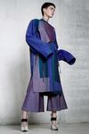
Previous spread, left: ACNE Studios’s resort 2016 looks
include a blouse and cropped flares, both silk. Photography:
courtesy of ACNE Studios. Previous spread, right: Sophie
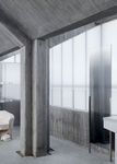
Hicks Architects used board-formed, sealed concrete
throughout an ACNE boutique in Seoul, South Korea.
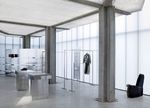
Left, from top: Clothing hangs from custom brushed-
aluminum racks. This trench coat is linen; photography:
courtesy of ACNE Studios. Right: Shelves wrap the brushed-
aluminum enclosure of a fitting room with storage behind.
The Gangnam district of Seoul was single-handedly Sweden’s ACNE Studios. (That’s an acronym in
catapulted into the world’s consciousness by the English: Ambition to Create Novel Expressions.)
horse-trot dance moves and universally catchy beat ACNE creative director Jonny Johansson brought
of Psy’s self-deprecating video for “Gangnam Style.” in Sophie Hicks Architects from London to design
Four years later, this poke at the lavish lifestyle of the freestanding building after admiring the firm’s
the toniest district in the South Korean capital holds worldwide Chloé boutiques, paneled in raw ply-
tight to its position as the most popular YouTube wood. To set off ACNE’s bold, multicolored clothing
video of all time. Satire or no, style there certainly for both women and men, statement pieces that
is in this luxury retail wonderland, home to bou- Sophie Hicks calls “very punchy and, at the same
tiques for Chanel, Christian Dior, Gucci, Prada, time, forward-thinking,” she envisioned a two-story
Louis Vuitton, and more. structure resembling a ghostly light box with “very
A glimpse of signage beckons shoppers down a little outward expression.”
side street near the river to find still another label, From vision to completion, the project took just
one year. “There’s almost no planning or heritage
permission required in Seoul,” she notes. So there
was no pushback to her idea of making the rooftop
an explosion of steel ducts and pipes, the exposed
innards of the HVAC system. “It’s my little joke about
the chaos on the roofs of Asian cities,” she says.
Below the roof, the facade is fiercely minimalistic,
clad in translucent white polycarbonate. During
the day, the polycarbonate combines with the city’s
heavy smog to impart a misty quality to the sun
filtering into the 2,500-square-foot interior, making
its spareness immediately striking. The sensation
of solitude is extremely rare in this city of over 10
million, its population density furthermore nearly
four times that of Stockholm.
Concrete board-formed to evoke wood weath-
ered by sea air, like a boardwalk in the Stockholm
archipelago, appears throughout starting with the
13-foot-high slab that stands at the entry to display “The sensation of solitude is extremely rare this city of over 10 million”
the ACNE name. A sharp Swede might notice
194 INTERIOR DESIGN APRIL.16 APRIL.16 INTERIOR DESIGN 195something curious about the plantings at the foot curved volumes that combine fitting rooms and
of this brutalist signage. Carefully curated, all are storage. These volumes support curved shelving,
Swedish plants or types very similar—including and clothing hangs from equally understated, slim
wild strawberries. “The only thing they have to do racks nearby.
is survive the really hot summer,” she says. An absence of typical furnishings contributes to
Also concrete are interior walls, structural col- the atmosphere of serenity and escape. The only
umns, and, spiraling around one of them, a stair- other furniture is a collection of seating by a fellow
case linking the separate women’s and men’s levels Londoner, Max Lamb. “Clever, lumpy little pieces,”
to a partially subterranean level with additional Hicks deadpans. Lamb carved the irregular forms
fitting rooms, an office, and storage. It was quite a out of polystyrene, then used an industrial sprayer
challenge to make the stair stand out as a contrast- to cover the surfaces with rubber in muted colors.
ing element while using the same heavy material, This treatment makes an otherwise flimsy material
she says: “It had to be light and airy. Look, no extremely durable without concealing the interest-
hands!” Deconstructing the concrete balustrade ing nooks and crannies.
into free-floating chunks helped to accomplish that. Virtually unheard of for retail environments, the
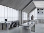
Display fixtures introduce brushed aluminum to store does not have a single spotlight. The ceiling’s
the materials palette. It appears in the form of three white powder-coated steel grid creates an even
table bases—the tops are concrete—as well as a wash of illumination similar to daylight by making
unit with drawers for the jeans that were ACNE’s the light from fluorescent strips, installed above,
first claim to fame, the cash-wrap desk, and two bounce back and forth. “We specified a system
Opposite: The staircase combines concrete with stainless-
steel and glass.
Left: Layered cotton tops are paired with a linen-wool skirt.
Photography: courtesy of ACNE Studios. Right: A built-in
mirror stands in front of the polycarbonate window wall.
196 INTERIOR DESIGN APRIL.16 APRIL.16 INTERIOR DESIGN 197“The stripped-back interior is of course facilitated by piling mechanicals on the roof”
where all framing is invisible, held from behind on PROJECT TEAM
little hooks,” she says. “And the panels are quite big, TOM HOPES; CARSTEN JUNGFER: SOPHIE HICKS ARCHITECTS.
HAEAHN ARCHITECTURE: ARCHITECT OF RECORD, MEP. HELEN
so you don’t have too many joints.”
DOOLEY: LANDSCAPING CONSULTANT. ARUP: LIGHTING CONSULTANT,
The clean ceiling planes and the interior’s STRUCTURAL ENGINEER. GANTER INTERIOR: METALWORK. CRE-ID:
stripped-back state overall are of course facilitated GENERAL CONTRACTOR.
by piling mechanicals on the roof. (All architectural PRODUCT SOURCES
in-jokes aside.) Exceptions, at both end walls, are THROUGHOUT MAX LAMB: CUSTOM SEATING. EVERLITE CONCEPT,
ARCHITECTURE LUMIÈRE: CURTAIN WALL PANELS. SAMSUNG: AIR-
the banks of aluminum diffusers. Unabashedly
CONDITIONING UNIT.
displaying the manner in which hot and cold air is
supplied, the system could almost be an art instal-
lation. And that impression is only deepened by the
slightly disorienting music that’s perceived at vary-
ing decibel levels—the speakers are hidden behind
the structural columns. “You walk into sound, then
out of it,” Hicks explains. We’re worlds away from
a horse-trot, Gangnam-style.
Left, from top: Concrete tops a drawer unit, for men’s jeans,
and a table with a vitrine containing leather goods. A pant
suit in linen and cotton has intentionally long sleeves;
photography: courtesy of ACNE Studios. Right: The entry
frames one of seven examples of custom seating by
Max Lamb.
198 INTERIOR DESIGN APRIL.16 APRIL.16 INTERIOR DESIGN 199You can also read


