Faculty Exhibition Catalog - Norco College Art Gallery The Studio Art & Art History
←
→
Page content transcription
If your browser does not render page correctly, please read the page content below
Norco College Art Gallery
           Presents

 The Studio Art & Art History
Faculty Exhibition Catalog
         Spring 2021
Studio Art & Art History Faculty

Introduction ...................................................................................... 3

Quinton Bemiller, Ed.D, M.F.A.
Associate Professor, Art .................................................................... 4

Diana Campuzano, M.F.A.
Associate Faculty, Art ..................................................................... 11

Meghan M. Chandler, Ph.D.
Assistant Professor, Art History ..................................................... 21

Lakshika Senarath Gamage, Ph.D.
Associate Faculty, Art History ........................................................ 38

Claudette Goux, M.A.
Associate Faculty, Art History ........................................................ 45

Timothy Haerens, M.F.A.
Associate Faculty, Art .................................................................... 53

Aaron Johnson, M.F.A.
Associate Faculty, Art .................................................................... 60

Megan Lindeman, M.F.A.
Assistant Professor, Art .................................................................. 63

Barbara May, M.A.
Associate Faculty, Art .................................................................... 71

Karin Skiba, M.F.A.
Professor Emerita, Art .................................................................... 78

End Notes (M.M. Chandler) ............................................................ 90

                                                               2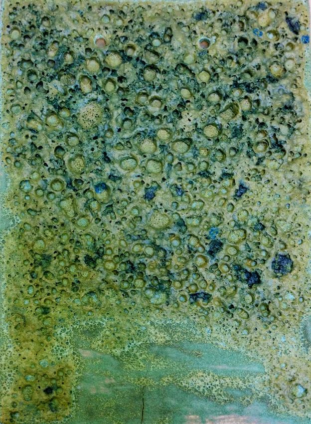
Introduction
Norco College Art Gallery is pleased to present this digital catalog, featuring the
work of the Norco College Studio Art and Art History faculty. In normal times, this
project would have been a Faculty Exhibition in the Art Gallery, to be experienced
in-person. In this time of pandemic, however, virtual options for art exhibitions
have become a common approach for many galleries and museums. Rather than
creating a virtual reality of a mock gallery space, we have chosen to create a lasting
document which will archive the images and words of our faculty.

One of the benefits of this catalog is the collaboration of Studio Art faculty and Art
History faculty. This academic year, 2020-2021, marks the first time Norco College
has had a full-time, tenure-track Art History position, now occupied by Dr. Meghan
M. Chandler. Just four years earlier, in 2017, we added a second full-time, tenure-
track Studio Art position, filled by Megan Lindeman. For the 26 years prior, this
college had only one professor in Art. Karin Skiba, Professor Emerita, was the first
full-time professor in Art at Norco College, the Founding Director of the Art Gallery,
and she continues to teach part-time. The Associate (part-time) Faculty in Studio
Art and Art History are essential in offering a full range of courses for students.
Their expertise complements that of the full-time faculty to support our Studio Art
and Art History degree programs. Our growth in recent years represents the future
of Norco College, one that is full of opportunities to expand course offerings and
resources for students.

Please enjoy the images, biographies, statements, website links and essays
contained in this catalog, which represents the high caliber of creative and scholarly
abilities of our Studio Art and Art History faculty at Norco College.

Quinton Bemiller, Ed.D., M.F.A.
Art Gallery Director
Associate Professor of Art
Norco College

                                          3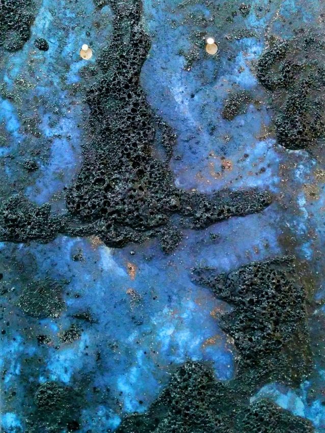
Quinton Bemiller

Biography

Quinton Bemiller is a painter, professor and curator. He serves as Director of the
Norco College Art Gallery and has taught Studio Art/Art History at Norco College
since 2012—first as Associate Faculty and since 2013, as a full-time professor. Born
in Arcadia, California, Quinton Bemiller grew up in the San Gabriel Valley and is a
fifth-generation Californian. He completed an A.A. at Pasadena City College, a
B.F.A. at Lesley University, and an M.F.A. at Claremont Graduate University. In
2019 he completed a Doctorate in Educational Leadership, Community College
Specialization, from California State University, San Bernardino.

Quinton Bemiller’s artwork is in the permanent collection of the Boston Public
Library, Lesley University and over 50 private collections. He has had solo
exhibitions at LAUNCH L.A., Offramp Gallery, Los Angeles International Airport,
Armory Center for the Arts, Palos Verdes Art Center, Torrance Art Museum and
Gallery 825/Los Angeles Art Association. Recent group exhibitions include
Paintings from the Interior at University of California, Riverside, curated by Andi
Campognone; Neoteric: The New Avant-Garde at Golden West College, curated by
Evan Senn; and Art Made in Quarantine, an international exhibition curated by
Seann Brackin, Madrid, Spain.

Website: www.bemillerstudio.com

Artist Statement

For me, painting is a personal language and a process of reflection. I have been
painting my whole life. The act of painting centers me, and brings balance to my
world. In the studio, I respond to the materiality of paint and the sensation of color.
Abstraction is a means to address those things which are real in this world, yet are
unseen and unspoken. In my paintings, I make these things visible. Experiences are
distilled into raw feelings, communicated through the interaction of color and form
on the canvas. My paintings are open-ended stories for contemplation. They are
unique objects in the world, to be pondered but not necessarily understood.

                                           4
Selected Works

No Blue Monday, 2021, acrylic on canvas over panel, 20 in. x 24 in.

Riot, 2021, acrylic on canvas over panel, 14 in. x 11 in.
                                           5
Greens for Steven, 2021, acrylic and vinyl on canvas over panel, 12 in. x 18 in.

Deposition, 2020, acrylic, oil and vinyl on canvas over panel, 8 in. diameter

                                           6
Santa Rosa, 2020, acrylic, oil and vinyl on canvas over panel, 8 in. diameter

Mesmerism, 2020, acrylic, oil and vinyl on unstretched canvas, 56 in. x 74 in.

                                          7
Bildungsroman, 2020, acrylic, oil and vinyl on canvas over panel, 20 in. x 16 in.

Safe Harbor, 2020, acrylic, oil, and vinyl on canvas, 30 in. x 40 in.

                                           8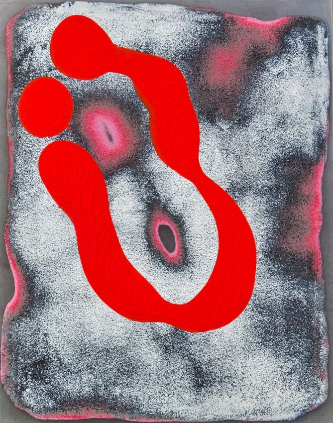
Abundance, 2020, acrylic, oil and vinyl on linen over panel, 14 in. x 14 in.

Quench, 2020, acrylic, oil and vinyl on linen over panel, 11 in. x 14 in.

                                           9
Reckless Abandon, 2020, acrylic, oil and vinyl on linen over panel, 11 in. x 14 in.

Piccadilly Circus, 2020, acrylic, oil and vinyl on canvas, 16 in. x 20 in.

                                           10
Diana Campuzano
Biography
Diana Campuzano is a Los Angles based Ceramicist. Through the process of
working with clay Diana explores ideas on the human relationship with time,
nature and the cosmos. Raised in Southern California, Diana has an MFA in
Ceramics from Claremont Graduate University and a BFA in Ceramics from New
Mexico State University. She began teaching at Norco college in 2017 and also
teaches at Riverside City College.
Artist Statement
My work takes bits and pieces from here and there to combine them in ways that is
a nod to the source while also taking them further by layering different influences
so that the viewer may see something new while embodying the inspiration. I often
seek to challenge the view by working on the ceiling to create a link between the
cosmos and the viewer. I play with the idea of fugitive beauty which I define as that
which is slowly changing and has to be appreciated for what it is now, despite it
being different in the future. Through my work I attempt to share this moment with
the viewer, to draw them in, and let them linger.
While my sculptures usually consist of smaller units, it creates a large presence.
The mass is something that cannot quickly be taken in but requires a viewer to
investigate the whole and its many parts. Each unit to me is not an individual piece
but a mark that makes up one whole. The flow between the whole and the parts and
vice versa is essential to creating moments of complexity. The work should
dominate the space, not sit there timidly. I seek for my work to have a bold almost
overwhelming presence, drawing people in and letting them explore the hundreds of
delicate pieces, each placed so carefully to be examined, savored, and pondered.
My art is about asking questions and provoking thoughts. The only answers that
my pieces have are the ones that the viewer brings to it. My work is created along
the lines of a conversation rather than a sermon.
11Selected Works
Concoctions, 2019, ceramic
12Concoctions (Detail, Blue), 2019, ceramic
13Concoctions (Detail, Green), 2019, ceramic
14Concoctions (Detail, Red), 2019, ceramic
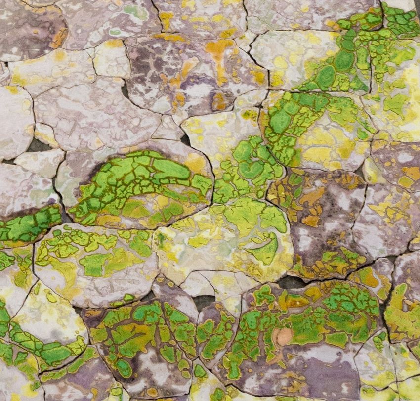
15Untitled Mosaic Green, 2016, ceramic
Untitled Mosaic Green (Detail 1), 2016, ceramic
16Untitled Mosaic Green (Detail 2), 2016, ceramic
17Untitled Purple, 2018, ceramic
Untitled Purple, Detail, 2018, ceramic
18Insignificantly Significant, 2017-2020, ceramic
Insignificantly Significant, 2017-2020, ceramic
19Insignificantly Significant (Detail), 2017-2020, ceramic
20Meghan M. Chandler
Biography
Meghan M. Chandler is an Assistant Professor of Art History at Norco College. A
New York native, she relocated to Southern California for graduate studies at UC
Irvine. Upon completing her Ph.D. in Visual Studies, Dr. Chandler migrated to the
Community College system, where she taught a variety of Art History and Film
Studies courses before joining Norco College. Central to all of her classes are issues
of equity, which also manifest in her academic research and writing. Chandler has
published a number of peer reviewed journal articles, anthology chapters, and a
digital textbook that looks to reframe Art History and visual culture as areas of
critical inquiry that are accessible, inclusive, and welcoming to all.
21Selected Work
Don’t Take My Kodachrome Away:
The Rise, Fall, and Return of Kodachrome Color Film
M. M. Chandler
Steve McCurry, “The Afghan Girl” (Sharbat Gula) for National Geographic (1984). Kodachrome 64.
Courtesy National Geographic.
Introduction
Even if you never heard of a “Kodachrome” before, chances are you have seen one.
From Gerald Sheedy’s snapshots of the fiery Hindenburg explosion, to Abraham
Zapruder’s infamous home movie of President Kennedy’s assassination, to Steve
McCurry’s haunting National Geographic photos of “The Afghan Girl”, Sharbat
Gula, the tragedies and triumphs of modern history have been burned into our
collective memory as color-saturated images captured on Kodachrome film. i
Released by George Eastman’s Kodak company as the first color film stock in 1935,
Kodachrome changed the nature and future of color photo-cinematic image-making.
Throughout the 1930s-1970s, Kodachrome achieved widespread commercial success
in both amateur and professional markets as a still photography and motion picture
22medium. Analog Kodachrome film began to fade into outmoded obsolescence when
the market turned to inchoate digital imaging technologies beginning in the mid-
1970s, which ultimately culminated in the discontinuation of its production and
photo-lab development by 2010. In many histories of technology, this would signal
the end of the story, but this is not the case for Kodachrome.
In addition to chronicling the historic rise and fall of Kodachrome, this essay will
consider the lasting cultural work accomplished through this groundbreaking
imaging technology. During the time of its popularization, Kodachrome’s unique
chemical processing and color-imaging properties intersected with a larger
American cultural turn towards artificial materials, synthetic consumer goods, and
escapist national rhetoric. The particular color palette offered through Kodachrome
photography and motion pictures became intertwined with a forward-looking,
futurist mindset that sought to escape the dark realities of the American Great
Depression. Users developed a new way to look at the world through Kodachrome
and, even more importantly, used its supernatural colors to fabricate a world view
that saw things not as they were, but as they were desired and imagined to be.
While Kodachrome no longer exists in its original form today, it has been revived as
a nostalgic visual throw-back to an analog past and still functions as escapist
vehicle. However, instead of providing escapism through color into a brighter
future, today’s users summon Kodachrome’s colors as a nostalgic pathway into the
imagined rosiness of a past time. The year 2016 has, indeed, been an important
revival moment for Kodachrome and its iconic colors, as well as retro escapism:
Kodachrome has been revived as a digital photo filter in AlienSkin’s latest editing
platform, ExposureX2, and has re-emerged as part of a widespread nostalgia
phenomena spreading throughout American visual culture as most recently
captured in Nadav Kander’s Kodachrome-inspired portrait of President-elect
Donald Trump for the cover of TIME magazine’s “Person of the Year” issue. ii
How did an imaging technology once associated with progressive change and
American dreams become the aesthetics of backwards-looking memory? This essay
seeks to answer this question by mapping and reframing our understanding of
Kodachrome through an analysis of its technological history, color aesthetics, and
its larger cultural work. Throughout its history, and especially today, Kodachrome
offers more than just the means for making pretty pictures. Rather, it offers a
critical lens through which we can re-examine darker aspects of American cultural
history and discourse. Although technically obsolete, Kodachrome continues to
haunt the present as a meaningful cultural phenomena entangled with broader
issues of artifice, escapism, nostalgia, and desires for mediated, rose-tinted
memories that actively shape rather than simply reflect lived events. Kodachrome’s
past, present, and future is even richer than the photographs or motion pictures
created with it, and this essay will illuminate the multifaceted, prismatic aspects of
its colorful legacy.
23Birth: 1816-1935
Diagram of Kodachrome motion picture film development process. Courtesy Hans Bruins.
The iconic images referenced in the introduction not only capture historic events,
but also chart the life history of Kodachrome and its groundbreaking milestones
within the history of color imaging. Attempts to mechanically reproduce images in
color date back to the invention of photography itself. One of the early innovators of
photography, Joseph Nicéphore Niépce, wrote to his brother in 1816 that “I must
succeed in fixing the colors; this is what occupies me at the moment, and it is the
most difficult.” iii Hand painting, tinted lenses, organic dyes were all used to infuse
color into black-and-white photographs, though with much effort and mixed results.
The earliest commercially successful method for producing colored photographs was
the Autochrome, introduced by the Lumière brothers in 1907. In this process, dyes
made from potato starch grains were added to the developed print to give it color. iv
Color motion pictures became a technical possibility with the introduction of
Kodak’s first motion picture color system, Kodacolor, in 1928. George Eastman
unveiled the new Kodacolor system at a lavish garden party hosted at his Rochester
estate, which was captured on Kodacolor film and remains in existence today as a
16mm home movie entitled Kodacolor Party (1928). v Initially marketed to amateur
cinematographers, Kodacolor could produce the illusion of moving, color images by
using an additive (also called lenticular) method. Essentially, Kodacolor’s additive
24colorizing process was based on the Keller-Dorian method: a 1920s French
innovation that used a complex array of lenses to separate red, green, and blue
wavelengths before individually capturing them on black-and-white film. When
these 3 color-coded strips were combined, or “added” back together, and played
through a special projector outfitted the same three color-splitting lenses, the final
projected image would appear as a rudimentary color moving picture. 1 Though an
important first step towards color imaging, Kodacolor was not ideal, especially not
for everyday, amateur users: it was expensive, required additional lenses, and a
special projector unit. Adding to these disadvantages was the fact that images
could only be temporary projected and not permanently printed in color. As such,
color motion picture prints could not be reproduced or kept in color, only visually
projected and experienced that way in the moment. vi Within professional
filmmaking, similar color-splitting techniques were used to create colorful
Hollywood films, as in the case of the “glorious” Technicolor technique perhaps best
known for bringing the fantasy world of ruby red slippers, emerald cities, and
yellow brick roads to life in MGM’s 1939 musical spectacle, The Wizard of Oz. vii
Kodachrome, however, would emerge as a revolutionary new type of film stock —
truly “a horse of a different color”, in every way.
The inventors behind Kodachrome were two amateur photographers, Leopold
Mannes and Leopold Godowsky Jr., who were hired to develop a realistic color film
stock alternative for Kodak. viii Their work resulted in Kodachrome: the first color-
capable film stock. At first, Kodachrome was only offered as 16mm motion picture
film, but within a year Kodak ramped up production to include 35mm photographic
film (costing $3.50 a roll, equivalent to approximately $54 US dollars today), and a
smaller, cheaper 8mm motion picture film for home moviemakers. Unlike previous
lens-based methods, Kodachrome was designed with three emulsion layers
embedded within a single film strip. Each of these layers contained silver halide
crystals sensitive to a different primary color wavelength. ix Kodachrome was also
different in that it did not contain dye couplers; rather, these were only added
during the development process. This innovative change resulted in final images
with increased image clarity, finer detail, and a high-contrast, broad-spectrum color
palette that became Kodachrome’s defining hallmark. Adding dye couplers during
processing also made this step more complicated; numerous dye baths containing
color chemicals and other fixatives unique to both the Kodak company and to the
Kodachrome product line had to be expertly orchestrated. Due to this complicated
and proprietary process, Kodak required all users to mail their undeveloped rolls to
an official Kodak processing laboratory. The cost of processing, along with a
convenient envelope, were included in the price of the film. However, the 1954
court case United States v. Eastman Kodak Co., put an end to this monopoly, and
independent facilities gained access to the means and materials to develop
1
For more on Kodacolor and amateur color filmmaking, see Charles Tepperman, “Color Unlimited: Amateur Color
Cinema in the 1930s” in Color and the Moving Image: History, Theory, Aesthetics, Archive, Brown, Stree, Watkins,
Eds. (New York: Routledge, 2013): 138-49.
25Kodachrome themselves. No other analog film stock, either before or after
Kodachrome, would use the same dye set formulas which has contributed to the
unique aura surrounding these truly one-of-a-kind images.
Consumers instantly heralded Kodachrome as the literal gold standard of color
imaging, and marveled at its ability to not only produce an unmatched range of
vibrant colors but to offer improved archival capabilities. Kodachrome products
promised to retain the clarity and color of final image up to 100 years with proper
storage. These archival abilities, combined with Kodachrome’s novel aesthetics,
captured the market and turned Kodachrome into an idealized color imaging and
preservation material. Kodak’s marketing for Kodachrome film repeatedly
emphasized its ability to reproduce and permanently maintain color vitality. x
Candy-colored photographs of flower arrangements, impossibly verdant vegetation,
and perfectly rosy-cheeked children proliferated the pages of equally color-obsessed
magazines like Popular Science and Life, all carrying the message that Kodachrome
film could make everything seem “vividly alive” and even better than the real
thing. xi This promotional rhetoric was, of course, riddled with hyperbolic promises
that no reader would have literally believed at the time. However, these early
advertisement strategies do reveal palpable desires to overcome the limits of the
natural world and reshape reality through new technologies. Humankind could,
and would, venture to remake the world through artificial materials and colors that
defied the possibilities and limits of nature, and Kodachrome would become part of
this process.
Growth: 1930s-1940s
Alfred Palmer, Operating a hand drill at Vultee-Nashville, woman is working on a "Vengeance" dive
bomber, Tennessee (1943). 4×5 Kodachrome transparency. Courtesy Library of Congress.
26During the 1930s, color became an important and valued aesthetic within American
culture, in large part because it was linked to progressive, modern living and served
as an antidote to the dark realities of the American Great Depression and lead-up to
World War II. With the exception of some photographers shooting in color, most
governmentally-funded Farm Security Administration photographers working
during the Dust Bowl and Depression reproduced images of American life in the
stoic gravitas of black-and-white. On the other side of the spectrum and as a bold
alternative to this grim reality, a “color revolution” was steadily sweeping across
America in the form of brightly-colored consumer goods. As Regina Lee Blaszczyk
notes in The Color Revolution (2012), through the 1920s-1930s a host of products
made of newly-engineered, cheaper plastic materials offered both an economic and
visual reprieve from austerity. xii In the same year Adams dreamed his optimistic
dream for American social ascension, the Tennessee Eastman company began
selling their first plastic-based, artificially-dyed acetate yarns, textiles, and home
decor products. Synthetic materials not only promised to capture and reproduce
vibrant colors, but would do so in a way that lasted longer and resisted wear-and-
tear, all while being more cost effective and economically accessible to less
economically solvent consumers. Many of these new products were promoted as
superseding natural products —a feat many early proponents saw as providing end
products that were better than the real thing. It was indeed “Better Things for
Better Living...Through Chemistry”, as the infamous 1935 DuPont slogan put it.
Color appearances, even if artificial in origin and unnatural in appearance, were
taking hold within modern American tastes and Kodachrome became a new
rhetorical tool used to support positive associations between color, vitality, hope,
and moving towards a brighter future. As the Library of Congress describes in their
exhibition Bound for Glory: America in Color, this would be “the dawn of a new era
— the Kodachrome era.” As with any act of rhetoric, however, Kodachrome
products and advertisements also began to sell a deeper message: that artifice was
preferable to reality, and nostalgic fantasies take precedence over truthful
remembrance. These colorful images would couple with Depression-era escapism,
wartime anxieties, and midcentury consumerism to mark a historic divide between
“the monochrome world of the pre-modern age and the brilliant hues of the
present.” xiii
The majority of images associated with World War II, both in historical cannon as
well as popular imagination, exist in the form of black-and-white photographs.
However, beyond Joe Rosenthal’s patriotic Raising the Flag on Iwo Jima (1945) or
Toyo Miyatake’s oppositional Boys Behind Barbed Wire (1942-1945), there exist a
number of war-time images captured as uncannily rosy Kodachromes. xiv Between
1939 and 1944, US government-employed photographers working with the Farm
Security Administration (later renamed the Office of War Information) shot
approximately 1,600 color photographs consisting mostly of 35mm Kodachrome
slides or transparencies, plus a few 16mm motion pictures. While small in number
compared to the other 171,000 black-and-white images produced by the Farm
27Security Administration/Office of War Information, the visual and rhetorical impact
of these wartime Kodachromes are perhaps even more striking than their
counterparts. xv The subject matter of these colored photographs varied as widely as
their hues: some depicted rural life and farm labor throughout the United States,
while others captured the industrial buildup of military equipment and other
wartime mobilization efforts. This last subset of photographs benefited as much
from Kodachrome’s color imaging abilities as Renaissance-era paintings did from
new innovations in oil paint; only Kodachrome could have captured the metallic
sheen of aircraft parts as they marched down the assembly line, or the menacing
appearance of killer bee yellow fighter planes as they circled midair. Black-and-
white photography could not have capture these material subtleties, plays of light,
or psychological impressions, and only Kodachrome could render the range, clarity,
and detail seen in these images.
The most striking images are not of the machines of war, though, but of the women
behind their construction. Women take center stage in many of Alfred Palmer’s
FSA/OWI photographs of military manufacturing, and the women featured in his
Engine Inspector for North American Aviation at Long Beach, California (1942) and
Operating a hand drill at Vultee-Nashville, woman is working on a "Vengeance"
dive bomber, Tennessee (1943) offer an especially meaningful look at Kodachrome’s
discursive power to alter meaning and shape perceptions through color. xvi Dressed
in a short-sleeve red, black, and yellow plaid shirt with high-waisted light denim
jeans, a Caucasian engine inspector from California leans into an open engine block
to adjust one of its many chrome tubes. In the second photo, an African-American
hand drill operator from Tennessee wears a vibrant, short-sleeve navy denim
jumpsuit while she drills rivets into a slab of sheet metal. Even though her brown
skin is mostly rendered in shadow compared to the white engine inspector, we can
still make out her reflection in the bright, reflective metal surface. Both women
have their dark hair neatly tucked into a deep crimson headscarf, knotted at the
front. In their dress and dogged attitudes, the visual parallels to the iconic Rosie
the Riveter are as clear as the colors are sharp. The garish blues, yellows, and reds
that gleam from Palmer’s photographs are especially similar to the popular
propaganda poster of Rosie the Riveter crafted by J. Howard Miller in 1942.
Responding to what appears to be a case of art/artifice becoming real-life, a
contemporary article in the Daily Mail proclaimed that these photographs show “a
moment where Rosie the Riveter moves out of the propaganda poster and into [the]
world.” xvii
What these photographs truly accomplish, however, is the reverse: in an act of
visual rhetoric facilitated by the color properties of Kodachrome, these images move
the world into the realm of propaganda. Though all visual mediations and acts of
representation can undoubtedly function in these ways, Kodachrome enabled a
unique visual sleight-of-hand through its bold and captivating colors. Blinded by
color, viewers marvel at the surface and are displaced into a different time —past or
28future, never present— without having to take stock of the larger issues and
murkier truths lurking beneath the image. By dressing-up these scenes of female
and African-American labor in the glossy saturated hues of Kodachrome, Palmer
blurred the harsh realities facing women at this time in American history when
neither women in general nor African-Americans of either gender were afforded
equal rights or unfettered opportunity. In her writings on gender, race, and labor in
WWII-era American industry, feminist scholar Maureen Honey notes that while
African-American women did accomplish some meaningful gains in the military
labor force, these advances were sharply circumscribed and undercut by residing
practices of legalized racial segregation and systemic discrimination. xviii Honey’s
research shows that African-American men and women only accounted for 6 percent
of all employees in US aircraft industries during WWII. xix When workers of color
were employed, they were often relegated to the most menial and physically
dangerous positions. African-American women, in particular, found themselves last
in line for safe and gainful employment compared to their white female
counterparts. In fact, the same year Palmer photographed a woman of color
operating a hand drill in Tennessee, a Western Electric plant in Baltimore built
segregated toilet facilities after protests from white women workers —certainly a
different scene and sentiment than Palmer creates in his vibrant and progressive-
seeming photos. The realities of work and polarized experiences of white women
and women of color in the military labor force are glaringly absent from the world of
Rosie the Riveter as well as these Kodachrome photographs. Palmer’s photos may
share the same cartoonish and up-key colors as Miller’s Rosie poster, but her “We
can do it!” slogan would only ring dimly true for many real-life Rosies.
29Maturity: 1950s-1960s
Kodachrome II Film print advertisement featured in U.S. Camera (March 1962).
Courtesy U.S. Camera.
Media historian Brian Winston writes that, “[c]olour photography is not bound to be
‘faithful' to the natural world. Choices are made in the development and production
of photographic materials.” xx Kodachrome’s unique color properties and processes
clouded viewers’ abilities to distinguish between artifice and reality, while
ultimately urging them to value the former over the latter. Kodak’s advertising
strategies for Kodachrome attempted to sell consumers on the premise that life and
memories looked better in Kodachrome. Several ads that ran throughout the 1950s
and ‘60s claimed that “color snapshots tell the story best”; that Kodachrome is “the
gift that keeps memories bright”; or that users could keep “memories fresh in
snapshots”. xxi Many domestic users even came to prefer these renderings to reality,
saying they favored artificial Kodachrome appearances precisely because they
improved upon real life and made events look happier. xxii “Kodachrome had a way
of making shots look better than real life”, claims amateur photographer, Charles
Moore. xxiii Tom Stone, a commercial photographer and camera store owner since
the 1960s, further confirms that “people liked it because it made things look better
than real.” xxiv Rather than being disparaged as tacky or dismissed for being
unrealistic, Kodachrome’s artificial and super-saturated range of colors were in
many ways embraced precisely because of this, and these breaks with reality
30became part of its iconic and trademark appeal. Another amateur photography
enthusiast, Mark Reed, reveals the success and impact of Kodachrome mediations
upon one’s recollection of lived events: “I remember the 4th of July, 1956 like it was
yesterday,” he recalls on his personal website, “[i]t was sixty-years ago, but I
remember it in Kodachrome.” xxv Reed’s sentiments are especially curious in that
they display the slippage between lived events and memory representations, reality
and Kodachrome renderings. This slippage is brought into even sharper focus when
considered alongside C. J. Bartleson’s investigation of chromatic shifts within
memory.
C. J. Bartleson was a scientist employed by the Kodak Company to research the
relationship between perception, color, and memory. In his 1960 study, “Memory
Colors of Familiar Objects”, Bartleson showed that when asked to identify the color
of a familiar object from memory, the vast majority of test subjects incorrectly
gauged the color, with a penchant for aggrandizing saturation and amplifying
brightness. xxvi Grass was greener in memory than in reality, and red bricks were
much more red in what Bartleson termed “memory colors”. Across all participants,
bright and snappy versions of familiar objects seemed the most “correct”, even
though these judgements far exceeded the actual color-metric values for those
objects. Bartleson’s findings effectively dispelled the ubiquitous saying that
memories fade with time; rather, it is clearly the opposite. This reversal also
accounts for Kodachrome’s wide popularity and success as a hyper-saturated
imaging medium charged with the mission of keeping users’ memories alive.
Kodachrome’s departure from naturalistic hues made it the ideal medium for
memories; its impossibly bright and saturated scenes did not capture reality, but
did appease and seem right to how users saw things in memory. Based on
Barlteson’s findings, Kodak doubled-down on their investments in saturated color
schemes, forsaking the pursuit of realistic accuracy and instead pursuing distorted
memory color ideals. Bartleson’s findings established a crucial mandate within
Kodak as well the photo-cinematic imaging industry at large: that representations
should carry the colors of memory and not reality in order to look “right” in users’
eyes. xxvii This version of “right”, however, was not based in factual reality, but
rather on how the mind’s eye chose to recolor what it saw in hindsight, reshaping it
into what the viewer would like to remember. Photography theorist and visual
culture philosopher, Vilém Flusser, would later propose in Towards a Philosophy of
Photography (1983) that the photochemical concept of “green'” is not based on
reality but some imagined image of “green” drawn from a fantastical world of gilded
dreams and memories. xxviii Foreshadowing Flusser’s 1980s theories, Kodachrome
was already accomplishing this work in practice, leading enthusiasts like Mark
Reed to start using “Kodachrome” as a neologistic adjective to describe their
memories.
31Death: 1970s-2000s
Freeze-frame from Funeral for a Friend. Directed, filmed, edited, and produced by Liz Coffey
(2006, Super 8).
Viewable at www.//archive.org/details/FuneralForAFriend.
The first few year of the 1970s still looked bright for Kodak: the company was
attempting to expand their Kodachrome product line while American folk-singer,
Paul Simon, released the heartfelt ballad “Kodachrome” in 1973. In one
particularly poignant passage, Simon encapsulated the essence of Kodachrome as
well as its nostalgic, memory-recoloring work:
They give us those nice bright colors
They give us the greens of summers
Makes you think all the world’s a sunny day.
(...) I know they’d never match
My sweet imagination
Everything looks worse in black and white.
Within the next few years, though, several pivotal changes would supply the first
nails to Kodachrome’s coffin, as well as fundamentally change the nature of analog
imaging making.
By 1975, Kodak unveiled the world’s first digital camera prototype. Weighing 8
pounds, sporting the dimensions of a toaster, and only having the ability to take
black-and-white low resolution (.01 megapixel) images, its nascent digital image did
not hold a candle to Kodachrome or other analog film images; it did, however, mark
a turning point towards digital and away from analog, a move that would continue
to make successive, innovative strides over the following decades. xxix Kodachrome
was beginning to slide into the register of nostalgic past-tenseness. Rather than
32appearing as glossy advertising spreads illustrating the heights of American
dreams, by the 1980s it was recast as the go-to visual marker for the “olden glory
days”, as seen in the Super 8 footage use in the opening credits for The Wonder
Years (1988-1993), a television series dedicated to wistfully looking back at
American life in the 1960s. xxx
Another critical blow came in the form of digital alternatives to traditional photo
printing practices. In 1990, Kodak announced a new Photo CD system that
rendered typical picture development old-fashioned and obsolete. Rather than
settling for small-scaled individual color prints, users could now store several
photos on a Photo CD and display their images on television screens in a digital
update of the projected family slideshow. Numbered were the days of tangible,
paper-based photos, home movies reels, and the analog slideshow. Pressure from
other companies, namely Fujifilm, pushed Kodachrome further to the margins.
Fuji’s new Fujichrome Velvia stock swooped in to eclipse Kodachrome’s position
within the waning analog market by offering a more sensitive color stock and
cheaper processing method. The new millennium also brought competition from
other digital camera developers, such as Nikon and Canon, who helped to steer the
course of the market and visual culture into the digital horizon. Thirty years after
Kodak’s first digital camera and only 6 years after Photo CD, the first of the
Kodachrome formats was discontinued: Kodachrome 120 was taken away in 1996,
with Super 8 following suit in 2005, and 16mm Kodachrome in 2006. The last
professional grade 35mm format of Kodachrome ended in 2009. Just shy of the
product line’s 75th birthday, all Kodachrome color films stocks were
decommissioned in a move that Kodak self-described as “break[ing] one of the
largest remaining ties to the era of pre-digital photography”. xxxi The Kodak
company itself would also file for bankruptcy, just tree years later in 2012.
Liz Coffey, an amateur filmmaker and archivist with the Harvard Film Archive,
provided a heartfelt visual sendoff to Kodachrome in her short silent film, Funeral
for a Friend (2006). xxxii Shot on a now-rare roll of Super 8 film in 2006, Coffey’s
eulogy begins as a faux home movie for the film in commemoration of its 5th
birthday, complete with intercut found footage depicting a real child’s birthday in
1940. We fast-forward next to 1975 and Kodachrome’s 70th birthday, which is
visualized as a fast-paced montage of more sober scenes showing the exterior of a
Woodman’s Market, an eerily empty school bus with blackout windows, a woman
removing her vest, and a quick flash of some kind of legal document. All of these
scenes bear the telltale signs of analog film: a slight graininess and several bright
blue streaks from improper processing run down the frame. The second half of
Coffey’s 2 minute and 30 second film focuses on the death and burial of a pristine,
red and gold box of Super 8 Kodachrome 40. Utilizing rudimentary stop-motion
animation techniques, Coffey flings open the lid of a miniature toy casket, offering
an implicit invitation for Kodachrome to assume its place. A box of Kodachrome 40
suddenly appears inside and through a series of rapid jump cuts, an ominous
33skeleton image is intercut with the Kodachrome coffin. A burial sequence follows
next, with a coffin-side memorial service attended by a semi-circle of vintage analog
cameras gathered to pay their final respects. After the surreal memorial, the
cameras become pallbearers and carry the coffin through a field a grass to a derelict
cemetery. A new, handmade tombstone appears amongst the chipped and faded
stone grave-markers. Made of paper and black marker, the headstone has a
floating skull on top, a row of iconic analog film notches along each side, and an
inscription that reads:
Kodachrome
1935-2006
Killed by “The Market”
R.I.P.
To end, Coffey makes one final visual proclamation, one that echoes the last
rallying call of Kodachrome’s many enthusiast: “Viva Kodachrome!”, which is spelt
out in white alphabet blocks on a patterned, hunter green carpet. Indeed, many
reactions to the end of Kodachrome have been phrased in terms of loss and death,
perhaps to a hyperbolic extent, but in ways that nonetheless reveal the profound
love and admiration many continue to hold for Kodachrome. Kodachrome is dead,
long live Kodachrome.
Afterlife: 2010-beyond
Freeze-frame from The Muppets at YouTube Space LA Kodachrome cover/music video. Directed by Kirk
Thatcher, performance by Dr. Teeth and the Mayhem Band (26 December 2015).
Viewable at https://www.youtube.com/watch?v=6_01zRwJOPw
Kodachrome may have been rendered obsolete as an analog film stock by the early
21st century, but continued enthusiasm from fans and capitalistic hope from Kodak
are giving the defunct format new prospects for a second coming. With the teasing
headline, “A comeback for Kodachrome? Maybe, Kodak says,” Sea Lahman
34chronicles Kodak’s latest attempts to capitalize on recent nostalgic technology
trends and reboot Super8 cameras, Ektachrome, and perhaps even Kodchrome
film. xxxiii Super8 and Ektachrome will be easier to resurrect: Kodak’s new Super8
camera model will blend the best of original analog with the latest in digital camera
technology, while Ektachrome processing was never as complex nor individualized
as Kodachrome’s. xxxiv Kodachrome film, however, might never be able make the
jump back from nostalgic remembrance to commercial viability. What it has been
able to do, though, is make the jump from analog film to digital filter.
Kodachrome has, in fact, already returned this past decade as a revived relic and
fetishized aesthetic within digital visual culture. In 2010, the same year the last
independent Kodachrome processing facility stopped their services, Instagram
debuted as a digital photo-editing and sharing application primarily designed for
mobile smart phones. Seven years after its debut, Instagram remains a widely
popular application that enables users to disseminate photos, many of which they
have digitally re-imagined through filters that recreate the unique visual aesthetics
of antiquated media formats — from the vibrant vermilion hues of Kodachrome, to
the austere metallic tones of early Daguerrotypes. In 2016, the software company,
Alien Skin, launched a new edition of their digital editing plug-in and app,
Exposure X2. Touted as one of the most advanced products on the market,
Exposure X2 can realistically “emulate the most iconic analog films, ranging from
vintage Daguerreotype to modern portrait films like Kodak Portra”, with the goal of
visually harkening back to the analog past. xxxv Alien Skin claims to have perfect
their mimicry of vintage film stocks through scrupulous scientific analysis of analog
formats and research into the chemistry of processing techniques; the company even
claims to have analyzed “film grain under a microscope to get the proper
characteristic look”. xxxvi Like the chemists in 1936 who were praised for having
“gone the silkworm one better” with their uncanny artificial silk fabrics, digital
software developers are now cheered for digitally going the analog film strip one
better. xxxvii
Even after Kodachrome and other analog imaging products have been phased out,
digital applications revive and profit off of their most distinguishing characteristics
and sell them to users as a way to repackage scenes from contemporary life and
send them into the realm of nostalgia. Users of Instagram, Exposure X2, or the
similar apps on the market are empowered to make their current lives look “better”
by shrouding them in digitally-produced, analog aesthetics — essentially turning
what just happened into a “vintage memory.” In a twist on Bartleson’s memory
colors research, today’s digital image manipulators are once again using color to
play with and shape their recollections. The aesthetics associated with fetishized
“past-tense-ness,” analog “realness,” or an “aura of periodization” as Arjun
Appadurai has term it, are used to make the present seem more “real” or
“meaningful” by recreating it through the analogue colors of the past. xxxviii While
this practice may seems to offer the promise of reviving historic imaging media and
35bringing increased awareness to them, detaching the visual qualities from the
original format and re-appropriating them within digital platforms gives way a type
of ahistorical aestheticism that even goes so far as to erase the actual names of the
analog source materials.
In the same way that nostalgia is disarticulated from reality, so is this form of
digital revival: while these apps and filters offer the appearance of reviving historic
imaging media and bringing increased awareness to extinct forms like Kodachrome,
they ultimately detach its visual qualities from the original format and its historical
moment, and re-present them as an ahistorical, renamed aesthetic. A filter
channeling the aesthetics and qualities of Kodachrome, for example, becomes an
Instagram filter simply renamed “Lo-Fi.” The omission of the Kodachrome moniker
is likely a consequence of copyright issues and trademark licensing, but the end
result remains: even if the colors appearances of Kodachrome seems to have come
back from the margins of forgotten obsolescence, the name and form itself has
ultimately disappeared and is replaced by a misleading departure from both the
history and historic use of Kodachrome, which was never “low-fi”. xxxix
This departure from reality also characterizes how contemporary users try to make
sense of Kodachrome and history today. When attempting to describe the
resurfaced World War II Kodachromes of Alfred Palmer, a Seattle newspaper saw it
necessary to remind readers that “Nope, it’s not Instagram, it’s Kodachrome”. xl
Looking back into Kodachrome’s own history, however, we find a similar
phenomena where users replaced reality with Kodachrome. Kodachrome enthusiast
Mark Reed, for example, described his memories of childhood as “Kodachromes”.
Evoking Jean Baudrillard’s postmodern theorization, reality is turned into
Kodachrome, which is then turned into Instagram, and each is mistaken for the
other. xli In what was no doubt intended as a playful and even cheeky inclusion at
the end of Lahman’s previously mentioned article, a 2015 music video starting Dr.
Teeth and a gaggle of multicolored Jim Henson Muppets (known as The Electric
Mayhem band) profoundly visualize Kodachrome’s complex, time-twisting
reincarnation within the digital present. xlii This music video cover of Paul Simon’s
Kodachrome includes images of swirling rainbow colors and a parade of Muppet
characters who either pose for digital snapshots or take their own smartphone
photos. Using the telltale visual language of smartphone cameras, we see Gonzo
zoom in and focus on a group of Muppet chickens; when he snaps the photo, the
chickens are transformed into brighter, higher-contrast Kodachrome colors through
what appears to be an added on Instagram filter. The onscreen inclusion of various
hashtag markers, including a “#noteasy” placed on top of an almost neon green
keyed-up shot of Kermit the Frog, places us clearly within the realm of Instragram.
Even in this tribute song for Kodachrome, we are nevertheless experiencing and
even mistaking Kodachrome as Instagram.
36Conclusion
From its beginning, Kodachrome has functioned as a type of visual transportation
tool, taking viewers out of the present and either into a brighter vision of the future
or into a rosier version of the past. In the 1930s, a “rhetoric of the colorful” emerged
in full force to visually pull Americans out of the Great Depression and into an
upwardly-mobile pursuit, “The American Dream”. In the 1940s, the horrors of
World War II and inequalities faced on the home front by women and people of color
were “color-washed” away in photographs that bore in the same garish hues as
those used in pro-American propaganda posters. The 1950s brought an outburst of
color-saturated marketing and advertisement campaigns selling the idea that
American domestic bliss was achievable through consumption and consummated
through the accumulations of colorful consumer goods, including Kodachrome film
products. By the 1960s, Kodachrome reached maturity and new research provided
tangible proof for the color-shifting nature of memory and how aggrandized pictures
in the mind’s eye are readily mistaken for reality. In today’s digital resurrections of
Kodachrome, the stock’s unique color aesthetics have been lifted from its obsolete
analog base and are used by new generation of users to transport themselves into a
candy-colored visual world of the “past”. Indeed, the legacy of Kodachrome has
proven to be as prismatic and enduring as its most iconic images, and its lingering
aesthetics are still being used to recolor the world as we want to see and remember
it. Kodachrome may be dead, but long lives its continued influence.
37Lakshika Senarath Gamage
Biography
Lakshika Senarath Gamage teaches Asian Art History at Norco College and Santa
Monica College. She also conducts research on South Asian art and photography at
the Getty Research Institute. She has been involved with the exhibition,
“Encountering the Buddha: Art and Practice Across Asia” at the Smithsonian
Institution and the Los Angeles County Museum exhibition, “The Jeweled Isle: Art
from Sri Lanka”. Her research interests focus on the intersection of art and religion
in South Asia. She received her Ph.D. in Art History from the University of
California, Los Angeles.
Selected Work
The Diverse Art and Architecture of Kerala & Tamil Nadu—In a Nutshell
Lakshika Senarath Gamage
The southwestern state of Kerala in India is located between the Lakshadweep Sea
to the west and the Western Ghats mountain range to the east. With the monsoons
that bring a very heavy rainfall and consequently, a lush vegetation and thick dense
rainforests, Kerala is known for its timber architecture and woodcarvings. Towards
the southern tip of India is the state of Tamil Nadu. In contrast to the constant
drizzle in Kerala, Tamil Nadu has a hot and dry climate. Builders rely on stone as
their primary raw material for Tamil Nadu architecture. The Palaghat pass
through the Western Ghats mountains allows a passage between northern Kerala
and Tamil Nadu. While Malayalam is mostly spoken in Kerala, Tamil is the
predominant language in Tamil Nadu. Hinduism is the major religion in both states
with ubiquitous Hindu temples dedicated to all the important deities of the Hindu
pantheon. However, the three examples I discuss in this short article are not Hindu
temples. Instead, they are three examples of South Indian architecture that not
38only underscore the complexity of the art and architecture in the southern states
but also provide a testament to the coalescence of diverse artistic traditions within
the region.
Map 1: https://www.pinterest.com/pin/711216966129838787/
Figure 1, © Lakshika Senarath Gamage
39Figure 2, © Lakshika Senarath Gamage
Located towards the southern tip of Tamil Nadu, The Padmanabhapuram palace
complex (Fig. 1) is the house of the Travancore royal family of Kerala. Although the
palace is located in Tamil Nadu as a result of later demarcation of state boarders,
the site belongs to the state government of Kerala. The center of the garden
landscaping consists of a shape of a conch shell, the crest of the Travancore royal
family. Built in 1601, the palace is mostly made with timber and is heavily
decorated with intricate wood carvings. (Fig. 2) The wooden interiors of the many
rooms kept the royal family members cool during the hot summers and properly
sheltered them from the intense monsoons.
The dance hall of the Padmanabhapuram palace (Fig.3) is the only structure within
the palace complex that is made of stone. The specially polished stone floor reflects
light and, close to the ceiling, it has a special viewing chamber for the female
members of the royal family from where they could see the dancers without being
seen. In addition to the royals and their guests, the court also entertained foreign
dignitaries. Within the palace grounds, there is a residence for foreign diplomats
built in European style with heavy masonry (Fig.4). This vast palace complex
consists of servants’ quarters, kitchens, military watch posts, storerooms for food
and weapons, several escape routes, and ministerial and clerical offices among other
buildings.
40Figure 3, © Lakshika Senarath Gamage
Figure 4, Image © Lakshika Senarath Gamage
Built in 1579 in Kerala, St. Mary’s Church is also known as Cheriyapally or small
church (Fig.5). Cheriyapally belongs to one of the oldest Christian communities in
India, the Orthodox Syrian Christians who trace their origins back to St. Thomas of
the 1st century. Dedicated to the Virgin Mary, Cheriyapally is built in an Indo-
European style. The overall cruciform layout and the architecture is reminiscent of
Portuguese-Baroque churches. The coffered ceiling of the apse and the walls consist
of many murals of biblical and non-biblical scenes and decorative motifs (Fig. 6).
However, the wooden components of the church evoke local Kerala architecture. The
church consists of a wooden pillared hallway supported by wooden rafters and other
decorative wood carvings (Fig.7). These wooden elements reference the wooden
41pillared hallways and the radiating wooden rafter ceilings of Hindu temples, in
terms of both style and iconography.
Figure 5, Image © Lakshika Senarath Gamage
Figure 6, Image © Lakshika Senarath Gamage
42Figure 7, Image © Lakshika Senarath Gamage
In the city of Madura in Tamil Nadu, the Thirumalai Nayakkar Palace built by king
Thirumalai of the Madurai Nayakkar dynasty (1623-1659 C.E.) functioned as the
main residence of the royal family (Fig. 8). The high arches and the robust pillars
that surround the central courtyard indicate a blending of Dravidian (South
Indian/Tamil) and Islamic Mughal, as well as architectural influences of the Italian
architect Thirumalai had commissioned to design the palace (Fig. 9). Today the
central courtyard, which the king used for the convening of the royal assembly, is
used for concerts and light shows.
Figure 8, Image © Lakshika Senarath Gamage
43Figure 9, Image © Lakshika Senarath Gamage
Although I present a synoptic version of these three building complexes, it is worth
noting that there is a myriad of other similar sacred and secular sites within Kerala
and Tamil Nadu that are yet to be studied in detail. As a relatively overlooked topic
within the broader discourse of Indian art, such diverse architectural designs of
Kerala and Tamil Nadu provide a wealth of material for students and researchers
alike.
Alongside the preeminent examples of towering Hindu temples that dominate the
landscape of the subcontinent, these lesser-analyzed and yet composite examples of
Kerala and Tamil Nadu further synthesize the rich tapestry of Pan-Indian art and
architecture.
44Claudette Champbrun Goux
Biography
Claudette Champbrun Goux, a native of France, received a Bachelor of Fine Arts
degree in Photography from Rice University, Houston, Texas in 1998. In 2004, she
graduated with a Masters in Art History from the University of California,
Riverside and has been teaching Art History in colleges and universities since then.
Her work has been exhibited in several groups and solo shows, in the United States
and in France. Her bibliography includes the 1996 Houston Area Exhibition
Catalogue, Spring 1997 issue of Heritage Magazine, and exhibition reviews in
Public News, The Press Enterprise and The Highlander. She has been awarded the
California Museum of Photography fellowship, the Christine Croneis Sayres
Memorial Award in Studio Art and a prize from the Texas Historical Foundation for
a photograph from her Series, Places of Worship. Her work is represented in
collections in Europe and the United States, including at The Blaffer Museum of the
University of Houston, Houston, Texas. She lives and works in Riverside, CA.
Websites
UCR/California Museum of Photography, Riverside, CA:
http://www.cmp.ucr.edu/exhibitions/goux/essay.html
Site of the ENSLS, Lyon, France: ensmédia - Lieux de culte, églises vernaculaires à
Los Angeles et Houston http://gedomia.ens.lsh.fr
Artist Statement
Places of Worship: Religious Vernacular Architecture in Inner City Neighborhoods
Theses photographs of small churches within the neighborhoods of Houston, Texas
and Los Angeles, California focus on the uniqueness of the vernacular architecture
and its implicit commentary on the American experience.
45You can also read