STFT-LDA: An Algorithm to Facilitate the Visual Analysis of Building Seismic Responses
←
→
Page content transcription
If your browser does not render page correctly, please read the page content below
Journal Title
                                                                                                                                             XX(X):1–16
                                        STFT-LDA: An Algorithm to Facilitate the                                                             ©The Author(s) 2021
                                                                                                                                             Reprints and permission:
                                        Visual Analysis of Building Seismic                                                                  sagepub.co.uk/journalsPermissions.nav
                                                                                                                                             DOI: 10.1177/ToBeAssigned

                                        Responses                                                                                            www.sagepub.com/

                                                                                                                                               SAGE

                                        Zhenge Zhao1 , Danilo Motta2 , Matthew Berger3 , Joshua A. Levine1 ,
                                        Ismail B. Kuzucu4 , Robert B. Fleischman4 , Afonso Paiva2 , Carlos Scheidegger1

                                        Abstract
                                        Civil engineers use numerical simulations of a building’s responses to seismic forces to understand the nature of
                                        building failures, the limitations of building codes, and how to determine the latter to prevent the former. Such simulations
                                        generate large ensembles of multivariate, multiattribute time series. Comprehensive understanding of this data requires
                                        techniques that support the multivariate nature of the time series and can compare behaviors that are both periodic
                                        and non-periodic across multiple time scales and multiple time series themselves. In this paper, we present a novel
arXiv:2109.00197v1 [cs.HC] 1 Sep 2021

                                        technique to extract such patterns from time series generated from simulations of seismic responses. The core of
                                        our approach is the use of topic modeling, where topics correspond to interpretable and discriminative features of the
                                        earthquakes. We transform the raw time series data into a time series of topics, and use this visual summary to compare
                                        temporal patterns in earthquakes, query earthquakes via the topics across arbitrary time scales, and enable details on
                                        demand by linking the topic visualization with the original earthquake data. We show, through a surrogate task and
                                        an expert study, that this technique allows analysts to more easily identify recurring patterns in such time series. By
                                        integrating this technique in a prototype system, we show how it enables novel forms of visual interaction.

                                        Keywords
                                        Visual data exploration, time series analysis

                                        1     Introduction                                                simulations. In such a scenario, data analysis and interactive
                                                                                                          visualization play a critical role.
                                        In what ways do building structures fail during an                   Specifically, the data generated by such computational
                                        earthquake? This question has serious legal and economic          simulations is a large ensemble of multivariate time series.
                                        implications: building codes such as the International            These simulations take as input a specification of the
                                        Building Code (ICC 2017) dictate safety standards, and these      structure of the building, and the ground acceleration of a
                                        can have an impact on how much buildings cost. Building           recorded earthquake. Each run of the simulation records a
                                        codes, in addition, do not necessarily reflect accurately the     number of physical variables (such as displacement, shear,
                                        complicated ways in which buildings sway and break, and           moment, and acceleration) at a relatively high frequency
                                        thus are constantly being revised since their introduction        (typically 400 samples per simulation second). Each of these
                                        in the 1980s (Kurama et al. 2018; FEMA 2013). In this             variables is recorded for each of the building floors’ degrees
                                        paper, we present a novel technique for visually exploring        of freedom for the duration of the earthquake.
                                        data generated from simulations of building responses under          Engineers wish to understand and compare the responses
                                        seismic loads, and a prototype system built to support the        across a number of different earthquakes. The resulting
                                        visualization of such data.                                       ensemble of time series data has both periodic and non-
                                           Civil engineers often use small-scale, real-life experiments   periodic components. As we will show in Section 4, the
                                        to understand the dynamics of buildings during such               frequency components change throughout the earthquake,
                                        earthquakes (Schoettler et al. 2009). This process can be         which means that traditional frequency-domain analysis is
                                        slow and laborious, but the data analysis is comparatively        not particularly well-suited. In response, in this work we
                                        straightforward. More recently, there has been a tendency         collaborated with civil engineers that produce and study such
                                        to use simulated shake tables to explore a variety of
                                        scenarios and to study the forces and stresses exerted
                                                                                                          1
                                        on buildings during such earthquakes. One of the central            the Department of Computer Science at the University of Arizona
                                                                                                          2
                                                                                                            the University of São Paulo
                                        advantages of computational science is the drastic reduction      3
                                                                                                            Vanderbilt University
                                        in experimental costs: studies that once were prohibitively       4
                                                                                                            the Department of Civil Engineering at the University of Arizona
                                        expensive and laborious to run are now performed entirely in
                                        silico. As a consequence, civil engineers now have an over-       Corresponding author:
                                                                                                          Zhenge Zhao, the Department of Computer Science at the University of
                                        abundance of data, and the barrier to the creation of safer       Arizona, HDC Lab, Gould-Simpson Building, 1040 E. 4th Street, Tucson,
                                        building and building codes is no longer in the creation of       Arizona, USA.
                                        such studies, but rather in understanding the results of such     Email: zhengezhao@email.arizona.edu

                                        Prepared using sagej.cls [Version: 2017/01/17 v1.20]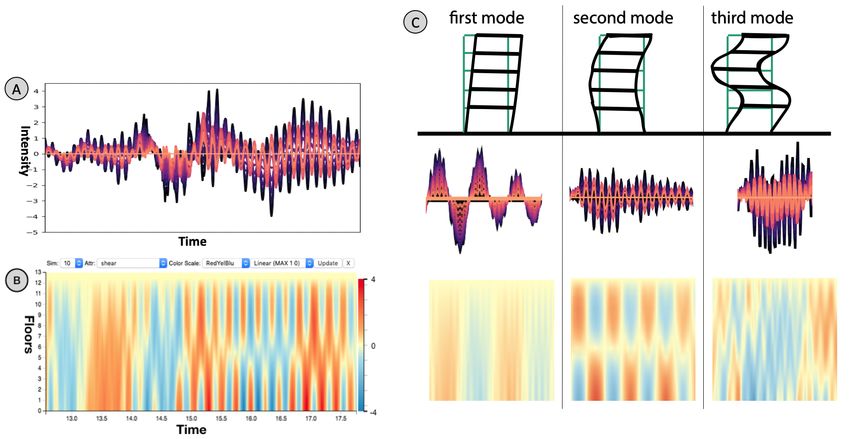
2                                                                                                               Journal Title XX(X)

Figure 1. The technique we propose in this paper, STFT-LDA, captures variation patterns across multiple time and frequency
scales, as well as different attributes in a multivariate time series (A). We show through one quantitative user studies and one
expert evaluation (Section 6) that the visual summaries (C) provide better discrimination of the behavior of such multivariate time
series. STFT-LDA uses topic modeling to capture variation patterns in the time series; in Section 6.2, we show that the topics
themselves in (B) are meaningful and interpretable. Finally, the information generated by STFT-LDA itself enables powerful visual
interaction modalities (D). Section 5.3 shows how the features enable a global overview that highlights overall similarities between
the behaviors of all simulations, and Section 5.2 shows how our technique supports different forms of visual interaction such as
content-based search for visual filtering, and global comparison of an ensemble of earthquakes.

data, in order to design a visualization that helps them in their   for the display of time series data. Keim et al. align
analysis. Specifically, we contribute:                              pixel dense visualizations of time series to high recursive
                                                                    patterns (Keim et al. 1995). Weber et al. use a spiral
      • a novel technique to extract periodic and non-periodic      metaphor to draw time series data, interleaving multiple
        features from time-series ensembles that combines           spirals when the data is multivariate (Weber et al. 2001).
        short-time Fourier Transforms with topic modeling           Carlis and Konstan also use spirals, but stack multiple
        (Section 4),                                                variables in 3D (Carlis and Konstan 1998). Byron and
      • a coordinated multiple-view prototype system that           Wattenberg use streamgraphs to visualize multivariate time
        leverages the advantages of visually encoding topics        series data (Byron and Wattenberg 2008). More recent
        and incorporates both local and global features             work has focused on how best to interact with time series.
        (Section 5), and                                            The TimeSearcher tool of Hochheiser and Shneiderman
                                                                    provides an approach to interactively perform range queries
      • one quantitative study and an expert evaluation             of multiple time series data (Hochheiser and Shneiderman
        which show that this technique can provide a better         2003), which was later extended by Buono et al. to
        infrastructure for visual analysis of this specific type    provide example-based querying (Buono et al. 2005). The
        of time-series data (Section 6).                            LiveRAC system of McLachlan et al. couples multiple views
                                                                    and semantic zooming to present visualizations of system
2     Related Work                                                  management data (McLachlan et al. 2008).
Our visualization approach builds on concepts from time                Our work is most related to visual analytics systems
series analysis and visualization of topic models. We also          that can help users identify patterns and structure within
describe recent research in the visualization of seismic data.      time series. Buono et al. use similarity-based forecasting to
                                                                    search for patterns in historical time-series data and visualize
2.1      Visualizing Time Series Data                               predictions of future behavior (Buono et al. 2007). Guo et
Data having a temporal component appears frequently in              al. use their EventThread system to cluster event sequences
a variety of settings, and thus there are numerous works            into categories using tensor analysis (Guo et al. 2018).
on visualizing time series data. We highlight those works           Lin et al. decompose time series using symbolic aggregate
that study multivariate time series. We refer the reader to         approximation to construct a hierarchical representation of
Aigner et al. for a more complete overview of time series           patterns generated by a sliding window (Lin et al. 2004).
visualization (Aigner et al. 2011).                                 Others have studied designing user-driven contexts based
   Some of the earliest work on time series visualization           on novel interactions. In particular, Muthumanickam et
focuses on questions of layout and best design choices              al. explore long time series by constructing a grammar of

Prepared using sagej.cls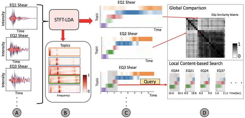
Zhao and Motta et al.                                                                                                          3

basic shapes based on user sketches (Muthumanickam et al.         al. use LDA to explore unsteady flow, mapping flow features
2016). Correll and Gleicher also study sketching for time         correspond to words (Hong et al. 2014). Chen et al. use LDA
series (Correll and Gleicher 2016).                               to categorize operation behaviors in the security management
   Finally, Jäckle et al. explore multivariate time series       system Chen et al. (2020). All these works share similarity
data by constructing 1D MDS plots over sliding temporal           to our own in that abstract, data-dependent concepts map to
windows (Jäckle et al. 2016). We similarly use a sliding         traditional components in topic modeling.
window in the STFT, but our windowing scheme is designed
to capture how frequency usage evolves over time. Miranda         2.3    Frequency-domain Analysis
et al. construct a “pulse“ to identify cyclic patterns in time-
series based on urban data (Miranda et al. 2017). Instead of      The frequency-domain representation of time series data
identifying cyclic patterns with topological tools, we focus      is a useful analysis tool for seismologists, as they
on periodic structures that exist at various frequencies. The     are often interested in understanding periodic and non-
structures translate to important features and visualization      periodic features. Fourier-based decomposition is widely
primitives that convey intuition about the frequency domain.      used for filtering noise and helping to identify periodic
                                                                  phenomena (Singh et al. 2017; Liu et al. 2016; Kuzucu et al.
2.2      Topic Modeling and Visualization                         2018), yet for time-localized behavior, Fourier methods are
                                                                  unsuitable. Short-Time Fourier Transform (STFT) preserve
Topic modeling has been utilized frequently in the context of     the frequency content dynamics over time, by shifting
visualizing text data. In particular, our work utilizes latent    a spatially-compact window and calculating the Fourier
Dirichlet allocation (LDA), pioneered by Blei et al. (Blei        transform in each small window (Allen 1977). Wavelet
et al. 2003) as a probability generalization of latent semantic   Analysis (Chakraborty and Okaya 1995) is similar to
analysis (Landauer et al. 1998).                                  STFT, but instead of using a fixed window, Wavelets
   In the field of text visualization, topic modeling is          enable multiresolution analysis via a set of windows whose
frequently used as a data processing step to provide more         functions resemble tiny waves that grow and decay in spatial
meaningful structure to unorganized documents. One feature        support. Within seismology, Sinha et al. (Sinha et al. 2005)
of topic models is that they offer a means to project             employ the Continuous Wavelet Transform (CWT), Wang et
individual documents into a lower dimensional (typically          al. (Wang et al. 2014) apply the Synchrosqueezing Transform
2D) spaces, providing views of the latent structure (Herr II      to the seismic signal to achieve a higher precision than
et al. 2009; Iwata et al. 2008). Termite relies on an             CWT, and Wang et al. (Wang 2007) uses Matching Pursuit
alternative display of topic models, using a tabular view         Decomposition to automatically determine the best spatial
that helps a user understand the distributions of terms both      resolution.
within and across topics (Chuang et al. 2012). Dou et                While these methods provide useful analysis tools for
al. user the parallel coordinates metaphor to display LDA         understanding the time-frequency representation of a single,
models in the ParallelTopics system (Dou et al. 2011).            or few, time series, they are poorly suited for handling the
The UTOPIAN system of Choo et al. uses force-directed             large amounts of time series that the domain experts we
layout to display topic models (Choo et al. 2013) and Lee         work with typically face. Visually analyzing a large amount
et al.’s iVisClustering system couples graph layouts with         of spectrograms – beit produced from STFT or Wavelets –
other views to interactively steer the LDA model (Lee et al.      is cognitively demanding, and few methods exist that can
2012). Providing supervision to LDA has beed studied by           help summarize such data. For instance, simply taking an
El-Assady et al. (El-Assady et al. 2018) who provide an           average of spectrograms might obscure important details,
iterative framework to adjust topics, informed by user studies    while dimensionality reduction techniques fail to retain the
by Lee et al. (Lee et al. 2017). Alexander and Gleicher use       time-frequency representations that are of interest to the
buddy plots to visually compare multiple topic models and to      domain experts.
derive comparison and understanding tasks (Alexander and
Gleicher 2016).
   More closely related to our own work are approaches            2.4    Visualization of Seismic Data
that visualize connections between topic models and time.         We also discuss other efforts in visualization that focus on
Luo et al. couple event-based analysis for text collections       visualizing seismic and earthquake data. These techniques
to identify topics in a time series view in EventRiver (Luo       usually emphasize two- and three-dimensional views,
et al. 2012). Wei et al.’s TIARA visualizes the evolution         typically coming from either simulation and/or observational
of topics over time (Wei et al. 2010), by using a modified        data. Much of this research has focused on techniques, such
ThemeRiver (Havre et al. 2000) display. Cui et al. also           as using images (Akcelik et al. 2003), video (Chourasia
employ the metaphor of rivers, but focus on visualizing           et al. 2008), or volume rendering (Ma et al. 2003; Yu
where specific events happen in the evolution of topics in        et al. 2004) to display earthquake data. Chopra et al. deploy
TextFlow (Cui et al. 2011). The approach of Leadline is           an immersive virtual environment to visualize earthquake
to associate topic themes with specific events, highlighting      simulations for domain scientists (Chopra et al. 2002).
topic streams by their length and burst behavior (Dou et al.      Wolfe et al. use ultrasound reflection to visualize seismic
2012).                                                            simulations as volume data (Wolfe and Liu 1988). While
   While most works that couple topic modeling with time          these techniques are powerful, we note that they focus on
focus on visualizing document collections, LDA extends            significantly different data than what we present in this work,
beyond just documents. Chu et al. use LDA to discover             as we visualize a building response to a measured earthquake
topics from taxi trajectories (Chu et al. 2014). Hong et          instead of the earthquake itself.

Prepared using sagej.cls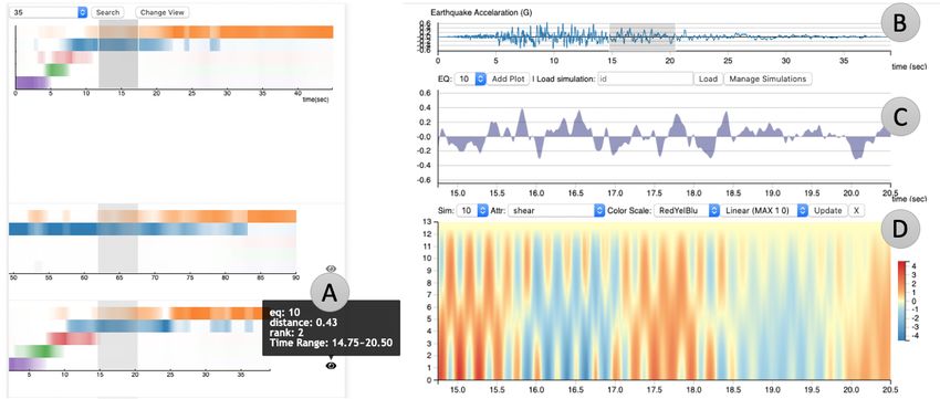
4                                                                                                             Journal Title XX(X)

   Even using different data, visualization systems for
earthquake visualization are motivational to the analysis
we employ, in particular in how they couple simulation
with measured data. Yuan et al. present a complete visual
system for studying earthquake data from multimodal
sources, including measured data (Yuan et al. 2010). Patel
et al. interpret measured seismic data using the Seismic
Analyzer to illustrate 2D seismic data (Patel et al. 2008).
Hsieh et al. also visualize time-varying field-measured data
to produce time-varying volumetric renderings (Hsieh et al.
2010). Komatitsch et al. provide comparisons of seismic
waveforms produced between simulation and observational           Figure 2. The preliminary system utilizes a 2D heatmap (B) to
data (Komatitsch et al. 2003). We again emphasize that while      visualize a time series across different floors (A). The variation
these works are inspirational in terms of studying seismic        of the color indicates the change of one physical attribute, which
                                                                  also reflects the vibration condition of the building. A linear
response, our work differs significantly in that we are focused
                                                                  interpolation is applied to the values between floors to facilitate
on trends that help us compare numerical simulations of           comparisons across floors and different timestamps. The color
buildings under seismic loads.                                    encoding simplifies the recognition of three basic vibration
                                                                  modes in (C), nevertheless, this method lacks the ability of
                                                                  summarizing the simulation behavior as well as making
3     Problem Setup                                               comparisons across different simulations. See Section 4 for the
We first describe the data that the civil engineers tend to       technique we propose to solve these problems.
produce via numerical simulation. In studying the behavior
of buildings that experience earthquakes, civil engineers are
concerned with analyzing simulations that produce sets of         Impulse A term describing a force applied onto the building
multivariate time series. A single simulation produces a          by the earthquake over a very short period of time. (Section
time series that expresses each physical variable on each         6.2)
degrees of freedom of a floor for given an input, recorded        Elastic and inelastic state Under an elastic vibration, the
earthquake signal. In this study, the simulations track 6         building can resume to undeformed initial position when
physical attributes of interest, for each floor: acceleration,    the external force is removed; however, inelastic vibration
shear, diaphragm force, moment, drift ratio, and interstory       causes irreversible damage to the structure, and it may
drift ratio. Each physical attribute is an important indicator    remain deformed even after the removal of the external force.
of the building status. For example, shear measures the           (Section 6.2)
cumulative force parallel to each floor, while interstory drift
ratio measures the positional difference between two floors
at a given point in time. This gives a vector-valued time         3.2    Preliminary Design Study
series for each attribute, and each simulation has 25,000 time
                                                                  Through regular meetings with civil engineers, we found
steps in average in this study. Each attribute is normalized
                                                                  that a key aspect of their analysis is understanding response
by dividing the raw value by a predetermined design limit.
                                                                  and the fundamental vibration modes of the building, often
This has the benefit that any value of the time series above
                                                                  determined by the mass of stiffness of the building. In
1 or below negative 1 indicate that the building is operating
                                                                  particular, studying these time series helps them understand
out of its safe design specifications, and mitigates the issue
                                                                  the fundamental vibration periods of the building, often
of comparing variables of different units. For simplicity of
                                                                  determined by the height, support structure, and materials
discussion, in what follows we treat the combinations of
                                                                  used to construct the building. As all objects have a natural
floors and variables as a combined multivariate signal (and
                                                                  vibrational period, understanding where deviations occur
thus, we abuse language at times and simply refer to the
                                                                  can often be indicative of damage. More specifically, the
quantity of interest as floor or variable).
                                                                  vibration behavior of a building can exist in different modes
                                                                  (Fig. 2(C)) where either all floors are vibrating in alignment
3.1      Glossary of Seismological Terms                          or out of alignment. For example, if all floors move in the
Earthquake Simulation A vibrational input that possesses          same direction, back and forth, the building will vibrate
the essential features of a real seismic event is applied to      like a pendulum swing. The civil engineers typically refer
structures to study the effects of earthquakes on structures.     to a building in this state as a first mode. If the building
(Section 1)                                                       undertakes shear stress from different directions at the same
Story Shear A term to measure the force parallel to each          time, it will bend like an “S” shape, which is typically
floor in a building. (Section 3.2)                                referred to as a second mode. If the building is swinging
Mode One of a set of independent vibration configurations         in the shape of an “M” or “W”, then this is typically
a building can exhibit. Higher modes correspond to more           called a third mode. In seismic analysis, these motions have
complex configurations. Buildings can vibrate in multiple         received long-lasting focuses and civil engineers conduct
modes simultaneously. (Section 3.2)                               many experiments in order to understand the internal
Ground Acceleration A time-varying attribute of the               connections between the mode behaviors of a building
earthquake directly indicating the acceleration of the ground     and earthquake (M. Bracci et al. 1997; Dazio et al. 2009;
at a particular point in time. (Section 5.3.2)                    Krawinkler and Seneviratna 1998).

Prepared using sagej.cls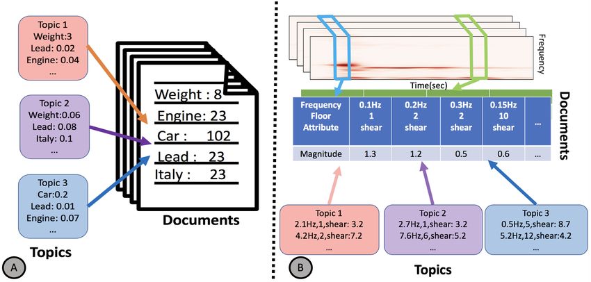
Zhao and Motta et al.                                                                                                                     5

                                                             Magnitude

                                                                         Figure 4. A synthetic, multivariate time series generated to
Figure 3. Traditionally, LDA is used to summarize different              illustrate the behavior of STFT-LDA. The time series (A) goes
distributions of word frequencies in documents into topics. In           through four different phases, characterized by different
our paper, we use LDA to summarize distributions of frequency            amplitudes and frequencies. In this case, we use STFT-LDA to
patterns obtained from STFT. Each “document” in our case is a            generate three topics (B) which characterize the overall
collection of frequency distributions from each of the different         variability in the time series, and the summary view (C) shows
attributes on the multivariate time series (specifically, one time       how the patterns change over time and how they relate to one
series for the shear strength measured in each floor).                   another.

                                                                         series, the visualization is still too complicated for users to
   Currently civil engineers use simple visualizations such              understand general patterns and make comparisons across
as line plots (Fig. 2(A)) to plot a building’s response to               different simulations. For example, civil engineers may spot
individual earthquake. However, it can be complex to directly            some of the mode behaviors in a simulation, but the user
analyze line plots as the data is measured across a range of             may still need to recall and match these color patterns back
floors and variables. Quickly spotting the mode of a building            and forth while inspecting another simulation. Secondly,
is challenging in this scenario, as differences between                  this direct visualization of time series doesn’t help much
modes manifest as subtle visual differences. Moreover,                   in answering important questions like how the frequencies
in a real-world scenario, the building’s motion in an                    change throughout the earthquake or what is the highest
earthquake is often more complicated than simply three                   intensity of the frequencies. Finally, this visualization is not
modes. Specifically, the movement is often disorderly and it             scalable when more variables are introduced, specifically,
also evolves slowly in response to damage, which leads to                considering two physical attributes at the same time. This
an evolution of material ductility that eventually alters the            is also a problem in previous methods when we are
vibrational modes.                                                       trying to visualize sets of frequency components across all
   Thus, for our initial task, we built an infrastructure                earthquakes and their variables.
to enable civil engineers to visually explore multivariate
time series and spot interesting patterns such as vibrational            3.3     Task Abstraction
modes. Towards this end, we built a prototype interface
using 50 earthquake simulations provided by the engineers.               In visually exploring multiple earthquake simulations, there
For each simulation, we utilize a 2D heatmap to visualize                are a set of tasks that civil engineers wish to achieve:
the response of each single physical variable plotted over                     • (T1) Summarizing Earthquake Behaviors. Civil
time and building floor. As shown in Fig. 2(B), users                            engineers would like to understand the space of
have access to different simulations and the corresponding                       discriminative earthquake behaviors.
physical attributes, and they can also choose different color
scales and mapping methods to emphasize various patterns.                      • (T2) Exploring Collections of Earthquakes. It is
We showed this visualization tool to the civil engineers                         challenging for civil engineers to even know where
and they agreed that this view is supportive in spotting                         to begin their study. Having a general overview of
periodic behaviors as well as understanding the deviations                       earthquakes can help them decide what earthquake, or
across both floor and time steps directly. In the meanwhile,                     set of earthquakes, to study first.
choosing different color maps could help them simplify the
signals and highlight interesting phenomena. In particular,                    • (T3) Exploring Time-localized Earthquake Fea-
civil engineers can roughly observe the main vibration mode                      tures. Given a single earthquake, the civil engineers
of the building by reading the color patterns. Taking the shear                  would like to understand how an identified feature at a
attribute of an earthquake for example, in Fig. 2(C), if the                     specific time interval relates to other earthquakes.
building is in the first mode, the colors of all the floors are
                                                                               • (T4) Identifying Deviations and Outliers in the Set.
either red or blue at the same time. On the other hand, if
                                                                                 In addition to summarizing the aggregate behavior
the building is in the second mode, the colors are always
                                                                                 of earthquakes, the civil engineers also seek to
different for the upper and lower floors at the same time
                                                                                 understand which combinations of parameters/inputs
steps, which reflects that the directions of the shear attribute
                                                                                 produce results that deviate from the expected
for corresponding floors are also opposite.
                                                                                 behavior.
   In moving to studying multiple earthquake simulations,
however, the 2D heatmap has limitations. First, even though                Fundamental to satisfying these tasks is a notion of
it reduces the complexity of the origin multivariate time                earthquake similarity, taken with respect to arbitrary

Prepared using sagej.cls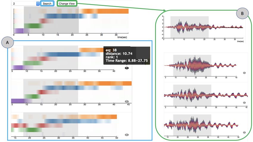
6                                                                                                            Journal Title XX(X)

time intervals. Similarity enables overviews of earthquake         4.1    Short-time Fourier Transform (STFT)
simulations, as measured across their entire duration,             Besides inspecting the time series of seismic responses,
allowing the user to identify one or a small set of earthquakes    civil engineers are concerned with their frequency domain
to begin their analysis (T2). Given a single earthquake,           representation, in order to distinguish periodic behaviors
similarity also enables the user to query earthquakes,             of earthquakes and how periodic behavior changes as the
either globally or locally in time, allowing the user to           earthquake simulation progresses. The STFT is a suitable
compare earthquakes at different time scales (T3). Finally,        transformation for this purpose, as it captures the time-
earthquakes that are dissimilar from the set can help to           localized frequency content of a signal. The STFT is
identify where large deviations have occurred that might           constructed by defining a temporal window of fixed size,
necessitate further investigation (T4).                            which we denote by τ, sliding the window over the signal,
   While there are many ways one can compute similarity            and for each window the Fourier transform is computed on
between the time series data produced by earthquake                the subset of the signal that resides within the window. This
simulations, in this work we seek a mechanism to produce           results in a sequence of frequency decompositions, one for
an interpretable similarity measure. Key to this interpretation    each window, for each time series of each variable in an
is producing visual representations of earthquakes that            earthquake. Fig. 3(B) shows an example of the STFT applied
enable civil engineers to understand why, when, and where          to an earthquake time series of a single variable (shear)
earthquakes are similar. Unfortunately, no technique in the        across thirteen floors. The STFT is shown as a color mapped
literature supports such demands. The core of our approach         spectrogram, where the x-axis refers to time steps, the y-
is a method to transform multivariate time series into such a      axis refers to frequency, and the color intensity refers to the
representation that improves how users visually comprehend         squared frequency magnitude of the FFT.
trends and patterns across time series. In particular, we model
multivariate time series through topic modeling. Concretely,
each multivariate measurement in time is replaced by a
                                                                   4.2    Topic Modeling STFTs using Latent
distribution of topics that best explain the earthquake at that           Dirichlet Allocation (LDA)
point in time.                                                     Although the STFT is descriptive of the phenomena present
   Our topic model is designed in such a way that each             in the earthquake time series, it is not an ideal visual
topic, viewed as a time series, smoothly changes over time,        encoding for exploration. It is necessary for the user to
and thus it is far easier to comprehend than the original          visualize the STFTs across all variables, but such views
earthquake simulation measurements. Furthermore, each              scale poorly in the number of variables. To build a visual
topic is characterized as a distribution over frequencies for      representation that compactly represents a set of STFTs,
each variable, and thus topics are interpretable with respect      we turn to topic modeling. Topic modeling has traditionally
to earthquake behaviors of interest to the civil engineers. This   been used to obtain a better understanding of textual data.
enables civil engineers to comprehend general earthquake           More specifically, as illustrated in Fig. 3(A), given a set of
behaviors by inspecting the individual topics (T1) as a            documents where each document is comprised of a set of
mechanism for summarizing the group. These time-varying            words and corresponding word counts, topics are learned
topic distributions underlie our visual analytics approach         from the data such that each topic is a mixture over words,
to exploring earthquake collections, as this representation        and documents are mixtures over topics. The topics are
drives how we compute similarity between earthquakes.              meant to capture latent themes in the document corpora, with
                                                                   each document typically represented with a few predominant
                                                                   topics, or themes, rather than its original set of words.
4     STFT-LDA: Topic Modeling for                                    In our scenario, we treat a multivariate time series
      Multivariate Time Series                                     earthquake as a time series of documents. More specifically,
                                                                   our vocabulary of words corresponds to a binned set of
At the core of our visual analytics technique is a novel           frequencies. In particular, we treat frequencies corresponding
representation of multivariate time series, designed to            to different variables in the earthquake as being distinct,
capture domain-specific features in a manner that enables          thus our vocabulary W for m uniformly discretized frequency
effective visual exploration. Time series data produced            ranges and n variables is of size |W | = m · n. Each document
from earthquake simulations can be characterized as having         is formed at a given time by cascading all STFT windows
periodic behavior that varies over time, where changes in          over all variables, taking the document’s word count as
periodicity often reflect different phases of the earthquake       the frequency magnitude. We then perform Latent Dirichlet
simulation. To capture time-varying periodic phenomenon,           Allocation (LDA) (Blei et al. 2003) over documents that
we use Short-Time Fourier Transform (STFT) (Allen                  come from all of the earthquakes, which results in a set of
1977), individually computed over all time series for each         topics. We do not normalize documents because different
earthquake simulation. Although descriptive of earthquake          earthquakes can have different frequency magnitudes, and
behavior, the STFT alone does not make it easier for the user      we prefer the topic modeling to be sensitive to these
to perform visual exploration of collections of multivariate       variations. On the other hand, for each document LDA
time series data. To this end, we perform topic modeling on        produces probabilities over topics, and thus the words
the set of STFT, and use the learned topics for both visually      over a topic, namely the weights over frequencies and
encoding time series, as well as computing similarity over         variables, cannot be interpreted as probabilities. We thus
time series. We discuss the STFT and topic modeling in more        normalize the topics, individually for each topic, allowing
detail below.                                                      us to comprehend importance of words in a relative manner.

Prepared using sagej.cls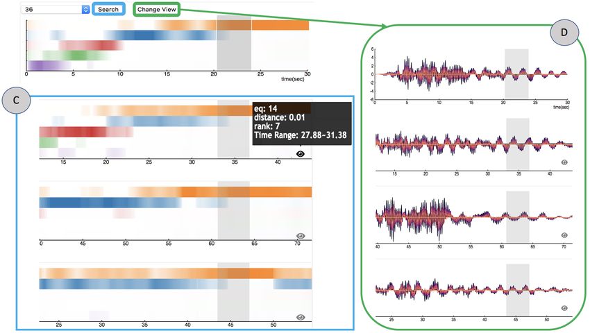
Zhao and Motta et al.                                                                                                                  7

Each topic thus outputs a mixture of variable-dependent              colors at that frequency encodes the different amplitudes of
frequencies, as illustrated in Fig. 3(B).                            each time series.

4.3      Illustrative Example
We use the topics for visualization with two different views,
see Fig. 4 for an illustration of a synthetic example modeled
with three topics. First, we visualize a given multivariate
signal by visually encoding each document in its time series
through its topic distribution, as shown in Fig. 4(C). This
view shows colored stripes to visualize each topic and its
evolution across time. Each row is associated with a given
topic, and we opacity-map each document’s normalized topic
weight. Within any given column, the topic weights will sum
to 1.0.
                                                                     Figure 5. Our topic representation also helps connect to the
   Second, we compactly visualize a topic as a 2D scalar             concept of vibrational modes. Buildings vibrate mainly in the
field, where the x-axis represents frequency, the y-axis             fundamental natural frequency (first mode) or as damage
represents variable, and we color map the probability of             happens the floors may vibrate out of alignment (second, third
each word belonging to the topic, as shown in Fig. 4(B). In          modes). The topic representation helps to see if the floors are
this manner, the user can identify patterns and transitions in       vibrating at the same frequencies, which can be verified if the
the time-series document-topic view, and access details-on-          signals are aligned by looking at the signal views.
demand in the topic view.
   We illustrate how these views help describe the original
signal (Fig. 4(A)). Our synthetic example models a single            5     System Description
earthquake that consists of 13 time series where each time
series has 4 phases, while the time series lasts for 50 seconds.     We implemented and experimented with STFT-LDA in a
Within each phase, these 13 time series have same frequency          prototype system (Fig. 6). We used an initial collection
but different amplitudes. The first phase is a sinusoid with         of 50 simulations of responses to earthquakes. Each
frequency 0.4Hz, in the second phase the sinusoid increases          building had 13 floors, and we investigated the variable
to a frequency of 3.2Hz, in the third phase the sinusoid             of shear on each floor, resulting in a 13-dimensional
changes to a combination of frequencies 0.4Hz and 1.6Hz,             signal whose lengths varied from 30 to 200 seconds. Each
while in the last phase the sinusoid’s frequency shifts to           simulation is the result of a custom simulation developed
1.6Hz. The sample rate is 400 samples per second.                    by two of our coauthors in Matlab where parameters
   For STFT computation we select a window size of 5                 such that the structural method and input earthquake
seconds, and slide the window every 0.125 seconds. Due to            signal were varied. We use python libraries like scikit-
the simplicity of our signal, we want the STFT to be more            learn(https://scikit-learn.org/), NumPy(https://numpy.org/)
precise in the location of the frequency/amplitude transitions.      and SciPy(https://www.scipy.org/) to process the simulation
For topic modeling, we set the number of topics to 3 to match        data with different filters like STFT and LDA. We use
the number of frequencies in the data. We expect the model           R for its corrplot package (Wei and Simko 2021) for
to capture the frequencies and separate them into different          hierarchical clustering (to reorder the rows and columns of
topics, and the topic transitions should occur approximately         the matrix view) as well as for the analysis of the user study
when the frequency changes in the signal.                            results. All the calculated data are stored in the backend
   Fig. 4 summarizes the results. As shown in Fig. 4(B), each        system as binary files in the file system. The application
topic clearly picks out the distinct frequencies in the original     web server is implemented with Flask (Grinberg 2018). For
data. Fig. 4(C) shows the time-series document-topic view,           the frontend design, we mainly rely on JavaScript library
where the distinct color changes between topics accurately           D3 (Bostock et al. 2011) and draw on both SVG and HTML5
capture the transitions between frequencies present in the           Canvas for better performance. In this section, we discuss
original time domain. It also accurately splits to two topics        each view and interactions we implemented as well as the
when there is a mixture of frequencies in the third phase.           insights of this simulation dataset we discover by using this
The transition between topics along the time series is clearly       prototype system.
indicated by the color changes and the time approximately
match the frequency changes in the time domain. This                 5.1    Topic View
exemplifies the typical use-case of the topic-oriented view          To analyze the data, we computed the STFT on each
STFT-LDA: the user obtains an overview of trends more                earthquake using SciPy’s STFT filter using a window size
easily than trying to detect patterns in the original time series.   of 5 seconds with a sampling frequency of 0.125 seconds.
   Fig.4(B) offers an alternative view of the data by                The output of the STFT is then processed through Scikit-
emphasizing the topics themselves. The bounding boxes                learn’s LDA filter with the batch learning method, setting
match the colors used in (C). Obviously, each topic identifies       the number of topics to five. The visualization for these
one distinct frequency in the signal data. Since the frequency       five topics are shown in Fig. 5(left). The bounding boxes
distribution of each topic is like an impulse function where         match the color stripes used in Fig. 5(right). Each topic
almost everywhere else is zero, we expect the topic modeling         is visualized as a 2D heatmap, where the x-axis represents
to pick out the individual frequencies. The opacity of the           frequencies from 0Hz to 16Hz, the y-axis represent 13

Prepared using sagej.cls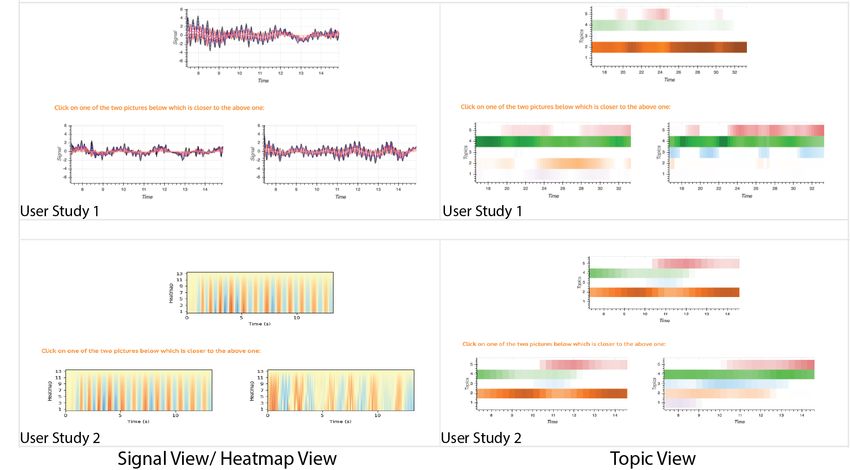
8 Journal Title XX(X)
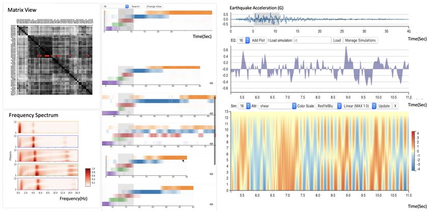
Figure 6. The prototype system consists of four views. The matrix diagram (top left) is used for navigation and summarizes the
overall behaviors across all the earthquakes. To understand the frequency distribution of each topic, the analysts can refer to the
frequency spectrums (bottom left) for details. The opacity of the color indicates the relative magnitude of a frequency for a specific
floor. The core of the system is the topic representation of each earthquake simulation (middle). It includes a content-based search
module to help quickly identify similar partial time series across different simulations. The last part (right) is a details view that
supports further exploration of simulation time series and helps civil engineers interpret the responses of buildings from another
aspect.
floors of the building, and the color opacity indicates the stores fast Fourier transform to speed up the process (for
normalized magnitude of each 2D scalar value. For example, full details, refer to Appendix 8). We pick the two most
the “orange” topic has one strong impulse with frequency similar parts from each simulation data, order all of them
around 0.4Hz and the frequency magnitudes are decaying by the distance and return the top simulations. All the search
along the floors. The “blue” topic picks up a higher frequency results are translated such that the similar parts are aligned
of 4.0Hz, however, the intensities of frequency for each floor (Fig. 7(A,C)). The search results will also be highlighted in
diverge from the middle floor of the building. Unlike the the matrix diagram view. We can hover on the icon to show
first two topics, the remaining three topics contain more details of the results including the earthquake number, rank,
mixtures of various frequencies. These five topics summarize distance between the result part and the search part and the
common distributions over frequencies and floors across all time range of the result part.
the simulations. By inspecting these topics, civil engineers
can have a better understanding of the general earthquake This feature also allows the user to compare against the
behaviors. Besides, as the spectrum illustrates the deviations signal view as a validation. Fig. 7(B,D) shows how these
among different floors, our visualization also benefits the two views align. Shared brushing highlights the same time
analysis of the vibration status of the entire building. regions in both views so that users can cross compare.
Design choices. In the frequency spectrum, we use a red In particular, this view helps to show both regions where
sequential colormap to indicate the normalized magnitude earthquakes are locally similar as well as regions where
of the frequency for each floor. We choose five qualitative earthquakes are dissimilar.
colors to represents the five topics and we utilize the opacity
Fig. 7(A) shows an example where the user has selected
to represents the percentage of topics at every time interval.
multiple topics and searched for a particular sequence. The
search hits that are returned show three cases that are quite
5.2 Content-based Search similar. Fig. 7(C) shows a different example, where the user
We also implemented an interface for content-based search has selected only a single topic to find other earthquakes that
against temporal regions of earthquakes, see Fig. 7 for express this topic. As a result, the most similar earthquakes
an illustration. This content-based search directly relies on in the selected region of time appear to have a significantly
using the topic representations (i.e. STFT-LDA data). The different behavior in the time steps prior to the selection. The
user can brush on a continuous area of one earthquake topmost hit (second row) appears to have a more continuous
simulation and quickly search for the most similar parts of transition between topics, while the next two closest hits
equal length among all the other earthquake simulations, (third, fourth row) appear to transition in different ways. The
where we use Euclidean distance as the similarity third row shows a more regular transition from the blue to
measurement. We then use a cross-correlation process to the orange topic, while the fourth row shows that the blue
calculate the sliding distance where an accumulation array and orange topics appear to be mixed.
Prepared using sagej.cls
Zhao and Motta et al.                                                                                                                 9

Figure 7. The content-based search illustrates how topic modeling helps to identify regions that are locally similar and dissimilar.
(A) and (C) show two different brushed regions in the top simulation and three of the most similar results aligned. For (A), a user
can quickly see all three are similar hits and then validate this comparison in (B). For (C), the topmost hit ends up having a different
behavior prior to the selection.

5.3      Other Views                                                 visualizing these time series directly. The views include
                                                                     a line chart visualizing the earthquake acceleration for
5.3.1   Matrix Diagram View STFT-LDA splits each earth-
                                                                     navigation (Fig. 8(B)), an area chart showing the impulses
quake simulation into a set of segments with a fixed win-
                                                                     of brushed earthquake time regions (Fig. 8(C)), and a 2D
dow size, and each segment is simply represented as a
                                                                     heatmap for visualizing the building responses quantified by
vector of weights. For any two segments coming from two
                                                                     different physical attributes across all the floors (Fig. 8(D)).
earthquakes, we compare them directly using the Euclidean
distance between these two vectors. Then, we calculate
the similarity between any two earthquake simulations by                Earthquake acceleration is an attribute of the earthquake
mapping the set of segments to a Gaussian distribution in            that directly indicates the intensity the of simulation, and
Hilbert space, and use Bhattacharyya’s similarity to compare         we plot it as a line chart for overview and a gray area plot
the earthquakes (Kondor and Jebara 2003).                            for details. What’s more, we present a 2D heatmap view
   We use matrix diagrams to visualize the behavior                  over time (x coordinate) and building floor (y coordinate) to
across earthquakes as a global comparison mechanism.                 visualize the response of each single physical variable. User
These are implemented using D3’s existing matrix diagram             can switch between different simulations and attributes and
infrastructure. Each cell in the across-earthquake matrix            the positive and negative values of the time series indicate
represents the similarity between two entire simulations             different movement direction of the variable.
using Bhattacharyya’s measure. In our tool, users can
select a cell in the matrix in order to show the details of
                                                                        We built interactions between the search module and the
two earthquake simulations. In the matrix, we reorder the
                                                                     details view to help explore the multivariate data and spot
sequences of the simulations using hierarchical clustering
                                                                     interesting patterns. For example, as shown in Fig. 8, when
with complete linkage using the R package corrplot. This
                                                                     a user brushes on a portion of the topic view and searches
matrix view helps to demonstrate how STFT-LDA produces
                                                                     for similar partial simulations, these views will automatically
meaningful global comparisons. For example, in Fig. 6 (top
                                                                     zoom into the same time region being searched. What’s
left) we can observe four major clusterings. We can click the
                                                                     more, by clicking on the eye icon in the searching results,
corresponding cell to do pairwise comparisons. And the the
                                                                     user can also quickly switch to highlighted time regions in
results in the content-based search will also be reflected in
                                                                     other earthquake simulations.These interactions enable quick
the matrix.
                                                                     access to the specific time range in earthquakes of the user’s
   Design choices. The matrix diagram is designed as grey-
                                                                     interest. They also keep the synchronization of the time range
scaled for two reasons: 1. the sequential color scheme can
                                                                     between the time domain and frequency domain and allow
be used to encode the similarity value; 2. the color channel
                                                                     the user to analyze similar time intervals discovered by topic
can be used for other interactions like highlighting the
                                                                     views in the time domain as well.
content-based search results or clicking mark.

5.3.2   Details View While the topic presentation provides              Design choices. We choose diverging color scales for
a highly-compressed summary of simulations’ overall                  emphasizing the differences and both continuous and
behaviors, the analysts still prefer a direct visualization of       discrete colormaps are provided in the view as the former
the responses for each floor. This will be a good complement         facilitates preserving values and the latter can help filter
for analyzing the stress condition of different floors. To           unimportant values by setting up different thresholds. To
support further exploration of simulation time series and            help users easily identify patterns over time and floors, we
help civil engineers interpret the responses of buildings from       choose to show one attribute each time instead of using small
another aspect, the system also includes multiple modules            multiples.

Prepared using sagej.cls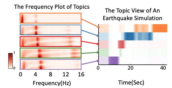
10                                                                                                               Journal Title XX(X)

Figure 8. Analysts can select a portion of the ground acceleration (B) and drill down into a specific earthquake simulation (D), to
visualize the response of a single physical variable plotted over time (x coordinate) and building floor (y coordinate). (C) is an area
plot visualizing the selected portion of the ground acceleration. By utilizing STFT-LDA, analysts can quickly navigate and zoom in to
the similar partial simulations. In (A) an analyst can quickly switch from EQ35 to EQ10 and zoom into time range 14.75s to 20.50s
automatically by clicking on the eye icon.

6     Evaluation                                                     the same type of building structure as the one on the top.
                                                                     Participants are asked to select the image on the bottom of
In the previous sections, we argued that STFT-LDA is
                                                                     the screen that looks “the most similar” to the one on the
practical to implement and provides a number of attractive
                                                                     top. We consider the answer correct if it matches the building
features in the context of a larger visual analysis system.
                                                                     structure.
However, one central question remains: does STFT-LDA
actually produce visual representations that more readily               Since “most similar” is a markedly subjective notion, and
distinguish different features of the multiple time series?          since participants of the study are not trained in analyzing
To evaluate the effectiveness of the technique and resulting         earthquake simulation data, we provided a short training
time-series visualization, we designed and conducted a               session where participants are given instant feedback as to
surrogate task with two conditions which we now describe.            whether or not they answered correctly. Although this is not
                                                                     an exactly realistic scenario, we believe the training session
                                                                     provides information for the kind of pattern that the analysts
6.1      Surrogate Task
                                                                     should be expected to find in real-world analyses.
Broadly speaking, we sought to study whether participants            Hypothesis and Design Our hypotheses are:
in the study would be able to distinguish differences in
the features that generated the time-series data. The true,              • STFT-LDA will provide higher accuracy in correctly
ecologically-grounded task of the analyst involves studying,               identifying similar patterns, compared to a time-series
at a potentially fine level, differences in the behavior of these          signal view;
time series. Such real-world tasks lack a clear notion of
ground truth, making quantitative experiments particularly               • STFT-LDA will provide higher accuracy in correctly
challenging. In order to arrive at one such design, we created             identifying similar patterns, compared to a time-series
a simpler, surrogate task, for which we do have ground truth.              heatmap view.
   In the study of building responses to earthquakes,
engineers create numerical simulations of a number of                We have done two independent trails for these two
different building structures, and test these structures against     conditions. For the first trial, the “visualization” independent
the same recordings of earthquakes. In addition, these               factor is whether the stimulus is a “topic view” (from the
simulations have an additional free parameter, the “load”            results of STFT-LDA) or a “signal view” (from a traditional
of the earthquake, a multiplicative factor of the ground             multiple time-series view). We use a within-subject design
acceleration that is used to simulate more (or less) severe          for the “visualization” factor, and use randomization to
versions of the same event.                                          counterbalance the order in which the factors are presented to
   The surrogate task we designed is a visualization matching        each participant. All participants are shown the same stimuli
forced-choice task, where the participants are shown three           for the training session, although the order in which the
stimuli, laid out on a computer screen as shown in Fig. 9.           training session stimuli are presented is also randomized
Each of the stimuli shows the same span of time during one           across participants. The dependent factor in our study is
fixed earthquake; the difference in the time series comes from       simply whether or not the participants picked the correct
a combination of earthquake load and building structure.             value, as defined above. Each participant is given a number of
Crucially, one of the images on the bottom is generated with         such baseline judgment tasks. For the second trail, we keep

Prepared using sagej.cls
Zhao and Motta et al. 11
Figure 9. Some samples from the stimuli presented to
participants in the surrogate task presented in Section 6.1. The
particular stimuli presented are chosen to highlight the range of
variation between easy and hard examples in the surrogate
task. The full set of stimuli and source code to reproduce the
Figure 10. Summary of analysis of surrogate task. On the left,
analysis is submitted as supplemental material.
we show a histogram of the times participant took to answer the
tasks, broken down by whether they answered correctly or not,
and visualization type. On the right, we show sample accuracy
all the other settings same as the first one except that the for the “topic” and “signal/heatmap” factors, together with the
“signal view” is replaced with a “heatmap view”. (estimated via binomial approximation) standard deviations. We
Pilot study We performed an informal, untimed pilot find that the null accuracy hypothesis can be rejected with
for our study with two participants, each answering an p = 3.36 × 10⁻⁵ and and p = 2.98 × 10⁻⁷ , respectively, and that
at the 95% confidence level, the odds ratio is smaller than 0.61
unlimited number of judgment tasks (until they informally
and 0.56, respectively. Relative to the signal-based
decided to stop). The exploratory information gathered (heatmap-based) visualization, this means participants are
from this study suggested we should expect to see around likely to be more than 60% (55%) more accurate in the study
a 10% absolute improvement in performance from the task using a topic-based visualization. At the same time, we
signal-based/heatmap-based visualization to the topic-basic cannot reject the null for the time hypotheses; see the text for
visualization, and we also learned that those participants did details.
not take more than 10 seconds to answer any of the baseline
judgment tasks. This gave us sufficient information to design
an experiment with sufficient length to give enough power the bootstrap finds similar results, and so does an analysis
to test the hypothesis. Ultimately, we arrived at a design of the difference in mean accuracy. We believe this provides
where each user answers 30 basic tasks and 4 “trivial” tasks adequate statistical evidence to support our hypotheses. A
designed to exclude participants who could not understand natural follow-up hypothesis, then, is: answers using the
these instructions. The trivial tasks showed an identical copy topic were more accurate because in those cases users took
of the target image as one of the alternatives. We designed longer to answer. We test this hypothesis using a two-sample
the analysis such that if any participant answers any of the t test in both two trials, and find that we cannot reject
trivial tasks incorrectly, we would discard the entirety of their the null, at p = 0.26 and p = 0.94, respectively. In other
input. In addition, the actual responses for the trivial tasks are words, we find strong statistical evidence that the users were
discarded. more accurate using the topic-based visual encoding, but no
evidence that they were slower (or faster) using the topic-
Participants We recruited a total of 19 participants in
based visual encoding.
the first trial, and 22 participants for the second one. The
Study materials and data We have made the study
time interval between two trails is around 13 months which
materials, data, and analysis available as part of the
minimizes the possibilities of mutual effect between two
supplemental material in the form of CSV files, R Markdown
trials. The participants were recruited by local volunteering
scripts to reproduce the analysis, and the actual generated
in classes and research meetings, and comprise a mix
analysis document.
of graduate students and researchers in computer science
and data visualization. Because we were not interested
in post-hoc analysis of demographic information, we did 6.2 Expert Study
not formally collect such information as gender or age of We conducted an expert study to evaluate the usefulness
participants. For all the participants, no data was discarded of our prototype system, where the expert is one of the
due to incorrect answers for the trivial tasks. our coauthors who has worked in structural and earthquake
Analysis Our study design enables a relatively simple engineering for years. It was deployed on a cloud server
statistical analysis, in which we can use Fisher’s exact test and executed in a web browser (Chrome). Before the formal
for count data (Agresti 2003). The exact count tables for this study, we piloted the user study with two Ph.D students,
study can be seen in Fig. 10. Fisher’s exact test allows us who have never seen the visualization. The information
to reject the null hypotheses in two trials at p = 3.36 × 10⁻⁵ we gathered helped us design each session and estimate
and p = 2.98 × 10⁻⁷ , respectively, and we find that this result time for each question. Then we scheduled the meeting
is robust under different analysis (which we include in the with the expert via Skype and we recorded his computer
supplemental material): an analysis of the odds ratio under screen with audio during the conversation. The entire user
Prepared using sagej.clsYou can also read