Look Before You Leap: Trusted User Interfaces for the Immersive Web - arXiv.org
←
→
Page content transcription
If your browser does not render page correctly, please read the page content below
Look Before You Leap: Trusted User Interfaces for the Immersive Web

                                        DIANE HOSFELT, Mozilla
                                        JESSICA OUTLAW, The Extended Mind
                                        TYESHA SNOW, The Extended Mind
                                        SARA CARBONNEAU, The Extended Mind
arXiv:2011.03570v1 [cs.HC] 6 Nov 2020

                                                                               Fig. 1. Basic immersive link navigation flow without trusted UI

                                        Part of what makes the web successful is that anyone can publish content and browsers maintain certain safety guarantees. For
                                        example, it’s safe to travel between links and make other trust decisions on the web because users can always identify the location
                                        they are at. If we want virtual and augmented reality to be successful, we need that same safety. On the traditional, two-dimensional
                                        (2D) web, this user interface (UI) is provided by the browser bars and borders (also known as the chrome). However, the immersive,
                                        three-dimensional (3D) web has no concept of a browser chrome, preventing routine user inspection of URLs. In this paper, we discuss
                                        the unique challenges that fully immersive head-worn computing devices provide to this model, evaluate three different strategies for
                                        trusted immersive UI, and make specific recommendations to increase user safety and reduce the risks of spoofing.

                                        CCS Concepts: • Security and privacy → Usability in security and privacy; Browser security; • Human-centered computing
                                        → Mixed / augmented reality.

                                        Additional Key Words and Phrases: link traversal, trusted user interfaces, immersive web

                                        ACM Reference Format:
                                        Diane Hosfelt, Jessica Outlaw, Tyesha Snow, and Sara Carbonneau. 2021. Look Before You Leap: Trusted User Interfaces for the
                                        Immersive Web. In CHI ’21: ACM Conference on Human Factors in Computing Systems, May 08–13, 2021, Yokohama, Japan. ACM, New
                                        York, NY, USA, 13 pages. https://doi.org/10.1145/1122445.1122456

                                        1   INTRODUCTION
                                        Browsing the web is a common, everyday task. Most people traverse links without thinking about the safety mechanisms
                                        that enable them to travel from one web location to another. Key among these is the fact that at any point in time, you
                                        can inspect your location by looking at the URL bar. In order to make trust decisions, users must first understand the
                                        Permission to make digital or hard copies of all or part of this work for personal or classroom use is granted without fee provided that copies are not
                                        made or distributed for profit or commercial advantage and that copies bear this notice and the full citation on the first page. Copyrights for components
                                        of this work owned by others than ACM must be honored. Abstracting with credit is permitted. To copy otherwise, or republish, to post on servers or to
                                        redistribute to lists, requires prior specific permission and/or a fee. Request permissions from permissions@acm.org.
                                        © 2021 Association for Computing Machinery.
                                        Manuscript submitted to ACM

                                                                                                                    1
CHI ’21, May 08–13, 2021, Yokohama, Japan Hosfelt
identity of the website they are visiting, which is indicated by the URL and HTTPS certificate data displayed in the URL
bar. However, previous research indicates that users often fail to note these indicators [2, 5, 8].
The immersive web refers to virtual experiences hosted through the browser [3]. This experience is commonly
accessed on a head-mounted virtual reality (VR) device like an Oculus Quest or HTC Vive. Immersive web browsers
are capable of displaying 3D content to users, as well as immersive 360° videos, and augmented reality (AR) content
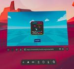
on AR-enabled devices. The immersive web has two modes, 2D and immersive (shown in Figure 2 and Figure 3
respectively), where the 2D mode is simply a 2D browser embedded in a 3D environment and immersive mode is a
fully immersive experience. In this context, immersive means to fully engage the user’s visual sense and present an
experience that appears to surround the user. Following Milgram’s taxonomy, this paper is focused on immersive virtual
reality experiences [6].
Fig. 2. A screenshot of 2D mode on the Oculus Quest, where Fig. 3. A screenshot of immersive mode on the Oculus Quest,
the URL bar and other browser chrome elements are visible. where the webpage renders all of the pixels. This mode is
The ’Enter VR’ button is shown just below the ’Start’ button. accessed by pressing the ’Enter VR’ button shown in Figure 2
On a 2D browser, the browser chrome is the borders of the browser window, including the window frames, menus,
toolbars, and scroll bars. Only the browser can render the browser chrome, including the URL bar. In immersive mode,
the immersive web lacks a browser chrome. The browser chrome prevents spoofing, because new windows and tabs
always have the full browser chrome—that is, developers can’t interfere with anything above the web page window. If a
browser UI can be influenced by arbitrary web sites to hide the URL or modify how it is displayed, then a malicious web
site can spoof UI elements to display arbitrary URLs, tricking the user into thinking they are browsing a trusted site.
When a user wishes to know where they are in a 2D browser, it is as simple as looking at the URL bar, but there
is no obvious way to do this in 3D immersive mode. Similarly, traversing a link safely requires that users be able to
understand and inspect the location of where they are going, which is possible in 2D, and not in 3D. This is because
browsing on the immersive web is most similar to the 2D analogue of full-screen mode—the web page controls all of
the pixels that a user sees. On the 2D web, it is reasonable to ask users to exit full-screen mode to navigate to a new site.
2Look Before You Leap: Trusted User Interfaces for the Immersive Web CHI ’21, May 08–13, 2021, Yokohama, Japan
However, leaving immersive mode is particularly jarring in a 3D environment (and could be disorienting if a user must
remove a headset to do so), serving as a barrier to adoption, as well as potentially breaking sites.
To follow a link in immersive mode on the immersive web, currently a user must exit immersive mode to 2D mode,
follow the link in 2D mode, then re-enter immersive mode on the new web page. A key goal for the immersive web is
to enable immersive-to-immersive navigation that does not require an exit to 2D mode. To do so there are a number
of problems that must be solved first, namely the lack of a link standard for the immersive web, and the inability to
inspect URLs to protect against redirection attacks and phishing. This paper addresses the latter.
Drawing inspiration from the browser chrome, the solution to this problem is to create a mechanism to indicate that
the browser is rendering the content being shown. This method enables the following activities:
• Link traversal
• Inspecting URLs
• Accountability (inspecting and revoking consent)1
In this paper, we propose three different security user interface (UI) mechanisms for indicating that a browser is
rendering the content being shown—in this case, the content being the destination of a link traversal. These mechanisms
allow users to make an informed decision if they would like to follow the link or return to their current location. We
then examine the effectiveness of each proposal via a user study, focusing on participants’ reactions to spoofing of the
security mechanism. This paper is the first to examine trusted UI mechanisms for VR.
We identify a key contradiction—users’ least preferred method was the most effective, while their most preferred
method was the least effective, with a spoofed mechanism fooling 44% of participants. This work should inform all
immersive browser vendors of the risks and potential solutions that exist to secure link traversals, as well as the usability
challenges of a trusted immersive UI. This paper summarizes the benefits and tradeoffs of each proposed security
mechanism.
In section 2, we discuss existing 2D mechanisms for protecting against phishing attacks. Our threat model is specified
in section 3 along with a definition of a trusted immersive UI, while the three privacy mechanisms we investigated are
defined in section 4. We discuss our findings (section 6) in section 7.
2 BACKGROUND
Phishing attacks are a huge problem for both users and brands. A phishing website is a fraudulent website intended to
capture sensitive data such as login credentials or payment information, often accessed via a link in a targeted email.
The FBI estimates that phishing attacks have cost businesses over $12 billion from 2013 to 2018 [1]. However, phishing
sites can also be accessed via fraudulent links in websites. Often, phishing sites will look identical to the legitimate site
they are imitating, with the only difference being an incorrect domain name.
TODO define origin and domain
Unfortunately, browser based phishing protection techniques have largely proven to be inadequate. Dhamija et. al.
found that 23% of users did not look at 2D indicators such as the address bar, status bar, and security indicators, leading
to incorrect choices 40% of the time [2]. They recommend placing indicators inside the users’ focus of attention, as well
as alerting users to untrusted states as well as trusted states.
Thompson et. al. studied the effectiveness of website identity indicators, such as Extended Validation (EV) certificates
and URLs [8]. They found that users often misidentified the origin of a URL based on the URL provided, corroborating
1 Granting consent does not require this mechanism.
3CHI ’21, May 08–13, 2021, Yokohama, Japan Hosfelt
Dhamija et. al., who showed that URLs are ineffective identity indicators. They recommended that future identity
indicators incorporate user research into the design phase.
Domain highlighting is a phishing mitigation approach wherein the domain of the URL is highlighted or bolded to
differentiate it from the rest of the URL. It visually enhances the domain, assuming users both recognize legitimate
domain names and pay attention to the URL bar as part of their browsing. Lin et. al. examine the effectiveness of this
technique in assisting users to identify phishing sites and conclude that it provides benefit to people who already attend
to the URL bar; however most people do not bother to look at the address bar unless they are told to [5].
Previously, banks deployed a system called SiteKey. First, users entered their username and were redirected to a new
page to enter their password. The password entry page also contained a unique, user-chosen image that the user was
instructed to look for before entering their password as a phishing protection. Schechter et. al. found that removing
this image and replacing it with an upgrade message tricked 97% of 60 participants into entering their passwords [7].
During preliminary discussions, there were concerns that two of our proposals, the Sigil and the Agent, were similar
to the SiteKey and that users could be similarly fooled. Due to this concern, we decided to study whether participants
would proceed with a link traversal if the security mechanism was replaced with a loading symbol.
Our security mechanisms are designed to indicate that the browser is rendering the content that the user is seeing—
not the website. For this reason, the user can trust that the content they are seeing is accurate. For example, if a website
were to render a link traversal, they could claim that the user is going to bank.com, but really send them to evilbank.com
to steal their banking credentials, whereas the browser would display the ground truth—that the link is going to
evilbank.com. For this reason, malicious websites may attempt to spoof our security mechanisms. Non-spoofability is
the key security property that our proposals must have, and what this study examines most thoroughly.
Currently, there are no phishing mitigations designed for the immersive web, preventing immersive browsing. Instead,
users must navigate using 2D mode in their immersive web browser, which is susceptible to all of the above issues. In
fact, users may be more susceptible to phishing, because reading text in 2D mode can be difficult; therefore they may be
fooled by small changes in domain names. Following the recommendations of Dhamija et. al., we incorporated user
testing into our design phase, prior to deploying an implementation of our security mitigation. We have also placed the
security indicator inside the users’ attention, requiring them to interact with it before proceeding with a link traversal
instead of relying on users to actively direct their attention to security indicators.
3 THREAT MODEL
The general idea that we need to convey to users is that there are some things that the browser and the browser alone
can render—the web page has no ability to draw these elements. The trust model on the web is that web pages are
inherently untrustworthy. The trusted immersive UI element indicates that the user is interacting with the browser, not
the webpage.
Suppose a user wishes to navigate to site B from site A by clicking on a link, but is redirected to site C. A trusted
immersive UI would protect against this type of threat by displaying the true origin (site C) that a user is navigating to
before navigation occurs.
Alternatively, a user might be navigated against their wish. A trusted immersive UI would protect against this threat
by ensuring that the user intends on navigating to a new URL and displaying the new origin to the user prior to
navigation. Essentially, the trusted immersive UI adds a small amount of friction to a link traversal in order to guarantee
user intention. This is a conscious decision.
4Look Before You Leap: Trusted User Interfaces for the Immersive Web CHI ’21, May 08–13, 2021, Yokohama, Japan
3.1 Trusted immersive UI
A trusted immersive UI provides mechanisms to make it clear that the user is interacting with the browser, not the
content, for example when:
• navigating between URLs;
• inspecting URLs;
• revoking and examining consent (accountability); and,
• providing user warnings such as insecure site warnings and phishing and malware protection warnings.
The following are properties of a trusted immersive UI [4]:
• non-spoofable;
• indicates where the request/content displayed originates from;
• if it relies on a shared secret with the user, the shared secret must be unobservable by a mixed reality capture;
• it is consistent between immersive experiences in the same UI;
• avoid spamming/overloading the user with prompts;
• easy to intentionally grant consent (e.g. the UI should be easily discovered);
• hard to unintentionally grant user consent (e.g. the UI should prevent clickjacking); and,
• provides clear methods for the user to revoke consent and verify the current state of consent
4 PRIVACY METHODS
A key concern in our threat model is that websites will attempt to spoof our trusted UI solution; therefore, we must
have a strong anti-spoofing property. For spoofing protection, there are two paths:
(1) A persistent UI: If spoofing occurs, it should be immediately obvious, because there will be multiple UIs shown.
This requires user onboarding to train them to detect spoofing.
(2) A non-persistent UI that relies on a shared secret: The page does not know the shared secret, and therefore can
not spoof the UI. This requires that the page can not capture the shared secret. It also requires that the user
notice the shared secret, and notice deviations from the shared secret.
4.1 Logo Proposal
The Logo (see Figure 42 ) is a persistent UI element that remains at the feet or above the head, depending on user
configuration, until it is activated by either pressing the back button on the controller or clicking a link. When activated,
the Logo moves to eye level, indicating that the dialog box shown is being rendered by the browser, not the website.
Because the Logo is a persistent UI element, if a website attempts to spoof it, there will be two Logos displayed—one
at eye level and one either at the feet or above the head. When the Logo is activated, users should check their configured
location to ensure that only one Logo is showing.
4.2 Agent Proposal
The Agent is a non-persistent user agent that appears when the browser, not the webpage, is rendering the content
that users see. It is randomly assigned to you at startup, but it can be customized. Because of the randomness and
customization, a web page cannot guess what your Agent looks like, so it forms a secret between a user and the browser.
2 The Logo is an institutional logo and has been redacted for anonymization purposes
5CHI ’21, May 08–13, 2021, Yokohama, Japan Hosfelt
Fig. 4. An activated Logo Fig. 5. The authentic Sigil middle panel
Fig. 6. The authentic Agent middle panel Fig. 7. A loading symbol in place of an Agent
Upon clicking a cross-origin link, users will be redirected to an interstitial room containing their Agent and portals
to their current location and the link location (Figure 6). Unlike other browser security mechanisms, which require
that users take affirmative action, this interstitial room confronts users with the security mechanism. First, they must
visually verify that the Agent that appears is the correct agent they were assigned or have customized. If it is incorrect,
then the browser is not currently rendering the interstitial page and they should not continue. To verify what their
Agent looks like, users can visit their browser home page.
Upon clicking a same-origin link, a dialog featuring the agent will appear asking the user if they wish to follow the
link.
4.3 Sigil Proposal
The Sigil is very similar to the Agent, but instead of a user agent, a non-customizable symbol appears when the browser
is rendering the content that appears. It is randomly assigned to users when they first start the browser. Because of
this randomness, a web page cannot guess what a user’s Sigil looks like, so it forms a secret between the user and the
browser. The mechanics are otherwise the same as the Agent.
6Look Before You Leap: Trusted User Interfaces for the Immersive Web CHI ’21, May 08–13, 2021, Yokohama, Japan
5 METHODOLOGY
Our overarching goal was to identify which of the aforementioned proposals is the most usable. We were looking for a
trusted immersive UI solution with strong anti-spoofing properties (theoretically guaranteed by all three proposals) in
practice. Overall, the exploration should answer two main questions:
(1) For each approach, do the security properties hold in practice? Is it usable? To determine usability, we asked
participants to rate their likelihood of moving forward with the link traversal and asked them if they felt the
concept made sense to them. Six participants provided usability scores for each concept on a scale of 1 (least
usable) to 5 (most usable).
(2) Which approach do users prefer and why?
We used Mozilla Hubs3 as a virtual space to host visual representations of each of the three proposals. This enabled
us to immerse participants as if we had implemented each proposal. For example, instead of simply showing a picture
of an avatar with the Logo at the avatar’s feet, the participant takes the place of the avatar and the Logo appears to be
at their feet.
At the beginning of the study, participants were introduced to the concept of navigating immersive links with a
three frame story, showing the beginning, middle, and end state of traversing a link (see Figure 1). The middle frame is
where our trusted UI solution would be applied.
The participants were provided with the following scenario for deeper understanding:
Suppose you’re in a game, and you want to buy tokens; someone sends you a link—how likely are you to
click the link and proceed to the store?
We created four Hubs rooms: a lobby, to introduce participants to link traversal, and one room for each proposal.
Participants joined a researcher in Hubs and were introduced to the concept of navigating immersive links, then
introduced to each of the three proposals in a random order. First, they entered an antechamber in each Hubs room
that displayed the security mechanism, and the researcher read a description of how the mechanism worked. Then the
participant had the opportunity to ask any questions. Afterwards they entered the main room, where they were asked
to make decisions based on their understanding of the security concept.
In the Logo room, participants viewed three link traversal stories, each with a beginning, middle, and end frame.
One of these was an authentic link traversal with no spoofing (shown in Figure 9), while the other two displayed the
two forms of spoofing possible—an additional logo either at the feet or overhead (shown in Figure 8).
In the Agent room, shown in Figure 10, participants viewed one link traversal story, but with four potential middle
panels. One middle panel was authentic (i.e. Figure 6), one was slightly wrong, one was completely wrong, and one
displayed a loading symbol (see Figure 7). The order of the frames visited was not randomized.
Similar to the Agent room, the Sigil room shown in Figure 11 displayed one link traversal story with four potential
middle panels. One middle panel was authentic, one was slightly wrong, one was completely wrong, and one displayed
a loading symbol. The order of the frames visited was not randomized.
The researcher directed the participant to stand on the white pedestal in front of the frames to elicit a sense of
immersion, just as if they were viewing a page on the immersive web. At each middle frame, the researcher asked what
they saw, and on a scale of 1 (not at all likely) to 5 (extremely likely), how likely would they be to click to continue
making the tokens purchase.
3 hubs.mozilla.com
7CHI ’21, May 08–13, 2021, Yokohama, Japan Hosfelt
After seeing all the proposals, the participant was asked which they found the most usable.
Fig. 8. A frame of the Logo proposal room showing a spoofed Fig. 9. A frame of the Logo proposal room showing the au-
Logo mechanism thentic, activated Logo mechanism
Fig. 10. The Agent proposal room showing frame one of the link traversal story and the four potential middle frames shown to
participants. In order, they show an Agent that is slightly wrong (the wrong color), a loading symbol, the authentic Agent, and a
completely wrong Agent.
Fig. 11. The Sigil proposal room showing frame one of the link traversal story and the four potential middle frames shown to
participants. In order, they show a Sigil that is slightly wrong (the wrong color), a loading symbol, the authentic Sigil, and a completely
wrong Sigil.
5.1 Recruitment and Demographics
We recruited seven men and two women from the USA, Canada, Australia, and Singapore. Each participant was required
to own an Oculus Quest so they could join the Hubs rooms immersively. However, two participants had technical issues
and joined the Hubs rooms on their computers. We did not note any substantial differences between the participants
who accessed the environment via head-mounted device or laptop.
We invited a range of participants based on the extent they reported paying attention to online security measures.
Two people stated they never pay attention to online security. Four people claimed they almost always do. The remaining
three participants were in the middle stating sometimes they do. We believe that recruiting people who hold different
attitudes towards online security helps represent the general population of technology users.
8Look Before You Leap: Trusted User Interfaces for the Immersive Web CHI ’21, May 08–13, 2021, Yokohama, Japan
Authentic Overhead Spoof Foot Spoof
Participant 1 4 1 1
Participant 2 5 1 1
Participant 3 3 1 3
Participant 4 4 1 1
Participant 5 4 2 2
Participant 6 5 1 1
Participant 7 4 1 1
Participant 8 5 1 1
Participant 9 5 2 3
Avg Likelihood 4.33 1.22 1.56
Median Likelihood 4 1 1
Table 1. Likelihood rating of continuing with a link traversal in the Logo room
5.2 Ethical considerations
Our institutions are not subject to IRB approval, but the experiment went through an internal review process. All
participants signed consent forms and were again verbally consented before proceeding with the interview. Each
participant received an honorarium for taking part in the study.
6 RESULTS
At the beginning of the study, we asked general questions about the relationship between the browser and websites, as
well as how participants verify on the 2D web that they are on the correct webpage.
Three participants self-reported that they sometimes check the URL of a website, particularly when performing
sensitive activities like banking, while one said that they know they are on the correct webpage because they type the
URL themselves. Another three participants reported that they judge being at the correct location by the content of a
webpage, not by any browser indicators. This corroborates prior research that indicates that users don’t look at URLs
and raises concerns that by properly imitating sites, phishing can be very effective [2].
Overall, no participants mentioned that the role of the browser was to protect users’ privacy and security, merely that
its role is to display webpages. Two participants conflated the role of a search engine with that of a browser, claiming
that the browser allows them to search for information.
We then asked participants to provide ratings from 1 (least likely) to 5 (most likely) of how likely they would be to
proceed with clicking the link to proceed with the link traversal, given the security mechanism displayed. The results
are shown in tables 1, 2, and 3. We found that having the correct shape of a Sigil or Agent, but using the wrong color
was difficult for users, respectively fooling 3 and 4 participants into continuing with a spoofed mechanism.
“This looks like my agent from earlier. But I’d give it the same amount of credibility as the yellow one. 3
out of 5. They’re pretty similar so I probably wouldn’t second guess. Maybe you could have your design
next to the one popping up so you could compare them?”
One possible issue for participants was that they quickly forgot what the correct Sigil or Agent looked like. One
requested a ’quick-check’ mechanism where she could pull up her true Sigil or Agent for a side-by-side comparison.
Another stated that he couldn’t be more confident until he was more familiar with his true Sigil or Agent, which he
believed would come with time.
9CHI ’21, May 08–13, 2021, Yokohama, Japan Hosfelt
Wrong color Loading Authentic Totally wrong
Participant 1 1 1 5 1
Participant 2 1 1 3 3
Participant 3 3 1 3 2
Participant 4 1 1 4 1
Participant 5 5 1 5 4
Participant 6 1 1 4 1
Participant 7 4 1 2 1
Participant 8 4 1 4 1
Participant 9 5 3 3 1
Avg Likelihood 2.78 1.22 3.67 1.67
Median Likelihood 3 1 4 1
Table 2. Likelihood rating of continuing with a link traversal in the Agent room
Wrong color Loading Authentic Totally wrong
Participant 1 1 1 4 1
Participant 2 1 1 3 1
Participant 3 2 1 3 1
Participant 4 1 1 - 1
Participant 5 5 2 5 1
Participant 6 1 1 5 1
Participant 7 1 1 4 1
Participant 8 5 1 5 1
Participant 9 5 3 4 2
Avg Likelihood 2.44 1.33 4.13 1.11
Median Likelihood 1 1 4 1
Table 3. Likelihood rating of continuing with a link traversal in the Sigil room. Participant 4 did not give a numerical rating for one
frame.
Tables 1, 2, 3 show the likelihood ratings of continuing with a link traversal when presented with a frame in the
Logo, Agent, or Sigil rooms, respectively. From this, we can calculate the average likelihood that a participant in the
study would proceed with a link traversal when presented with an authentic, spoofed, or loading frame. As Table 1
shows, participants had a very high likelihood of proceeding when shown only one Logo, and a very low likelihood
of proceeding when shown a spoofed Logo. Likewise, Table 2 demonstrates that participants were very unlikely to
proceed when shown a loading symbol or a completely wrong Agent, but somewhat likely to proceed when shown an
Agent of the wrong color. Worryingly, they were also only somewhat likely to proceed when shown their authentic
Agent, showing the low confidence they had in their recall. Sigil results for the loading symbols and totally wrong Sigil
were similar to that of Agent, while participants were less likely to be spoofed by a Sigil of the wrong color and more
likely to proceed with their authentic Sigil (very likely versus somewhat likely).
7 DISCUSSION
Overall 6 out of 9 (67%) participants preferred the Agent concept, while the other 3 preferred the Sigil. Some per-
ceived positives of the Agent versus the Sigil were the customization possibilities, with participants believing that
customization would help them remember their Agent. However, they were also concerned that people would pick
10Look Before You Leap: Trusted User Interfaces for the Immersive Web CHI ’21, May 08–13, 2021, Yokohama, Japan
similar customizations, presenting a security risk, or potentially forget the customizations they made, especially if
they frequently changed their customizations. One participant proposed adding a customizable name to the Agent that
would appear as an additional authentication factor.
Only two professed any preference for the Logo, calling it easy to use. This suggests that the description of the Logo
concept was perhaps inadequate and more work on onboarding users is required.
“It’s more complex to understand. While we’re here, I can ask questions and take too much time. But most
users who aren’t familiar with internet security won’t understand the concept and won’t know when to
trust situations. 2 or 3. Is there an easy way to teach the audience about this?”
However, another user believed that this concept would easily be grasped by a majority of users, despite preferring
another method:
I hand my headset to kids all the time...it feels like is gonna be the easiest to explain to someone
like them... I’ll just use my parents as the example. It’s really easy to say ‘Look for two—anytime you see
one, look for two. If you’ve got one, then it’s OK!’ And that’s really straightforward."
7.1 Loading symbol
Due to the findings of Schechter et. al [7], we were particularly interested in what users would think when confronted
with a loading symbol instead of the security mechanism. Numerous participants needed to be prompted to consider
the symbol as a loading symbol, because it was not animated, which is a potential limitation of this study.
Only one participant confessed that they were impatient and likely to click through before the loading symbol
resolved into the security mechanism (either Sigil or Agent). Most participants said that they would wait for the loading
to resolve or reload the page.
“Either it’s trying to load my agent or it isn’t secure and this is a red flag. If it was the loading screen I
was used to seeing, then 3 out of 5. Maybe I would trust it, but maybe I would wait.”
One participant correctly identified that there was no reason for there to be a loading symbol. The security mechanisms
are browser-based and should be stored on the device, so there should be nothing to load over the network.
7.2 Limitations and Challenges
This study evaluated participants’ recall of three security mechanisms over a short period of time. In a real world
scenario, it is possible that users could have long breaks between using their immersive devices and need to recall a
security mechanism over long periods of time. While the Sigil and Agent mechanisms provide a way to verify what
your correct Sigil or Agent look like, deployments may want to provide a ’refresher course’ in the functioning of the
mechanism as a whole.
Whichever trusted immersive UI method a platform chooses to deploy will require an onboarding and educational
component. For example, the customization process for the Agent concept could be used to introduce users to the
problem and mitigation, instructing them to look for their agent during security sensitive tasks such as link traversals.
For the Logo and Sigil concepts, a separate onboarding experience would need to be created and deployed when the
feature is launched. An additional complication is that all users in this study share their devices, presenting a challenge
for users who have been handed a headset but not appropriately inducted into the security mechanism meaning and
working. Further work should explore how casual users can safely traverse links in a shared user model.
11CHI ’21, May 08–13, 2021, Yokohama, Japan Hosfelt
While we randomized the order of the concepts users viewed, we did not randomize the order of the frames presented
in the rooms, which could influence participants’ reactions and ratings.
7.3 Future Research Directions
During the course of the study, we identified six promising future research directions.
Inspecting URLs: In the Logo interstitial screen, participants were presented with an option to ’inspect’ a URL
prior to visiting it, which intrigued them. More research is needed to determine what information would be actionable
for users in deciding whether to move forward with a link traversal, or if presenting this option increases the cognitive
burden on users and should not be included.
“I see the logo. . . not sure if it’s over my head or at eye level. I wish I could see ‘inspect this website.’ Do I
know that this is my dialogue that comes up from my browser? If it’s what I’m used to seeing, I’d inspect
it probably. And curious what it would show me. I would like to see the website’s credentials. If I inspect
the website and it looks good, I’d be likely to proceed. 4 out of 5”
Education methods: Any platform choosing to deploy a trusted immersive UI should investigate the most effective
way to educate users on their chosen method. A particular challenge will be educating secondary users in the functioning
of the security mechanism.
Customization: The Agent concept allows customization. Any platform choosing to implement the Agent mecha-
nism should investigate the effects of customization on user recall and spoofing, as well as the ability for the customization
process to serve as an education method.
Dimensions of randomness and change: What dimensions of change (e.g. color/shape) are more difficult to
detect to design effective Sigils or Agents? Additionally, how many dimensions of randomness are required for security
properties to hold?
AR contexts: Finally, this paper is focused on exploring trusted immersive UI for virtual reality devices, but the
immersive web is also designed to work for augmented reality devices. Further research should explore how to adapt
the concepts presented here to AR contexts.
Accessibility: The concepts presented in this paper require users to visually verify security mechanisms. Further
work is required to identify mechanisms that will be accessible for the visually impaired.
8 CONCLUSION
In this paper, we present the results from a 9-person study to investigate the efficacy and usability of three security
mechanisms for securing link traversals on the immersive web against unintended navigations or redirection attacks.
In particular, we investigated the effect of a loading screen on two security mechanisms, and found there to be little
negative impact. A contradiction that we identify is that users’ least preferred method was the most effective, while
their most preferred method was the least effective. Based on these results, we recommend that systems implementing
open-ended navigation in immersive contexts should use the Logo approach which functions well with the current
shared device paradigm. Additional research into efficiently onboarding and educating users will be essential to the
success of the deployment of the Logo method. While this method was the least preferred, we believe that with improved
onboarding and education, this method will be easily understood and grasped by a majority of users. We also present
six promising research directions identified from the study.
12Look Before You Leap: Trusted User Interfaces for the Immersive Web CHI ’21, May 08–13, 2021, Yokohama, Japan
REFERENCES
[1] 2018. Business E-mail Compromise The 12 Billion Dollar Scam. https://www.ic3.gov/media/2018/180712.aspx
[2] Rachna Dhamija, J Doug Tygar, and Marti Hearst. 2006. Why phishing works. In Proceedings of the SIGCHI conference on Human Factors in computing
systems. 581–590.
[3] WebXR Editors. 2020. The Immersive Web Working Group. https://github.com/immersive-web/immersive-web.github.io
[4] WebXR Editors. 2020. WebXR Privacy Security Explainer. https://github.com/immersive-web/webxr/blob/master/privacy-security-explainer.md#
trusted-ui
[5] Eric Lin, Saul Greenberg, Eileah Trotter, David Ma, and John Aycock. 2011. Does domain highlighting help people identify phishing sites?. In
Proceedings of the SIGCHI Conference on Human Factors in Computing Systems. 2075–2084.
[6] Paul Milgram and Fumio Kishino. 1994. A taxonomy of mixed reality visual displays. IEICE TRANSACTIONS on Information and Systems 77, 12 (1994),
1321–1329.
[7] Stuart E Schechter, Rachna Dhamija, Andy Ozment, and Ian Fischer. 2007. The emperor’s new security indicators. In 2007 IEEE Symposium on Security
and Privacy (SP’07). IEEE, 51–65.
[8] Christopher Thompson, Martin Shelton, Emily Stark, Maximilian Walker, Emily Schechter, and Adrienne Porter Felt. 2019. The web’s identity crisis:
understanding the effectiveness of website identity indicators. In 28th {USENIX } Security Symposium ( {USENIX } Security 19). 1715–1732.
13You can also read

