Interactive Data Visualization: A Petri Dish for Intelligence Augmentation
←
→
Page content transcription
If your browser does not render page correctly, please read the page content below
Interactive Data Visualization: A Petri Dish for Intelligence Augmentation
Professional Statement, Arvind Satyanarayan, MIT EECS & CSAIL
        “To think in interaction with a computer in the same way that you think with a colleague whose competence sup-
        plements your own will require much tighter coupling between [human] and machine” – J. C. R. Licklider, 1960

Licklider’s foundational Man-Computer Symbiosis [7], along with Douglas Engelbart’s Augmenting Human Intellect [3],
envisages partnerships between humans and machines where the strengths of one complement the limitations of
the other. This vision of symbiosis or intelligence augmentation is receiving renewed attention in the face of rapid
advances in artificial intelligence and machine learning — while models can help scale human effort and mitigate
our cognitive biases, humans remain key for adapting models to the complex and ever-changing sociocultural
landscape. My research group examines the substrate of this interactive loop: the design of the computational
representations that mediate interactions between people and machines. On the human side, these representa-
tions form the nouns and verbs of user interfaces, and shape what we perceive to be possible with a (graphical or
textual) interface. On the machine side, these representations impact how tractable it can be for algorithms to rea-
son about tasks or domains. Thus, we study how these representation should be designed, explore the intelligence
augmentations they enable, and more richly characterize and expand who these representations serve.
My research investigates these issues in the domain of interactive data visualization. From scientific discovery to
business intelligence, journalism, and public policy, society has increasingly embraced visualization as a critical
medium for recording, analyzing, and communicating data. And, the human-computer partnership of intelligence
augmentation is central to visualization: people use visualizations to interactively make sense of data and inspect
algorithmic processes, while automated methods can suggest effective visualizations and unobtrusively optimize
processing. Moreover, through its formal models (e.g., scales of measure for input data, SQL for data transforma-
tion, and grammars of interactive graphics), visualization provides a conducive structure for more systematically
exploring the design, engineering, and sociotechnical implications of intelligence augmentation.

DESIGNING COMPUTATIONAL REPRESENTATIONS FOR INTELLIGENCE AUGMENTATION
My PhD work contributed two declarative models for specifying interaction techniques within data visualizations:
Reactive Vega [14, 15], an expressive low-level representation that extends techniques from functional reactive
programming and streaming databases; and Vega-Lite [13], a concise and higher-level grammar that enables sys-
tematic enumeration of interaction techniques. These models have been widely adopted in data science (e.g., via
the Altair Python package [18]), in industry (e.g., at Apple, Google, and The LA Times), and in academic research,
and my group uses them as platforms for further research on how their design enables intelligence augmentation.

For instance, with Lyra 2 [21], my students and I studied how designers can
construct interaction techniques by demonstration (i.e., by performing mouse
clicks or drags on the visualization directly) rather than through textual speci-
fication. Heuristics parse these demonstrations to enumerate candidate Vega-
Lite specifications and populate a sidebar of thumbnail suggestions. Users can
select suggestions, preview and test them live, or refine them through addi-
tional demonstration. In the sidebar, Lyra also exposes signals: reactive vari-
ables that drive interactive behaviors found in the lower-level Vega language.
Through drag-and-drop operations, these signals can be bound to the proper-
ties of visual elements to author custom interaction techniques that would not
have been expressible with Vega-Lite alone (e.g., labeling the corners of a A user demonstrates a cross ltering interaction in Lyra 2.
brush). Thus, with Lyra 2, users no longer need to explicitly select an abstraction level to work with. Rather, the
system reasons about the affordances of the two levels and bridges between them based on user interaction: Vega-
Lite’s high-level primitives make it a suitable target for rapidly producing recognizable output via demonstration,
while Vega’s lower-level design enables fine-grained customization fit for sidebar property inspectors.
Similarly, with B2 [20], my collaborators and I developed mechanisms to tighten the feedback loop between coding
and interactive analysis in computational notebooks. Instead of requiring data scientists to manually specify visu-
alizations, B2 instruments data frames to automatically synthesize corresponding visualizations. This step lever-
   fi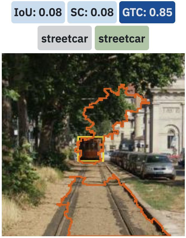
ages Vega-Lite’s high-level design as marks and visual encod-
ings are inferred from the data types of data frame columns,
and interactive selections are added by analyzing data frame
lineage (e.g., a cross filtering interaction between two visualiza-
tions whose data frames share a common ancestor). The resul-
tant visualizations are displayed in a sidebar dashboard, rather
than interleaved with code in the notebook, to facilitate richer
multi-view coordination. And, to ensure that analysts can act on
and reproduce the results of interactive analysis, B2 reifies in-
teractions as data frames, and maintains an interaction log in a B2 bridges computational notebooks and interactive dashboards by using
Vega-Lite s interactive selection as a shared representation.
code cell. Here, too, Vega-Lite plays an important role: by mod-
eling interaction techniques as selections, or declarative data queries, interactions can be reified and logged in se-
mantically meaningful ways (i.e., by referencing data fields and values rather than low-level events and properties).
This thread of work points a way forward for intelligence augmentation: layered, declarative domain-specific ab-
stractions can provide a shared representation for people and machines to collaborate around. Declarative do-
main-specific models allow both sides of intelligence augmentation to reason about tasks in more semantically
meaningful ways — for example, allowing users to focus on visualization design concerns rather than implemen-
tation details, while allowing systems to reason about data types and provenance to optimize processing. Critically,
layering these models helps diffuse the classic tension between ease-of-use and expressivity: both people and sys-
tems can choose a level of abstraction suited for the task at hand and, as Lyra 2 demonstrates, fluidly move be-
tween them as needs change. In ongoing work, my group is unpacking the implications of these insights by explor-
ing wider portions of the visualization design space (e.g., for distributed data and asynchronous events under re-
view at VIS 2022 [19], and unifying models of animation and interaction in preparation for EuroVis 2022) as well as
generalizing our approach to interactive web applications (a first submission is planned for ACM CHI 2022).
UNCOVERING NOVEL ABSTRACTIONS VIA MACHINE LEARNING INTERPRETABILITY
While promising, the models above have required several PhDs worth of effort to craft for just a single domain —
an approach that will not scale for widespread adoption of intelligence augmentation in a diverse range of do-
mains. Thus, in parallel, my group is turning to neural-based machine learning (ML) models. While these models
are demonstrating astonishing capabilities by learning patterns from large-scale datasets, deploying them is
fraught with risk because it is difficult to determine what these patterns are, audit them in cases of model failure,
or ensure they align with values of fairness and equity. Accordingly, my group investigates how visualization can
be used to inspect the representations ML models learn, enabling users to build trust in or even learn from them.
By default, learned representations are expressed too abstractly to map onto domain semantics — in computer
vision, for example, models represent images as high-dimensional data cubes, where each cell is an activation or the
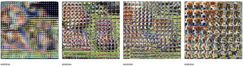
amount a neuron fires due to the input. My collaborators and I have shown [11] how an optimization process, that
perturbs an image of random noise in order to maximally activate the representation, can transform the data cube
into a semantic dictionary: instead of abstract indices, activations
ACTIVATIONS AS A VECTOR
now map to to visual icons that surface human-salient concepts a = [0, 0, 0, 25.2, 164.1, 0, 42.7, 4.51, 115.0, 51.3, 0, 0, ...]
4,1
(e.g., “floppy” and “pointy” ears as shown in the figure). This ACTIVATIONS AS A SEMANTIC DICTIONARY
dual expression — activations as mathematical or visual con-
structs — affords a rich, compositional design space. For in-
stance, we can jointly optimize the entries of the semantic dic- VISUALIZING THE ACTIVATION VECTOR VIA THE SEMANTIC DICTIONARY
tionary to depict the activation vector, repeat the process across
the image to yield an “activation grid” and combine this grid = + + + + ...
with feature attribution techniques to reveal which learned rep- ACTIVATION GRIDS OF HIDDEN LAYERS DEPICT EVOLVING LEARNED REPRESENTATIONS
resentations are most responsible for the model’s output. Our
exploration suggests opportunities to formalize this design
space, akin to user interface toolkits and grammars of graphics,
such that users can assemble their own, custom interfaces to
interpret their ML models rather than relying on monolithic EDGES AT LAYER MIXED3A GEOMETRIES AT MIXED4A PARTS OF OBJECTS AT MIXED4D COMPOSED PARTS AT MIXED5A
Through interface sketches, we explore the a fordances of treating ma-
chine learned concepts as both mathematical and interface constructs.
’
f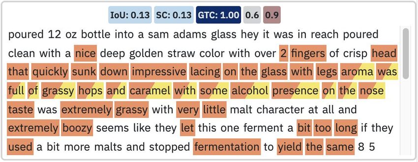
tools. However, there are also limitations with our approach: arguably, the semantic mapping is occurring largely
because the domain (computer vision) is aligned with our perceptual system, rather than due to specific interface
design choices. And, as a result, these interfaces require substantial manual inspection — to turn up examples for
our perceptual system to attend to — which occurs in an ad hoc fashion and can yield cherry-picked results.

To address these concerns, my students and I are developing methods that are agnostic to input modality and
structure the process of interpretability so that the burden of mapping semantics does not fall entirely on the hu-
man. For example, the Embedding Comparator [1] calculates a similarity score to compare pairs of embedding
models (i.e., models that map high-dimensional discrete input to lower-dimensional continuous vector spaces).
This score computes the reciprocal local neighborhood of every embedded object (i.e., how many of an object’s nearest
neighbors are shared between the models or are unique to a model), and uses this score to organize and visually
encode interface elements (e.g., color-encoding projection plots and sorting local neighborhood visualizations).
Our user studies show that our score-based approach allows participants to more broadly and deeply explore em-
beddings, and thus have more confidence in their insights, as compared to their existing Jupyter-based workflows.

Similarly, with Shared InterestImageNet
                                     [2], [LIME]
                                           we have developed           a[Integrated
                                                     BeerAdvocate: Aroma  set ofGradients]
                                                                                    metrics to                            ImageNet [LIME]
                                                                                                                         ImageNet [LIME]
                                                                                                                                            BeerAdvocate: Aroma [Integrated Gradients]
                                                                                                                                            BeerAdvocate: Aroma [Integrated Gradients]                             Ima

measure the alignment between human-annotated ground truth and mod-
                                   HUMAN ALIGNED

                                                                                                         ALIGNED
el behavior (as determined by saliency, or scores for each input feature that

                                                                                                      CONFUSER

                                                                                                                                                                                             CONFUSER
                              a                                                                e
indicate its importance for the model’s output). These metrics, analogous a                                                                                                              e

                                                                                                   HUMAN
to precision and recall for model performance, help reveal eight recurring
patterns of model behavior across computer vision and natural language

                                                                                                                SUBSET

                                                                                                                                                                                             INSUFFICIENT SUBSET
                                   SUFFICIENT SUBSET

classification (four patterns are shown in the figure). Through case studies,

                                                                                                              SUBSET
                                                                                                   INSUFFICIENT
we demonstrate how these      b metrics can be composed together within a bf                                                                                                             f

                                                                                                   SUFFICIENT
visual analytics workflow to enable more systematic analysis of model be-
havior. For instance, a board-certified dermatologist used Shared Interest
to rapidly identify lesion types that the model was “obviously [doing] a pretty
                                   SUFFICIENT CONTEXT

                                                                                                              CONTEXT
                                                                                                        DISTRACTOR
good job [with]” but that they  “would discard the model” for lesions that exhib- g

                                                                                                                                                                                             DISTRACTOR
                              c                                                                c   SUFFICIENT
                                                                                                                                                                                         g
ited a “scalloped border.” Perhaps most interestingly, Shared Interest
helped the dermatologist find cases where the model relied on both the
lesion and surrounding skin to make a prediction, causing them to wonder
                                   CONTEXT DEPENDANT

                                                                                                            CONFUSION

if “[the model] is seeing something we’re not truly appreciating in the clinical im-
                                                                                                    CONTEXTDEPENDANT

                                                                                                                                                                                             CONTEXT CONFUSION
age […] Maybe there’s really subtle
                              d     changes we’re not picking up that it is able to.” dh                                                                                                 h
                                                                                                   CONTEXT

Although these first two research threads have been unfolding indepen-
dently, I am building towards a future where machine-learned representa- 4 (out of 8) recurring model behavior patterns across two
                                                                                 modalities (vision and text) identi ed via Shared Interest
tions help bootstrap the design of expert-crafted symbolic representa- (model saliencies in orange, human annotations in yellow).
tions. To do so, however, we not only need to discover what the learned
representations are (i.e., the focus of my current work) but also what their functional role in the decision space is.
Thus, my group’s ongoing work broadens our focus on interpretability along two axes. First, we are moving be-
yond purely exploratory interfaces and towards more collaborative ones, where a person manipulates learned repre-
sentations to build intuition for how they operate. Here, our initial results seem promising — by perturbing model
inputs in semantically-meaningful ways, we found that 14 physicians were able to identify (mis)alignments be-
tween model behavior and clinical concepts [17]. Along the second axis, we look to shift interpretability to earlier
phases of the ML pipeline (i.e., from “post hoc” interpretability to interpretability during model training). In doing
so, how might we not only observe learned representations emerge and evolve over training epochs, but also inter-
vene and steer the model’s learning in more granular ways than active learning approaches have considered so far?

WHO ARE THESE REPRESENTATIONS DESIGNED FOR?
The third strand of my research examines the sociotechnical implications of my technical work. In collaboration
with two other teams of researchers, my group and I critically reflected [12] on our work on visualization tooling to
surface assumptions we had implicitly made about our target end-users. In particular, intelligence augmentation
research is often wrapped in the language of “democratization” (i.e., making expert workflows available to the
broader public). But, in doing so, we realized that we were losing important nuance when thinking about data lit-
eracy and expertise. For example, although our tools focus on enabling visualization design without programming,
           fi
they require data to be structured in specific ways which, in turn, requires users to engage in non-trivial computa-
tional thinking. This simplistic conceptualization of expertise recurs in the context of ML interpretability as well,
as end-users are often bucketed into three categories: ML experts, domain experts, or “non-experts.” To bring
more nuance to characterizing stakeholders, my group drew on the literatures in pedagogy, critical theory, and
participatory design to contribute a more granular treatment of user expertise and needs [16]. We decompose
expertise into types of knowledge (formal, instrumental, personal) and the contexts they may manifest in (ML,
data domain, and the general milieu) to yield a generative framework to inform future interpretability research. For
instance, our framework helps identify opportunities to leverage instrumental knowledge to up-skill workers in
new domains via ML, as well as the ways in which people with personal knowledge in the milieu (seeming “non-
experts” under prior approaches) can contribute rich “on-the-ground” information to help debug model failures.

My group’s study on COVID-19 visualizations [6] has further highlighted the pressing need for researchers to treat
data literacy and expertise with nuance. By analyzing 41,000 visualizations discussed across 500,000 tweets, and
through a 6-month digital ethnography of coronavirus Facebook groups, we discovered how COVID-19 skeptics
have been marshaling data science and visualization to argue against public health guidance (e.g., mask mandates
and lockdowns). Contrary to the temptation to describe this phenomenon as “anti-science,” we found that Face-
book group members engaged in meticulous data-driven discourse and citizen science — encouraging one-anoth-
er to “follow the data”, critically assessing data sources and representations in the style of academic peer review,
and conducting livestream tutorials for downloading and wrangling public health data. Moreover, the “counter
visualizations” these groups produce do not fit easy “chart junk” caricatures but are often so highly polished as to
be right at home in scientific and journalistic publications or health department records. Our findings expose ur-
gent tensions in research on data visualization and intelligence augmentation (including my own). Binary catego-
rizations of literacy/illiteracy (or expert/non-expert) do not capture these groups’ skillful manipulation of data and,
arguably, our use of “democratization” hinders us from grappling with how intelligence augmentation may be con-
tributing to the problem — how might our work, by making expert practices broadly accessible, be facilitating a
devaluing of expertise? Ever-more “expressive” tools or even error checkers [5] are unlikely to ameliorate matters
significantly until they shift towards considering knowledge as “multiple, subjective, and socially constructed” [10].

Finally, my research has also begun to work with blind and low-vision people — a population that has been under-
served, at best, by data visualization. After my students engaged in a collaboration with The Perkins School for The
Blind, we distilled a series of sociotechnical considerations for accessible visualization [8] including being atten-
tive to how research novelty may be in tension with the often “low tech” interventions that a disabled population
might most benefit from, and ensuring that research participants with disabilities are compensated to reflect their
specialized skills (e.g., with reading braille or using a screen reader). To operationalize these considerations, we are
exploring alternate modalities for representing data. Although we have investigated haptics [4], we have found
natural language to be especially promising [9] — we collected and analyzed 2,000 visualization captions to identi-
fy four level of semantic content. Evaluat- # Descriptor Semantic Content                             Example
ing the usefulness of sentences at every
level with 30 blind and 60 sighted individ-                         causal inferences, cultural rela- “The big drop in prices was caused by nancial
                                                   4 Contextual     tionships, current events         crisis of 2007 – 2008.”
uals reveals similarities and stark differ-
ences: while both groups generally prefer             Perceptual & complex trends/patterns, common “There was a gradual stair-shaped rise in the
                                                   3 Cognitive      concepts, “natural” articulation  interest rate between 2005 and 2006”
mid-level semantic content, they diverge
sharply at the lowest and highest levels.          2
                                                      Statistical & descriptive statistics, extrema,  “GOOG has the greatest price over time. MSFT
                                                               Comparative      outliers, correlations, etc.        has the lowest price over time.”
Our ongoing work builds on these in-
                                                    Elemental &       chart type, encoding channels,        “This is a multi-line chart that plots price (0 to
sights by improving support for screen           1 Encoded            title, axis ranges, labels, colors    800) by date (2000 to 2010).
readers in the Vega stack and investigat-
                                               A four-level model of semantic content for accessible visualization via natural language description [9].
ing neural methods for automatically gen-
erating level 3 captions. Like most assistive technology, I anticipate that successful outcomes here will yield bene-
fits that extend beyond people with disabilities (also known as the “curb cut effect”). In particular, I believe ad-
vances in accessible visualization will help us raise the level of abstraction of visualization research. For instance,
improving screen reader support is likely to impose pressures on grammars of graphics that may yield even high-
er-level task- or insight-oriented grammars. Similarly, were our ML model able to produce reasonable level 3 cap-
         fi
tions, it would suggest that the model had learned representations of the cognitive tasks sighted people perform
when reading visualizations. If so, we should be able to repurpose these representations for other tasks — for ex-
ample, recommending insightful visualizations rather than simply valid ones like current recommender systems.
Much like the “visual encoding” abstraction has enabled systematic study of what visualizations look like, I expect
accessible visualization research will yield abstractions that facilitate deeper study about what visualizations mean.

RESEARCH IMPACT
The visualization software my research has contributed is open source and widely used in the tech industry (e.g., at
Google, Apple, and Microsoft), in journalism (e.g., at the LA Times), by the Jupyter and Observable data science
communities, and has been deployed on Wikipedia. I have prioritized broad communication of my research re-
sults and thus have spoken to academic audiences outside my immediate communities (e.g., keynotes or invited
talks at an ACM SIGMOD workshop and the American Statistical Association’s SDSS conference) as well as at prac-
titioner venues (e.g., OpenVis Conf and the U.N. Data Viz Camp). My group also published an interactive article of
our COVID-19 study results; it has repeatedly gone viral on social media and has been read by almost 20,000 people
in 4 months. My work has been recognized through Best Paper awards and nominations, an NSF CAREER and
Google Research Scholar Award, and I have been named a Kavli Fellow by the National Academy of Science.

TEACHING STATEMENT
At MIT, I have contributed to teaching in severals ways. I have developed a new graduate course 6.859: Interactive
Data Visualization (previously numbered 6.894) that mixes traditional lectures with active learning techniques and
interactive studios to increase student engagement and improve performance. The class prioritizes grappling with
the ethical implications of visualization via an individual assignment, several readings, as well as a lecture session
comprising think-pair-share activities and small group discussions. It attracts students from a diverse range of
disciplines including computer science, architecture, design, urban studies and planning, and the Business School.
Enrollment has grown from 50 to 128 in its most recent (third) offering, and students in the class nominated me
for MIT’s Teaching with Digital Technology Award. Class materials were featured on the front page of Hacker News,
and are being used at Stanford University, the University of Washington, and the Université Paris-Saclay.

I also co-instruct 6.170: Software Studio, an undergraduate course on engineering interactive web applications, with
Prof. Daniel Jackson. I helped redesign the course to place greater emphasis on user-centric design methods and
analyzing the the ethical implications of software and user interface design. This broader focus has reinvigorated
enrollment, which had dropped to a low of 56 the year I began and has now rebounded to 98. Based on this work,
Prof. Jackson and I were invited to participate in the MIT College of Computing Dean’s Action Group on Active Learn-
ing Projects, and for my work across both classes, I received the department’s 2020 Kolokotrones Education Award.

Finally, my PhD students and I have mentored 18 undergraduate and Master’s students. These students have been
co-authors on our research publications, have helped to republish our COVID-19 study results via an interactive
article, and have contributed to our open source software projects including Vega-Lite and Lyra.

SERVICE STATEMENT
I have served my communities in various roles including by organizing the bi-weekly MIT CSAIL HCI Seminar,
serving on the program and organizing committees for academic and practitioner conferences (e.g., IEEE VIS,
ACM IUI, OpenVis Conf, and Information+), and as a co-editor for the Distill journal. The bulk of my service, how-
ever, has been devoted to broadening participation in computer science. In the MIT EECS department, I serve on
the Committee for Diversity, Equity, and Inclusion and the subcommittee interviewing inaugural Diversity Officer
candidates. Through MIT’s Summer Research Program, which provides research pathways for students from minori-
tized or underserved backgrounds, I am mentoring an undergraduate intern whose work is planned for an ACM
CHI 2022 submission. For my efforts, the department awarded me the 2021 Seth J. Teller Award for Excellence, Inclu-
sion and Diversity. Finally, for my academic community, I have twice served as the Diversity & Inclusion Co-Chair for
IEEE VIS, and helped grow our diversity scholarship program to reach students across Latin America including in
Brazil, Colombia, Mexico, Peru, and Puerto Rico. I now serve on the IEEE Ad Hoc Committee on Diversity & Inclusion,
tasked with making recommendations to promote diversity and inclusion across all IEEE conferences.
REFERENCES
1.    Angie Boggust, Brandon Carter, and Arvind Satyanarayan. Embedding Comparator: Visualizing Differences in Global
      Structure and Local Neighborhoods via Small Multiples. arXiv preprint arXiv:1912.04853 (2021).
2.    Angie Boggust, Benjamin Hoover, Arvind Satyanarayan, and Hendrik Strobelt. Shared Interest: Large-Scale Visual Analy-
      sis of Model Behavior by Measuring Human-AI Alignment. Under Review at the IEEE Visualization Conference (VIS), 2021.
3.    Douglas C. Engelbart. Augmenting Human Intellect: A Conceptual Framework. Menlo Park, CA (1962).
4.    Nava Haghighi, Nathalie Vladis, Yuanbo Liu, and Arvind Satyanarayan. The Effectiveness of Haptic Properties Under Cog-
      nitive Load: An Exploratory Study. arXiv preprint arXiv:2006.00372 (2020).
5.    Aspen K. Hopkins, Michael Correll, and Arvind Satyanarayan. VisuaLint: Sketchy In Situ Annotations of Chart Construc-
      tion Errors. Computer Graphics Forum, Vol. 39 (Proceedings of EuroVis 2020).
6.    Crystal Lee, Tanya Yang, Gabrielle D Inchoco, Graham M Jones, and Arvind Satyanarayan. Viral Visualizations: How Coro-
      navirus Skeptics Use Orthodox Data Practices to Promote Unorthodox Science Online. In Proceedings of the ACM Conference
      on Human Factors in Computing Systems (CHI), 2021. Best Paper Nominee.
7.    Joseph C. R. Licklider. Man-Computer Symbiosis. IRE Transactions on Human Factors in Electronics (1960).
8.    Alan Lundgard, Crystal Lee, and Arvind Satyanarayan. Sociotechnical Considerations for Accessible Visualization Design.
      In Proceedings of the IEEE Visualization Conference (VIS), 2019.
9.    Alan Lundgard and Arvind Satyanarayan. Accessible Visualization via Natural Language Description: A Four-Level Model
      of Semantic Content. Under Review at the IEEE Visualization Conference (VIS), 2021.
10. Miriah Meyer and Jason Dykes. Criteria for Rigor in Visualization Design Study. IEEE Transactions on Visualization and
    Computer Graphics (2020).
11.   Chris Olah, Arvind Satyanarayan, Ian Johnson, Shan Carter, Ludwig Schubert, Katherine Ye, and Alexander Mordvintsev.
      The Building Blocks of Interpretability. Distill (2018).
12. Arvind Satyanarayan, Bongshin Lee, Donghao Ren, Jeffrey Heer, John Stasko, John Thompson, Matthew Brehmer, and
    Zhicheng Liu. Critical Reflections on Visualization Authoring Systems. IEEE Transactions on Visualization and Computer
    Graphics (2020).
13. Arvind Satyanarayan, Dominik Moritz, Kanit Wongsuphasawat, and Jeffrey Heer. Vega-Lite: A Grammar of Interactive
    Graphics. IEEE Transactions on Visualization and Computer Graphics (2017). Best Paper Award.
14. Arvind Satyanarayan, Ryan Russell, Jane Hoffswell, and Jeffrey Heer. Reactive Vega: A Streaming Dataflow Architecture
    for Declarative Interactive Visualization. IEEE Transactions on Visualization and Computer Graphics (2016).
15. Arvind Satyanarayan, Kanit Wongsuphasawat, and Jeffrey Heer. Declarative Interaction Design for Data Visualization. In
    Proceedings of the ACM Symposium on User Interface Software and Technology, 2014.
16. Harini Suresh, Steven R. Gomez, Kevin K. Nam, and Arvind Satyanarayan. Beyond Expertise and Roles: A Framework to
    Characterize the Stakeholders of Interpretable Machine Learning and their Needs. In Proceedings of the ACM Conference on
    Human Factors in Computing Systems (CHI), 2021.
17. Harini Suresh, Kathleen M. Lewis, John V. Guttag, and Arvind Satyanarayan. Intuitively Assessing ML Model Reliability
    through Example-Based Explanations and Editing Model Inputs. Under Review at the IEEE Visualization Conference (VIS),
    2021.
18. Jacob VanderPlas, Brian E. Granger, Jeffrey Heer, Dominik Moritz, Kanit Wongsuphasawat, Arvind Satyanarayan, Eitan
    Lees, Ilia Timofeev, Ben Welsh, and Scott Sievert. Altair: Interactive Statistical Visualizations for Python. Journal of Open
    Source Software (2018).
19. Yifan Wu, Remco Chang, Joseph M. Hellerstein, Arvind Satyanarayan, and Eugene Wu. DIEL: Interactive Visualization
    Beyond the Here and Now. Under Review at the IEEE Visualization Conference (VIS), 2021.
20. Yifan Wu, Joseph M. Hellerstein, and Arvind Satyanarayan. B2: Bridging Code and Interactive Visualization in Computa-
    tional Notebooks. In Proceedings of the ACM Symposium on User Interface Software and Technology, 2020.
21. Jonathan Zong, Dhiraj Barnwal, Rupayan Neogy, and Arvind Satyanarayan. Lyra 2: Designing interactive visualizations by
    demonstration. IEEE Transactions on Visualization and Computer Graphics (2021).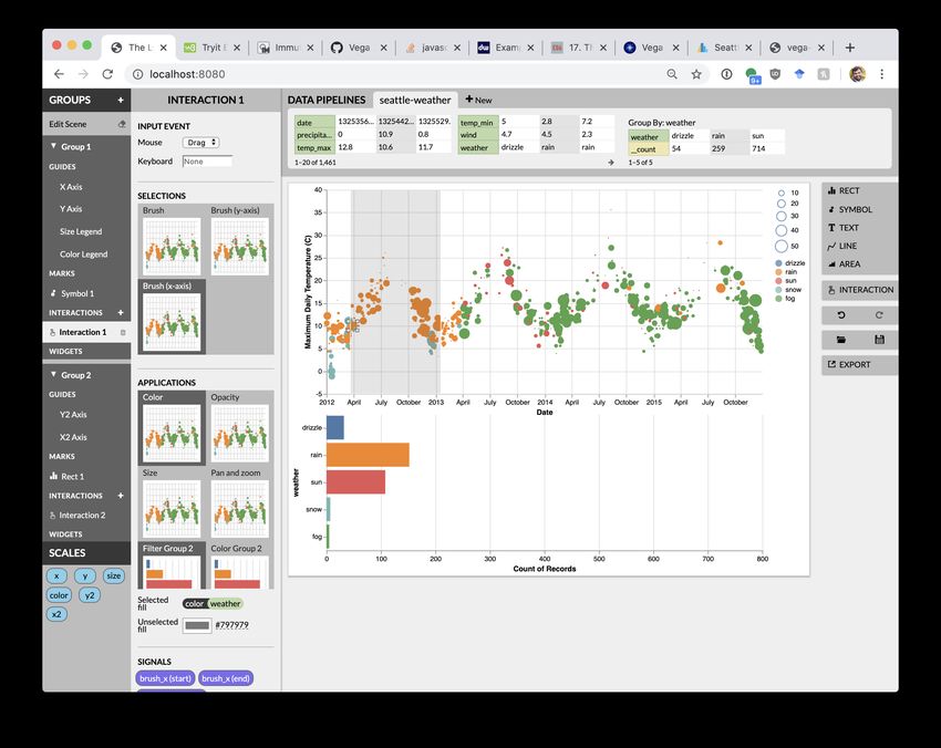
You can also read