How People use Presentation to Search for a Link: Expanding the Understanding of Accessibility on the Web
←
→
Page content transcription
If your browser does not render page correctly, please read the page content below
How People use Presentation to Search for a Link:
 Expanding the Understanding of Accessibility on the Web

                  Caroline Jay† , Robert Stevens† , Mashhuda Glencross† and Alan Chalmers‡
                                                          †
                                                              School of Computer Science
                                                               University of Manchester
                                                     ‡
                                                      Department of Computer Science
                                                           The University of Bristol
                                                    E-mail: caroline.jay@manchester.ac.uk

ABSTRACT                                                                  manner that replicates interaction with small screen devices. We
It is well known that many Web pages are difficult to use by both         ask two questions: firstly, what is it about audio screenreader pre-
visually disabled people and those who use small screen devices.          sentation of a Web page that really makes it difficult to use; sec-
In both cases there exists a problem of viewing a great deal of in-       ondly, what is it about the standard presentation that is missing and
formation with presentation capabilities reduced from the intended        needs to be replaced? The obvious and unattainable answer is that
formatted large-screen colour display. It is pertinent, however, to       the external memory provided by paper or a screen, together with
ask how the presentation of Web pages on a standard display makes         the speed and accurate control of information flow afforded by the
them easier for sighted people to use. To begin to answer this ques-      human visual system is required [17]. All assistive technology for
tion, we report on an exploratory eye-tracking study that investi-        visually disabled people attempts, in some way, to provide some
gates how sighted readers use the presentation of the BBC News            kind of replacements for these fundamental facilities.
Web page to search for a link. We compare the standard page pre-             The difficulties with access to Web content by visually disabled
sentation with a “text-only” version and observe both qualitatively       people is well documented [6, 5], however what is less well doc-
and quantitatively that the removal of the intended presentation al-      umented is the exact nature of the problems encountered by those
ters “reading” behaviours. The demonstration that the presenta-           users. Profoundly Visually disabled people usually use a screen-
tion of information assists task completion suggests that it should       reader1 (such as Jaws [1, 8]), which speaks screen content under
be re-introduced to non-visual presentations if the Web is to be-         the direction of the user, in order to “read” what is on the screen.
come more accessible. Finally, we propose that models derived             When a Web page is loaded into a browser, by default the page
from studies that reveal how presentation is used to aid task com-        contents are typically spoken from top-left to bottom-right. Natu-
pletion can form the basis for annotation and transcoding of Web          rally, such a spoken presentation is difficult to use—memory cannot
pages to present pages in a more usable non-visual form.                  handle such quantity and review is not really possible. Of course,
                                                                          the screenreader allows finer control over what is spoken than this
                                                                          cumbersome mechanism. A user can move around a page using
Categories and Subject Descriptors                                        cursor keys. This allows movement at the level of lines, characters,
K.4.2 [Computers and Society]: Social IssuesAssistive Technolo-           words, paragraphs, etc. It would seem that all parts of a page can
gies for Persons with Disabilities; H.1.2 [Information Systems]:          be accessed; so, what is the problem?
User/Machine SystemsSoftware Psychology; H.5.2 [Information                  The screenreader access described above is slow and cumber-
Interfaces and Presentation]: User InterfacesEvaluation/methodology; some, but still presented as difficult. What makes such access dif-
H.5.2 [Information Interfaces and Presentation]: User InterfacesS-        ficult? Much effort in Web accessibility has focused on access to
creen Design; I.7.5 [Document and Text Processing]: Document              content. This includes access to graphics; tables; figures; etc. Much
CaptureDocument Analysis                                                  has been achieved, but access to Web pages continues to be a prob-
                                                                          lem; why is this?
                                                                             In a text-only presentation (such as that shown in Figure 1), the
1. INTRODUCTION                                                           majority of the formatting and layout is removed [19]. The user is
   In this paper we explore the problems encountered by people            given what amounts to a traditional linear document, but with lit-
with profound visual disabilities when browsing Web pages in a            tle differentiation between text serving different purposes, such as
                                                                          headings, plain text and emphasised text that usually supports the
                                                                          processing of the printed information [20]. Through eye-tracking
                                                                          studies, we have examined how readers use a Web page’s presen-
Permission to make digital or hard copies of all or part of this work for tation to accomplish their task. We have compared this with how
personal or classroom use is granted without fee provided that copies are the presentation of the text-only version of the same page is used
not made or distributed for profit or commercial advantage and that copies
bear this notice and the full citation on the first page. To copy otherwise, to      1
republish, to post on servers or to redistribute to lists, requires prior specific     In this article we restrict ourselves to those users who are pro-
permission and/or a fee.                                                             foundly visually disabled. Assistive technology for users with im-
W4A at WWW2006 23-26 May 2006, Edinburgh, UK                                         paired vision cover a broad range of tools including magnification,
Copyright 2006 ACM 1-59593-281-x/06/05 ...$5.00.                                     colour or contrast enhancement, etc.
to accomplish the same task. The latter simulates, to an extent,both to increase accessibility, there seem to be “difficulties”. Takagi
the presentation on small screen and the experience of a visually et al. [18] classified the problems into three categories:
disabled person using a Web page through reduced visual effects
and reduced information content on the screen. 1. Adherence to guidelines, not usability issues;
The presentation of a page generally facilitates a sighted user in
2. Over-reliance on syntactic checking of Web pages;
achieving their goal, be it searching, browsing, following links etc.
It is well known from the principles of graphic design and informa- 3. No attention on the time component in the operations pro-
tion presentation that how content is laid out can influence how a vided to aid access.
task is performed and what interpretation is made of data [20]. If
we are to support visually disabled and small-screen users to use These observations usefully describe some of the sources of prob-
Web pages it is important to characterise the situation beyond “dif- lems encountered by visually disabled users without really describ-
ficult”. We would like to have insight into how Web presentation ing the nature of those problems.
is used by sighted users. It is not the presentational qualities them- The problem is summed up by Hanson [7], who says, “specifi-
selves that need to be re-introduced, but what users do with those cations for accessibility of Web pages do not necessarily guarantee
formatting and layout features. We attempt to do this by examin- a usable or satisfying Web experience for persons with disabilities.
ing eye-tracking data during the exercise of basic Web based tasks It is not uncommon to have pages that meet standards but are still
on standard and text-only versions of a page—which features are difficult to use by persons who have difficulties.”
looked at and for how long in each presentational style? Harper et al. [3] and Yesilada et al. [22] have used the metaphor
Once we know the difficulties a lack of presentation causes, it of travel to raise the notion of using a Web page above that of deal-
will be easier to know what to replace or re-introduce into audio ing with mere ‘sensory translation’. Just as people use travel ob-
presentations. Our eye-tracking studies have produced a vast quan- jects in the environment (signs, landmarks and other cues) to help
tity of data, of which we examine only a portion here. From these them orientate and navigate, so a Web user can use travel objects
studies, we can see how a human uses the page’s presentation dur- on a Web page to aid mobility—the ease of travel in a Web page.
ing navigation and orientation. From our observations of how read- The layout and presentation of a Web page provides these travel
ers use presentational information to orientate and navigate in or- objects. A well designed page eases travel and a badly designed
der to accomplish tasks, we propose that eye-tracking studies can page hinders travel and decreases mobility. A text-only page will
be used to provide models of page usage that can be applied to dif- tend to lack more of these travel objects and thus the reader is again
ferent styles of presentation in order to transcode those pages. It is hindered in their task.
known that such transformations can, to some extent, replace some Screen readers, unlike sighted users, cannot see the implicit struc-
of the facilities of a standard Web page presentation [2]. Our inves- tural and mobility knowledge encoded within the visual presenta-
tigations should provide a basis for driving such transformations. tion of Web pages [21]. “It is impossible for blind users to distin-
In Section 2 we describe the context in which this work has been guish visually fragmented groupings only from the sequence of tags
performed. We then describe our experiment: its design, proce- read to them [2]. ” So, we begin to see that basic sensory transla-
dure and equipment (see Section 3). Our results are presented in tion of what is encoded within HTML still lacks what is necessary
Section 4. A discussion of the results is given in Section 5. to support usable access to the Web. We can identify the Web cor-
relates of what in printed material enables and supports effective
2. RELATED WORK information processing [20], as something lacking in current non-
visual renderings of Web based material.
Profoundly visually impaired users usually access the Web us-
We have used eye-tracking in this study because we wish to find
ing screen readers [8] or specialised browsers [1]. There are many
out how sighted users exploit the visual presentation of a Web page.
sources that state the difficulty that such users have using the Web
Once we have an insight into what it is that visually disabled people
via tools such as screenreaders. The Disability Rights Commission
can no longer do without this information then it is possible to be-
(DRC) report of 2004 [6] concludes that most UK Web sites (81%)
gin to plan to replace those facilities. Whilst eye tracking has been
fail to satisfy even basic accessibility requirements. A similar situ-
used to investigate cognitive processes for over 100 years [14],
ation exists in the USA [5]. Coyne and Nielsen [5] concluded that
monitoring people’s gaze during Web use is a relatively new disci-
“the Web is about three times more difficult to use for people who
pline. Recording the pattern of fixations on a Web page is a power-
are visually impaired than it is for sighted users”. The question still
ful tool, enabling us to determine those areas that are most salient
remains, however, as to exactly what makes it so difficult.
(attract the most fixations), and those that receive little attention.
One part of the answer is in simply extracting information en-
Its most obvious applications are in improving the standard de-
coded within the HTML of a Web page. Thatcher et al. [19] give
sign and layout of Web pages, and evaluating their usability [16].
practical advice on constructing accessible Web sites by elucidat-
Studies have also examined the saliency of items on a page under
ing guidelines [4] and using HTML to best advantage. Text-only
varying conditions (e.g., [9, 12, 10]), how eye movements vary ac-
alternatives to standardly formatted Web pages are offered as “ac-
cording to information scent [13] and how looking for a menu is
cessible” options. However, [19, Chapter 1] states “the issue of
influenced by page complexity and prior expectations [11]. To our
text only versions crosses into the idea of separate versus inclusive
knowledge, no one has investigated how gaze patterns differ when
design”. Why should visually disabled people use different pages
searching on either the standard or text-only versions of the same
to sighted users? As well as problems of maintenance etc., there
page. Here, we do just that, by tracking participants’ eye move-
is a resistance to the development of Ghettos. [15] observe that,
ments as they search for specific links on the standard and text-only
“designers look at sites that are meant to serve as models of ac-
versions of the BBC News Web site.
cessibility and are appalled by the aesthetics. For most designers,
accessibility equates with boring, uninteresting designs. The state
of accessibility on the Web today represents a failure of the imagi- 3. METHODOLOGY
nation”. Eye-trackers provide an effective means of recording where a
Even when pages are built according to guidelines that are meant user’s gaze falls on a particular part of a computer screen, and hence(a) Standard formatted BBC Webpage (b) Text-only version of BBC Web page Figure 1: The BBC Web page used in this study. 1(a) is the standard formatted versions and 1(b) is the text-only version of the same page. Cached versions can be found at http://aig.cs.man.ac.uk/people/jayc/bbc_study.htm. a good indication of the location of his or her attention. The num- ber of fixations an area receives indicates the amount of attention it attracts; the average duration of these fixations corresponds to its complexity (more complex stimuli require longer fixations to pro- cess) [14]. In the current study, participants’ eye movements were tracked while they were searching for a link on either the standard or text- only versions of the BBC News Website (see Figure 1).2 The time to locate the link provided a measurement of task difficulty. The number of fixations indicated the amount of attention required to find the link, and the average duration of fixations indicated the relative complexity of the information presented on each page. 3.1 Equipment The equipment used for the study is displayed in Figure 2. The experiment was run on a SONY VAIO VGN-FS315S laptop. Stim- uli were displayed on a SONY VAIO SDM-HS75P monitor and a Tobii x50 Eye Tracker, positioned at the base of the monitor, tracked the participant’s gaze. The Tobii ClearView Analysis soft- ware was used to record and analyse eye-movement and event data. 3.2 Design The study used a between-subjects design in which participants searched for links on the BBC News Manchester Web page (see Figure 1). This site was chosen as it is widely known in the UK, but the actual content on any one day will change. BBC pages are also automatically provided with a text-only page. Sighted users, de- spite having the facilities of the visual system outlined in Section 1, will experience much of the effect of an audio screenreader render- ing through experiencing a text-only version. The text-only version Figure 2: The equipment used will also reflect the effects of a small-screen rendering, irrespec- tive of the BBC’s provision of a version for small-screen devices. This mimicry arises from the text-only version having little of the visual formatting of the standard presentation and the consequent reduction of information content. Of course, the correspondence 2 http://aig.cs.man.ac.uk/people/jayc/bbc_ study.htm
between sighted users reading a text-only page and the reality of
profoundly visualy disabled people’s use of an audio screenreader
is only partial at best. It does, however, provide some flavour of the
interaction.
   Half of the participants searched for a link to the BBC Manch-
ester Website on the standard version of the page, and a link to a
story about the Chinese community on the text-only version of the
page; the other half searched for the link to the BBC Manchester
Website on the text-only page, and the link to the story about the
Chinese community on the standard page. The links were chosen
because they were next to each other on the page, and positioned
on the right in the standard version and approximately two-thirds
of the way down in the text-only version, so participants would not
see them immediately on entering the page. The presentation or-
der of the two site versions alternated between users. At the end
of the experiment, users were asked to indicate whether they used
the BBC website more than once a week, and whether they found
it easier to perform the search on the standard or text-only version
of the page.

3.3     Participants and Procedure                                                                   (a) China Search
   Eighteen participants between the ages of 17 and 50 with normal
or corrected vision took part. The study was carried out as part of
visit days by prospective students to the School of Computer Sci-
ence.3 Both prospective students and their parents were asked to
volunteer to take part in the study. The procedure was explained
and the study performed, which took about five minutes. Partici-
pants were shown the recording of their eye-movements after the
experiment.
   Each participant sat 50 cm from the monitor and went through
the calibration process. The participant was told to look for either
the BBC Manchester or Chinese community link. The participant
entered the appropriate version of the page and started searching,
indicating that he or she had located the link by hovering over it
with the mouse. The participant then searched for the other link on
the alternative version of the page.

4.     RESULTS
   The eye tracker recorded the position of the participant’s gaze on
the Web page throughout the experiment. We used the ClearView
analysis software to calculate the number of fixations that occurred
(a fixation is where the eyes rest on part of the stimulus for more                               (b) Manchester Search
than 100 msec, in order to process information), their position, their
order, and their average duration. Figures 3 and 4 show the areas of
the page that received the most fixations in the standard and text-        Figure 3: Hotspot analysis of standard presentation of the BBC
only versions of the page respectively (red = 9 or more fixations,         Manchester Web page.
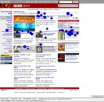
green = 4 or more, grey = 0). Participants tended to fixate on the
salient areas when searching the standard page: headlines, some
images, and prominent words in the text. The areas with the most
fixations also appeared to vary according to the link participants         tempt to locate what appears visually to be the next most likely
were searching for - when looking for the Manchester link, they            location for the link. The gaze plots in Figure 5 illustrate this pro-
looked more at the menus, as this may seem a logical place from            cess for participants searching for each link on the standard page
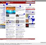
which to navigate to a BBC regional Website. On the text-only              and those in Figure 6 show the same two participants searching for
page, participants fixated in a uniform manner on nearly all of the        the other link on the text-only page. When looking at the stan-
text on the left-hand side of the page, indicating that it was allocated   dard page, participants will make large saccades to move from one
equal importance as they read down from the top until they found           salient area to the next; on the text page however, saccades are
the link.                                                                  much smaller, as the participants read through the text from top to
   Qualitative analysis of the gaze replay and fixation order data         bottom.
confirms that participants simply read down the page in a serial              A two-way ANOVA (page × link) showed that participants made
fashion when looking for the link on the text-only page. On the            significantly more fixations on the text-only site, regardless of the
standard page, however, participants’ eyes dart around as they at-         link they were searching for, than they did for the standard site
                                                                           (F1,32 = 2.183, p
(a) Gazeplot for Manchester link
(a) China Search (b) Manchester Search
Figure 4: Hotspot analysis of text-only presentation of the BBC
Manchester Web page.
(b) Gazeplot for China link
ure 7). The duration of a fixation, however, lasted significantly Figure 5: Gazeplots for participants searching for the Manch-
longer on the standard page (F1,32 = 0.208, pFigure 8: Number of participants who found it easier to locate
the link on the standard and text-only pages.
Figure 9: Mean duration of a fixation on each type of page.
(a) Gazeplot for (b) Gazeplot for China
Manchester link link
Figure 6: Gaze plots for participants searching for the Manch-
ester and China links on the textual BBC Manchester Web
page.
Figure 10: Mean time in seconds to locate the link.
An Audio rendering lacks the very facilities that make the vi-
sual system the predominant human information gathering system,
that is, the ability to control information flow from the outside with
speed and accuracy, because there is an external memory holding
the information [17]. In the case of Web pages, there is the addi-
tional factor of even being able to access what is being presented—
the focus of much of the work reviewed in Section 2. Current audio
renderings lack the formatting and presentation available in the vi-
sual mode: Spacing; typefaces; font-size; colour; etc. Non-speech
and audio cues can potentially add some of this information, but
this has not so far been greatly exploited in the rendering of Web
Figure 7: Mean number of fixations on each type of page.
pages.
In this exploratory experiment we have attempted to further char-
acterise the problem of Web accessibility. In this study qualita-
5. DISCUSSION tively we see a stark difference in eye-movement behaviour in thetwo conditions. In the standard, formatted presentation (preferred [5] K. P. Coyne and J. Nielsen. Beyond ALT text making the
by the majority of participants), saccades are greater and fixations web easy to use for users with disabilities. Nielson Norman
longer. The link menu is being used, along with the distinct pre- Group, 2001.
sentational fragmentation of the page into areas. In contrast, the [6] Disability Rights Commission. The web access and inclusion
text-only page provoked eye-movements more akin to those seen for disabled people. Technical report, Disability Rights
in reading of ordinary printed text. The page is being “read”, rather Commission (DRC), UK, 2004.
than being used to navigate towards the link goal. The speculation [7] V.L. Hanson. The user experience designs and adaptations.
is that a sighted user can use the formatting of the page to achieve In S. Harper, Y. Yesilada, and C. Goble, editors, Proceedings
the task and that the longer gaze duration is a consequence of de- of the international cross-disciplinary workshop on Web
cision making on orientation and navigation. The text-only page is accessibility, pages 1–11, 2004.
in effect similar to that which a blind user encounters in an audio [8] Henter-Joyce, Inc. Jaws.
presentation. The eye-movements seen in this condition are simi- [9] T. Joachims L. Granka and G. Gay. Eye-tracking analysis of
lar to those seen in cursor movements during reading. The lack of user behaviour in www search. In SIGR’04, pages 478–479,
opportunity to “dart” around the page to orientate and navigate are Sheffield, UK, 2004. ACM Press.
removed.
[10] A. Tholke M. Schiessl, S. Duda and R. Fischer. Eye tracking
Text-only versions of Web pages have been advocated as options
and its application in usability and media research. In
for presentation on small-screen devices. The observations of this
MMI-Interactiv ’03, pages 41–50, 2003.
investigatory study would suggest that this is not sufficient for a us-
able interaction with a page on a mobile device. Similarly, for vi- [11] J. McCarthy, A. Sasse, and J. Riegelsberger. Could i have a
sually disabled users, a text-only version of a Web page does make menu please? an eye tracking study of design conventions. In
the information available, but using that information is seen to be Proceedings of HCI2003, pages 401–414, 2003.
difficult without the facilities that a formatted presentation affords [12] B. Pan, H. A. Hembrooke, G. K. Gay, L. A. Granka, M. K.
a sighted Web user. Feusner, and J. K. Newman. The determinants of web page
So the question is how to replace the facilities afforded by pre- viewing behavior: An eye-tracking study. In Eye Tracking
sentation to both visually disabled users and those sighted people Research & Applications Symposium on Eye-Tracking
who use small screen devices? Layout provides borders for por- Research & Applications, pages 147–154, San Antonio,
tions of information. Ideally, the objects on a page guide a reader Texas, 2004. ACM Press.
through the information such that he or she can accomplish their [13] P. L. Pirolli, S. K. Card, and M. Van Der Wege. Visual
task [20]. This is the basis of the use of the travel metaphor [3] information foraging in a focus+context visualization. In
in increasing Web accessibility. Here, the travel objects that facili- Proceedings of ACM Conference on Human Factors and
tate movement through a Web page are identified and semantically Computing Systems (CHI 2001), pages 506–513, Seattle,
marked up [22]. This markup is then used to help transcode a page 2001. ACM Press.
into either an order that facilitates use or a fragmentation that facil- [14] K. Rayner. Eye movements in reading and information
itates use. processing: 20 years of research. In Psychological Bulletin,
Eye-tracking studies have confirmed our hypothesis about the pages 372–422, 1998.
utility of a standard and a text-only presentation. One way of bring- [15] B. Regan. Accessibility and design a failure of the
ing this information back into a presentation is via transcoding. imagination. In S. Harper, Y. Yesilada, and C. Goble, editors,
Does this eye-tracking data provide any mechanism by which transcod- Proceedings of the international cross-disciplinary workshop
ing can be driven? Obviously, markup and transcoding cannot oc- on Web accessibility, pages 29–37, 2004.
cur by hand alone. Our aim is to see whether we can create models [16] M. Russell. Using eye-tracking data to understand first
of how presentation is used for navigation and orientation about a impressions of a website. In Usability News 7.2, 2005.
page such that we can look at a page’s presentation and infer how [17] R. D. Stevens, A. D. N. Edwards, and P. A. Harling. Access
the presentation will be used. Such models will be able to drive to mathematics for visually disabled students through
the transcoding of a page and begin to re-introduce into an audio multi-modal interaction. Human-Computer Interaction
rendering the same support for tasks that a sighted user has in pre- (Special issue on Multimodal Interfaces), pages 47–92, 1997.
sentational cues for task completion. [18] H. Takagi, C. Asakawa, K. Fukuda, and J. Maeda.
Acknowledgements: Caroline Jay is funded by EPSRC grant Accessibility designer visualizing usability for the blind.
EP/D036518/1. ASSETS’04, pages 177–184, 2004.
[19] J. Thatcher, P. Bohman, M. Burks, S.L. Henry, B. Regan,
6. REFERENCES S. Swierenga, M.D. Urban, and C.D. Waddell. Constructing
Accessible Web Sites. Glasshaus, 2002.
[1] C. Asakawa and T. Itoh. User interface of a home page [20] P. Wright. The psychology of layout: Consequences of the
reader. In ASSETS’98, pages 149–156. ACM Press, 1998. visual structure of documents. In R. Power and D. Scott,
[2] C. Asakawa and H. Takagi. Annotation-based transcoding editors, American Association for Artificial Intelligence
for nonvisual web access. In ASSETS’00, pages 172–179. Technical Report FS-99-04, pages 1–9. AAAI Press, 1999.
ACM Press, 2000. [21] Y. Yesilada, S. Harper, C. Goble, and R. Stevens. Screen
[3] Goble C.A., S. Harper, and R.D. Stevens. The Travails of readers cannot see (ontology based semantic annotation for
Visually Impaired Web Travellers. In ACM 2000 Hypertext visually impaired web travellers). In N. Koch, P. Fraternali,
(Proceedings of the Eleventh ACM Conference on Hypertext and M. Wirsing, editors, Web Engineering - 4th International
and Hypermedia), pages 1–10. ACM Press, 2000. Conference, ICWE 2004 Proceedings (LNCS 3140), pages
[4] W. Chisholm, G. Vanderheiden, and I. Jacobs. Web content 445–458. Springer, 2004.
accessibility guidelines 1.0. World Wide W eb Consortium [22] Yeliz Yesilada, Robert Stevens, and Carole Goble. A
(W3C), 1999.foundation for tool based mobility support for visually impaired web users. In Proceedings of the Twelfth International World Wide Web Conference, 2003.
You can also read


