BRAND GUIDELINES 2021 - TEOLA Design
←
→
Page content transcription
If your browser does not render page correctly, please read the page content below
BRAND GUIDELINES 2021
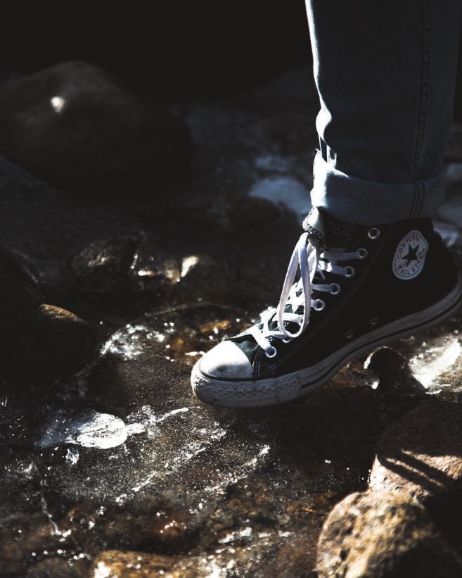
TABLE OF CONTENTS
                                                                                        Contents
    Table of Contents . . . . . . . . . . . . . . . . . . . . . . . . . . . . . . . . . . . . . 3
    Introduction . . . . . . . . . . . . . . . . . . . . . . . . . . . . . . . . . . . . . . . . . . 4
    Company History . . . . . . . . . . . . . . . . . . . . . . . . . . . . . . . . . . . . . . 4
    Brand Personality  . . . . . . . . . . . . . . . . . . . . . . . . . . . . . . . . . . . . . 5
    Brand Identity  . . . . . . . . . . . . . . . . . . . . . . . . . . . . . . . . . . . . . . . . 5
    Company Timeline . . . . . . . . . . . . . . . . . . . . . . . . . . . . . . . . . . . . . 6
    Logo Evolution . . . . . . . . . . . . . . . . . . . . . . . . . . . . . . . . . . . . . . . . 8
    Logo Usage . . . . . . . . . . . . . . . . . . . . . . . . . . . . . . . . . . . . . . . . . 10
    Typography . . . . . . . . . . . . . . . . . . . . . . . . . . . . . . . . . . . . . . . . . 12
    Colour Palette . . . . . . . . . . . . . . . . . . . . . . . . . . . . . . . . . . . . . . . 13
    Imagery . . . . . . . . . . . . . . . . . . . . . . . . . . . . . . . . . . . . . . . . . . . . 14
    Products  . . . . . . . . . . . . . . . . . . . . . . . . . . . . . . . . . . . . . . . . . . . 16
    Target Market / Audience . . . . . . . . . . . . . . . . . . . . . . . . . . . . . . . 17
    Brand Position . . . . . . . . . . . . . . . . . . . . . . . . . . . . . . . . . . . . . . . 18
    Brand Competitors . . . . . . . . . . . . . . . . . . . . . . . . . . . . . . . . . . . 19

2                                                                                                        3
INTRODUCTION                                                                   BRAND PERSONALITY
    The Converse brand guidelines acts as a key document that helps content        All of Converse’s visual devices create the image that the wearer’s
    creators communicate a consistent message for the Converse brand. It           personal style is what matters most and it appeals to a younger, more
    is therefore a great asset for creating consistent, on-brand content and       active crowd. Their unique style of advertising is by presenting a lifestyle
    communicates the company’s design standards to everyone.                       that many consumers can identify with, which allows them to sell their
                                                                                   products to a larger audience.

    COMPANY HISTORY
                                                                                   BRAND IDENTITY
    Converse is an American shoe company that designs, distributes, and
    licenses sneakers, skating shoes, lifestyle brand footwear, apparel, and       Converse goes by many elements which make up their mission statement:
    accessories. It has been a subsidiary of Nike Inc. since 2003.                 “To give people the opportunity to express themselves through their
    The origins of Converse Inc. date back to 1908, when Marquis M. Converse       Converse shoe.”They are best known for selling shoes as well as clothing
    founded the Converse Rubber Company in Malden, Massachusetts                   and their brand identity is identified with a star. This logo is on their
    primarily manufacturing galoshes. They created the famous “All Star”           website but they have specific shoe brand logos for their 3 types of shoes.
    canvas basketball sneaker in the 1920s and it gained more popularity on        Their shoes are known for having canvas lining and they have a slogan
    the streets rather than the courts due to it being worn mostly by musicians.   which is catchy and well known: “Shoes are Boring. Wear Sneakers.”
    The brand can boast one of the most recognizable elements of visual            It is very popular and is known for its canvas shoes. Many people have
    identification, which appeared in 1963 because in 1962, the company            been inspired to design and wear their own shoe, which is what Converse
    decided to create a permanent logo based on the star.                          aims to achieve - wearing their shoes for comfort and self-satisfaction.

4                                                                                                                                                                 5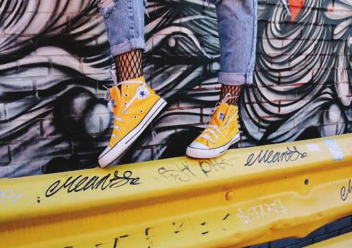
COMPANY TIMELINE
    1908                                                                          1970s
    Marquis Mill Converse opened the Converse Rubber Shoe Company in              Converse introduced the first coloured canvas in 1971, available in gold,
    Malden and began production.                                                  green, orange, red, blue and light blue. In the same year, suede versions
                                                                                  were produced for the first time. Converse lost popularity as a basketball
    1910–1920                                                                     shoe and it was only now that people fully accepted the trend of wearing
    The company had expanded its plant to produce 4,000 pairs of boots            trainers on their feet as casual footwear. Members of the beatles were
    and rubbers daily. In 1916, they were looking to expand their company and     seen wearing the shoes.
    the decision was made by Converse to begin manufacturing footwear for
    basketball. In 1919, Converse refined the Non-Skid outsole pattern and        1980s
    added corrugated patterns to the toe and heel for increased traction. In      The use of converse for basketball had completely died out, but sales did
    1920, the duck and brown leather took on a new mantle – the ‘All Star’. The   not. Wackier syles like glow in the dark or camo had been developed and
    new models were also updated with a ‘Bat Wing’ toe bumper and instep          converse were a ‘must have’ in everyone’s wardrobe. The Rolling Stones
    reinforcement for added durability. Soon public caught on and all athletes-   made the “Chuck Taylor” official trainer of the Steel Wheels Tour in 1989.
    men, women and children, were wearing “tennis shoes.
                                                                                  1990s
    1930–1940                                                                     The official All Stars patch was attached to all the high top trainers. Many
    Chuck Taylor designed the white high top model for the 1936 Olympics,         new basket ball shoe designs were made in the 90s but not many people
    and the shoe with its patriotic red and blue trim became very popular         wore them as basket ball shoes; it was mainly a fashion style worn by
    along with all black canvas and leather models of the All Star. As the        teenagers. The biggest thing for converse was the release of the He:01
    United States entered the Second World War in 1941, the vast majority         shoe in 1999 which helped raise the continuously lowering sales figures
    of Converse’s production became focused on supporting the war effort.         from the early 90s.
    Converse helped out by making boots for army pilots and soldiers. They
    tried to make their shoe as accessible and cheap as possible during this      2000 ONWARDS
    time. The American soldiers even trained in All Stars.                        Converse was bought by Nike in 2003 for $305 million. Around this
                                                                                  time, new shoes such as the heeled converse were invented. Their
    1950–1960                                                                     manufacturing was no longer in the USA after 2001 and was moved to
    More people started to play basketball and some players requested a low-      countries such as China, India, Vietnam and Indonesia. The company’s
    cut sneaker for less restriction of the ankle. Popular celebrities such as    success has grown even more since then and 60 percent of all Americans
    Elvis Presley started wearing them, setting a new trend for the public. In    have owned or own a pair. Also, a pair is purchased every 43 seconds.
    the 1960s, the official low cut shoe was introduced. All-Stars were worn By
    90 percent of college and professional basketball players.
6                                                                                                                                                                7
LOGO EVOLUTION                                                                  2003–2007
                                                                                    A black five-pointed star was placed inside a circle with a white
    Generally, the brand has six different logo options, although it did not have   background. The central element was made small, and under the graphic
    a permanent label at the beginning of its career. Instead, the manufacturer     part is the inscription “Converse.” The letter “n” is lowercase, and the
    used the inscription in different styles until he launched the All-Star shoe    remaining letters – in capital letters. Font has been changed to a thin font
    line which gained incredible popularity.                                        identical to Zoria Bold. Letter space increased.
    1963–1977                                                                       2007–2011
    Modest and minimalistic logo. It’s just a rectangle with the word “Converse”    The version created by the artist Jim Labadini in the 1970s was chosen
    in lowercase and in front, a miniature five-pointed star of black color – a     for visual identification. A black star is placed next to the chevron in the
    sign of excellence and the highest quality products. The background is          form of an open triangle of two wide stripes. The star is located sideways,
    light gray, the letters are dark, the same size.                                and seems to stand on one beam. The name of the manufacturer is at the
                                                                                    bottom and the style of letters is identical to previous versions.
    1977–2003
    The emblem was used, in which the star prevails; enlarged and placed            2011–2017
    in the center of a square with rounded corners. It is completely white,         A five-pointed star is gracefully inscribed in the letter “O.” This combination
    so it stands out against a black background. Under it is the name of the        came from additional versions and became recognized throughout the
    company. The word is written in bold sans serif in uppercase – except the       world. It was she who turned a simple label into a cult brand. The artists
    letter “n,” which is left lowercase. The font type is Sans-Serif.               enlarged and placed the name of the company on a white background.

                                                                                    2017–DATE
                                                                                    Slight adjustment to the 2007 logo. The chevron and star were reduced
                                                                                    in size, increasing their color to coal-black. Font was changed with all the
                                                                                    letters in the upper case.

8                                                                                                                                                                     9
LOGO USAGE DON’Ts
Do not alter color from accepted standards.
Ensure you maintain the integrity of the logo at all times. The logo is a
combination mark logo of symbol and type. To maintain consistency in Do not place the logo within a line of text.
branding, the following rules should apply. Do not fill shapes with patterns or add special effects.
DOs Do not overprint the logo on complex photographs or textures that will
Maintain a clear space around the logo as illustrated show through the open spaces of the logo.
Use the logo as white on black background or black on white background Do not violate the signature clear zone.
Always maintain enough contrast for readability Do not compress the logo
Do not stretch the logo
Do not overlay the logo
Do not rotate the logo to any degree.
Do not make the logo smaller than half inch or 5mm
10 11TYPOGRAPHY COLOUR PALETTE
FONT COLOUR The color combination is monochrome: black, white and a light shade
of grey. Black symbolizes integrity, elegance, and perfection, white
Black
symbolizes charm and purity, and grey represents neutrality and balance.
PRINT FONT Pops of colour are used as accent colours wherever neccessary.
The Metropolis font family is the primary font to be used for brand
collateral and other print materials. Metropolis Black is to be used for
Charcoal Black
all main headlines, Metropolis Semi Bold should be used for secondary
CMYK–32,13,0,69
headlines and Metropolis Regular for body. All caps for headlines and small
RGB–21, 27, 31
letters for body.
Hex–#36454F
ABCDEFGHIJKLMNOPQRSTUVWXYZ
White
ABCDEFGHIJKLMNOPQRSTUVWXYZ CMYK–0,0,0,0
abcdefghijklmnopqrstuvwxyz RGB–255, 255, 255
Hex–#FFFFFF
OFFICE DOCUMENTS
For the office documents such as Microsoft Word and Powerpoints, we Gray
require usage of Arial font to guarantee consistency across all systems. It CMYK–0,0,0,40
also provides editing accessibility for non-creative teams and individuals. RGB–167, 166, 166
Hex–#A7A9AC
SPECIAL CASE: USING OTHER FONTS
In the rare instance that a font becomes part of a graphical illustration in a
multimedia or campaign communication, it may become necessary to use a
font other than the brand’s main font. In these cases, ensure you are using
a high-quality font that complements Spring body & soul brand fonts.
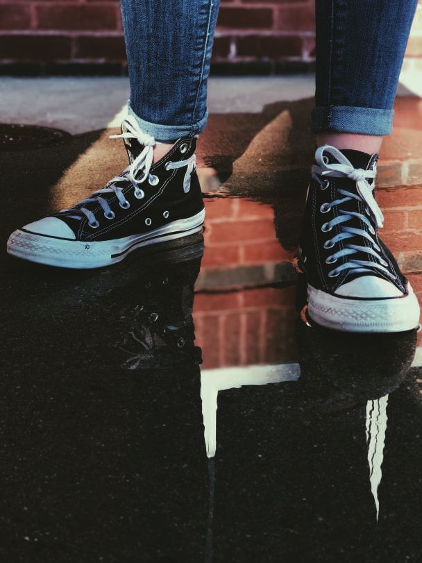
12 13IMAGERY
Imagery plays an important role in Converse brand identity. This content Bold The wearers of Converse products are free
includes campaigns, online and live events, reports, website, microsites, to define their style, so flexibilty is allowed
print digital publications, marketing and advertising; etc. To ensure the in the use of imagery so far the pictures are
brand integrity of Converse, the imagery may be described as shown: Striking produced with the highest quality standards.
Playful
High contrast
Colourful
Inspiring
Black and white
Creative
14 15PRODUCTS TARGET MARKET / AUDIENCE
Apart from sneakers which are customizable, the company manufactures All of Converse’s visual devices create the image that the wearer’s
clothing for men, women and kids. They comprise of tops, tees, pants, personal style is what matters most and it appeals to a younger, more
shorts, hoodies, sweatshirts, jackets, skirts, dresses, romper and vests. active crowd. Their unique style of advertising is by presenting a lifestyle
that many consumers can identify with, which allows them to sell their
The company designs, distributes and licenses casual sneakers, apparel
products to a larger audience.
and accessories under the Converse, Chuck Taylor, All Star, One Star, Star
Chevron and Jack Purcell trademarks. Converse targets the Aspirers, the materialistic, acquisitive and the image
conscious people. Marketing IS focused mainly on the younger generation
Converse counts its strategy of regularly rolling out new products, key to
and who fall in the “reformer”, “aspirer” and “explorer” based lifestyle.
keeping consumers enticed to keep buying Converse shoes.
16 17BRAND POSITION BRAND COMPETITORS
The brand is positioned as a brand that is worn by artists, dreamers, rebels, Converse main competitors are Reebok, New Balance, Adidas, Puma, Fila,
rockers, and originals. It celebrates individuality. The brand encourages its Timberland, Vans and Under Armour..
customers that if they are one-of-a-kind, they should try converse.
Converse excels over its competitors in the following ways:
The brand was previously positioned as an athletic footwear brand but
It is a well known brand around the world and more product development
now the brand is positioned as a “retro-modern subculture” and is a classic
opportunities exist for Converse as most of the products are fashion
shoe for the people of the younger generation. The superior quality,
sensitive. Converse can diversify into shirts and other fashion accessories
carefully selected price ranges and image has acquired a good position in
as these are high value items. They also have more aggressive advertising
the buyer’s mind.
and promotion strategies through e-commerce platforms.
The Chucks is positioned as a brand that is trendy yet simple. Converse
Converse is threatened by the following:
has used “Cultural Symbol Approach” to position Chucks in the market and
it is named after the legendary basketball player Chuck H. Taylor. The industry is very price and fashion sensitive and hence poses a threat
fashionable
to Converse. Fake imitation products is also a threat and being a global
brand, Converse can be affected by recession and economic fluctuations.
low price high price
practical
18 19You can also read