The New Zealand Medical Workforce in 2017
←
→
Page content transcription
If your browser does not render page correctly, please read the page content below
The New Zealand
          Medical Workforce
          in 2017

The New Zealand Medical Workforce in 2017   1
Contents
Executive summary ................................................................................................................... 3
Facts at a glance ........................................................................................................................ 3
Data sources used in this publication ........................................................................................ 4
Representativeness of the survey data ..................................................................................... 5
Changes in the medical workforce ............................................................................................ 7
Work type ................................................................................................................................ 12
Workloads................................................................................................................................ 16
Geographic distribution........................................................................................................... 21
Ethnicity ................................................................................................................................... 30
Gender ..................................................................................................................................... 36
International medical graduates ............................................................................................. 39
Retention ................................................................................................................................. 41
Survey method ........................................................................................................................ 46
Explanation of terms used ....................................................................................................... 49
Further information ................................................................................................................. 51
Appendix 1 – Changes in the medical workforce by work role ............................................... 52
Appendix 2 – Work type .......................................................................................................... 53
Appendix 3 – Age ..................................................................................................................... 54
Appendix 4 – Ethnicity by work type ....................................................................................... 55
Appendix 5 – Retention of New Zealand graduates ................................................................ 57
Appendix 6 – List of tables and figures.................................................................................... 58

The New Zealand Medical Workforce in 2017                                                                                                     2
Executive summary
This report presents the results of the Medical Council of New Zealand workforce survey for
2017. It contains information about changes in the medical workforce including retention
rates for doctors.

This report was prepared by Andrew Cullen, Council’s Senior Information Systems Analyst,
with support from other Council staff and Bill Grant of AllGo Analytics.

We would also like to thank all the doctors who responded to the survey and provided the
valuable data around the type and amount of work they are doing that allows us to present
this report.

Key findings
Numbers of doctors: The total number of doctors based on registration data increased by
4.0 percent in 2017 from 15,212 to 15,819 – this represents doctors on the register with a
current practising certificate.

Māori doctors are still under-represented in the medical workforce, but there are positive
changes at graduate level: The proportion of Māori doctors increased to 3.6 percent in 2017
but is still well below their proportion of the New Zealand population. However, almost 16
percent of Otago’s graduates in 2017 were Māori, and in 2016, Māori and Pasifika doctors
made up a fifth of Auckland’s graduating doctors.

Proportion of female doctors continues to increase: 44.8 percent of doctors in the active
workforce were female, up from 43.9 percent in the previous year. If the current trend
continues, women will outnumber men by 2025.

The fastest growing specialities were emergency medicine, urgent care and psychiatry:
Based on numbers of practising doctors with vocational scopes of practice, these three
specialities all increased by over 8 percent in 2017 (emergency medicine by almost
10 percent).

    Facts at a glance                                   2012            2013      2014         2015          2016         2017

    Size of the workforce1                             14,042       14,283       14,533       14,737       15,212       15,819
    Doctors per 100,000 population2                     313.2           317.7     317.6        318.1        321.3         327.9
    Proportion of IMGs3 (%)                               41.4           41.9       42.0         40.4         40.4         40.0
    Proportion of females (%)                             41.3           41.7       42.4         43.5         43.9         44.8
    Average age of workforce                              45.4           45.5       45.7         45.2         45.5         45.9
    Average weekly workload (hours)                       43.9           43.7       43.6         44.4         44.7         44.2
    Average proportion of new IMGs
    retained after 1 year4                                53.5           54.5       55.4        56.9          57.7         58.4
1   Figures are based on registration data. See Table 2 for more information.
2   Figures are based on the size of the workforce as measured by registration data (see Table 2) and Statistics New Zealand’s
    estimated residential population as at 31 March of the particular survey period.
3   IMG: international medical graduate (see page 49 for definition).
4   See ‘Retention’ on page 41 for more information and ‘Survey method’ on page 46 for information on how this figure was
    calculated.

The New Zealand Medical Workforce in 2017                                                                                        3
Data sources used in this publication
This report incorporates the results of the Medical Council of New Zealand workforce survey
for 2017 with registration data. It also includes other non-register registration data collected
from doctors as part of the initial registration process and at the time doctors renew their
practising certificates each year.
Decreased survey response rate in 2017
While data from other sources has been used in previous years, there is a greater use of
non-survey data in the 2017 report. This is largely because the response rate to the survey in
2017 was lower – in 2017, the response rate dropped to 80.1 percent of doctors surveyed
compared with 96.3 percent in 2016 and 99.7 percent in 2015.1
Previously, survey data have often been presented as absolute figures (i.e. headcounts), and
this could be justified by the level of response to the survey. However, with the lower,
though still representative, response rate this year, survey data will only be presented as
proportions (i.e. as a percentage of survey respondents).
Why is there a lower response rate?
In 2015, Council moved to an online application process for the renewal of practising
certificates and collection of workforce survey data. Subsequent changes to make it clearer
that completion of the workforce survey was voluntary and easier for doctors to opt out
appear to have been the driver for the reduction in the response rate.
The workforce survey data is important and is used by organisations like the Ministry of
Health to inform areas such as workforce planning. Further declines in the response rate
would reduce the usefulness of the data, and therefore, it is really important that doctors
complete the survey each year.
Register data and other non-register data
Register data
Register data is that used as part of the medical register. This includes doctors’ scopes of
practice, practising certificate dates and qualification data.
Non-register registration data
Non-register registration data is collected from doctors when they renew their practising
certificate each year or when doctors notify Council of changes during the year. This includes
information on where doctors are employed, the level of their practice, the type of medicine
and whether they are in a vocational training programme.
Survey data
Doctors are surveyed as part of their application to renew their practising certificate. This
survey collects more detailed information from doctors about the work they are doing, filling
in the gaps not covered by register data and non-register registration data and adding
richness to these datasets.
1
For a fuller explanation of the method used to calculate survey response, see the survey method
section on page 46.
The New Zealand Medical Workforce in 2017 4Representativeness of the survey data
Although the response rate of this year’s survey is lower than in previous years, we believe
the response is still representative and that valid conclusions can be drawn from the data.
Survey statistical confidence – population size
A major factor in determining survey statistical confidence is the size of the population.
For our survey, the size of the population is the number of doctors on the register with a
current practising certificate – 15,819 as at 31 March 2017.
For a population of this size, a response rate of 80 percent can be said to provide 95 percent
certainty.2 This supports our conclusion that, even though our response rate is lower, any
conclusions drawn from the data are still valid.
Demographic comparison – survey data versus register data
While the population size is important, this is meaningless if the response is not
representative – that is, if those who responded do not reflect those being surveyed.
To test whether the survey data is representative, we compared the age and gender of those
who responded to the survey with those on the medical register. While there were some
very small differences when broken down by age group, the breakdown by gender was
nearly identical.
This further supports our conclusion that the survey response for 2017 is representative.
Comparison by gender
Figure 1 illustrates that, when broken down by gender, the demographics of the two groups
are effectively identical.
Figure 1: Comparison of survey respondents with doctors on the medical register
as at 31 March 2017 by gender
2
GreatBrook, Survey Statistical Confidence: How Many is Enough?, https://greatbrook.com/survey-
statistical-confidence-how-many-is-enough/.
The New Zealand Medical Workforce in 2017 5Comparison by age group Figure 2 and Table 1 show there are small differences between the two groups when they are broken down by age group. There are a greater proportion of younger doctors (aged between 25 and 39) amongst doctors on the register compared with those who responded to the survey. There is a corresponding larger proportion of doctors aged 40 and over amongst survey respondents. This suggests that doctors who come to New Zealand for short periods and are not asked to complete the workforce survey are on average younger. Figure 2: Comparison of survey respondents with doctors on the medical register as at 31 March 2017 by age group Table 1: Summary of differences between survey respondents and doctors on the medical register as at 30 June 2017 by age group (selected age groups only) Age group 25–29 30–34 35–39 40–49 50–54 55–59 60–64 Survey difference to -0.3% -0.4% -0.3% 0.0% +0.3% +0.1% +0.1% register Comparison by country of qualification The proportion of international medical graduates (IMGs) amongst doctors on the register is higher than the proportion of IMGs amongst doctors who responded to the survey (42.6 percent versus 40.0 percent). This reflects that many IMGs who come to New Zealand for short periods are not asked to complete the survey. The New Zealand Medical Workforce in 2017 6
Changes in the medical workforce
Size of the workforce
Registration data show that the number of registered doctors increased by 4.0 percent in
2017 from 15,078 to 15,716. This change compares to an increase of 3.2 percent in the
previous year (see Table 2).
Table 2: Estimated yearly workforce growth and changes in composition
1985 1990 1995 2000 2005 2010 2016 2017
Total workforce (based
on registration data)1 6,337 6,806 7,998 9,779 11,215 13,266 15,212 15,819
Percentage change in
total workforce from
previous year
measured by
registration data (%)2 - - - - 3.3 3.5 3.2 4.2
1 The total workforce according to registration data represents the number of doctors on the medical register with a current
practising certificate as at 30 June of that year taken from Council’s Annual Report.
2 Percentage change cannot be shown for years prior to 2005 because the available data are incomplete.
Figure 3 shows just the size of the medical workforce as measured by registration data and
of the New Zealand population compared to 2001 levels.
Figure 3: Change in size of the medical workforce compared to change in size of the
New Zealand population (2001–2017)
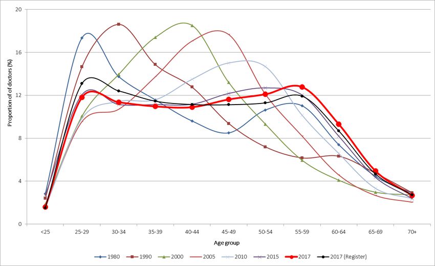
The New Zealand Medical Workforce in 2017 7Age distribution of the workforce Figure 4 compares the age distribution of the active workforce3 based on survey data from 1980 to 2017, focusing on selected series (1980, 1990, 2000, 2005, 2010, 2015 and 2017) to aid in comparing the changes over time. In 2017, the largest group of doctors were those aged 55–59, closely followed by those aged 50–54. In 2010 and 2005, this was doctors aged 45–49, and in 2000, the largest group was doctors aged 40–44. Looking further back, in 1990, the largest group of doctors was those aged 30–34, and in 1980, it was those aged 25–29. This reflects that the average age of the workforce is higher than it used to be. However, as highlighted in previous reports, the overall distribution in recent years is much more even, and the proportion of doctors aged 25–29 has noticeably increased since 2000. As noted in the 2015 report, this is likely due to the increased numbers of graduates being produced by New Zealand’s medical schools in recent years (see Table 25 on page 57). Figure 4: Age distribution of the active workforce (1980–2017) 3 Active doctors are those who responded to the workforce survey and reported working 4 or more hours per week. The New Zealand Medical Workforce in 2017 8
Gender distribution of the workforce
In 2017, 44.8 percent of the active workforce were female. This compares with 43.9 percent
in 2016 and 43.5 percent in 2015.

Figure 5 compares the proportion of females in the active workforce at 5-yearly intervals
going back to 1980. This shows that the proportion of females was just 16.4 percent in 1980
but has been increasing steadily since that time. A rough projection of the current trend
suggests that women will outnumber men amongst doctors by 2025.

Figure 5: Proportion of active doctors by gender (1980–2017) showing projected trend
forward to 2025.

The New Zealand Medical Workforce in 2017                                                     9
Distribution by age and gender
Figure 6 shows the distribution of doctors by age and gender using a population pyramid.

This shows that female doctors are more like to be younger compared with male doctors.
The largest groups of female doctors are those aged 25–29 and 30–34. The largest groups of
male doctors are those aged 50–54 and 55–59.

Figure 6: Distribution of active doctors by age and gender

The New Zealand Medical Workforce in 2017                                                  10
Changes by work role
Clarification regarding terminology used
In some cases, the categories may not reflect current terminology but have been retained to
allow for comparison of data over time. The main example of this is house officers who are
now more commonly known as interns or PGY1s (postgraduate year 1s).

General practitioner and specialist
For the purposes of registration, general practice is a specialist scope of practice, and
doctors registered in a vocational scope of general practice are considered to be specialists.
However, for the purposes of the survey, specialist and general practitioner (GP) are
recorded in separate categories to aid analysis and interpretation of the data. Because data
are self-reported, not all doctors who report themselves as specialists or GPs will hold a
vocational scope of practice.

Changes by work role over time
Figure 7 shows how the proportion of doctors by work role at their main work site has
changed over time, focusing on the four main work roles. In 2017, 28 percent of active
doctors were GPs. This proportion has decreased over time – prior to 2000, it was just under
40 percent and has been steadily decreasing.

Conversely, the proportion of specialists has increased over time – from 31 percent in 2000
to 37 percent in 2017. The proportion of registrars also increased over that same period and
was 18 percent in 2017 (up from 14 percent in 2000).

Figure 7: Proportion of active doctors by work role (1980–2017)

The New Zealand Medical Workforce in 2017                                                    11
Work type
The analysis in previous years that compared the numbers of active doctors by work type in
the current year with the previous year is not possible given the decreased response rate in
2017.

Table 3 instead uses registration data to show the changes in the number of doctors
registered in vocational scopes. Only scopes with more than 100 doctors in 2018 are shown.
The full list including all vocational scopes can be found in Table 22 on page 53.

Table 3 shows that the largest increases in the number of doctors practising in a vocational
scope in the last year were in emergency medicine (9.5 percent), urgent care (8.4 percent)
and psychiatry (8.1 percent).

Looking at the changes in numbers since 2005, emergency medicine was again the largest
increase, up 238 percent, with intensive care medicine up 136 percent and urgent care up
100 percent.

General practice, the largest single vocational scope, increased by 2.1 percent between 2017
and 2018 and by 48 percent since 2005.

Table 3: Number of doctors by vocational scope for selected years (2005–2018)
                                                                                Year1                             Percent
                                                                                                                   change
    Vocational scope                                      2005       2010       2015       2017        2018      2017–2018
    General practice                                     2,446      2,701      3,303      3,534       3,609                +2.1
    Internal medicine                                      656         761        958     1,051       1,099                +4.6
    Anaesthesia                                            488         577        737        801         814               +1.6
    Psychiatry                                             425         489        559        575         622               +8.2
    Diagnostic and interventional radiology                266         303        448        477         489               +2.5
    Paediatrics                                            219         289        353        379         401               +5.8
    Pathology                                              225         238        278        298         309               +3.7
    Obstetrics and gynaecology                             223         234        280        293         313               +6.8
    General surgery                                        227         235        262        280         291               +3.9
    Orthopaedic surgery                                    211         237        273        269         291               +8.2
    Emergency medicine                                       88        135        224        272         298               +9.6
    Public health medicine                                 130         157        177        170         169               -0.6
    Urgent care                                            103         119        136        190         206               +8.4
    Ophthalmology                                          107         124        134        141         147               +4.3
    Otolaryngology head and neck surgery                     85         97        108        114         118               +3.5
    Intensive care medicine                                  44         58         81         98         104               +6.1
    Rural hospital medicine                                    -        26        105        114         117               +2.6
    Total                                                6,389      7,310      9,069      9,755      10,117                +3.6
1     Figures represent the number of doctors with vocational scope and current practising certificate as at 30 June of the year.

The New Zealand Medical Workforce in 2017                                                                                      12
Work type and age Figure 8 compares the average age of different work types, focusing on those work types with more than 50 respondents. The average age was highest in medical administration and occupational medicine (57 years), primary care (53 years) and dermatology (51 years). The average age was lowest for those in house officer rotations (27 years), with the next lowest being emergency medicine, intensive care medicine and general surgery (all 40 years). Anaesthesia and rural hospital medicine both had the same average age as the overall population at 45 years. Figure 8: Average age by work type at main work site (areas with more than 50 doctors) The New Zealand Medical Workforce in 2017 13
The New Zealand Medical Workforce in 2017 14
Note regarding internal medicine
Respondents to the survey who reported working in internal medicine had an average age of
42 years. One possible explanation for this is doctors reporting a work role of house officer
and a work type of internal medicine.

If the work type of house officer is excluded, the average age for doctors working in internal
medicine is 44 years. If we look only at doctors who reported working as a specialist, the
average age is 50 years.

Age and vocational scopes
Table 4 shows that the average age of doctors on the register with a current practising
certificate and a vocational scope of practice between 2005 and 2018, focusing on scopes
with 100 or more doctors. The same analysis showing all scopes can be found in Table 23 on
page 54.

The average age of doctors with a vocational scope and current practising certificate was
52 years in 2018, up from 48 years in 2005.

The average age increased in all vocational scopes, although the increase was smallest in
diagnostic and interventional radiology and internal medicine, which both increased by
1 year, and largest in psychiatry and public health medicine where both increased by
5 years.

Table 4: Average age of doctors on the register with a vocational scope (2005–2018)
                                                                    Year
 Vocational scope                             2005       2010       2015       2017       2018
 Anaesthesia                                   46         48         49         49         49
 Diagnostic and interventional radiology       48         49         49         49         49
 Emergency medicine                            41         43         45         45         45
 General practice                              49         51         53         53         53
 General surgery                               49         51         51         51         51
 Intensive care medicine                       46         48         49         50         50
 Internal medicine                             50         51         50         51         51
 Obstetrics and gynaecology                    49         51         52         52         52
 Ophthalmology                                 49         50         51         51         51
 Orthopaedic surgery                           49         50         52         52         52
 Otolaryngology head and neck surgery          49         51         53         54         53
 Paediatrics                                   47         48         49         50         50
 Pathology                                     49         50         51         51         51
 Psychiatry                                    48         50         52         53         53
 Public health medicine                        47         49         51         51         52
 Rural hospital medicine                                  47         49         50         50
 Urgent care                                   45         48         51         51         51
 All doctors with vocational scope             48         50         51         51         52

The New Zealand Medical Workforce in 2017                                                   15
Workloads Hours worked by work type Figure 9 shows the average hours worked by work type, again looking only at those work types with 50 or more respondents. The average hours worked per week was highest in general surgery (56.8 hours), house officer rotations (56.6 hours) and orthopaedic surgery (55.3 hours). The average hours worked per week was lowest in primary care (34.5 hours), urgent care (35.6 hours) and general practice (36.3 hours). Figure 9: Average hours worked by work type (areas with more than 50 respondents) The New Zealand Medical Workforce in 2017 16
Hours worked by work role
Table 5 shows the changes over time in the average number of hours worked each week, by
work role, at the doctor’s main work site.

Overall, the average number of hours doctors have reported working has been decreasing
down from 47.1 hours in 2000 to 44.2 hours in 2017.

House officers reported working the most hours each week, followed by registrars. Hours
reported by these two groups were decreasing between 2000 and 2010 but have been
increasing in recent years, with house officers now reporting more hours than they did in
2000 – the only group to do so.

We have no information on why hours reported by house officers are increasing, and given
the improvements in employment conditions for new doctors, it is surprising. One possibility
is that some house officers are trying to report multiple rotations rather than their typical or
most recent working week. If so, this would cause the number of hours worked by those
doctors to be overstated and inflate the average for house officers.

Average hours worked by specialists and GPs have continued to decrease over time,
with GPs down to 36.2 hours (from 42.2 in 2000) and specialists down to 44.3 hours (from
48.2 in 2000).

Table 5: Average hours worked by work role (2000–2017)
                                                             Year
 Work role                           2000         2005         2010         2015        2017
 General practitioner                42.2         39.8         37.8         37.1        36.2
 House officer                       55.7         54.6         52.1         53.7        57.1
 Registrar                           55.0         53.1         51.6         51.4        52.4
 Specialist                          48.2         46.6         45.2         45.0        44.3
 All doctors                         47.1         45.5         43.9         44.4        44.2

The New Zealand Medical Workforce in 2017                                                     17
Hours worked by age and gender
For all active doctors, the average number of hours worked was 44.2 per week in 2017.
Table 6 shows that doctors aged in their 20s worked the most hours each week on average.
Females work a similar number of hours to males during their 20s (slightly more for doctors
aged 24 and younger).
After the age of 30, males work more hours, and the gap is largest between the ages of 40
and 59. For males, the average number of hours continues to remain above 50 hours per
week until the 35–39 age group.
Table 6: Average of total hours worked, by age and gender
Age group All ages,
average
Gender ≤24 25–29 30–34 35–39 40–44 45–49 50–54 55–59 60–64 65–69 70+ hours
Female 57.9 55.1 46.1 37.8 36.9 35.8 36.8 36.9 36.3 35.9 30.6 41.1
Male 57.8 56.8 51.7 47.2 46.7 46.8 46.4 45.4 44.2 39.1 31.9 46.7
All doctors 57.8 55.9 48.6 42.2 41.7 41.5 42.2 42.2 41.9 38.4 31.7 44.2
Table 7 shows that the average number of hours worked per week for females decreased in
2017 to 41.1. The average number of hours worked per week for males also decreased in
2017, albeit by a smaller amount from 47.0 hours to 46.7 hours.
The average number of hours worked per week for females is up from 2005 whereas males
are reporting fewer hours than they did in 2005.
Table 7: Average hours worked, by gender and year (2005–2017)
Year
Gender 2005 2010 2015 2016 2017
Female 40.6 39.8 41.2 41.8 41.1
Male 48.3 46.6 46.8 47.0 46.7
All doctors 45.5 43.9 44.4 44.7 44.2
Part-time work and gender
Females were more likely than males to work fewer than 40 hours per week. Almost 41
percent of females reported working fewer than 40 hours compared with 17 percent of
males.
Doctors who reported working fewer than 40 hours were asked to record the main reason
for this. The most common reasons given by females were personal preference
(1,083 respondents), family commitments (554 respondents) and part-time work
(468 respondents).
The vast majority of male doctors who reported working fewer than 40 hours most
commonly gave the reason for this as personal preference (731 respondents). Other
commonly given reasons were that they were retired or semi-retired (166 respondents) and
part-time work (127 respondents). A much smaller number of male doctors reported
working part-time due to family commitments (51 respondents).
The New Zealand Medical Workforce in 2017 18Hours on call by work role
When completing the workforce survey, doctors were asked to record all hours they actually
worked in an average week as hours worked, including hours where they were on call and
were required to work.
Hours on call measures the additional hours when doctors were on call but were not
required to work. If no on-call hours are reported, the doctor was either not on call or chose
not to provide details of their on-call hours.
Table 8 shows on-call hours by workforce roles. Almost 70 percent of doctors reported no
on-call hours. Specialists were most likely to be on call, with over half of specialists reporting
some on-call hours and over 36 percent on call for 10 or more hours per week.
Almost three-quarters of GPs reported working no on-call hours, although this was fewer
than house officers and registrars, where this proportion was 96 percent and 85 percent
respectively. For house officers and registrars, this reflects the higher average hours worked
by these doctors.
Table 8: Doctors’ on-call hours, grouped in each work role (%)
On-call hours, General House Medical
grouped practitioner2 officer Registrar officer Specialist
No on-call hours 74.4 95.5 84.7 71.9 44.9
1–4 8.0 0.8 1.3 2.2 6.8
5–9 4.5 1.3 3.8 4.7 12.0
10–19 5.5 2.0 6.6 10.7 19.0
20–49 5.1 0.4 3.2 8.8 14.4
50 and over 2.5 0.0 0.5 1.7 2.8
Total1 100.0 100.0 100.0 100.0 100.0
1 Individual categories may not add up to total due to rounding.
2 GP includes those doctors who reported a work role of primary care.
The New Zealand Medical Workforce in 2017 19Hours on call by employer
Table 9 shows the main place of work for doctors on call for 10 or more hours each week
and compares specialists with all other work roles – 87 percent of specialists on call for 10 or
more hours worked in a public hospital at their main work site.
Of the doctors from other work roles who were on call for 10 or more hours, 43 percent
worked in a group private practice at their main work site, and just under 41 percent worked
in public hospitals.
Table 9: Proportion of doctors on call for 10 or more hours each week, by employer (%)
Main employer Specialist Other work roles Total
Commercial company 1.3 2.8 1.8
Government department/agency 2.7 3.1 2.9
Professional body 0.1 0.5 0.2
Group private practice 4.8 43.2 17.2
Private hospital 2.1 1.4 1.9
Public hospital 86.6 40.3 71.7
Solo private practice 2.3 8.8 4.4
University/polytechnic 0.8 1.1 0.9
Other 2.0 7.6 3.8
Total1 100.0 100.0 100.0
1 Individual categories may not add up to total due to rounding.
Hours on call – changes over time
Table 10 shows the changes in the average on-call hours by work role between 2000 and
2017. All work roles are reporting fewer on-call hours than they did in 2000, and the overall
average is also down from 10.2 hours in 2000 to 6.0 hours in 2017.
Table 10: Average on-call hours by work role (2000–2017)
Year
Work role 2000 2005 2010 2015 2017
GP 9.6 5.6 5.3 4.8 4.9
House officer 2.6 1.3 0.8 0.5 0.4
Medical officer 8.9 5.6 4.6 6.7 5.9
Registrar 5.1 3.2 2.8 2.4 2.2
Specialist 16.7 13.1 11.0 10.2 9.9
All doctors 10.2 7.3 6.3 5.9 6.0
The New Zealand Medical Workforce in 2017 20Geographic distribution Important information about geographic data Although care is taken in producing this data, we recommend that caution is used in interpreting and relying on figures in this section. To allow data to be presented in geographic regions, we allocate every doctor who responds to the survey to their nearest territorial local authority (TLA) and district health board (DHB). However, there are a number of limitations that mean that these data will not always be completely accurate. Doctors often work in more than one location, and in allocating each doctor to a single TLA and DHB, we cannot fully represent every location in which the doctor is working. Some geographic regions are closely related, especially those in the wider Auckland and Wellington regions. Taking this example, doctors might work across the entire Wellington region throughout the year but will only be represented in these figures against one TLA and DHB. This means that the results, especially when analysed by DHB, tend to be skewed towards the main DHB in a region – for example, Auckland DHB in the Auckland region and Capital & Coast in the Wellington region. Auckland combined into a single TLA region – the Auckland ‘Super City’ – in November 2010. In the years that followed, we continued to report the separate regions from before the merger to allow comparison with previous years. Unfortunately, because this has now become unmanageable, from 2015 onwards, the figures for Auckland are presented as a single TLA. The separate DHBs within Auckland will still continue to be reported separately. Effect of reduced response rate In previous years, we have presented geographic data and especially data by DHB in the form of headcounts. We are unable to do this for 2017 because of the reduced response rate to the survey. Instead, figures are presented as proportions of the total. We apologise that we are unable to provide the data as presented previously and appreciate this will make the data less useful for some stakeholders. We are looking at ways to source and present headcount data in future reports, potentially based on non-register data collected from doctors. The New Zealand Medical Workforce in 2017 21
District health boards
Table 11 shows the proportion of doctors at each DHB, along with the proportion of FTEs,
proportion of GPs and average hours worked.

Table 11: Distribution of doctors and GPs by DHB region

                                             of population (%)

                                                                                                                Average hours
                                                                 of doctors (%)

                                                                                  total FTEs (%)
                                                                                  Proportion of
                                             Proportion

                                                                 Proportion

                                                                                                   Proportion
                                                                                                   of GPs (%)

                                                                                                                worked
 DHB                         Population
 Northland                     175,400            3.7                3.2              3.2             3.7          44.4
 Waitemata                     606,000           12.6                8.7              8.6            10.7          43.4
 Auckland                      523,500           10.9               20.1             20.8            12.5          45.8
 Counties Manukau              546,600           11.4                6.7              6.6             8.5          43.2
 Waikato                       408,800            8.5                8.3              8.4             8.5          44.8
 Bay of Plenty                 231,900            4.8                4.7              4.5             5.9          42.3
 Lakes                         108,500            2.3                1.8              1.9             2.2          45.3
 Hauora Tairāwhiti              48,500            1.0                0.8              0.8             0.8          43.6
 Hawke’s Bay                   163,900            3.4                3.2              3.2             3.8          44.9
 Taranaki                      118,100            2.5                2.0              2.0             2.0          43.2
 MidCentral                    176,600            3.7                3.4              3.5             2.9          45.9
 Whanganui                      64,100            1.3                1.0              1.1             1.2          46.9
 Wairarapa                      44,500            0.9                0.5              0.4             0.8          40.1
 Hutt Valley                   147,900            3.1                2.0              1.8             2.6          41.3
 Capital & Coast               312,700            6.5                9.9              9.9             8.5          44.1
 Nelson Marlborough            148,800            3.1                2.8              2.6             3.8          41.2
 West Coast                     32,500            0.7                0.4              0.4             0.4          43.3
 Canterbury                    551,400           11.5               12.5             12.3            12.1          43.5
 South Canterbury               59,600            1.2                0.8              0.9             1.1          45.2
 Southern                      324,300            6.8                7.3              7.2             8.0          43.6

Distribution of doctors
While the figures show that Auckland DHB is the largest DHB, this is likely to be exaggerated
by the limitation of having to allocate each doctor to a single DHB. Looking at the three DHBs
in the Auckland region as a whole, over a third of all doctors (36.5 percent) work at either
Auckland, Waitemata or Counties Manukau DHBs. This is consistent with the proportion of
the New Zealand population contained within these areas (35 percent).

Just over 76 percent of doctors are based in the North Island. Again, this is consistent with
the distribution of the New Zealand population.

The largest DHB in the South Island is Canterbury with 12.1 percent of all doctors, slightly
more than their proportion of the New Zealand population.

The New Zealand Medical Workforce in 2017                                                                                       22
Distribution of GPs
The two largest DHBs in terms of numbers of GPs are Auckland and Canterbury (both 12.5
percent).
The distribution of GPs was largely consistent with the New Zealand population. Areas that
were relatively under-represented included Counties Manukau (-2.9 percentage points) and
Waitemata (-2.0 percentage points).
Areas that were relatively over-represented were Auckland (1.6 percentage points), Capital
& Coast (1.93 percentage points) and Bay of Plenty (1.1 percentage points).
Hours worked
In terms of hours worked, there wasn’t much variation across DHBs. The DHB with the
highest average hours worked was Whanganui (46.9 hours), followed by MidCentral (45.9
hours) and Auckland (45.8 hours).
The DHBs with the lowest average hours were Wairarapa (40.1 hours), Nelson Marlborough
(41.2 hours) and Hutt Valley (41.3 hours).
Gender
Table 12 shows the percentage of female doctors, percentage of IMGs and average age for
each DHB.
Table 12: DHBs by percentage female, percentage IMG and average age
Percentage
Percentage
female (%)
IMGs (%)
Average
age
DHB Population
Northland 175,400 44.8 51.0 47.0
Waitemata 606,000 46.1 38.5 46.5
Auckland 523,500 45.6 31.3 45.9
Counties Manukau 546,600 47.0 41.3 46.0
Waikato 408,800 38.1 49.7 45.6
Bay of Plenty 231,900 47.5 48.2 44.8
Lakes 108,500 47.0 46.6 45.0
Hauora Tairāwhiti 48,500 42.1 47.7 46.9
Hawke’s Bay 163,900 46.9 44.2 45.4
Taranaki 118,100 40.2 50.2 45.2
MidCentral 176,600 39.3 41.8 44.7
Whanganui 64,100 33.6 63.3 47.9
Wairarapa 44,500 37.9 58.6 56.3
Hutt Valley 147,900 44.6 43.4 48.6
Capital & Coast 312,700 48.4 32.1 44.2
Nelson Marlborough 148,800 45.6 41.9 46.4
West Coast 32,500 37.0 69.6 47.1
Canterbury 551,400 46.8 36.1 45.4
South Canterbury 59,600 31.1 50.0 51.0
Southern 324,300 43.3 44.6 47.0
The New Zealand Medical Workforce in 2017 23The percentage of female doctors varied quite widely between DHBs. The DHBs with the highest percentages of female doctors were Capital & Coast (48.3 percent), Bay of Plenty (47.5 percent) and Counties Manukau (47.0 percent). The DHBs with the lowest percentages of female doctors were South Canterbury (31.1 percent), Whanganui (33.6 percent) and Wairarapa (37.9 percent). International medical graduates Again, the percentage of IMGs varied quite widely between DHBs. West Coast had the highest percentage of IMGs – almost 70 percent (69.6 percent), followed by Whanganui (63.3 percent) and Wairarapa (58.6 percent). The DHBs with the lowest percentages of IMGs were Auckland (31.3 percent), Capital & Coast (32.1 percent), Canterbury (36.1 percent) and Waitemata (38.5 percent). This may reflect that main urban areas are easier to staff and so are less reliant on recruiting doctors from overseas. Age There was some variation in age across DHBs but not as pronounced as with gender and IMGs. The DHB with the highest average age was Wairarapa (56.3 years), followed by South Canterbury (50.1 years). The DHBs with the lowest average ages were Capital & Coast (44.2 percent), MidCentral (44.7 percent) and Bay of Plenty (44.8 percent). The New Zealand Medical Workforce in 2017 24
Urban/rural
Method
Statistics New Zealand, in its report New Zealand: An Urban/Rural Profile,4 outlines the
complexities involved in classifying an area as rural or urban and notes that there is no
internationally recognised definition of a ‘rural’ area.
One way of approximating how rural or urban an area is is to look at how densely it is
populated. For the purposes of this section, we have allocated TLAs into one of three groups
based on population density. The population density for each TLA was calculated by dividing
its population by its land area (in km2).
As an example, Wellington City, an urban area, is listed as having an area of 290 km2 and a
population of 212,700, giving it an average population density of 733 people per square
kilometre. South Wairarapa District, generally considered a rural area, is listed as having an
area of 2,387 km2 and a population of 10,250, giving it an average population density of 4.3
people per square kilometre.
The three groups are defined as:
main urban — areas with 100 or more people per square kilometre
secondary urban — areas with 21–99 people per square kilometre
rural — areas with 20 or fewer people per square kilometre.
Table 13: Summary of workforce statistics by population density of area (all doctors)
Population density
Main urban Secondary urban Rural
100+ people 21–99 people per 0–20 people
Workforce measure per km2 km2 per km2
Proportion of doctors (%)1 75.5 12.9 11.6
Proportion of GPs (%)2 65.4 14.2 20.4
Population3 2,971,530 660,500 1,160,840
Proportion of population (%) 62.0 13.8 24.2
Average hours worked 44.5 43.7 42.3
Average hours worked by GPs 33.6 33.6 36.2
Average on-call hours 5.4 6.9 8.6
Average age 45.3 46.2 49.0
Proportion of female doctors (%) 45.5 44.1 41.6
Proportion of IMGs (%) 37.0 44.3 54.9
1 Represents all active doctors who responded to the survey.
2 Represents active doctors who reported working in general practice at one or more of their work sites.
3 Population figures are based on Statistics New Zealand’s estimated residential population as at 30 June of the particular
survey period, in this case, 30 June 2017.
4
Statistics New Zealand: New Zealand: An Urban/Rural Profile
http://www.stats.govt.nz/browse_for_stats/people_and_communities/Geographic-areas/urban-
rural-profile.aspx
The New Zealand Medical Workforce in 2017 25Distribution of doctors
Urban areas have a higher concentration of doctors compared with rural areas. Over three-
quarters of doctors are in main urban areas compared with 62 percent of the population.
One-quarter of people live in rural areas, but these areas only make up 11.6 percent of
doctors. Secondary urban areas have about the same proportion of doctors as they do the
population.
Distribution of GPs
While the majority of GPs are found in urban areas, the distribution of GPs is less skewed
towards urban areas compared with the overall medical workforce. GPs in main urban areas
make up 65.4 percent of doctors, with GPs in rural areas making up 20.4 percent and GPs in
secondary urban areas 14.2 percent.
Hours worked and on call
For all doctors, the average number of hours worked per week is slightly lower in rural areas,
but the number of on-call hours is higher. Doctors in rural areas were on call for 8.6 hours
per week on average compared with 5.4 for doctors in main urban areas.
Looking only at hours worked by GPs, the average hours worked per week is higher in rural
areas than in urban areas – 36.2 hours per week in rural areas compared with 33.6 hours per
week in main urban areas.
Age distribution
Overall, doctors working in rural areas tend to be older than those working in urban areas –
the average age is 49.0 years in rural areas compared with 45.3 years in main urban areas.
One reason for this is likely to be that most house officers, who tend to be much younger,
will work in training centres in urban areas. Table 14 compares the average age of doctors by
work role and population density group, focusing on GPs, registrars and specialists.
Table 14: Average age by work role and population density group
Population density
Main urban Secondary urban Rural
100+ people 21–99 people per 0–20 people
Workforce measure per km2 km2 per km2
Average age (GPs)1 51.6 51.4 51.7
Average age (registrars)1 32.8 33.5 33.1
Average age (specialists)1 51.0 52.2 53.5
1 Based on work role at main employer.
Table 14 shows that the average age of GPs is actually very similar across the population
density groups – 51.6 years in urban areas compared with 51.7 years in rural areas.
The same is true for registrars, where the average age is 32.8 years in urban areas and only
slightly more in rural areas (33.1 years).
However, specialists in urban areas are, on average, younger than those in rural areas – 51
years in urban areas compared with 53.5 years in rural areas.
The New Zealand Medical Workforce in 2017 26Distribution by age group Figure 10 compares the age distribution of doctors in urban and rural areas. Just under 26 percent of doctors in rural areas were aged 39 or under compared with almost 38 percent of doctors in urban areas and 32.3 percent in secondary urban areas. As noted earlier in this section, this reflects that younger doctors will be working in training centres in urban areas and not yet available to work in more rural areas. Figure 10: Distribution of doctors by age and population density (main urban and rural) The New Zealand Medical Workforce in 2017 27
Gender
Figure 11 shows there is a higher proportion of female doctors in urban areas compared
with rural areas – 45.5 percent of doctors in main urban areas are female compared with
41.6 percent of doctors in rural areas.

Figure 11: Proportion of doctors by gender and population density of area

International medical graduates
Figure 12 shows there is a higher proportion of international medical graduates (IMGs) in
rural areas compared with urban areas – 54.9 percent of doctors in rural areas are IMGs
compared to 37 percent in main urban areas. This may reflect that rural areas are sometimes
harder to staff and so positions in these areas are more likely to be filled by doctors from
outside New Zealand.

Figure 12: Proportion of IMGs by population density of area

The New Zealand Medical Workforce in 2017                                                 28
Combined Auckland region
With Auckland being presented as a combined region for the first time in 2015, we are
continuing to look at this region by itself. As expected, the combined region is categorised as
a main urban area with its population of 1,657,200 and land area of 4,938 km2, giving it a
population density of 335 people per square kilometre.

Presented as a combined region, Auckland represents over a third of New Zealand’s
population (34.6 percent) and has 35.5 percent of all doctors and 31.9 percent of all GPs.

Doctors in Auckland on average work slightly fewer hours but are on call for more hours
compared to the workforce as a whole. The proportion of female doctors in Auckland is
higher, while the proportion of IMGs is lower.

Table 15: Summary of workforce statistics – Auckland City
    Workforce measure                                     Auckland City            New Zealand
    Proportion of doctors (%)1                                    35.5                        -
    Proportion of GPs (%)2                                        31.9                        -
    Population3                                              1,657,200               4,792,870
    Proportion of population (%)                                  34.6                        -
    Average hours worked                                          44.7                    44.2
    Average hours worked by GPs                                   34.5                    34.1
    Average on call hours                                           4.8                     6.0
    Average age                                                   46.1                    45.9
    Proportion of female doctors (%)                              46.0                    44.8
    Proportion of IMGs (%)                                        34.9                    40.0
1     Represents all active doctors who responded to the survey.
2     Represents active doctors who reported working in general practice at one or more of their work sites.
3     Population figures are based on Statistics New Zealand’s estimated residential population as at 30 June of the particular
      survey period, in this case, 30 June 2017.

The New Zealand Medical Workforce in 2017                                                                                         29
Ethnicity
Changes in ethnicity of the workforce over time
Table 16 shows the ethnicities of doctors over time. The proportion of doctors who
identified themselves as Māori has been increasing and in 2017 is the highest it has been –
3.6 percent.
The proportion of Pasifika doctors is slightly down in 2017 compared with 2015 but is
increasing overall – up from 1.1 percent in 2000 to 1.9 percent in 2017.
The proportion of NZ European/Pākehā doctors remains above 50 percent but is slowly
declining. The proportion of doctors identifying as other European was also down slightly
but remains around 20 percent as it has since 2010.
Table 16: Proportion of doctors by ethnic group (%)
Ethnicity 2000 2005 2010 2015 2017
Māori 2.3 2.6 3.0 3.4 3.6
Pacific Island (Pasifika) 1.1 1.5 1.3 2.0 1.9
Chinese 4.5 5.4 5.3 5.9 5.7
Indian 4.5 5.1 5.9 6.0 5.5
Other non-European 7.6 10.8 9.9 11.9 10.9
Other European1 - 15.4 19.7 20.5 19.7
NZ European/Pākehā 76.5 57.5 53.3 51.4 50.2
Not answered 3.2 1.5 1.5 2.4 -
Refused2 0.2 0.2 0.2 0.0 2.4
Total3 100.0 100.0 100.0 100.0 100.0
1 In 2000, other European and NZ European/ Pākehā were combined in one category.
2 From 2016, not answered is no longer an available option. The ethnicity question can only be answered or refused.
3 Individual categories may not add up to total due to rounding.
Proportion of doctors by ethnicity in the workforce compared with the
New Zealand population
Table 17 shows the proportion of doctors by ethnicity, as well as the equivalent proportion
of the overall New Zealand population based on the results of the most recent Census5
focusing on Māori, Pasifika and NZ European/Pākehā.
Although the proportion of Māori and Pasifika is increasing, these groups continue to be
noticeably under-represented compared to their proportion of the population, even
allowing for differences in method.6
5
Although there was a Census conducted in March 2018, the results were not yet available at the time
this report was written. Coincidentally, the 2018 Census results were delayed because of a lower than
expected response rate – see https://www.stats.govt.nz/2018-census/.
6
We are using a prioritised count to assign a doctor to one ethnic group (see the survey method section
on page 46), whereas Statistics New Zealand counts a person once for every ethnic group they identify
with. Because of the way the Census results were published, it was not possible to find an equivalent
figure for each group.
The New Zealand Medical Workforce in 2017 30Table 17: Proportion of doctors and New Zealand population by ethnic group
Proportion of New
Proportion of doctors Zealand population
Ethnicity1 (2017) (2013 Census)2
Māori 3.6 14.7
Pacific Island (Pasifika) 1.9 6.6
NZ European/Pākehā 50.2 60.5
Total3 100.0 100.0
1 Proportions calculated including the other ethnicity categories not shown in the table. The table includes only these three
categories for ease of reading.
2 Figures based on the results of the 2013 Census published by Statistics New Zealand – see
http://www.stats.govt.nz/Census/2013-census/profile-and-summary-reports/ethnic-profiles.aspx.
3 Individual categories may not add up to total due to rounding.
Developments in the ethnicity of medical graduates
While there is still a large gap in the representation of Māori and Pasifika doctors amongst
the medical workforce, there are signs this gap is slowly being closed. The proportion of
Māori doctors is higher amongst newer doctors, especially house officers (see Table 19 on
page 32). This reflects that significant progress is being made at graduate level.
In December 2016, a record number of Māori and Pasifika doctors graduated from both
New Zealand medical schools.7 Notably, Auckland University reported that “Māori and
Pacific medical graduates made up about a fifth of the 215 doctors to graduate”8 and have
stated their aim is that 25 percent of new entrants are Māori and Pasifika.9
At Otago University, 45 Māori doctors graduated in 2016, a proportion representative of
Māori in the New Zealand population – a first for the University. In addition,
Otago University reported a 179 percent increase in the numbers of Māori and Pasifika
students in their medicine programme.10
We followed up with the medical schools to see if the 2017 and 2018 graduate classes had
similar representation of Māori and Pasifika doctors.
Otago University advised that, in 2017, they had 27 Māori graduates out of a total of 249
graduates (10.8 percent), and in 2018, they had 42 Māori graduates out of a total of 267
(15.7 percent).
7
The New Zealand Medical Workforce in 2015, p28, Medical Council of New Zealand, 11 April 2018.
8
University of Auckland, 23 November 2016, https://www.auckland.ac.nz/en/about/news-events-and-
notices/news/news-2016/11/record-number-of-new-mori-and-pacific-doctors-this-year.html.
9
Newsroom, 19 March 2018, https://www.newsroom.co.nz/2018/03/18/97643/the-need-for-maori-
and-pacific-doctors.
10
University of Otago, 8 June 2018, https://www.otago.ac.nz/news/news/otago688339.html.
The New Zealand Medical Workforce in 2017 31Ethnicity by age
Table 18 shows the average age of doctors by ethnic group and gender. Māori, Pasifika,
Chinese and Indian doctors all have average ages lower than the overall figure, with Chinese
doctors having the lowest average ages for both females and males – 36.3 years and 40.8
years respectively.
Both females and males identifying as NZ European/Pākehā had an average age higher than
the overall figure, with male doctors the only group to have an average age greater than 50
(51.4 years).
Table 18: Average age of doctors by ethnicity and gender
Average age
Ethnicity Female Male Overall
Māori 37.6 41.8 39.6
Pacific Island (Pasifika) 38.7 42.9 41.0
Chinese 36.3 40.8 39.0
Indian 43.2 46.4 45.2
Other non-European 40.7 44.4 42.8
Other European 42.9 47.4 45.2
NZ European/Pākehā 44.5 51.4 48.4
All doctors 42.8 48.3 45.9
Ethnicity by age group
Table 19 compares the proportion of each ethnicity by age group with its proportion of the
overall workforce. The intention is to try and measure how much the gap in representation
is being closed by increased graduate numbers of Māori and Pasifika doctors.
Taking an example to show how this works, Maori made up 11.9 percent of doctors aged
less than 25 but only 3.6 percent of doctors overall. This means their relative representation
in this group was 8.3 percentage points more than in the workforce as a whole.
Table 19: Distribution of doctors by ethnicity and age relative to overall distribution
Age group
EthnicityDoctors identifying as NZ European/Pākehā mirror Māori in that they are less relatively represented up to the age of 44 and then are more relatively represented peaking in the 55– 59 age group (+9.9 percentage points). Doctors identifying as other European are the second largest group numerically and are more relatively represented amongst doctors aged between 30 and 49 (and less relatively represented amongst doctors younger than 30). This is likely to reflect IMGs coming to New Zealand who have already been working as doctors for a number of years. Ethnicity by work role Figure 13 shows the distribution of ethnic groups by work role. The proportion of Māori and Pasifika doctors reporting their work role as house officers and registrars is higher than that for NZ European/Pākehā (45.7 percent for Māori, 45.8 percent for Pasifika and 20.2 percent for NZ European/Pākehā). This reflects their greater representation amongst younger doctors. Specialists Conversely, the proportion of doctors reporting as specialists was highest amongst NZ European/Pākehā doctors (43.3 percent), compared to only 22.4 percent for Māori and 19.2 percent for Pasifika. The proportion of doctors reporting as general practitioners was a lot more consistent across ethnicities with all groups falling between 25 and 30 percent. Figure 13: Proportion of ethnic groups by work role at main work site The New Zealand Medical Workforce in 2017 33
General practitioners
While the proportion of Māori doctors working in general practice is about the same as their
representation within the overall workforce (3.6 percent), the Royal New Zealand College of
General Practitioners (RNZCGP) is working to improve this figure.

The goals the RNZCGP are aspiring to achieve by 2021 are to increase:
- Māori GPEP1 registrars to 22 percent of the annual intake
- the number of Māori GPs in Taranaki, Whanganui and Hauora Tairāwhiti to add 50
    percent more GPs
- the number of Māori GP teachers, medical educators and examiners.11

11
     NZDoctor, TIME TO KŌRERO. Te reo! Give it a go, 12 September 2018,
     https://www.nzdoctor.co.nz/article/print-archive/time-korero-te-reo-give-it-go.

The New Zealand Medical Workforce in 2017                                                 34
Ethnicity by work type
Table 20 shows the relative representation of each ethnicity for work types with more than
100 doctors.
To give an example of how this works, doctors identifying as Māori made up 3.6 percent of
the workforce, but 9.3 percept of doctors reported their work type as house officer rotations
so their relative representation is +5.7 percentage points. Other than in house officer
rotations, Māori had greater representation in public health medicine (+3.1 percentage
points).
Pasifika doctors had greater representation in general surgery (+4.0 percentage points) and
urgent care (+2.5 percentage points).
Doctors identifying as NZ European/Pākehā had significantly greater representation in public
health medicine (+19.0 percentage points), orthopaedic surgery (+7.0 percentage points)
and anaesthesia (3.6 percentage points).
Psychiatry, intensive care medicine, emergency medicine and urgent care were all areas
where doctors identifying as other European were highly represented. This may reflect that
these areas have a high proportion of IMGs.
Table 20: Relative representation by ethnicity for work types with more than 100
respondents compared with distribution of workforce as a whole
Pacific Island (Pasifika)
NZ European/Pākehā
Other European
Chinese
Indian
Māori
Other
House officer rotations +5.7 +1.6 +4.3 +0.8 +2.1 -12.5 -1.8
Anaesthesia -1.5 -1.0 +0.7 -2.1 -3.4 +2.2 +3.6
Diagnostic and interventional radiology -2.6 -0.9 +1.4 +0.3 -2.0 -2.8 +7.0
Emergency medicine -1.0 -0.4 -2.1 -1.3 -1.4 +19.6 -12.2
General practice 0.0 +0.2 -0.4 +0.1 -0.5 -0.5 +1.9
Intensive care medicine -1.3 -1.1 -0.3 -4.0 -4.1 +7.8 +2.4
Internal medicine +0.1 -0.7 +2.7 +0.6 +4.2 -1.6 -6.4
Obstetrics and gynaecology +0.9 +0.6 -1.2 +1.4 +3.1 -0.8 -3.0
Ophthalmology +0.0 -0.1 +4.4 +0.4 -0.8 -7.2 +2.7
Paediatrics +0.1 +0.1 -0.2 -0.1 -2.2 -1.9 +4.4
Pathology -2.7 -1.0 -0.2 -1.0 +0.4 +1.6 +1.1
Psychiatry -0.4 -0.5 -3.0 +3.3 +2.3 +7.9 -9.6
Public health medicine +3.1 +1.5 -4.6 -1.1 -7.6 -11.9 +19.0
Surgery: general +0.7 +4.0 +0.8 +0.1 +1.7 -5.6 -1.8
Surgery: orthopaedic +1.0 +0.8 -1.3 -1.2 -1.5 -6.4 +7.0
Surgery: otolaryngology head and neck -0.6 -1.9 -0.6 +1.0 -0.7 -1.5 +3.0
Surgery: plastic and reconstructive surgery -0.9 -1.9 +4.1 -1.1 +1.6 -6.3 +2.4
Urgent care -2.1 +2.5 -1.3 +0.3 +1.6 +8.2 -7.6
The New Zealand Medical Workforce in 2017 35Gender Vocational trainees Figure 14 shows the proportion of trainees in each vocational training area by gender, focusing on those areas with more than 20 trainees. Female doctors made up the majority of doctors in vocational training (54 percent) and were most highly represented in obstetrics and gynaecology, and paediatrics. Male doctors were most highly represented in orthopaedic surgery, urgent care and general surgery. Figure 14: Vocational training area by gender (areas with more than 20 trainees) The New Zealand Medical Workforce in 2017 36
Work role
Figure 15 shows the change in the proportion of females in the workforce by work role at
their main work site between 1980 and 2017.

The overall proportion of females in the workforce (based on survey responses) increased by
1 percentage point to 44.8 percent in 2017. Women continue to outnumber men amongst
house officers (56.7 percent), registrars (52.6 percent) and, for the first time, GPs albeit only
slightly (50.1 percent).

Women are least represented amongst specialists, making up 34.2 percent, although this
gap should continue to decrease as the doctors who are currently house officers and
registrars complete training.

Figure 15: Proportion of females by work role at main work site

The New Zealand Medical Workforce in 2017                                                     37
You can also read