Tech Savvy: TREND ALERT: Landini Associates
←
→
Page content transcription
If your browser does not render page correctly, please read the page content below
july-august 2021 // retrofitmagazine.com

Tech Savvy:
Washington, D.C.’s Carnegie
Library Continues Connecting
People and Information as an
Apple Store + More Retail Projects

                                                           *
              I M P R O V I N G Y E S T E R D AY F O R T O D AY
                                                                   TREND ALERT:
                                                                   AR & VR
|BUSINESS|
SHOPPING
THE
EXPERIENCE
In-Store Design Reinventions Transform Retailers’ Fortunes
A
mid fears of a brick-and-mortar A large space with extensive inventory may
decline and the push for customer W R I T T E N BY | RIKKI LANDINI not be needed to fill this role and, in fact,
attention and increased sales, many a smaller footprint with a sharp, psycho-
retailers are directing their design efforts materials, environmental graphics, and the graphically focused design is often hugely
into shaping the look and feel of online introduction of radical yet logical store lay- effective.
platforms to mitigate those concerns. But outs and concepts, design teams can help The men’s lifestyle company GentSac, for
the smartest brands recognize that it’s large chains and boutiques reinvent how example, offers a compelling case study. As
a mistake to neglect the physical shop- customers experience brick-and-mortar a customizable subscription service selling
ping environment. After all, more than retail for encounters that outshine what pared-down kits of grooming essentials,
85 percent of total U.S. retail sales dollars they’d experience elsewhere, in-store as the brand’s value proposition lies in its
were spent in person, even throughout the well as on the Internet. mixture of high quality and thoughtful
pandemic. (Read more about this statistic curation, streamlining consumers’ naviga-
from the U.S. Department of Commerce at A Smart IRL Presence that tion through a crowded market. GentSac’s
bit.ly/2TDIyH9.) In fact, the most agile and Boosts URL Profits founders felt that a brick-and-mortar pres-
successful retailers are investing in fresh Many direct-to-consumer e-commerce ence would help potential customers better
in-person experiences that can attract brands have found that a physical pres- engage with the product, a vision they
new customers, enhance loyalty and return ence helps drive online sales by enhancing hoped to translate into a permanent store-
rates, and boost in-store sales while multi- customer engagement. Temporary pop-up front following the success of a pop-up.
plying their online profits, too. trials are a common first step, and their To realize this potential, Landini As-
Through bold transformations of success can lead to a permanent storefront. sociates was engaged to transform a tight
18 RETROFIT // July-August 2021By challenging the normal approach to
layout and materiality for a value-based
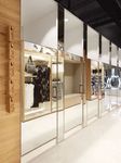
fashion storefront, Landini Associates’
PHOTOS: SHARRIN REES
retail reinvention for Glassons—now being
rolled out across the company’s entire
portfolio of stores—dramatically improved
brand perception among customers and
mall landlords.
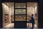
GentSac wanted customers to engage directly
PHOTOS: ROSS HONEYSETT
with the brand and seek advice in-store, try
products before they subscribe to the brand’s
service and buy immediate essentials. Landini
Associates worked with GentSac leadership
to develop a deep understanding of the brand
mission and ethos before designing its store.
retrofitmagazine.com // RETROFIT 19shopping center space into a 161-square- brand and, more to the point, its founders
foot flagship for GentSac, with the goal have seen a nearly 60 percent online sales
of allowing customers to engage directly increase since opening.
with the brand and seek advice in-store,
try products before they subscribe to the Designers Reinvent Normal to
brand’s service or simply buy immediate Shift Consumer Perceptions
essentials. It was critical for the design In the same way that a creative and brand-
team to work with GentSac leadership and responsive design can help connect the
develop a deep understanding of the brand dots between in-person experiences and
mission and ethos. The resulting design is online sales, this design approach can also
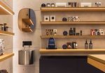
thoughtfully minimalist and calming with help retailers reinvent themselves and radi-
a material palette of light gray concrete cally shift public perception in a positive
walls offset by simple timber shelves that way. Consider Landini Associates’ recent re-
allow the product to remain the focus. design for Glassons, a New Zealand-based
Wall-mounted wooden hooks display fashion retailer facing global competition
the range of curated product “sacs,” and a from stores, such as H&M and Zara. The
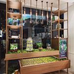
PHOTOS: COURTESY PRIMERA corner testing station offers an opportu- project brief from Glassons leadership to
nity to try products. The storefront features Landini Associates was to better present
In South Korea, eco-skincare brand black steel and glass sliding doors that the in-store product, making collections
Primera’s story is told and made physical allow the entire store to open, creating more intelligible and heightening custom-
through the use of natural materials, an inviting atmosphere that reflects the ers’ perceived quality of the great-value
drawings, photography and in-store herb brand personality and attracts customers merchandise.
gardens that juxtapose props of test inside. More a gallery space than a skincare As with GentSac, Landini Associates’
tubes and scientific apparatus expressing store, the GentSac space has generated design solution involved a deliberate, un-
Primera’s extensive scientific research. significant foot and online traffic for the conventional approach to materiality and
20 RETROFIT // July-August 2021layout. In this instance, the design team
understood that reinventing the brand
meant reinventing expectations of what
a clothes-shopping experience should
look and feel like. Taking inspiration from
the layout of supermarket aisles, the bold
design removes all products from the walls
and places them in wardrobe-like display
units that coherently frame individual col-
lections and allow them to be easily styled
together—a marked contrast to the usual
practice of cramming in as much product
as possible into a physically and visually
crowded interior environment.
The Glassons material palette includes
light oak, concrete and mirrors, resulting in
a fresh interior space that feels expansive PHOTO: ROSS HONEYSETT
and urban, along with other important
benefits. In fact, Landini Associates found Landini Associates reinvented its retail Inside Burt’s Bees’ Asia stores,
that presenting merchandise in this format for an approachable yet premium a large image of founder Burt
seemingly pared-down way created space position emphasizing sustainability and a Shavitz in nature with his bees sets
for 50 percent more product on the sales philosophy that everything should be for the brand’s story, along with an
floor. Another smart design solution that the greater good. From a design perspec- ever-popular collection of products
contributes to the clean aesthetic and en- tive, this meant storefront spaces that from the 1980s original range.
hances the sense of spaciousness is setting express brand principles: a simple, frugal
mirror-concealed stock rooms around the world that is at one with nature. Inside the
perimeter of the store. From a shopper’s store, a large image of founder Burt Shavitz thematic combination of nature and sci-
perspective, the result is an experience that in nature with his bees sets the brand’s ence—was translated into the redesigned
is at the same time more chic and more story, along with an ever-popular collection space with a newly refined experience that
intimate. of products from the 1980s original range. appeals to an increasingly sophisticated
By challenging the normal approach Natural materials capture the brand’s audience. The design approach enables a
to layout and materiality for a value-based essence and golden lighting recreates the narrative celebrating the science behind
fashion storefront, Landini Associates’ retail magic of being inside a beehive, inviting the natural efficacy of Primera’s products.
reinvention for Glassons—now being rolled warmth and encouraging customers to The brand’s story is told and made physi-
out across the company’s entire portfolio dwell longer in-store, discovering Burt’s cal through the use of natural materials,
of stores—dramatically improved brand Bees full offerings. Adding to the in-store drawings, photography and in-store herb
perception and not just among customers. experience is the dramatic honey wall, gardens that juxtapose props of test tubes
Leadership reports that mall landlords who which is made of replicated honey jars, for and scientific apparatus expressing Prim-
once turned Glassons away are now seek- an inviting and friendly atmosphere that era’s extensive scientific research. This kind
ing out the brand, offering prime high-traf- aligns with the brand personality, defined of comprehensive and narrative-driven
fic locations within their shopping centers. as passionate and cheerful. In tandem with design approach helps retailers generate a
the interiors, Landini Associates redesigned coherent language for customers, enabling
Telling Brand Stories the brand’s graphics and communica- them to feel the brand identity through the
Through Design tions: Signage, ticketing and information physical environment.
Storytelling is another powerful method graphics are often embossed with a playful, Ultimately, finding the best solution
for defining and selling a brand, and design iconic bee, all of which create a consistent for a retail client depends on the client’s
teams can help retailers reimagine their brand message that reinforces the position attentiveness to customer needs and an
in-store experience to tell their story and of Burt’s Bees as a standout choice in a understanding of how current in-store
distinguish themselves from the competi- crowded market. models are enhancing or detracting from
tion. Doing so requires a holistic approach Similarly, for the South Korean eco- the consumer experience. For creative and
in which every element of the physical skincare brand Primera, Landini Associ- forward-thinking retailers who understand
space—from signage to layout and store ates reinvented the retail flagship store the power of design to impact business, a
architecture—becomes a narrative tool. in Myeong-dong, Seoul, with a modern transformed in-person shopping environ-
When the popular skincare brand Burt’s storytelling of the brand’s highly successful ment can drive loyalty and sales, both on-
Bees planned for an expansion in Asia, “Botanist Atelier” concept. This concept—a the-ground and online.
retrofitmagazine.com // RETROFIT 21You can also read


