Spring Color - Corey Damen Jenkins
←
→
Page content transcription
If your browser does not render page correctly, please read the page content below
COLOR
PA I NT
Dying to Try
These obsession-worthy shades are inspiring
designers to experiment with new hues.
STARMAN
PORTOLA PAINTS & GLAZES
“The London restaurant
Sketch Gallery made me
fall in love with pink. Por-
tola’s Starman is more
subtle, less public-space
pow. It comes in a specialty
finish called Royal Satin
that has mica in it, so even
though it is a blush color,
it has a silvery sheen, like
satin ballet slippers. I can’t
wait to try it in a kitchen
with brass cabinet doors.”
TARA SEAWRIGHT
PRODUCER EMMA BAZILIAN PHOTOGRAPHER COURTESY OF SKETCH LONDON.
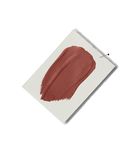
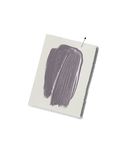
AWESOME VIOLET BRASSICA 271 MAHOGANY 36 TURKISH MARKET C2-571 TWILIGHT MAGENTA
SW 6815 FARROW & BALL FARROW & BALL C2 PAINT 2074-30
SHERWIN-WILLIAMS BENJAMIN MOORE
“I’m so inspired by the “In California, we tend to “I was lucky enough to
“While visiting the Art earth tones I see at my fam- lean toward light-colored have dinner once with “On my last trip to Paris,
Institute of Chicago last ily’s cabin on Anderson walls, but I’m dying to designer Juan Pablo Moly- I became enamored with a
summer, I fell hard for Island in Washington State. use Mahogany. The color neux and his wife in their door painted in this deli-
this delicate violet in This muddy lavender is reminds me of an iconic Paris home. The cinnamon cious, saturated magenta.
one of Monet’s water-lily the perfect complement to chocolate-brown Billy red of his library was cozy It’s a romantic and passion-
FOR MORE DETAILS, SEE RESOURCES
paintings. It was like a the rich greens, browns, Baldwin room. I think it and welcoming and practi- ate color that brings to mind
sweet melody standing and warm grays of the would be a great backdrop cally glowed in the evening a kiss—or even gleaming,
out among the other colors Pacific Northwest. I’d use for art and antiques—not light. While I may not be wet nail polish, freshly
on the canvas. It would it as an adventurous neutral to mention neutral uphol- able to build my own secret applied. I would love to use
be a perfect accent to a in a kitchen or bathroom. stery. The color really door like the one hidden it in a woman’s office with
navy blue or charcoal gray, It would be gorgeous with pops in the evenings, espe- in his bookshelves, I could floor-to-ceiling built-ins.
or as a splash of color walnut or smoked oak, cially with candles lit.” paint the walls in a color I’d give it a glossy finish and
within a neutral palette.” unlacquered brass, and a DAVID PHOENIX that transports me back to pair it with white furnish-
AMY WAX beautiful marble.” that magical night.” ings and brass accents.”
HEIDI CAILLIER MELANIE CODDINGTON KEITH LICHTMAN
24 HOUSE BEAUTIFULCOLOR
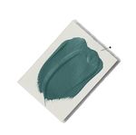
TEAL OCEAN 2049-30
BENJAMIN MOORE
“Years ago, John Ike—one of the partners in my
firm—introduced me to James McNeill Whistler’s
Peacock Room. It was totally the opposite of
what I would normally be drawn to—ostenta-
tious, a total show-off—but it was beautiful!
The color was like a deep ocean with different
shades of blue and green. I want to see it used
on faux-shagreen kitchen cabinets.”
MIA JUNG
PHOTOGRAPHER COURTESY OF THE FREER GALLERY OF ART AND ARTHUR M. SACKLER GALLERY,
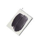
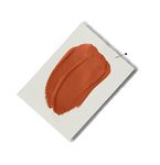
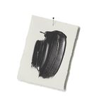
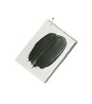
GREEN GRAPE STUDIO GREEN 93 OFF-BLACK 57 OBSTINATE ORANGE E25-44
88YY 66/447 FARROW & BALL FARROW & BALL SW 6884 FINE PAINTS OF EUROPE
GLIDDEN SHERWIN-WILLIAMS
“Studio Green is at the “I’ve always wanted to find “I’m very inspired by
“I have been perusing forefront of my color wheel the right project to use “I recently fell in love with nature. When working out
travel sites while planning these days. It’s an incred- Off-Black. It reminds me of the vibrant tangerine color West, we are fortunate to
a trip to celebrate my par- ibly deep shape-shifter of a the color of the sky just of a client’s Hermès hand- experience the majestic
ents’ birthdays, and I’ve tone. To create a moody before sunrise—a dusky bag. It’s joyous, exciting, Roosevelt elk in the imme-
been inspired by how escape in any space, I would black. I look to David Adjaye’s and gutsy! Orange remains diate landscape of our
residents of many exotic adorn the walls with this Sunken House for inspira- one of those elusive, undis- projects. I would use the
locales use fun colors on green and couple it with tion: It shows how black covered countries in the brown-gray tones of the
SMITHSONIAN INSTITUTION
their front doors to light, t extured fabrics on can be used to emphasize world of color. Some people elk’s coat in a high gloss on
brighten up their facades. the furniture. To top it all another color, creating a are ambivalent about using a wall to accentuate the
This apple green—not off, I’d be sure to have some beautiful balance. I’d use it because it’s not safe or texture of wood and create
quite lime or acidic—would killer lighting.” it strategically in an office conservative, but it’s all more depth of space.”
look fantastic against MELISSA LEWIS space or in a bedroom. about how you work it in WILLIAM PEACE
a gray or white exterior.” It has a calming effect.” with everything else.”
ANNIE LOWENGART DANI ARPS COREY DAMEN JENKINS
26 HOUSE BEAUTIFULYou can also read


