MIM-2021 Data Analysis Tool User Guide - Mortality and Longevity - April 2021 - SOA
←
→
Page content transcription
If your browser does not render page correctly, please read the page content below
Mortality and Longevity

 MIM-2021 Data Analysis Tool User Guide

April 2021
2
MIM-2021 Data Analysis Tool User Guide
AUTHOR Longevity Advisory Group: SPONSOR Mortality and Longevity Strategic
Larry N. Stern, Chair, FSA, MAAA Research Program Steering Committee
Jean-Marc Fix, FSA, MAAA
Sam Gutterman, FSA, MAAA, CERA, FCAS,
FCA, HonFIA
R. Dale Hall, FSA, MAAA, CERA, CFA
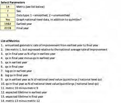
Thomas A. Jones, ASA, MAAA
Allen M. Klein, FSA, MAAA
Patrick David Nolan, FSA, MAAA
Laurence Pinzur, Ph.D.
Ronora Stryker, ASA, MAAA
Patrick Wiese, ASA
Caveat and Disclaimer
This study is published by the Society of Actuaries (SOA) and contains information from a variety of sources. It may or may not reflect the experience of any
individual company. The study is for informational purposes only and should not be construed as professional or financial advice. The SOA does not
recommend or endorse any particular use of the information provided in this study. The SOA makes no warranty, express or implied, or representation
whatsoever and assumes no liability in connection with the use or misuse of this study.
Copyright © 2021 by the Society of Actuaries. All rights reserved.
Copyright © 2021 Society of Actuaries
3

CONTENTS
Introduction.............................................................................................................................................................. 4
Tabs 1 and 2: Historical Mortality Datasets ............................................................................................................... 4
Tab 3: Graphical Comparison of National Level SSA and NCHS Mortality Information ............................................... 5
Tabs 4 and 5: Graphical Comparisons of NCHS Socioeconomic Quintile and Decile Mortality Information................. 7
Tabs 6 and 7: Graphs of Mortality Rates Across Years and Ages ................................................................................ 8
Tabs 8 and 9: Inputs for Heat Maps ........................................................................................................................... 8
Tabs 10 and 11: Heat Maps ..................................................................................................................................... 10
Tabs 12 and 13: Comparison of SSA and NCHS Mortality Rates to Other Mortality Tables ....................................... 10
Acknowledgments .................................................................................................................................................. 11
Endnotes ................................................................................................................................................................ 12
About The Society of Actuaries ............................................................................................................................... 13

                                                                                                                                        Copyright © 2021 Society of Actuaries
4
MIM-2021 Data Analysis Tool User Guide
Introduction
As described in the MIM-2021 Report 1, the selection of an appropriately chosen historical mortality data
set is an essential requirement of the MIM-2021 projection methodology. This document is a step-by-step
guide for the MIM-2021 Data Analysis Tool that can help users compare and analyze the various historical
mortality data sets available in the MIM-2021, as well as compare those historical rates to previously
published SOA mortality tables.
It should be noted the MIM-2021 Data Analysis Tool deals only with historical mortality rates. It does not
compare or analyze any of the future mortality rates developed under the MIM-2021.
Throughout this User Guide, the term “NCHS rates” without any further designation refers to all of the
following historical data sets:
• Full population mortality rates developed from National Center for Health Statistics (NCHS) death
counts starting in 1982 and U.S. census data going back to 1980.
• A variety of subsets of the NCHS full population data set, split into ranges (quintiles and deciles)
based on estimated socioeconomic categories; (site Mortality by Socioeconomic Category in the
United States). These subsets can be selected individually or blended in combination with other
subsets to more closely approximate the anticipated mortality experience of the covered
population to which the resulting mortality improvement rates are to be applied.
• Two additional groups of “static” NCHS decile data sets. These deciles have been based on
socioeconomic categories fixed as of 1980 2 and 2016, respectively, as contrasted to the subsets
described in the immediately preceding bullet, which reflect changes in socioeconomic deciles as
they might have varied over time.
Whenever it becomes necessary to distinguish among any of these NCHS data sets, some additional
description will be supplied.
Tabs 1 and 2: Historical Mortality Datasets
Tabs 1 and 2 include all of the historical SSA and NCHS mortality rates (smoothed 3 and unsmoothed,
respectively) required to produce the various graphs, heat maps, and tables generated in the remaining
tabs of the spreadsheet. The rates are shown for every calendar year starting in 1982 through 2018.
Two-dimensional Whittaker-Henderson smoothing was performed on the unsmoothed mortality rates
starting at age 15 through age 97. Therefore, Tab 1 includes smoothed gender-specific SSA and NCHS
mortality rates between those two ages only, while Tab 2 includes the unsmoothed gender-specific SSA 4
and NCHS mortality rates from ages 0 through 110.
Copyright © 2021 Society of Actuaries5
In both Tab 1 and Tab 2, specific mortality rates can be readily identified by “filtering” on the down arrows
in cells B7 through E7:
• Column B, “Data”: Choose from the desired historical SSA or NCHS data set(s) from the following
options:
o “d”: NCHS decile data sets, with deciles that vary in accordance with each county’s
socioeconomic categorization over the period 1982 through 2018.
o “d-1980”: NCHS decile data sets, with socioeconomic categories fixed as of 1980
o “d-2016”: NCHS decile data sets, with socioeconomic categories fixed as of 2016
o “q”: NCHS non-static quintile data sets
o “ssa”: SSA data set
• Column C, “Decile or Quintile”: For the NCHS rates, choose from the desired decile(s), quintile(s),
or “total” 5:
o Numeric value from 1 to 10: The value “1” represents the lowest socioeconomic scored
population group for both decile and quintile data sets. The data sets representing the
highest socioeconomic scored population groups are “5” for quintiles and “10” for
deciles.
o “total”: The full-population data set
• Column D, “Year”: Choose the desired calendar year(s); 1982 through 2018
• Column E, “Gender”: Choose the desired gender(s); “f” or “m”
Tabs 1 and 2 are “protected” sheets, meaning they cannot be altered. This is necessary because if the
structure of the data were inadvertently modified, then various worksheet tabs that use the data could
malfunction.
Tab 3: Graphical Comparison of National Level SSA and NCHS Mortality
Information
As discussed in Section 3 of the MIM-2020 Report, the SSA and NCHS data sets were derived from different
sources for ages 65 and over. Tab 3 allows users to visualize differences in the underlining mortality rates
and assess the impact of those differences on various related metrics.
Figure 1 displays an example of the inputs for Tab 3.
Copyright © 2021 Society of Actuaries6
Figure 1
TAB 3 INPUTS
.
The graph produced with this set of inputs (Figure 2) compares the annualized geometric rate of mortality
improvement from 1982 through 2018 for males aged 20 through 97, based on the smoothed SSA and
NCHS data sets
Figure 2
TAB 3 GRAPH SHOWING ANNUALIZED GEOMETRIC RATE OF MORTALITY IMPROVEMENT
National-Level Mortality Data: SSA versus NCHS
Copyright © 2021 Society of Actuaries7
Tabs 4 and 5: Graphical Comparisons of NCHS Socioeconomic Quintile and
Decile Mortality Information
Users can compare a range of key mortality metrics generated by each of the NCHS quintile (Tab 4) and
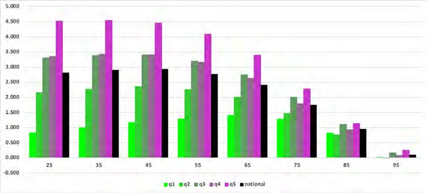
decile (Tab 5) data sets. Figure 3 displays an example of the inputs for Tab 4.
Figure 3
TAB 4 INPUTS
The bar graph produced with this set of inputs (Figure 4) shows for each NCHS quintile (and for the national-
level NCHS data set) a comparison of the change in period life expectancies between 1982 and 2018 for
females at eight ages, based on smoothed mortality data.
Copyright © 2021 Society of Actuaries8
Figure 4
TAB 4 BAR GRAPH COMPARING THE CHANGE IN PERIOD LIFE EXPECTANCIES
Except for an additional option to select one of the “static” decile data sets (d-1982 or d-2016) for the
comparisons, the inputs and analysis in Tab 5 are the identical to those in Tab 4.
Tabs 6 and 7: Graphs of Mortality Rates Across Years and Ages
Tabs 6 and 7 provide the user with an opportunity to compare graphs of mortality rates across a range of
years and ages. Users first select in cell C7 of both Tabs the type of output desired:
• Mortality rates
• Natural logarithm of mortality rates
• The ratio of the selected mortality rate to the corresponding mortality rate in 1982.
On Tab 6, users can select up to ten combinations of data set, age and gender. Running the “Redraw Graph”
macro produces a graph of the corresponding mortality rates across all years from 1982 through 2018.
Similarly, on Tab 7, after selecting up to ten combinations of data set, calendar year and gender, a graph
comparing mortality rates across all ages 20 through 90 is produced.
Tabs 8 and 9: Inputs for Heat Maps
Tabs 8 and 9 offer the user the ability to select mortality data sets to plot on a heat map(s). After selecting
the desired data set(s) and pressing RUN, a user is transported to Tab 10 which displays the requested heat
maps.
Tabs 8 and 9 are similar in nature, but they each serve a slightly different purpose. Tab 8 is used to select a
series of heat maps to produce in sequence, with each heat map reflecting a single mortality data set. For
example, one could produce heat maps for each of the five socioeconomic quintiles. Tab 9, in contrast,
produces just one pair of heat maps (female and male), but permits a user to blend data sets by entering
Copyright © 2021 Society of Actuaries9
weights across quintiles or deciles. For example, a user could produce female and male heat maps that
reflect a 50%/50% blend of deciles 9 and 10.
Both Tabs 8 and 9 permit a user to specify both the age range (cells B9 and B10) and the year range (cells
B10 and B11) to display on the heat maps. Either smoothed or unsmoothed data can be selected (cell
B14). Any of three output types can be selected with cell B15: (1) mortality improvement rates, (2)
mortality rates and (3) mortality rates divided by the corresponding rate in a user-specified year (cell B16).
On Tab 8, after choosing the age/year range and the type of output, range B19:B98 is used to select data
sets. Figure 5 illustrates a request to produce heat maps for six data sets: a “total” data set includes all
quintiles, and then each of the five separate quintiles. The numbering in the example below – 1 through 6
– indicates the order in which the heat maps will output on Tab 10. Simply leave a cell blank if the user
does not wish to output a heat map for that data set.
Figure 5
TAB 8 EXAMPLE OF DATA SET SELECTION FOR HEAT MAPS
SSA-F
SSA-M
1 q-total-F
q-total-M
2 q-1-F
q-1-M
3 q-2-F
q-2-M
4 q-3-F
q-3-M
5 q-4-F
q-4-M
6 q-5-F
Using input range B19:B98, the user may select as many (or as few) data sets as the user wishes, i.e., there
is no maximum or minimum limit on the number of selected data sets.
Cell B101 contains an optional input enabling the selected data to be expressed relative to the user-
specified data set in cell B101. For example, suppose a user enters “q-total-F” in cell B101, and suppose,
with cell B15, a user selects mortality improvement rates as the desired output. In this case, the heat maps
will show mortality improvement rates expressed relative to those from data set “q-total-F” (the national-
level data). Continuing this example, suppose the improvement rate for females aged 55 in 2010 is 1%
using national level data, and 1.5% using data for the upper quintile. Then relative improvement rate for
the upper quintile is 1.5% minus 1.0%, or 0.5%, and this result would be plotted on the heat map.
Like Tab 8, Tab 9 has inputs for selecting the age and year range to plot on the heat maps. Beginning in row
19, however, the inputs on Tab 9 differ from those on Tab 8. Use cell B19 to select one of 6 data sets to
plot. Data sets 1 and 2 are national-level data sets, while data sets 3 through 6 involve quintiles or deciles.
For these data sets, the user must enter quintile/decile weightings on row 29. The weights must sum to
100%.
After setting the parameters, press RUN on Tab 8 or 9 to produce the heat maps.
Copyright © 2021 Society of Actuaries10
Tabs 10 and 11: Heat Maps
Tab 10 presents the heat map(s) requested on Tab 8 or Tab 9. The default color legend appears in range
C6:R6. Alternatively, a user can enter their own set of colors in range C11:R11, and then set cell I13 to
“User-Specified”. To enter a set of colors on row 11, simply format each cell’s background color to match
the desired color.
Rows 7 through 10 contains the numerical values corresponding with each color. A user may change any of
these values, taking care the sequence of values increases monotonically from left to right.
Tab 11 shows the data plotted on the heat maps on Tab 10. To see all the data, set cell B5 and B6 to “1”,
and then re-run Tab 8 or Tab 9. For a compact presentation of the data, use cells B5 and B6 to show only
every “Nth” calendar year and every “Nth” age. After setting cells B5 and B6, re-run Tab 8 or 9 to produce
the desire output.
Tabs 12 and 13: Comparison of SSA and NCHS Mortality Rates to Other
Mortality Tables
Tab 12 facilitates a comparison of the SSA and NCHS mortality rates against commonly used mortality
tables. Use cells B8, B9 and C19:L19 to select a SSA or NCHS data set. This data set can be compared
against any of the data sets shown on rows 33 through 226. Select any (or all) of these data sets by
entering a “1” in the appropriate cell in range J33:J226. If the user wishes to exclude a data set, simply
leave the corresponding row blank in column J.
Cell B23 provides two options for comparing the SSA or NCHS data against the comparison mortality table.
Under option 1, the outputs will be SSA/NCHS mortality rates minus the corresponding rates for the
comparison table(s). Under option 2, the outputs will be SSA/NCHS mortality rates divided by the
comparison table(s).
After setting the various parameters, press “Fetch and Compare the Selected Mortality Tables”. The
outputs will appear in columns P through AA. Each row shows the results for one comparison table.
Consider the following example:
Figure 6
TAB 12 EXAMPLE
This example compares NCHS national-level female mortality rates against the RP-2006 female white-collar
employee mortality table. No results appear for ages 20, 30 and 40 because the RP-2006 table begins at age
50. Consider the “133%” value at age 70. This indicates the NCHS mortality rate at age 70 is 33% greater
than the corresponding mortality rate from the RP-2006 table.
Note Tab 13 contains the comparison mortality tables. Keep in mind some of these tables do not cover the
entire age. For example, many of the annuitant tables begin at age 50.
Copyright © 2021 Society of Actuaries11
Acknowledgments
The authors’ deepest gratitude goes to those without whose efforts this project could not have come to
fruition: the volunteers who generously shared their wisdom, insights, advice, guidance, and arm’s-length
review of this study prior to publication. Any opinions expressed may not reflect their opinions nor those of
their employers. Any errors belong to the authors alone.
Mary Bahna-Nolan, FSA, MAAA, CERA
James Berberian, ASA, EA, MAAA, FCA
Kevin Mark Bye Jr, ASA
Timothy D. Morant, FSA, MAAA
Marianne Purushotham, FSA, MAAA
Linn K. Richardson, FSA, MAAA, CERA
Manuel S. Santos, FSA, FCIA
George Silos, FSA, MAAA, CERA
Joel C. Sklar, ASA, MAAA
Jim Toole, FSA, MAAA, CERA
At the Society of Actuaries:
Cynthia MacDonald, FSA, MAAA, Sr. Experience Studies Actuary
Jan Schuh, Sr. Research Administrator
Copyright © 2021 Society of Actuaries12
Endnotes
1
Society of Actuaries. 2021. “Developing A Consistent Framework For Mortality Improvement”.
https://www.soa.org/resources/research-reports/2021/developing-consistency-framework/.
2
Although the NCHS mortality data begins in 1982, the decennial census as of 1980 was used to establish
socioeconomic categories for this group of static NCHS data sets. Given the decennial census occurs only
once every 10 years (e.g. 1970, 1980, 1990, etc.), the 1980 census is positioned closest in time to the first
year of the NCHS mortality data (1982).
3
See Appendix A of the MIM-2021 Report for a description of the methodology used to smooth historical
mortality rates. Society of Actuaries. 2021. “Developing A Consistent Framework For Mortality
Improvement”. https://www.soa.org/resources/research-reports/2021/developing-consistency-
framework/.
4
The SSA mortality rates included in Tab 2 are those that were published in connection with the annual
Trustees’ Reports, and subsequently reflect the SSA’s standard practice of smoothing their mortality rates
within calendar years, but not between calendar years.
5
For the SSA data set, “total” is the only available option in column C.
Copyright © 2021 Society of Actuaries13
About The Society of Actuaries
With roots dating back to 1889, the Society of Actuaries (SOA) is the world’s largest actuarial professional
organization with more than 31,000 members. Through research and education, the SOA’s mission is to
advance actuarial knowledge and to enhance the ability of actuaries to provide expert advice and relevant
solutions for financial, business and societal challenges. The SOA’s vision is for actuaries to be the leading
professionals in the measurement and management of risk.
The SOA supports actuaries and advances knowledge through research and education. As part of its work,
the SOA seeks to inform public policy development and public understanding through research. The SOA
aspires to be a trusted source of objective, data-driven research and analysis with an actuarial perspective
for its members, industry, policymakers and the public. This distinct perspective comes from the SOA as an
association of actuaries, who have a rigorous formal education and direct experience as practitioners as
they perform applied research. The SOA also welcomes the opportunity to partner with other organizations
in our work where appropriate.
The SOA has a history of working with public policymakers and regulators in developing historical
experience studies and projection techniques as well as individual reports on health care, retirement and
other topics. The SOA’s research is intended to aid the work of policymakers and regulators and follow
certain core principles:
Objectivity: The SOA’s research informs and provides analysis that can be relied upon by other individuals
or organizations involved in public policy discussions. The SOA does not take advocacy positions or lobby
specific policy proposals.
Quality: The SOA aspires to the highest ethical and quality standards in all of its research and analysis. Our
research process is overseen by experienced actuaries and nonactuaries from a range of industry sectors
and organizations. A rigorous peer-review process ensures the quality and integrity of our work.
Relevance: The SOA provides timely research on public policy issues. Our research advances actuarial
knowledge while providing critical insights on key policy issues, and thereby provides value to stakeholders
and decision makers.
Quantification: The SOA leverages the diverse skill sets of actuaries to provide research and findings that
are driven by the best available data and methods. Actuaries use detailed modeling to analyze financial risk
and provide distinct insight and quantification. Further, actuarial standards require transparency and the
disclosure of the assumptions and analytic approach underlying the work.
Society of Actuaries
475 N. Martingale Road, Suite 600
Schaumburg, Illinois 60173
www.SOA.org
Copyright © 2021 Society of ActuariesYou can also read