Improving energy bills: interim report - A report prepared for the Australian Energy Regulator - Behavioural Economics ...
←
→
Page content transcription
If your browser does not render page correctly, please read the page content below
Improving energy bills: interim
report
A report prepared for the Australian Energy Regulator
September 2021

                                                        Behavioural Economics Team of the Australian Government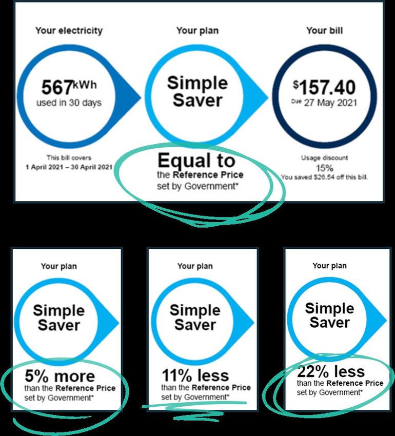
BETA and behavioural insights

                                                 What is behavioural                             Why is it useful for
About BETA                                       insights?                                       public policy?
The Behavioural Economics Team of the            Economics has traditionally assumed             Behavioural insights apply behavioural
Australian Government, or BETA, is the           people always make decisions in their best      concepts to the real world by drawing on
Australian Government’s central unit applying    interests. Behavioural insights challenges      empirically-tested results. These new tools
behavioural insights to improve public policy,   this view by providing a more realistic model   can inform the design of government
programs and processes.                          of human behaviour. It recognises we are        interventions to improve the welfare of
                                                 systematically biased (for example, we tend     citizens.
BETA’s mission is to advance the wellbeing of
                                                 to satisfy our present self rather than         Rather than expect citizens to be optimal
Australians through the application and
                                                 planning for the future) and can make           decision makers, drawing on behavioural
rigorous evaluation of behavioural insights to
                                                 decisions that conflict with our own            insights ensures policy makers will design
public policy and administration.
                                                 interests.                                      policies that go with the grain of human
                                                                                                 behaviour.

                                                                                                                                           2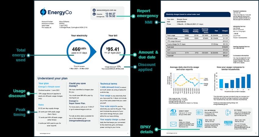
Executive Summary
Context and research design                                                     Bill comprehension: Understanding how the bill was calculated
BETA partnered with the Australian Energy Regulator (AER) to apply              • We tested different formats for the detailed charges table showing the
behavioural insights to the design of energy bills. We conducted a literature     breakdown of costs. None of the alternative designs performed better than the
review to identify key research questions, which we examined through two          current ‘invoice-style’ table.
online samples involving over 14,000 Australians, including six randomised      • Simple plan summaries helped consumers to better understand their plan (but
controlled trials.                                                                did not improve the likelihood they would choose a better deal).
Bill content: What is the priority content for inclusion on the bill?           Bill comprehension: Switching and market engagement
• The main purpose of energy bills is to enable customers to make a             • In two separate trials, adding a ‘best retailer offer’ to bill prototypes increased
  payment.                                                                        respondent’s intention to switch plans. This was based on responses to an
• Many survey respondents said they also use bills to: find information about     open question seeking suggestions for how to save money.
  how much energy they use, understand how their bill was calculated, and       • We also tested the impact of comparing plans on bills to a reference price.
  find information about their energy plan.                                       Respondents were more likely to say they would shop around for a better plan
Bill simplification: Length, layout, and definitions                              if they saw that their plan was equal to the reference price, and less likely to
• Consumers find bills complex and confusing. We explored two aspects of          shop around if they saw that it was below the reference price.
  simplification: variations in bill length or layout.                          Bill comprehension: Energy usage and solar exports
• Compared to a short bill, we did not find evidence that a well-designed       • A benchmark helped consumers understand how household consumption
  longer bill reduced comprehension. Reducing the amount of content may           compared to similar households but the format didn’t make a difference.
  not be that important for addressing information overload. This is just one   • Energy usage charts worked equally well, irrespective of their format.
  element of simplification.
                                                                                • We tested various formats for a new chart showing solar exports. No format
• We also designed a bill where some information was removed but available        clearly outperformed the others however 87% of respondents who have solar
  via a link to view a ‘Home Energy Report’. This friction made respondents       panels said they would value having this information on their bill.
  much less likely to find the information, even when asked to look for it.
                                                                                Limitations and next steps
• Including a box with plain English definitions for technical terms had no
                                                                                • Like any research, ours has limitations. We’ve highlighted these in the report.
  positive impact on comprehension.
                                                                                • This is an Interim Report prepared to inform the AER’s consultations on the
                                                                                  Billing Guideline. BETA will publish our full report later in the year.     3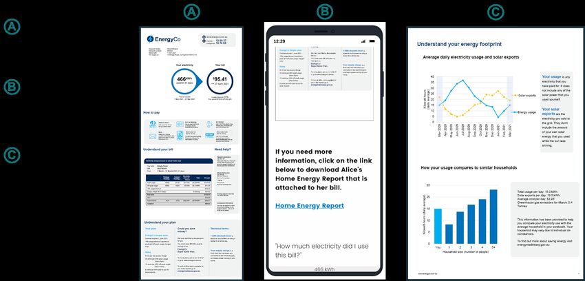
Contents

A.   Context and research design

B.   Bill content

C.   Bill simplification: length, layout and definitions

D.   Bill comprehension: how the bill is calculated

E.   Bill comprehension: switching and market engagement

F.   Bill comprehension: energy use and solar exports

G. Limitations and next steps
H.   Appendix: bill designs

                                                           4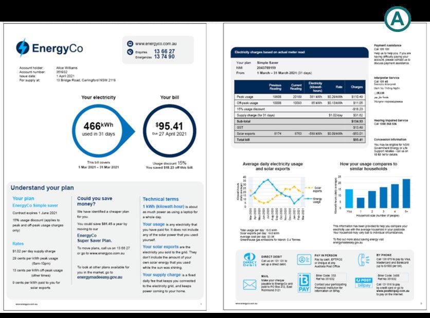
We undertook a review of existing literature                                                                            The literature review identified
                                                                                                                        several well-supported findings:
BETA began this project by undertaking a literature review on three bill content areas:
                                                                                                                  Energy bills include complex content that
                                                                                                              1   can make them difficult to understand and
      Complex bill content and structures are confusing for consumers in the energy market.                       cause confusion for consumers.
      Retailers and consumer groups contest what causes this confusion, but there are matters where
      evidence in the literature is clear on the changes that can improve energy bills. Replacing text with       Bill simplification, based on evidenced-
      graphs, using conversational language, reducing the amount of information, and providing
      important information on the first page are proven ways to improve bill comprehension. Further
                                                                                                              2   based behavioural principles, can reduce
                                                                                                                  the cognitive load that bills place on
      research should test whether standard presentation of key plan characteristics and plain language           consumers, making them easier to
      definitions of technical terms improve understanding.                                                       understand and effectively use.

      Providing consumers with feedback on their energy usage is an effective way to engage                       Drawing on the available literature,
      and educate them on their energy efficiency. However, issues with the format and delivery of
                                                                                                              3   stakeholder submissions and broader
      usage feedback in Australia means that many consumers have problems understanding this                      evidence from behavioural science, we
      information. Existing research does not clarify the ideal format and mode of delivery for this and          identified four key principles for the design
      the information could be improved to help consumers whilst reducing costs for businesses.                   of energy bills:
                                                                                                                  a. Language: Use simple, conversational
                                                                                                                     language
      Making bills easier to compare is a crucial step in encouraging switching, but more active
                                                                                                                  b. Presentation: Make the bill visually
      promotion of switching services in bills themselves also motivates inert consumers.
                                                                                                                     attractive
      Standardisation of key terms between retailers will help consumers make better decisions when
      comparing plans. However, switching providers is often difficult. Encouraging ‘within provider’             c. Salience: Make the key information
      switching (i.e. to a cheaper plan offered by one’s current retailer) may be an easier and more                 salient
      effective method for helping consumers. So-called ‘Best offer’ notices and other calls to action on         d. Structure: Order the information
      bills need further investigation to identify how they can be used to aid consumer switching.                   carefully and logically.

               Caveat: The literature review sought to cover most of the key research relevant to identifying gaps in relation to energy bill contents and
               billing requirements but it was not a full systematic review and so does not claim to be comprehensive.                                            5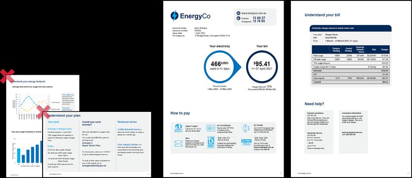
We identified gaps in the literature
The gaps in the literature that we identified included:                                    These gaps shaped our three research questions:

        Simple definitions of technical terms, e.g, kilowatt-hours, tariffs, should be
        tested to improve comprehension of bills.                                                  Bill content: What is the priority
                                                                                                   content for inclusion on the bill?
        The presentation of calls to action (for switching behaviour) should be tested      This covers how consumers engage with their energy bills
        to improve understanding of consumers while minimising distrust.                    (what elements they read, and what they use their bills for)
                                                                                            and the impact of some new types of bill content.
        A standardised summary of plan characteristics placed on the front page
        should be tested for its potential to improve comprehension of a plan.
                                                                                                   Bill simplification: How do we reduce
        Different displays of total usage in historical usage graphs should be tested to           information overload in bills?
        improve comprehension of bills.
                                                                                            This covers bill length and layout, as well as inclusion of
                                                                                            plain English definitions of technical terms.
        The impact of taking non-essential information off bills and/or delivering it
        through alternative means (such as a link from the bill to a website) should be
        tested to determine whether it would improve comprehension.
                                                                                                   Bill comprehension: How do we
        The efficacy and format of peer comparison (benchmarking) energy usage
                                                                                                   maximise comprehension of bill content?
        graphs should be tested to improve comprehension for consumers and reduce
        costs for businesses receiving complaints.                                          Comprehension covers a number of features:
                                                                                            • How the bill is calculated
        Communication of solar power in bills should be tested to help consumers
                                                                                            • Switching and market engagement
        more accurately evaluate the value of their solar system and optimise their
        consumption.                                                                        • Energy use and solar exports
                                                                                                                                                           6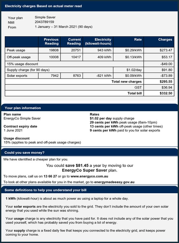
We conducted research with over 14,000 Australian consumers
We collected 2 online sample populations targeting energy
consumers living in the regions covered by the National Energy
Customer Framework (QLD, NSW, SA, TAS and the ACT). We
oversampled respondents from SA, TAS and the ACT. The
sample characteristics are illustrated on the next slide.
There were 6 randomised controlled trials (RCTs) embedded in
the 2 samples. For each RCT, respondents were shown one bill
design, followed by a series of questions designed to measure
their comprehension (based on up to 9 questions) or intentions.
Respondents were randomly assigned to see different bill
designs independently for each trial.
The first sample population of 6,372 respondents (Group A)
included a survey and 3 trials. In each trial, we tested 4 bills or
bill elements (hence each bill was shown to more than 1,500
respondents). The ordering of the 3 RCTs was the same for all
respondents but the ordering of the survey and the 3 RCTs was
randomised.
The second sample of 7,827 respondents (Group B) included 3
more trials, with 5 bills or bill elements in each trial (again
showing the bill to more than 1,500 respondents). The ordering
of each RCT was randomised.

                Caveat: like any research, ours has limitations. We’ve highlighted these as relevant in the report. Please also see
                Section G: Limitations and next steps.                                                                                7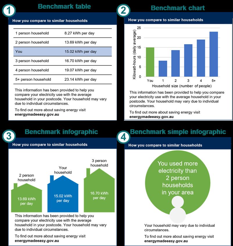
The survey reflected groups in varied circumstances in different
parts of Australia*

* Group A, n=6,372; Group B showed similar diversity.              8
Contents

A.   Context and research design

B.   Bill content

C.   Bill simplification: length, layout and definitions

D.   Bill comprehension: how the bill is calculated

E.   Bill comprehension: switching and market engagement

F.   Bill comprehension: energy use and solar exports

G. Limitations and next steps
H.   Appendix: bill designs

                                                           9
Consumers use bills to pay their bills,                                                     Top 4 uses of bills
and for various related purposes
                                                                                                Finding out much to
Respondents receive their bills through various channels: an email, a letter, in an             pay
app, and/or on a retailer website.
Most consumers use the bill to find out how much to pay (although this may be
optional for direct debit consumers). Consequently, the most-read bill elements are
the ones relevant to paying the bill: the amount owing, and the due date.                       Finding out how much
Bills are used for a variety of related purposes. Other popular uses consumers                  energy they have used
selected include:
• finding out how much energy they have used,
• checking how their bill was calculated, and
• finding information about their energy plan.
                                                                                                Checking how their bill
A substantial minority identified other ways they use the bill, including for complaints,
                                                                                                was calculated
seeking financial help, or to find interpreter services.
Further details on these survey findings will be presented in the final report, which
will be published later this year.                                                              Finding information
                                                                                                about their energy plan

                                                                                                                          10
                                                                                                                           10
We asked consumers whether they would value new or existing
elements of their bills
We tested several types of new and existing bill content designed to meet the Australian Energy Market Commission’s (AEMC) billing objectives. After giving
respondents an opportunity to engage with the bill content (through a randomised controlled trial), we asked a follow-up question to find out whether they agreed that
they would value this information on their own energy bill. The graphics below show that a large majority of respondents strongly, moderately or slightly agreed that
they would value this information.
Caveats: 1) stated preferences do not always match actual preferences. 2) The percentage for each group may be affected by responses
from ‘non-genuine’ participants. 11Contents
A. Context and research design
B. Bill content
C. Bill simplification: length, layout and definitions
D. Bill comprehension: how the bill is calculated
E. Bill comprehension: switching and market engagement
F. Bill comprehension: energy use and solar exports
G. Limitations and next steps
H. Appendix: bill designs
12How we developed
well-designed prototype bills Key design principles applied to energy bills
We drew on previous research and key behavioural Language
Use conversational language and plain English, aiming for a
insights principles to design prototype bills.
year 7-8 reading level. Remove jargon or technical terms where
We used a prototype ‘simple bill’ that had we developed during previous possible.
research on energy billing (BETA, 2018) as the starting point for testing
the impact of length and layout.
Our previous research included: Presentation
Make the bill visually attractive. Use a combination of text,
• a review of the literature, diagrams and tables.
• focus groups in which participants compared three existing electricity
bills, answered semi-structured questions, and designed their ideal bill,
• user testing, including eye tracking of a range of designs and checking Salience
comprehension, and
Include key information on the front page. Only include one
• testing a subset of the designs through a framed field experiment. graphic for the ‘amount due’. Use boxes and bold sparingly to
highlight key information.
We also applied BETA’s ‘WISER framework’ for improving government
forms to the updated bill designs (BETA, 2020) .
Structure
Group the bill contents into common themes (e.g. how to pay,
understand your bill, understand your plan). Order information
carefully and draw out key facts.
13We tested the length and layout of well-designed bills
We designed four bills which varied in length, layout and the number of additional elements on the bill.
The ‘simple bill’ from our previous research (BETA, 2018), was the starting point for all 4 bills developed for this trial. To design a ‘comprehensive bill’, we reviewed
many bills in the market, and drew on key ideas from our literature review and from stakeholder submissions. The ‘basic bill’ was stripped back to minimum essential
information.
In all the bills tested, we set out to make the information as clear and as easy to understand as possible, based on principles established in the existing literature.
Thus, we tested well-designed prototypes, not genuine bills. Each bill element was kept constant across designs so we could isolate the impact of specific changes to
bill length or layout. In subsequent trials, we tested the impact of including individual elements (such as a plan summary) or we tested variations in the design of that
element (such as the past usage chart).
Respondents were randomly assigned to view one prototype bill – described below – and were able to refer to it to answer a series of comprehension questions.
1 2 3 4
Comprehensive bill (2 pages) Structured comprehensive bill Email-style bill Basic bill (2 pages)
Similar to many existing bills over (3 pages) Main bill contains same content as Only contains information necessary
two, densely packed pages. Same content but with headings, first two pages of Bill 2 in long email to enable payment, a table showing
more white space, and a “home format. The additional information in how the bill was calculated and key
energy report” on the third page (this the “home energy report” is available contact details (omits plan summary,
drew together all the information via a clickable link. definitions, best offer and home
about energy consumption, solar energy report).
exports and benchmarks).
14Bill 1: Comprehensive bill (control group)
15Bill 2: Structured comprehensive bill (3 pages)
16Bill 3: Email-style bill (with link to further information)
17Bill 4: Basic bill (2 pages with limited content)
What’s in and what’s out?
The basic bill retained essential information:
• How much, when and how to pay
• The detailed charges table
• ‘Need help?’ contact details
The basic bill did not have:
• The plan summary
• Past energy usage, benchmarks or solar exports
• The ‘best offer’
• Definitions of technical terms
18In a well-designed bill, the overall length and layout isn’t a big
barrier
Respondents were able to refer to their bill to answer 9 questions that tested:
• comprehension of payment information (amount, date, payment methods),
• ability to correctly identify important details (NMI, contact numbers),
• understanding of how their bill was calculated.
For all 4 bill designs, respondents were about equally likely to find the correct
answers. This was true regardless of whether the bill design was:
• re-structured to add more white space,
• shortened by removing additional content,
• arranged in a commonly used format in the market, with a link to more
information.
The scope of this research did not include testing genuine bills used by energy
retailers. We reviewed many bills in developing the trial design however testing a
handful of genuine bills would have had limited value given that retailers have created
many different versions. Furthermore, without some standardisation of presentation, if
different bills had performed differently, it would not have been possible to determine
what bill attribute caused it to perform better than others.
Note: We will include the results of a range of secondary outcomes in our final report,
to be published later in the year.
Caveats: 1) We designed our survey experiment to attempt to mimic a real-life situation. Nonetheless, respondents’ comprehension in
an online survey setting may be different from energy consumers’ comprehension in real life.
2) The percentage for each group may be affected by responses from ‘non-genuine’ participants however, the differences between
19
these groups are robust to any such responses.Why didn’t the shorter bill perform better?
Our literature review concluded that several factors contribute to cognitive
overload when reading energy bills: consumers’ low energy literacy, complex
and inconsistent language, large amounts of information, and confusing
layouts.
And yet the shorter ‘basic bill’ performed no better than the others – and
perhaps worse on questions related to understanding how the bill was
calculated (see table).
So why didn’t the shorter bill perform better?
• Shorter is not always simpler. Some additional explanatory information can
make a bill easier to understand.
• All layouts drew attention to key information, such as by putting the amount
and due date in a bold circle. Even on the longer bills, this information was
still easy enough to find in our prototypes.
These results suggest that a bill that incorporates sound design principles can
vary (within a reasonable range) in terms of content and length without
compromising comprehension and causing information overload.
20Small friction costs, like clicking a link, are a big deterrent
All bill designs other than the ‘basic bill’ contained information on: past
energy usage, energy benchmarks, and solar exports. This information
was presented in the following formats:
• The Comprehensive Bill (#1) had these charts embedded on page 2
among other information (a common way to present this information).
• The Structured Comprehensive Bill (#2) had larger charts on page 3
with the heading Understanding Your Energy Footprint.
• The Email-Style Bill (#3) had a link in the bill prompting respondents to
‘Click on the link to download the Home Energy Report’.
For these three bills, we asked respondents additional comprehension
questions about their energy usage and energy generation (solar exports).
We found no differences in comprehension about energy usage or solar
exports between the two comprehensive bills. However, the Email-Style
Bill with the clickable link performed substantially worse on this
measure (21-22 percentage points lower than comprehensive bills, which
contained identical information). This is because only 15% of respondents
in the Email Bill group clicked on the link to download the Home Energy
Report.
Caveats: 1) We designed our survey experiment to attempt to mimic a real-life situation. Nonetheless, respondents’ willingness to click
on a link in an online survey setting may be different from that of energy consumers in real life. 2) The percentage for each group may be
affected by responses from ‘non-genuine’ participants however the differences between these groups are robust to any such responses. 21Including a definitions box did
not improve comprehension
We used plain English wherever possible in the energy bill.
However, some technical terms were hard to replace so we tested the impact
of adding a box with plain English definitions for:
• ‘Kilowatt-hours’
• ‘Solar exports’
• ‘Supply Charge’ and
• ‘Usage charge’ (or ‘energy usage’).
We explicitly tested definitions twice, adding them to plan summaries and to
home energy charts to see if they boosted comprehension.
We found no positive impact of including a definitions box on
comprehension.
This result was a surprise as we asked a series of comprehension questions
that should have been easier to answer with clear definitions. If anything, our
results suggested the group who received definitions may have performed
worse on these questions. We are unsure why this might be.
We sought to select the appropriate technical terms and provide clear
definitions but we are open to the possibility that different definitions may have
yielded a different response.
22Contents
A. Context and research design
B. Bill content
C. Bill simplification: length, layout and definitions
D. Bill comprehension: how the bill is calculated
E. Bill comprehension: switching and market engagement
F. Bill comprehension: energy use and solar exports
G. Limitations and next steps
H. Appendix: bill designs
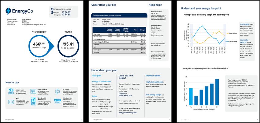
23Plan summaries made it easier to understand
your plan (but not to choose the best deal)
Energy plans have many different characteristics—such as peak and off-peak hours, rates, supply
charges, and discounts. Understanding these characteristics is important for understanding how the bill
was calculated, and how consumers might optimise their energy usage. For example, the breakdown of
charges usually states the peak and off-peak usage, but without knowing which times of day are peak or We added in
off-peak, it is difficult to know how to reduce your bill in the future. a summary
In the Australian energy market, few retailers include plan details on the bill. Some include the plan name
but others do not even include this.
We designed a brief summary of plan characteristics that set out: the plan name, contract expiry date,
details of the usage discount, and details of the rates (including the times and rates for peak and off-peak
charges).
We found that a plan summary helped consumers to better understand how their bill was
calculated. Specifically, a higher proportion of respondents who saw the plan summary (62%) correctly
understood the time of peak and off-peak periods (specifically, that midnight was off-peak and 8pm was
We showed
peak) compared to those who did not (53%). two alternatives
We did not find evidence that a plan summary helped respondents choose a better deal. We asked
respondents to compare three plans: their own bill (either with or without a plan summary) plus two
alternatives drawn from the Energy Made Easy website, both of which were lower cost. However,
respondents who saw a plan summary were no more likely to choose a better deal. We suspect this is
because Energy Made Easy already simplifies plan comparison by prominently displaying what the bill
would have cost under each plan. In this sense, respondents are not disadvantaged when comparing to
other plans through Energy Made Easy.Existing charges table performed as well as our re-designs
The detailed charges table is an important bill feature.
Charges tables typically include the number of units of energy consumed (e.g. days or
kilowatt hours), price per unit, and the total amount for the bill. This is usually found on
page 2 of a bill.
In our review of existing bills, detailed charges tables were relatively similar across
different retailers. A previous study found that their “reengineered bills outperformed
currently in-market utility bills on numerous key metrics of clarity and fluency” in
research for the Ontario Energy board (BEworks 2016).
We tested several designs, two of which were inspired by the BEworks design, against
a version that looks similar to many designs currently in the market.
We found that the alternative detailed charges tables failed to materially outperform
the familiar ‘invoice-style’ table. Consumers did not rate the new versions easier to
understand, nor were they able to answer the comprehension questions more
accurately.
In part, this was because respondents who saw the invoice-style table already had a
high level of comprehension. Three-quarters of these respondents were able to verify
the amount of the supply charge and to rate the detailed charge breakdown as easy to
understand.
One challenge is to create a design that is flexible enough to be adapted for any of the
different pricing models currently available in the market.
25Contents
A. Context and research design
B. Bill content
C. Bill simplification: length, layout and definitions
D. Bill comprehension: how the bill is calculated
E. Bill comprehension: switching and market engagement
F. Bill comprehension: energy use and solar exports
G. Limitations and next steps
H. Appendix: bill designs
26Testing switching behaviours
and market engagement
We tested the impact of two features on switching behaviours and Methodological differences
market engagement, but with differences in methodology
We used different measures to evaluate the impact the best retailer
The AEMC final determination specifies that billing information should enable small offer and the reference price.
customers to “compare their customer retail contract with other energy offers
available to them”. For the best retailer offer, respondents were asked an
open question seeking suggestions on ways to reduce
We used different methods to test how providing ‘best retailer offer’ and ‘reference
energy costs or save money on their electricity, and they
price’ information on a bill could impact consumers’ intentions to engage in switching
could write in any free-text response.
behaviours.
For the reference price, respondents were asked whether
Best retailer offer the information about the reference price would lead them
For the ‘best retailer offer’, we tested if adding information about to: shop around for a better deal, stay on their current
cheaper plans available from their current retailer prompted participants deal, or feel unsure.
to think about comparing or switching plans.
Consequently, it is not possible to make a direct comparison
between the two sets of results.
Reference price
However, the differences between groups within a trial (e.g. the
For the ‘reference price’, we tested if adding information comparing an
difference between ‘best offer’ and ‘no best offer’, or between ‘equal
existing plan to the market reference price would increase participants'
to reference price’ and ‘below reference price’) remain reliable
intention to shop around.
estimates the impact of those features.
27We added a ‘best retailer offer’ We added information telling consumers about cheaper plans available from their current retailer. The ‘best retailer offer’ was included in a box entitled ‘Could you save money?’ along with a statement of how much money could be saved, and an encouragement to compare with other plans in the market by visiting the Energy Made Easy web site. We wanted to know whether seeing this information would make people more likely to consider switching plans. We tested the impact of the ‘best retailer offer’ in two different ways: • A control group of participants saw the detailed charges table and plan summary, while another group saw these along with ‘best offer’ box (Group B) • A control group saw a bill prototype with no best offer (the basic bill), while three other groups saw various bills all containing the best offer message but placed in varying locations (Group A) Respondents were asked an open question seeking suggestions on ways to save money on their electricity (Group B) or reduce energy costs (Group A) and could write in any free-text response.
The best retailer offer                                                                                   Free text responses: suggesting ways to reduce
                                                                                                                           energy costs
increased people’s intention
to switch plans                                                              “    Change plans to the
                                                                                  one recommended
                                                                                                                        “   Perhaps go to a comparison
                                                                                                                             site and see if she is using
                                                                                                                                  the cheapest plan”
                                                                                                                                                                             “      Do the washing
                                                                                                                                                                                    during off-peak
                                                                                     on her bill”                                                                                       times”
The presence of a ‘best offer’ message on the bill substantially increased
the proportion of respondents suggesting the bill recipient should compare
their plan or switch to a better one. This was true in both trials.
                                                                             “          Try to use energy-
                                                                                          saving lights”                   “      Use blanket instead
                                                                                                                                  of heater. Watch TV                        “   Use power more
                                                                                                                                                                                when sun shining”
                                                                                                                                      in the dark”
Respondents were asked for suggestions to save money or reduce energy
costs. We coded responses as ‘comparing or switching plans’ if they
suggested:
                                                                                                        % who suggested comparing or switching plans
• Calling the energy company to ask for a better plan or discounts, or                                               (Group A: n=6,372. Group B: n= 7,827.)
                                                                                                16                                                             16
• Compare the plan with others in the market.                                                                                                                                                16
The best offer message was most effective (the effect was tripled) when it
was more prominent on the bill (Group B). But just having it somewhere on                       12                                                             12

                                                                             % of respondents

                                                                                                                                            % of respondents
the bill was enough to cause a substantial effect (Group A).                                                                 12

What other money-saving suggestions did people provide? This was an
optional question so around half the respondents did not provide an                             8                                                               8
answer. Of the remainder, most (other than those listed above) were:                                      7

• Suggestions to cut down energy use (the majority)                                             4                                                               4        5
• Suggestions to use more solar or off-peak energy, and use less at peak
  times
                                                                                                0                                                               0
74% of respondents said they would value best offer information on their                             no best offer     with best offer                              no best offer      with best offer
bill.                                                                                                   Group A (whole bill focus)                                      Group B (page 2 focus)

                                                                                                 Caveat: The percentage for each group may be affected by responses from
                                                                                                 ‘non-genuine’ participants however the differences between these groups are
                                                                                                 robust to any such responses.
We added a comparison to the
government ‘reference price’
The Reference Price and the Default Market Offer are Government
initiatives intended to lower energy prices and improve participation in the
market. They operate to set a cap on standing offers and to mandate a
consistent benchmark price for comparisons.
While not meant as a proxy for the average market price, the aim of the
reference price is to make it easy for consumers to compare different
electricity plans and prices. In particular, when retailers advertise their
electricity plans, they are required to show how it compares to the
reference price.
We added a comparison to the reference price to the first page of the bill,
depicting plans that were below, equal to or above the reference price.
We expect that adding the reference price to the bill would make it easier
for consumers to quickly compare their current plan with advertised plans
however we were unable to test this.
Instead we tested how consumers’ stated intention to shop around
changed depending on how their plan compared to the reference price
(above, equal to or below). This is a different method to that used to test
‘best offer’ as we asked people explicitly whether they would shop around
for a better deal. This means the proportions saying they would switch
should not be compared between ‘best offer’ and ‘reference price’.
30Including the reference price may prompt some consumers to
shop around
But the reference price could induce complacency for consumers whose plans are below the reference price
We tested the impact of including information that the energy plans was % who would shop around for a better deal
50
equal to or below the reference price.
For plans equal to the reference price, 40% of respondents said they
40
would ‘shop around for a better deal’. But this proportion decreased for 40
those with a plan below the reference price.
% of respondents
30
It is possible that consumers who have plans below the reference price
29
will incorrectly interpret the reference price comparison as a sign they 26
are on a good plan, inducing complacency. However, we did not test this
20
directly so this remains a question for further research.
77% of respondents said that they would value having reference price
10
information on their bill.
Note: we also tested the impact of information showing an energy plan 0
that was above the reference price, and found an even higher inclination Equal to the 11% less than the reference 22% less than the reference
to shop around. However, in reality, almost no consumers have such reference price price price
plans so we have focused on the results for the other 3 groups.
Caveats: 1) We asked respondents about their intentions to shop around however we know that people do not always follow through on
these intentions. 2) These proportions are not directly comparable to those given in ‘best offer’ testing due to differences in the outcome
measures used. 3) The percentage for each group may be affected by responses from ‘non-genuine’ participants however the differences
between these groups are robust to any such responses. 31Contents
A. Context and research design
B. Bill content
C. Bill simplification: length, layout and definitions
D. Bill comprehension: how the bill is calculated
E. Bill comprehension: switching and market engagement
F. Bill comprehension: energy use and solar exports
G. Limitations and next steps
H. Appendix: bill designs
32Benchmarks tell you how you
compare to similar households
Energy bill benchmarks compare a consumer’s usage to the average usage
by households with the same number of people in the same postcode.
(Individual usage varies depending on individual circumstances.)
Electricity consumption benchmarks for residential customers are mandatory
for residential customer bills, and the first benchmarks were published in 2011.
Our literature review found mixed evidence on the effectiveness of
benchmarks on energy bills. Several studies have found they are effective
at reducing energy consumption when delivered through an energy efficiency
report. However, it is less clear that this also occurs when benchmarks are
displayed on energy bills. Furthermore, it is possible that such benchmarks
can produce a boomerang effect, where low consumption consumers increase
their usage.
Energy retailers suggested that consumers generally do not like the
benchmark charts because they have “caused unnecessary consumer
distrust, complaints and costs” (AGL, 2020). Ergon Energy (2020) describes
similar customer complaints about issues with the benchmarking graph and
claims that “each customer is unique and there are too many variables in a
household to correctly depict such information on a comparison graph”.
Consumer groups also suggested that consumers do not like peer comparison
charts (e.g. EWON, EWOV, EWOQ and EWOSA, 2020, p.5)
Retailers present benchmarks in a variety of ways so we designed 4 different
ways to present the benchmarks: a table, a chart, a detailed infographic, and
a simple infographic.
33Benchmarks helped consumers compare energy usage with
others (but all 4 benchmark designs performed equally well)
We tested whether benchmarks help consumers assess whether energy
usage was ‘higher than other people’. Respondents saw a prototype bill
for a single person household and were asked to determine whether the
household’s energy usage was above, below or around average, as
compared to others.
The control group saw a historical usage chart but did not see a
benchmark. Of these, only 24% correctly answered that their
consumption was above average. This question had four options so this
reflects a pure guess. In effect, the control group allowed us to assess
whether comprehension improved for those who saw the benchmark.
Consumers who saw a benchmark were more likely to determine
that the energy usage was ‘higher than other people’. They were also
more likely to attribute an expensive bill to high usage, rather than an
expensive plan or a mistake. In addition, 72% of respondents who saw
benchmark information reported that they would find this information
valuable on their own bills.
BETA also tested different benchmark designs but we did not find
evidence that one design outperformed the rest.
Note: We will include the results of additional outcome measures in our
final report, to be published later in the year.
Caveat:The percentage for each group may be affected by responses from ‘non-genuine’ participants. (This may partially explain the
apparently low accuracy rate of 42-45%.) However the differences between these groups are robust to any such responses. 34Energy usage and solar
exports
We tested standalone electricity usage charts and
some that were merged with solar exports.
The AEMC final determination requires bills to enable small
customers to easily understand “their energy consumption and
production, and related costs and revenue, to assist with using
energy efficiently; comparing their retail contract with other energy
offers available to them; and considering options for energy supply
other than through the distribution system.”
Past energy usage (consumption): Charts showing electricity
use over the past year (usually 13 months or 5 quarters) are a
familiar element of electricity bills. The seasonality of energy use
means that usage charts help consumers to understand why their
bills go up and down from one billing period to the next, and to
track if it has gone up or down, relative to the same time last year.
Solar exports (generation): Bills typically contain very little
information about solar exports even though 31% of survey
respondents (and a similar proportion of Australian households)
have solar panels. Bills usually just show the total number of
kilowatt-hours exported to the grid for that billing period (not
including self-consumption). More efficient self-consumption of
solar has the potential to reduce bills and pressure on the grid at
peak times.
35Past energy usage: Solar exports: 87% of people with
most charts worked solar panels want information
equally well about solar exports on their bill
We tested different types of solar charts, each showing seasonal variation in a way
BETA tested several versions of a typical 13-month energy
that mirrors the 13-month energy usage chart. We depicted the solar generation
consumption chart. Several versions were combined with
information in a table, a bar chart, or a line chart. We also varied whether the
solar generation data.
information was combined with their past energy usage, or sat adjacent to it.
We tested comprehension using four multiple choice
In this trial, we did not include a pure control group (with no information on solar
questions looking at:
generation). Had we done so, the control group would (at best) only have been able to
• month-on-month comparisons, answer one of the four questions, and even then it would have been complicated.
• seasons of peak usage, We did not find evidence that the manner of presentation (e.g. table or chart)
• expected patterns, and made a difference to the accuracy of respondents’ answers to 4 comprehension
questions. Respondents who actually have solar panels in their home were better at
• comparisons to the same time last year. answering these questions, scoring about 7 percentage points better than non-solar
Most designs performed about the same, although the customers.
combined bar chart (number 4) appeared to perform worse 87% of solar customers said that they would value this information on their bill.
than the others.
Note: We will include the results of additional outcome measures in our final report, to
be published later in the year.
36Contents
A. Context and research design
B. Bill content
C. Bill simplification: length, layout and definitions
D. Bill comprehension: how the bill is calculated
E. Bill comprehension: switching and market engagement
F. Bill comprehension: energy use and solar exports
G. Limitations and next steps
H. Appendix: bill designs
37There are limitations to our research
We did our best to design our survey and the survey experiments to generate answers to the questions in our research plan. Nonetheless, like any
research, our studies have limitations that should be considered when assessing our results. These have been highlighted where relevant in the results
above.
Survey experiments Intentions vs Actions Reliability of self-reports Online survey panel
We ran experiments within a survey: We used a range of outcome measures At several points in our surveys, we We collected our sample through an
different respondents saw different but most assessed comprehension or asked people what they want to see on online survey panel, where panellists
versions of the energy bill, and then intentions. Unfortunately, we know the an energy bill. While these 'self-reports' regularly participate in surveys in return
compared their answers to questions comprehension and intentions alone do are often a useful guide, sometimes for small incentive payments. This
about their comprehension or not necessarily lead to action - this is they may be misleading. For example, gives rise to two issues.
intentions. known as the 'intention-action gap'. when people are in a reflective state First, some respondents will not have
(as with a survey experiment) they
The survey environment is different Nonetheless, intentions are a provided genuine responses. Although
often prefer more information and
from the real-world setting where necessary precursor to action so we we attempted to remove clearly
detail. In a busy, real-world setting,
people are likely to be juggling other typically assume that an increase in non-genuine responses, some will
greater levels of detail sometimes lead
activities and distractions when they intentions will lead to some (smaller) remain. We do not expect this to
to inaction.
receive their bill. increase in action. change the main in this report but we
will conduct sensitivity analysis to
Consequently, the findings from survey
assess the impact, if any, of
experiments will only generalise
non-genuine responses.
imperfectly into the real world.
Second, although the sample is large
and diverse, it is not truly
representative of the Australian
population. In particular, it only includes
people who are online and willing to
regularly participate on online surveys.
38Next steps This is an Interim Report prepared to inform the AER’s consultations on the Billing Guideline. Accompanying this report are: • A literature review that BETA prepared earlier this year, and • The pre-analysis plans we prepared prior to analysing the results of the randomised controlled trials described in this report. These publications are all available at: https://behaviouraleconomics.pmc.gov.au/projects/improving-energy-bills BETA will publish a full report later in the year. It will include: • Analysis of ‘intention outcomes’ based on free-text survey responses • Survey results • Subgroup analysis, and • Sensitivity analysis, including any variation due to non-genuine responses. It will also include appendices that include: the survey questions, descriptive statistics, and the statistical analysis underpinning the results in this report.
References
•   AGL, 2020. Submission to AEMC consultation paper.
•   BETA, 2018. Electricity Information to Fit the Bill: Redesigning Bills to Support Consumer Engagement. The Behavioural Economics Team of the Australian
    Government
•   BETA, 2020. Improving Government Forms Better Practice Guide. The Behavioural Economics Team of the Australian Government
•   BEWorks, 2016. Introduction to Behavioural Economics for CDM, Applications and Best Practices for Bill Design. Toronto
•   Ergon Energy, 2020. Submission to AEMC consultation paper.
•   EWON, EWOV, EWOQ and EWOSA, 2020. AEMC Consultation Paper – Billing contents and billing requirements. Joint submission by the Energy and Water
    Ombudsmen of: New South Wales (EWON), South Australia (EWOSA), Queensland (EWOQ) and Victoria (EWOV).

                                                                                                                                                              40
Behavioural Economics Team of the Australian Government
Behavioural Economics Team of
the Australian Government
Commonwealth of Australia 2021 Use of the Coat of Arms
ISBN 978-1-925364-74-3 Improving energy bills: interim report The terms under which the Coat of Arms can be used are detailed on the following
website: https://pmc.gov.au/cca
Copyright Notice
With the exception of the Commonwealth Coat of Arms, this work is licensed under Other uses
a Creative Commons Attribution 4.0 International license (CC BY 4.0) Enquiries regarding this license and any other use of this document are welcome at:
(https://creativecommons.org/licenses/by/4.0/) Managing Director
Behavioural Economics Team of the Australian Government
… Department of the Prime Minister and Cabinet
1 National Circuit
Third party copyright Barton ACT 2600
Wherever a third party holds copyright in this material, the copyright remains with Email: beta@pmc.gov.au
that party. Their permission may be required to use the material. Please contact
them directly. The views expressed in this paper are those of the authors and do not necessarily reflect
those of the Department of the Prime Minister and Cabinet or the Australian
Attribution Government.
This publication should be attributed as follows:
© Commonwealth of Australia, Department of the Prime Minister and Cabinet, Media enquiries media@pmc.gov.au
Improving energy bills: interim report . Find out more: pmc.gov.au/betaAppendix: Bill designs
43Group A: Trial 1 (Length and layout)
Trial 1 investigated whether the length and layout of the bill impacts comprehension. We used bills of varying lengths and
layouts to determine if providing additional information causes information overload.
Trial 1 had the following arms:
• Control (C) = Comprehensive bill
• Treatment 1 (T1) = Structured bill
• Treatment 2 (T2) = Simple email bill with link to additional information
• Treatment 3 (T3) = Basic bill with limited content.
44Control (C) = Comprehensive bill
45Treatment 1 (T1) = Structured comprehensive bill
46Treatment 2 (T2) = Simple email bill with link to additional
information
47Treatment 3 (T3) = Basic bill with limited content
48Group A: Trial 2 (Reference price)
Trial 2 tested the inclusion of the ‘reference price’ on the bill, to see whether consumers are sensitive to different reference
price levels, and whether they would value the information on the bill. A four-arm trial to test reference price with the following
groups:
• Treatment 0 (T0) = Plan is “equal to the reference price”
• Treatment 1 (T1) = Plan is “11% less than the reference price”
• Treatment 2 (T2) = Plan is “22% less than the reference price”
• Treatment 3 (T3) = Plan is “5% more than the reference price”
49Treatment 0 (T0) = Plan is “equal to the reference price”
50Treatment 1 (T1) = Plan is “11% less than the reference price”
51Treatment 2 (T2) = Plan is “22% less than the reference price”
52Treatment 3 (T3) = Plan is “5% more than the reference price”
53Group A: Trial 3 (Detailed charges table)
Trial 3 tested alternative presentations of the detailed charges table to see which most improved comprehension and was
preferred by customers as easy to understand.
Trial 3 involved the following arms:
• Control (C) = Traditional table
• Treatment 1 (T1) = Two tables
• Treatment 1 (T2) = Coloured infographic and two tables
• Treatment 1 (T3) = Black & white infographic and two tables
54Control (C) = Traditional table
55Treatment 1 (T1) = Two tables
56Treatment 1 (T2) = Coloured infographic and two tables
57Treatment 1 (T3) = Black & white infographic and two tables
58Group B: Trial 1 (Plan summaries,
market engagement and definitions)
This was a five arm trial with the following groups:
• Control (C) = Detailed charges table only
• Treatment 1 (T1) = Detailed charges table + Plan summary
• Treatment 2 (T2) = Detailed charges table + Could you save money?
• Treatment 3 (T3) = Detailed charges table + Plan summary + Could you save money?
• Treatment 4 (T4) = Detailed charges table + Plan summary + Could you save money? + Definitions
59Control (C) = Detailed charges table only
60Treatment 1 (T1) = Detailed charges table + Plan summary
61Treatment 2 (T2) = Detailed charges table + Could you save
money?
62Treatment 3 (T3) = Detailed charges table + Plan summary + Could
you save money?
63Treatment 4 (T4) = Detailed charges table + Plan summary + Could
you save money? + Definitions
64Group B: Trial 2 (Benchmarks)
This was a five arm trial with the following groups:
• Control (C) = usage chart only
• Treatment 1 (T1) = usage chart + benchmark table
• Treatment 2 (T2) = usage chart + benchmark vertical bar graph
• Treatment 3 (T3) = usage chart + benchmark infographic
• Treatment 4 (T4) = usage chart + benchmark simple infographic
65Control (C) = usage chart only
66Treatment 1 (T1) = usage chart + benchmark table
67Treatment 2 (T2) = usage chart + benchmark vertical bar graph
68Treatment 3 (T3) = usage chart + benchmark infographic
69Treatment 4 (T4) = usage chart + benchmark simple infographic
70Group B: Trial 3 (Energy consumption
and generation charts and definitions)
This was a 5x2 factorial design trial. The first ‘level’ had 5 groups for the different usage and solar charts. The second ‘level’
had 2 groups for with/without definitions. This means respondents were divided into 10 groups as shown below.
B0 = Without B1 =With
definitions definitions
A0 = Complex consumption chart, solar generation table A0B0 A0B1
A1 = Simple consumption column chart, solar generation table A1B0 A1B1
A2 = Two column charts A2B0 A2B1
A3 = Combined bar chart A3B0 A3B1
A4 = Combined line chart A4B0 A4B1
71A0 = Complex consumption chart, solar generation table
72A1 = Simple consumption column chart, solar generation table
73A2 = Two column charts
74A3 = Combined bar chart
75A4 = Combined line chart
76B1 = With definitions (placed beneath A~)
77You can also read