Detecting and Forecasting Local Collective Sentiment Using Emojis
←
→
Page content transcription
If your browser does not render page correctly, please read the page content below
Detecting and Forecasting Local Collective Sentiment Using Emojis
                                                                             †
                                 Mei Fukuda1, 2 * , Kazuyuki Shudo1 , Hiroki Sayama2
                       1
                         Department of Mathematical and Computing Science, Tokyo Institute of Technology
        2
            Center for Collective Dynamics of Complex Systems, Binghamton University, State University of New York

                            Abstract                                 analysis techniques to find words, some words have multi-
                                                                     ple conjugations, or the same word is written using different
  The analysis of collective social sentiment using large-scale
  data obtained from the Internet, such as social media data,
                                                                     characters, which can make the analysis difficult.
  has been actively conducted in recent years, but not many of          In this study, we analyzed tweets associated with location
  them considered geographical distributions of sentiments or        information to detect local collective sentiment of each pre-
  their spatial dynamics. In this study, we analyzed tweets as-      fecture in Japan, especially in response to societal events.
  sociated with location information to detect local collective      In addition, to extract positive and negative sentiments, we
  sentiment of each prefecture in Japan, especially in response      used emojis as language-independent indicators. Through
  to societal events. To extract positive and negative sentiments,   the analysis, we found that negative sentiment increased na-
  we used emojis as language-independent universal indicators        tionwide on days when a major typhoon hit, when the death
  of positive/negative sentiments. We found that negative sen-       of a celebrity was reported, and after the onset of a COVID-
  timent increased nationwide on the day of a major typhoon          19 pandemic in Japan, while positive sentiment increased
  hit and after the onset of a COVID-19 pandemic in Japan,
  while positive sentiment increased around Christmas and the
                                                                     around Christmas and the announcement of university or
  announcement of university or high school admission deci-          high school admission decisions, with some geographical
  sions, with some geographical variations. Then, we computed        variations. We also found that the change in the number of
  the correlation coefficient of the number of positive tweets on    tweets before and after the pandemic showed a characteris-
  the same day and observed the relationship between the pre-        tic of the prefecture well. Also, the co-occurrence of senti-
  fectures. We also built a linear regression model to forecast      ments among the prefectures became stronger after the pan-
  the local positive sentiment of a prefecture from other prefec-    demic in the large cities, while the ones among the surround-
  tures’ past values, which achieved a reasonable predictability     ing prefectures weakened. We also built a linear regression
  with R2 = 0.5–0.6. Based on the coefficient matrix of this         model to forecast the local positive sentiment of a prefec-
  sentiment forecast model, we constructed a causal network of       ture from other prefectures’ past values, which achieved a
  prefecture sentiments in Japan. Interestingly, the relationships
  among prefectures and their centralities changed significantly
                                                                     reasonable predictability with R2 = 0.5–0.6. Based on the
  before and after the COVID-19 pandemic.                            coefficient matrix of this sentiment forecast model, we con-
                                                                     structed a causal network of prefecture sentiments in Japan.
                                                                     Interestingly, the relationships among prefectures and their
                        Introduction                                 centralities changed significantly before and after the pan-
The large-scale analysis of collective social sentiment us-          demic.
ing data obtained from the Internet, such as social media
data and blogs, has been actively conducted in recent years                              Data Collection
(Dodds et al. 2011; Sano et al. 2019). Most of the studies to        We calculate the level of positive or negative sentiment
date have been conducted in large units, such as nationwide,         based on the number of tweets that contain specific emojis.
and not many have considered the geographical distribution              We first select the representative emojis. We use the Emoji
or spatial dynamics. Also, many previous analyses of col-            Sentiment Ranking (Kralj Novak et al. 2015) to select emo-
lective emotions have used the frequency of occurrence of a          jis. They computed the sentiment score of emojis by the sen-
word in an emotion dictionary, a list of words that describe         timent of the tweets in which they occurred, and they pub-
a certain emotion, as an indicator. There are several chal-          lished a list of 751 frequently used emojis with data such
lenges with this approach. For example, it is not possible           as their occurrence rates, sentiment scores, and neutrality.
to apply the exact same analysis across multiple languages.          Based on the Emoji Sentiment Ranking, we exclude emojis
Moreover, some languages require advanced morphological              with a neutrality value of 0.45 or higher, and selected the
   * Current affiliation is Google Japan G.K.                        300 most frequently used emojis. This is to eliminate emo-
   †
     Current affiliation is Kyoto University.                        jis of things that are hard to imagine as carrying feelings,
Copyright © 2021, Association for the Advancement of Artificial      such as emojis of books and so on. Next, we classify emojis
Intelligence (www.aaai.org). All rights reserved.                    with a sentiment score higher than 0.3 as positive and lower

                                 Workshop Proceedings of AAAI ICWSM-2022
                                        (SocialSens 2022), June 2022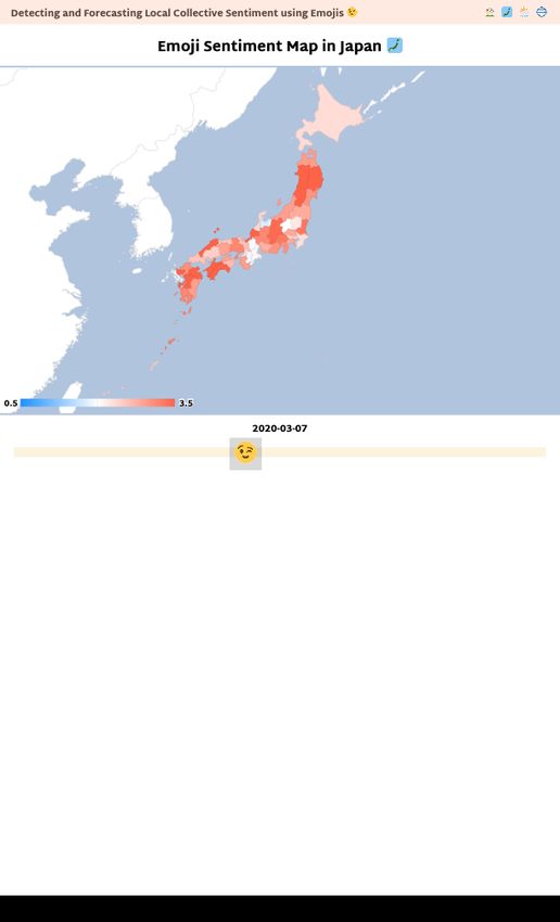
than 0.3 as negative, and obtained 211 positive and 89 neg- each day is also available at https://meipipo.github.io/emoji-
ative emojis. 0.3 is the average sentiment score reported in sentiment/map.
(Kralj Novak et al. 2015). Finally, by a manual check, we As discussed in the previous section, several societal
exclude the obviously wrong ones, then reduce them to 60 events are reflected in the sentiment throughout the country.
emojis each. Fig. 1 shows the selected positive and negative Fig. 4(a) shows the days when the major typhoon landed on
emojis. Japan. On October 12, 2019, the typhoon made landfall in
Next, we obtain the number of tweets using the endpoint the Kanto region in central Japan, where the capital Tokyo
GET /2/tweets/counts/all of the Twitter API for and other cities are located, causing storms, flooding, and
Academic Research. We retrieve tweets in Japanese, exclud- other damage. Areas that were heavily damaged on this day
ing retweets and replies, that contained at least one of the show overall negative sentiment. On the following day, Oc-
representative emojis selected for each of the positive and tober 13, we can see positive sentiment beginning to return
negative. We obtain the number of tweets which are associ- from southern Japan as the typhoon moves northward. Fig.
ated with each 47 prefectures for each of the 366 days from 4(b)(c) shows the days before and after the days when the
October 1, 2019 to September 30, 2020. whole of Japan turned positive and negative, i.e., the days
when national university acceptance announcements were
Data Analysis made and the days before and after the death of a celebrity
We analyze the obtained data in several ways and discussed was reported. In both examples, sentiment is scattered until
results. the day before the event occurs.
Number of Tweets in Tokyo
We visualize and observe the number of tweets for some ma- Changes in the Number of Tweets
jor prefectures. Fig. 2 shows the number of positive and neg-
ative tweets for 366 days in Tokyo. We make the following Next, to observe whether people’s sentiments change before
observations. First, more positive tweets were posted than and after COVID-19, we observe changes in the number of
negative tweets, which is about twice as much. The previ- positive and negative tweets. We first divide the tweets into
ous study indicates that the popular emojis are mostly pos- two groups, one from October 2019 to March 2020 (referred
itive (Kralj Novak et al. 2015), so this result is reasonable. to as “before COVID-19”) and the other from April to Octo-
Second, the number of tweets increases on weekends, i.e, ber 2020 (referred to as “after COVID-19”).
Saturdays and Sundays. Similar findings are obtained in the Then, for each prefecture and for each of the positive and
existing study (França et al. 2016). Third, there are signif- negative sentiments, we calculate the value of the change in
icantly fewer positive tweets from Tokyo after COVID-19. the following way. First, we calculate the value by subtract-
We divide the tweets into two groups, one from October ing the average number of tweets before COVID-19 from
2019 to March 2020 (referred to as “before COVID-19”) the average number of tweets after COVID-19. Next, we
and the other from April to October 2020 (referred to as “af- normalize that value by dividing it by the average number
ter COVID-19”), and conducted a t-tests. While there is no of tweets for the entire 366 days. If this value is positive,
significant difference between the two groups for negative it means that the number of tweets for that sentiment in-
tweets, there is a significant difference for positive tweets creased after COVID-19. The values for positive tweets are
with p < 0.01. Fig. 3 shows the violin diagrams. Fourth, plotted as x and for negative tweets as y for each prefec-
changes in the number of tweets reflect some societal events. ture in Fig. 5. We make the following observations. First,
For example, negative tweets increased on the day that ma- the number of negative tweets increased in 39 of the 47 pre-
jor typhoon Hagibis hit Japan (October 12, 2019) and on the fectures. And there are 36 prefectures out of 47 in which the
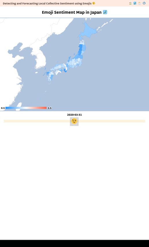
day that the sudden death of famous Japanese comedian Ken number of negative tweets tended to increase more than the
Shimura was reported (March 30, 2020). In contrast, the per- number of positive tweets. These results suggest that nega-
centage of positive tweets increased on Christmas Day (De- tive sentiments may have increased after COVID-19 due to
cember 25, 2019) and on the day that national universities anxiety over the pandemic and the impact of people refrain-
announced their acceptance decisions (March 6, 2020). This ing from going out. Second, the trend of this change differs
result is also observed in other prefectures, as can be seen depending on the characteristics of the prefectures. In pre-
in the heatmap shown in Fig. 4. The following section de- fectures that are large cities where many people commute to
scribes more about the heatmap. work or school, such as Tokyo, Osaka, and Aichi (indicated
by the red stars in the figure), the number of negative tweets
Geographical Heatmap increased, while the number of positive tweets decreased.
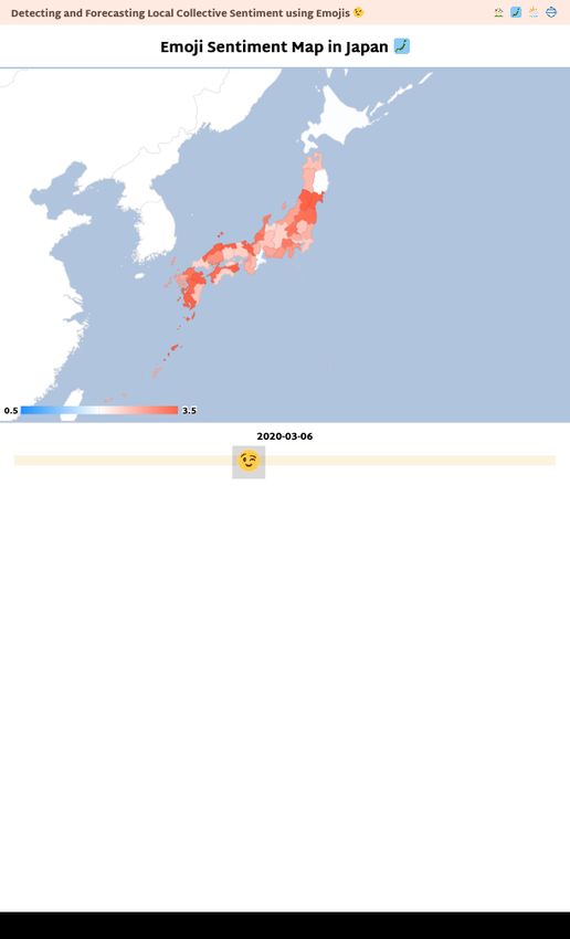
We calculate the value of the ratio of the number of positive On the other hand, prefectures surrounding such large cities,
tweets divided by the number of negative tweets for each such as Saitama, Chiba, Kanagawa, Nara, and Gifu (indi-
day from October 1, 2019 to September 30, 2020, for each cated by the green triangles in the figure), saw an increase in
of the prefectures. We then create a geographic heatmap as both negative and positive tweets. This can be attributed to
shown in Fig. 4, with prefectures colored red if their value is the fact that working from home has become more common,
large, i.e., more positive, white if it is about average (≈ 2.0), and people who used to commute to large cities spend more
and blue if it is small, i.e., more negative. The heatmap for time at home.
Workshop Proceedings of AAAI ICWSM-2022
(SocialSens 2022), June 2022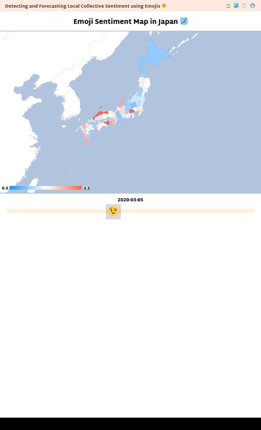
(a) Positive emojis. (b) Negative emojis.
Figure 1: Representative emojis to extract sentiment from tweets.
Positive
Typhoon Hagibis Death of Ken Shimura Negative
After the COVID-19 pandemic
Christmas day Announcement of
admission decisions
Figure 2: Number of positive and negative tweets in Tokyo from October 2019 to September 2020.
3000 3000
national news more. These changes may have strengthened
the co-occurrence of the positive sentiment.
2500 2500
We also build a network, by keeping the edges between
Number of negative tweets in Tokyo
Number of positive tweets in Tokyo
prefectures that have high correlation coefficients (≥ 0.7).
2000 2000
Fig. 6 visualizes the network before and after COVID-
19. The number of nodes |V | and edges |E| in the net-
1500 1500
works are (|V |, |E|) = (25, 95) before COVID-19 while
1000 1000
(|V |, |E|) = (16, 36) after COVID-19. Before COVID-19,
the network was mainly formed by nodes of large cities
500 500
and their surrounding prefectures with large populations, but
after COVID-19, the number of nodes decreased, and the
0 0
edges between the major cities basically remained.
Before COVID-19 After COVID-19 Before COVID-19 After COVID-19
(a) Positive tweets. (b) Negative tweets. Forecasting Model
We build linear regression models to forecast future senti-
Figure 3: Changes in the distribution of the number of tweets ment for each prefecture before and after the COVID-19.
in Tokyo before and after COVID-19. We use the number of positive tweets on a given day in a
given prefecture as the dependent variable and the average
number of positive tweets over the past five days for each of
Co-Occurrence of Positive Sentiment Between the 47 prefectures as the explanatory variables. The coeffi-
Prefectures cient of determination R2 for the model is about 0.5 to 0.6
To observe the co-occurrence relationship between the pre- on average. Then, we form a causal network from the coef-
fectures, we calculate the correlation coefficient of the num- ficients of the model. If the contribution of the explanatory
ber of positive tweets on the same day for all pairs of pre- prefecture to prediction of the dependent prefecture was sta-
fectures. We discuss the differences in the values of the cor- tistically significant (p < 0.05), we add a directed edge from
relation coefficients for before and after COVID-19, respec- the node of the dependent prefecture to the explanatory pre-
tively. This analysis reveals, first, that the correlation coef- fecture and use the absolute value of the coefficient as the
ficients were generally smaller after COVID-19. The pos- weight of the edge. We calculate the PageRank centrality in
sible reason could be that the travel restrictions imposed that network and observe which prefectures have the larger
by COVID-19 made it less likely that sentiment would be influence on the other prefectures.
shared. On the other hand, the correlation coefficient be- Fig 7 shows the geographical distributions and graph vi-
tween Tokyo and Osaka, the two largest cities in Japan, in- sualizations of centralities in the causal networks before
creased significantly from 0.77 to 0.85. Since the two cities and after COVID-19. In the geographical map (left), col-
are geographically located far apart, they may have shared ors are darker for higher PageRank. In the visualized net-
fewer similar events before COVID-19, but after COVID-19, work (right), the size and color of the node indicates the
they may have been more affected by the pandemic because value of the PageRank. We make the following observa-
they are large cities, or they may have referenced the same tions. First, while there was a large gap between areas of
Workshop Proceedings of AAAI ICWSM-2022
(SocialSens 2022), June 2022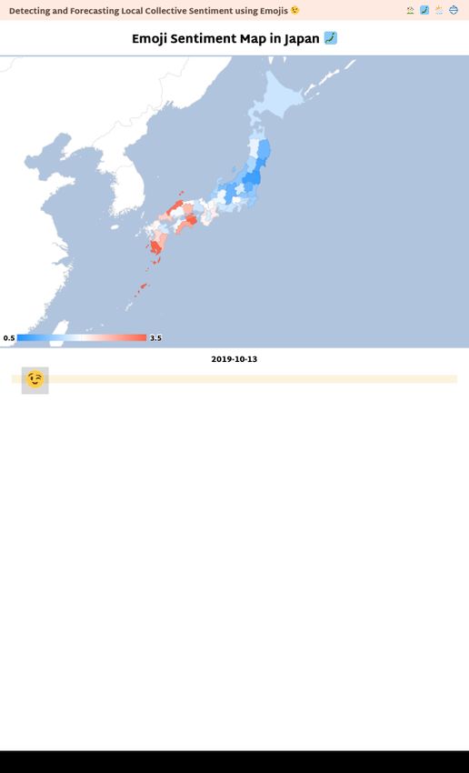
Oct 12, 2019                                                    Oct 13, 2019

                     (a) Days when Typhoon Hagibis, which caused extensive damage, hit Japan and headed north.

    Mar 5, 2020                               Mar 6, 2020                               Mar 7, 2020

(b) Around the day when the announcement of acceptance to national universities begins. The announcement began on March 6, with 60%
of the universities announcing by March 6 and 80% by March 7.

    Mar 29, 2020                              Mar 30, 2020                              Mar 31, 2020

(c) Around the day when it was reported that the famous comedian Ken Shimura passed away suddenly due to COVID-19. The news was
reported on March 30.

          Figure 4: Geographic heatmap of sentiment toward significant societal events in Japan for each prefecture.

                              Workshop Proceedings of AAAI ICWSM-2022
                                     (SocialSens 2022), June 2022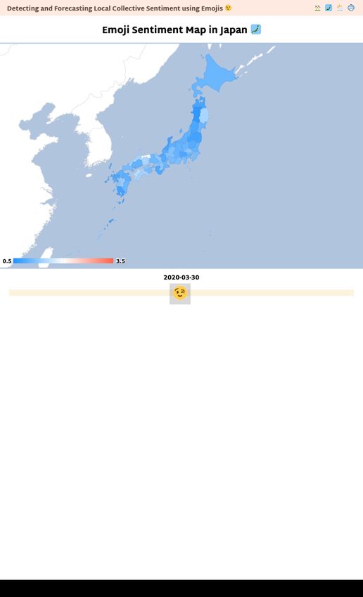
and eigenvector centrality.
Wakayama
0.4
0.3
Toyama
Kagoshima
Kagawa
0.2 Yamaguchi Hokkaido Fukui
Okayama Yamanashi
Okinawa
Nagasaki Nagano
Tokushima Saitama Kanagawa
Fukuoka Gifu
Ehime Tochigi
Hiroshima Nara Yamagata
0.1
Tottori Aichi Aomori Miyagi
Oita Kochi Ishikawa
Kyoto Hyogo Ibaraki
Shimane Osaka Miyazaki Chiba Niigata
Negative
Iwate
0.0 Tokyo Fukushima Akita
Shiga Gunma
Shizuoka
Saga
0.1
Kumamoto (a) Before COVID-19.
Mie
0.2
0.3
0.4
0.4 0.3 0.2 0.1 0.0 0.1 0.2 0.3 0.4
Positive
Figure 5: Changes in the total number of positive and nega-
tive tweets by prefecture before and after COVID-19.
(b) After COVID-19.
strong and weak influence before COVID-19, the size of Figure 7: Geographical distributions and graph visualiza-
influence is more dispersed after COVID-19. Second, pre- tions of centralities in a causal network before and after the
fectures that had a strong influence before COVID-19 are COVID-19 pandemic.
mainly those located around large cities such as Tokyo, Os-
aka, and Fukuoka, but after COVID-19, this regularity has
disappeared. The reason why prefectures around large cities Conclusion
have a strong influence is that they have relatively large pop- In this study, we observed collective sentiment in Japan us-
ulations and large flows of people, and therefore are more ing geo-tagged tweets to capture the geographical distribu-
likely to represent the national sentiment than the unique en- tion and using emojis, which is a language-independent in-
vironment of the large cities themselves. After COVID-19, dicator of sentiments. Through the analysis of data for 366
people moved less and the impact of the pandemic varied days from October 2019 to September 2020, we examined
depending on prefectures, suggesting that there was no reg- various trends in collective sentiment in Japan. The results
ularity in the influence of the sentiment. showed that the collective sentiment reflected societal events
These results were also observed for in-degree centrality such as major disasters and the death of a celebrity. We also
observed an increase in negative tweets after COVID-19 and
a change in the co-occurrence relationship between prefec-
Hiroshima
Fukuoka
Chiba tures. We also built a linear regression model to forecast the
Hokkaido local positive sentiment of a prefecture from other prefec-
Oita Shiga
Nara NiigataNagano Tochigi
Osaka
Hyogo tures’ past values, and we indicated that the relationship of
Kyoto
Mie
ChibaSaitama
Fukuoka
Gunma influence among prefectures also changed significantly be-
Hokkaido Yamagata Tokyo
Ibaraki Tokyo
Shizuoka
Aichi
Fukushima Aichi
Gunma fore and after COVID-19.
Hyogo Kagawa Nagano
Osaka Niigata
Future work include the following. First, collect more data
Miyagi Ehime Gifu
to carefully observe the impact of seasonal factors and to
Shiga Tochigi
Shizuoka remove any bias toward individuals in less populated areas.
Second, improve the forecasting model by using other meth-
Okayama Kyoto
ods, such as transfer entropy, autoregression model, LSTM
and deep neural networks, and by adding other explanatory
(a) Before COVID-19. (b) After COVID-19. variables, such as known social events and weather. Third,
apply the same analysis to other regions with different lan-
Figure 6: Networks between prefectures that have high cor- guages. This can be easily applied thanks to emojis and is
relation coefficients. expected to yield interesting results.
Workshop Proceedings of AAAI ICWSM-2022
(SocialSens 2022), June 2022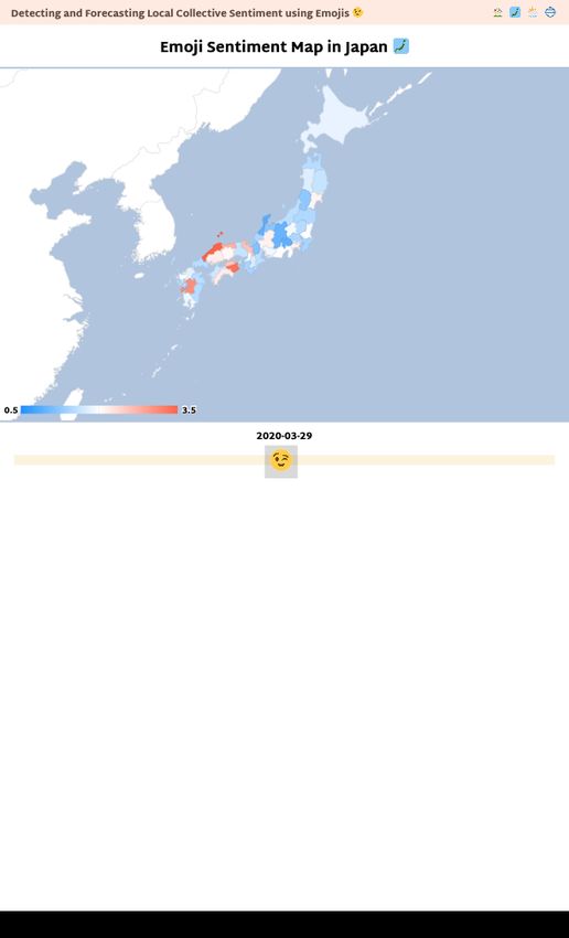
References
Dodds, P. S.; Harris, K. D.; Kloumann, I. M.; Bliss, C. A.;
and Danforth, C. M. 2011. Temporal Patterns of Happiness
and Information in a Global Social Network: Hedonometrics
and Twitter. PLOS ONE 6(12).
França, U.; Sayama, H.; Mcswiggen, C.; Daneshvar, R.; and
Bar-Yam, Y. 2016. Visualizing the “heartbeat” of a city with
tweets. Complexity 21(6): 280–287.
Kralj Novak, P.; Smailović, J.; Sluban, B.; and Mozetič, I.
2015. Sentiment of emojis. PLOS ONE 10(12). URL http:
//kt.ijs.si/data/Emoji sentiment ranking/index.html.
Sano, Y.; Takayasu, H.; Havlin, S.; and Takayasu, M. 2019.
Identifying long-term periodic cycles and memories of col-
lective emotion in online social media. PLOS ONE 14(3).

                              Workshop Proceedings of AAAI ICWSM-2022
                                     (SocialSens 2022), June 2022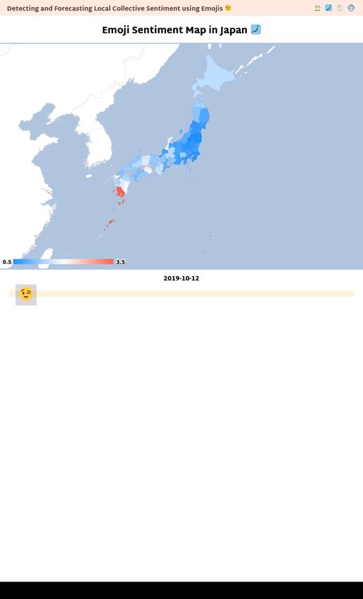
You can also read