Turning Event Logs into Process Movies: Animating What Has Really Happened
←
→
Page content transcription
If your browser does not render page correctly, please read the page content below

1

           Turning Event Logs into Process Movies:
            Animating What Has Really Happened
            Massimiliano de Leoni, Suriadi Suriadi, Arthur H. M. ter Hofstede, Wil M. P. van der Aalst

      Abstract—Today’s information systems log vast amount of data which contains information about the actual execution of business
      processes. The analysis of this data can provide a solid starting point for business process improvement. This is the realm of process
      mining, an area which has provided a repertoire of many analysis techniques. Despite the impressive capabilities of existing process
      mining algorithms, dealing with the abundance of data recorded by contemporary systems and devices remains a challenge. Of
      particular importance is the capability to guide the meaningful interpretation of this “ocean” of data by process analysts. To this end,
      insights from the field of visual analytics can be leveraged. An approach is proposed where process states are reconstructed from
      event logs and visualised in succession, leading to an animated history of a process. This approach is customisable in how a process
      state, partially defined through a collection of activity instances, is visualised: one can select a map and specify a projection of activity
      instances on this map based on their properties. In this paper an implementation of the proposal is described for the open-source
      process-mining framework ProM along with reporting an evaluation with one of Australia’s largest insurance companies: Suncorp.

      Index Terms—Business Process Mining, Visual Analytics, Event-log Animation, Process Visualisation

                                                                           F

1    I NTRODUCTION                                                             niques are certainly needed, process analysts need to be
As a result of increased automation and storage capacity,                      guided with regards to where to focus their attention
more and more data is recorded by today’s software                             in this “ocean of data”, which automatic techniques to
systems and devices. The McKinsey Global Institute                             choose for further analysis and how to fine-tune these
(MGI) estimated that enterprises globally stored more                          techniques. To achieve this, one can leverage from the
than 7 exabytes of new data on disk drives in 2010,                            field of visual analytics, a term coined by Jim Thomas
while consumers stored more than 6 exabytes of new                             in [4], which “combines automated analysis techniques with
data on devices such as PCs and notebooks [1]. The                             interactive visualizations for an effective understanding, rea-
amount of data recorded in various domains has been                            soning and decision making on the basis of very large and
growing exponentially, thereby following Moore’s law.                          complex data sets” [5].
While the availability of large amounts of data is an                             A starting point of this paper is the belief that the ap-
enabler for various forms of analysis, the sheer quantity                      plication of techniques from the field of visual analytics
and diversity of this data creates new challenges [2].                         can play a significant role in overcoming the challenges
  In the field of Business Process Management (BPM),                           related to the analyses of large collections of (process)
so-called process-aware information systems record in-                         data.
formation about the execution of business processes in                            In [6] a map metaphor was used to aid people in the
event logs. Analysing such event logs has been the                             selection of activities to perform. A “map” could, e.g.,
driver of the area of process mining (see e.g. [3]), which                     be a geographical map, a timeline, or an organisational
emerged a little over a decade ago. In this relatively                         chart, and activity instances are positioned on this map
short timespan, this discipline has proven to be capable                       according to their properties. In addition, the colour of
of providing deep insight into process-related problems                        a dot representing an activity instance is determined by
that contemporary enterprises face. Through the appli-                         its status or distance, e.g., how close the activity is to its
cation of process mining, organisations can discover the                       deadline, how long it is being executed. The approach
processes as they are conducted in reality, check whether                      focussed on showing the current state of the information
certain practices and regulations were really followed                         system at run-time. This approach can easily be extended
and gain insight into bottlenecks, resource utilisation,                       to a-posteriori analysis: using the information stored in
and other performance-related aspects of processes.                            event logs, it is possible to replay the history and build
  Despite the fact that the field of process mining has                        the states the system went through. Hence, for each
shown itself to be a valuable addition to the BPM                              “map”, a sequence of different “photographs” can be
landscape, dealing with large collections of data still                        built, showing how activities were projected on the map
remains a challenge. In fact, although automatic tech-                         in each of these states. If, for each map, the constructed
                                                                               sequence of photographs is played in succession, one
• M. de Leoni and W. M. P. van der Aalst are with Eindhoven University
                                                                               obtains a different “process movie”. These movies or
  of Technology. M. de Leoni is also with University of Padua.                 animations (one per map) provide analysts and domain
• S. Suriadi and A. H. M. ter Hofstede are with Queensland University of       experts with a helicopter view of the past execution
  Technology
                                                                               history seen from different perspectives.
2
TabsC-CAnimationCMovieC
Chooser
and a new validation effort, this time with subjects from
Suncorp, one of Australia’s largest insurance companies.
AggregatedCdotC-CsizeCofCthe
This evaluation is concerned with determining whether
ListCofCactivityCinstances
dotCisCpositivelyCcorrelatedCwithC
theCnumberCofCactivityCinstances ColourCLegend the map metaphor is understood and can help to provide
thatCareCnotCtoCbeC aggregated.
positionedConCtheCmap.
meaningful insights.
The paper is organised as follows. Section 2 positions
our work with respect to the literature, highlighting the
limitations that exist in relevant state-of-the-art work.
Section 3 discusses the adjusted framework. Then, Sec-
ListCofCactivityCinstances
tion 4 provides some details of the implementation of
CthatCcannotCbeCplacedConC
theCmap. this framework realised as a plug-in of the ProM envi-
DistributionCof
ronment. Section 5 describes a case study illustrating the
TimelineCand
TimeCSlider
variablesCperCdot
(mouseCover)
ACclockCshowingCtheCcurrentC
approach in the context of insurance claims processing
SliderCtoCadjust
PlayCButton
timestampCofCtheCmovie
movieCspeed for homes in Suncorp. Section 6 starts with reporting
the feedback from stakeholders of a Dutch municipality
followed by the changes that were required to cope with
Fig. 1. A screenshot of a process movie referring to the the problems pointed out. Then, the section describes the
log data of a process enacted in an Australia insurance evaluation of the adapted framework done in collabora-
company to deal with claims. Activity instances are pro- tion with Suncorp. Finally, Section 7 concludes the paper
jected onto the Australian state of the claimants. by summarising the results obtained and identifying
future directions of work.
An example of such a movie is shown in Figure 1 2 R ELATED W ORK
where the event log refers to the execution of process in- The approach presented in this paper builds on two
stances to handle insurance claims of an insurance com- emerging disciplines: process mining [3] and visual analyt-
pany in Australia. The process map is of a geographic ics [5], [4]. As a general comment, one can observe that
type: each activity instance is projected onto the map as while many techniques have been developed for process
a dot in the time frame when it was being executed as mining, data mining and statistical analysis, they often
recorded in the log. The dot is positioned on the Aus- do not, or insufficiently, take visualisation aspects into
tralia state of the claimant. At any given point in time, account. Conversely, one can observe that the research
the size of the dots on the map represents the number of community in the area of information visualisation (see
activity instances which are projected on to that position. e.g. [9] or [10]) has not focussed on process-related
The instances can have different characteristics (e.g., in aspects.
the figure, relative to the claim’s type). Therefore, the ar- There exists a number of research works (e.g., [11],
eas of dots are also sliced according to the percentage of [12], [13]) on aspects related to visualisation in the field
instances with given characteristics, and different colours of business process management. These works employ
are assigned to the slices. Completed activity instances different metaphors and also mash-up approaches to
are no longer shown on the map. Thus, Figure 1 is the represent the state of a process at run-time. The approach
“photograph” of the activity instances at a particular described in [6] elaborates on these ideas and captures a
point in time as shown in the timestamp box (i.e. 23 Dec process state as a map with a colouring scheme used for
2011 14:18:05). The time slider at the bottom of the figure the activities representing their status or their character-
allows users to go back or forth to a certain point in time istics. This approach though is aimed at providing run-
to view the corresponding photograph. Alternatively, the time support for activity selection and not at providing
photographs can be played in a continuous sequence by support for the analysis of the history of a process.
activating the ’play’ button. The term “visual analytics” was coined in [4]. This ref-
In [7] an initial framework was proposed that exploits erence reviews the early work in this field. A comprehen-
the map metaphor to show a summary of an event log in sive more recent reference is provided in [5]. Examples of
the form of an animation. The corresponding implemen- recent significant research in the area of visual analytics
tation was realised as a plug-in for the ProM open-source can be found in document analysis [14], financial analy-
process mining framework (www.processmining.org). A sis [15], [16] and geo-spatial object analysis [17]. In [18]
set of experiments was conducted with some stakehold- pioneering work is reported where visual analytics is
ers from a Dutch municipality to obtain some quick applied to the field of data mining. Another interesting
initial feedback [8]. As a result of the feedback, the work is [19] which concerns displaying multiple time
framework was adjusted to cope with the problems that series without aggregation. The above body of work uses
were identified. In fact, significant extensions and mod- static representations for capturing time dependencies,
ifications of the initial framework and of the accordant i.e. images that summarise the analysis of time-oriented
implementation were needed. This paper reports on the data. When larger data sets come into play, static repre-
resulting framework, its corresponding ProM plug-in, sentations show their limits as they require large screens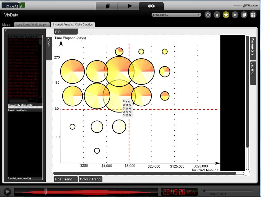
3

to represent the time axis. Conversely, dynamic represen-          be visualised as a sequence of such photographs, that
tations (i.e., using the physical time) show their power           together form a “movie”. To convey more information,
when the focal point is to analyse the data over time. A           each dot can be filled with a colour, where this colour
detailed up-to-date survey is reported in [20], where it is        depends on the value of a characteristic of choice of the
clear that there is no significant research work that uses         corresponding activity instance.
dynamic representations: “A frequent goal is to integrate             An activity instance is the execution of a certain activity
data from multiple time stemps in a single image”. Often,          in a certain case and it can thus be represented as a
time abstraction is used for this purpose. Unfortunately,          pair (at, cid), with at ∈ A the activity type (A is the
to visualise process-related data, temporal aspects are of         universe of activity types) and cid ∈ C the case (C is the
crucial importance as they are related to concurrency and          universe of case identifiers). Processes also access and
causality of the activities being performed. Therefore,            modify data. Let V be the universe of variable names,
abstracting time would relegate the time dimension to              then a process data variable is a pair (vn, cid) where vn ∈ V
second-class status.                                               and cid ∈ C. These variables can take on different values
   Most of the work in the visual analytics area is tailored       in different cases and also within the same case as time
to a particular application or to a particular visualisa-          progresses.
tion. This is also confirmed by [21]: ”To our knowledge,              Our framework only provides visualisations for ac-
there exists no visualisation framework that [. . . ] provides a   tivity instances that have been created but are not yet
broader selection of possible representations. We think that       concluded. Such activity instances can be in a number
an open framework fed with pluggable visual and analytical         of states: they can be scheduled when they have been
components for analyzing time-oriented data is useful. Such        created but not yet been assigned to a resource, they can
a framework will be able to support multiple analysis tasks        be assigned when they have been assigned to a resource
and data characteristics, which is a goal of Visual Analytics”.    but have not yet started execution, executing when work
In fact, the configuration of different maps allow one to          on them has commenced, and suspended when work
plug different representations, thus supporting multiple           on them has been temporarily halted. We will use the
views.                                                             set Z to capture the various states which an activity
   To our knowledge, only the approach of the so-called            instance can be in, Z = {Scheduled , Assigned , Executing,
Fuzzy Animations [22] can be considered to be process-             Suspended , Concluded }. An activity instance is referred to
aware. It focuses on providing a graphical user interface          as active if it is in a state that is an element of Z except
where the past states extracted from the event log are             for the state Concluded.
projected onto a process model which is automatically                 Definition 1 (Event): Let U be the universe of val-
derived from the events in the log. It is a valuable ap-           ues that variables can take. An event e is a tuple
proach though quite specific: it only focuses on control-          (at, cid , t, z, P ) where:
flow aspects and visualisation is limited to process                  • at ∈ A is an activity type;
graphs.                                                               • cid is a case identifier;
                                                                      • t is the timestamp when event e occurred;
                                                                      • z ∈ Z is the state to which the corresponding
3   T HE F RAMEWORK
                                                                         activity instance moves;
In this section, we define a formal framework that cap-               • P : V 6→ U is an assignment of values to variables.
tures the mapping of event logs to “movies”. Through                     Function P is partial since not every event has an
the resulting movies the history of a process can be visu-               associated value for all process variables.
alised in different contexts, thus facilitating its analysis.
                                                                   We use the following functions to access the con-
The framework is derived from the framework presented
                                                                   stituent elements of an event e = (at, cid , t, z, P ),
in [7], where the main difference is that a richer notion
                                                                   activity(e) = at, case(e) = cid , timestamp(e) = t,
of state is adopted. The notion of state as presented
                                                                   state(e) = z and properties(e) = P . The latter function
here allows one to exploit temporal information when
                                                                   will be overloaded and properties(e, vn) = P (vn). More-
defining the positioning of activity instances.
                                                                   over, given a function f , dom(f ) represents the domain
   The events in an event log can be sorted chrono-
                                                                   of f .
logically and subsequently be replayed in that order.
                                                                      Definition 2 (System State): Let T be the universe of
The occurrence of an event makes the system enter
                                                                   possible timestamps. A system state S = (α, ν, τ s ) con-
a particular state. Hence, by replaying all events in
                                                                   sists of:
the event log in chronological order, it is possible to
rebuild a process history, i.e. the sequence of states the            • a function α : (A × C) 6→ Z where α(at, cid) = z

system went through. Each state can be represented                       denotes that activity instance (at, cid) is in state z ∈
as a configuration of activity instances on a map of                     Z;
choice. In order to define how states can be represented              • a function ν : (V × C) 6→ U where ν(vn, cid) = vvalue

on a map, we have to choose an image for that map                        denotes that variable (vn, cid) has value vvalue ;
                                                                                         s                           s
and to define the positioning of activity instances as                • a function τ : (A × C) 6→ T where τ (at, cid) =

dots on that image. Such an annotated map can be                         t denotes that activity instance (at, cid) started at
seen as a “photograph” and, thus, a process history can                  timestamp t.
4

Due to our definition of activity instance, as a pair                      exists a partial function that returns a pair of expressions
consisting of activity name and case identifier, it is not                 for each activity type.
possible to distinguish between different instances of the
same activity within the same case. Such instances may                      position m : A 6→ Expr(V ∪ {T , t}) × Expr(V ∪ {T , t})
arise from the occurrence of loops in a process model.                     where Expr(X) is the domain of all expressions that use
                                                                           some of the variables in X. For each activity instance
3.1   Creation of the Sequence of States                                   ai = (at, cid) and each map m, position m returns a pair
Similar to existing algorithms for conformance check-                      of expressions. The evaluation of these expressions, over
ing [3], this framework is based on the principle of                       a state S, returns a pair of coordinates (x, y) which is the
replay. Events in the log are replayed to determine, a                     position of ai on map m at state S.
posteriori, the sequence of states that the system has                        More specifically, variables T and t are used to incor-
gone through. In order to formalise this notion for our                    porate references in time: they are used to represent the
framework, let us first define the overriding operator ⊕.                  starting time of activity instances and the current time of
                                                 →
                                                 −                         replay, respectively. Let ξ : X 6→ U be a value assignment
Let f be a function, a function f 0 = f ⊕ ( x0 , y) is defined
        →
        −                                                    →
                                                             −             of a subset of the variable names in X. We define eval
by f 0 ( x0 ) = y and f 0 (x) = f (x) for all x ∈ dom(f ) \ { x0 }.        as a function which, given an expression f ∈ Expr(X)
The definition of ⊕ can be extended to tuple sets, by                      and a value assignment ξ, yields an integer number:
iteratively applying the definition to all tuples in the set
(noting that the order in which the elements are chosen                                            eval[[f ] (ξ) = c
is not important).
   Definition 3 (Replaying of events): Let Si = (αi , νi , τis )           where c ∈ Z.
be the current state during replay and e be the next                         Given a map m ∈ M , a state Si = (αi , νi , τis ),
event to replay. Replaying e causes the current state Si                   an activity instance ai = (at, cid) ∈ dom(αi ), then
                                                                                               0      00
to change to state Si+1 = (αi+1 , νi+1 , τi+1  s
                                                  ). This change           positionm (at) = (fm,a , fm,a   ). The coordinates of ai on
is denoted as Si −
                     e
                    → Si+1 , where                                         map m for state Si at a given timestamp t is:
                                                                                                         0                     00

 αi+1 = αi ⊕ ((activity(e), case(e)), state(e))                               coord m (ai) Si = eval[[fm,at   ] (ξai ), eval[[fm,at ] (ξai )
 νi+1 = νi ⊕ {((v, case(e)), properties(e, v)) | v ∈ dom(properties(e))}
                                      s
 and if state(e) 6= Executing then τi+1    = τis                           where ξai (vn) = νi (vn, cid), ξai (T ) = τis (ai) and ξai (t) =
             s    = τis ⊕ ((activity(e), case(e)), timestamp(e))
 otherwise τi+1                                                            t.
  The initial state from which replaying starts is S0 =                       For example, consider a loan request process where
(α0 , ν0 , τ0s ) where dom(α0 ) = dom(ν0 ) = dom(τ0s ) = ∅.                each instance corresponds to a different request. The
Replaying is used to reconstruct the execution history.                    applicant’s monthly income and the requested loan
  Definition 4 (Execution History): Let he1 , . . . , en i be the          amount are stored in variables income and loan. One can
sequence of events in an execution log ordered by times-                   define a cartesian map c where every activity instance is
tamp, i.e. for every 1 ≤ i < j ≤ n, timestamp(ej ) ≥                       associated with a distinct dot whose x and y coordinates
                                 e1     e2            en                   are determined by the values of these variables. Assume
timestamp(ei ). Let S0 −→           S1 −→       . . . −→ Sn be the
                                                                           that the maximum values of income and loan, as seen in
sequence of states visited when replaying the event
                                                                           the log, are 150000 and 10000 respectively. Also assume
log. An execution history is a sequence of pairs H =<
                                                                           that the maximum x and y coordinate values on to which
(S1 , t1 ), . . . , (Sn , tn ) > where (Si , ti ) denotes that the
                                                                           a dot can still be properly displayed on map c are 800
system entered state Si at time ti = timestamp(ei ).
                                                                           and 600 respectively. To ensure that an activity instance
                                                                           with maximum income and loan values can be properly
3.2   Mapping States onto Maps                                             displayed, we can define a position function such that
                                                                                                        800             600
Activity instances are visualised as dots on a map. By                     positionc (at) = (income · 150000  , loan · 10000 ).
not fixing the type of map, but allowing this choice to                       The projection of a state Si = (αi , νi , τis ) onto a map
be configurable, different types of relationships can be                   m is the projection of activity instances ai ∈ dom(αi )
shown thus providing a deeper insight into the context                     onto m at position coord m (ai) Si . As can be seen from
of the work that was performed. Many types of maps                         the definition, the function position m is partial and hence
can be thought of: geographical maps (e.g., the map of                     not all activity instances in the state are mapped. This
a university’s campus), process schemas, organisational                    may be because it simply is not meaningful. However,
diagrams, Gantt charts, etc. Naturally, one can also make                  there may also be activity instances in dom(αi ) that are
highly specialised maps to suit a particular purpose.                      not mapped as some of the variables in the position
The positioning of an activity instance may vary across                    function do not have a value. Another reason for an
different maps. When the use of a certain map is envis-                    activity instance not to be projected onto a given map is
aged, the location of activity instances at runtime on this                that its coordinates are invalid, i.e. falling outside that
map should be captured through a formal expression                         map (for example because the x or the y coordinate
specified at design time.                                                  are negative). Given a map, activity instances that have
  Definition 5 (Position function): Let M be the set of                    invalid coordinates or none at all need to be visualised
maps of interest. For each available map m ∈ M , there                     differently from instances with valid coordinates. To this
5

end, each map is associated with two lists of activities              age(ai) = 1. Value age(ai) decreases exponentially as
instances, one enumerating the activity instances that do             ai ages. When t − τis (ai) = MET (at), age(ai) = 0.5.
not have coordinates and one enumerating those which                  An established approach is used to map age(ai) to a
have invalid ones.                                                    colour: the “Fire Colour Pallet” [10]. The colour ranges
   As mentioned before, the dots representing activity                in intensity from a bright white (age(ai) = 1) through
instances can be filled with colour. This allows for richer           yellow, orange (age(ai) ∼ 0.5), brown, and then to black
visualisation as one can take the value of a variable                 (as age(ai) ≈ 0).
of choice into account. Currently, different colouring                   In order to deal with dots that may overlap on a
schemes are proposed, which are based (i) on the state                certain map, they are represented transparently. The
of the activity instances, (ii) on the characteristics of the         colour of areas of overlap is determined by the colours
case of the activity instance or (iii) on the age of the              of the individual dots involved. Unfortunately, this may
activity instances.                                                   lead to confusion in some cases as it may be hard to
   Based on the state of the activity instance. When this             correctly interpret the resulting colour, but the advantage
scheme is used, an activity instance ai is coloured accord-           of this approach is that dots whose area is completely
ing to αi (ai) where Si = (αi , νi , τis ) is the current state. In   covered by one or more other dots still remain visible.
particular, for activity instances that are in the scheduled,         If the centres of dots coincide, then the dots involved
allocated, executing or suspended state, we fill the rel-             are merged to form bigger dots in order to avoid that
ative dot with white, cyan, green or black, respectively.             dots whose sizes and centre positions are identical can
Of course, activity instances that are concluded or not               no longer be visually distinguished from each other. The
scheduled are not represented on a map.                               diameter of such dots grows according to the number n
   Based on the characteristics of the case of the activity           of activity instances involved. Li et al. [23] conducted
instance. When this scheme is used, the end user chooses              an analysis with a number of subjects where they found
one of the variables vn ∈ V present in the event log.                 that quantities represented as circles are most intuitively
The value of the selected variable determines which                   perceived when the circle grows as a power of 0.4.
colour is used to fill the dots of the activity instances             Applying this observation to our case, i.e. when joining
in the case. Let Sn = (αn , νn , τns ) be the last state in the       n dots of different activity instances, the diameter of
execution history. The dot corresponding to an activity               the resulting dot is computed as n0.4 . The amalgamated
instance ai = (at, cid) ∈ dom(αi ) is coloured according to           dots are also divided in as many slices as there are
νn (vn, cid), i.e. the last value assigned to variable vn for         constituting dots, and each slice is filled with the colour
the case cid. In particular, the 15 most commonly occur-              of the dot which it corresponds to.
ring variable values are associated with the 15 non-white                Another important feature is concerned with handling
colours of the 16-colour EGA palette1 . The white colour              activities instances when they are going to disappear.
is excluded as it is used to represent all other variable             If a dot suddenly disappears between two consecutive
values. The colour of dots for a particular case should not           photographs, end users would not notice that the corre-
change during an animation. Otherwise, one can easily                 sponding activity instance is completed, especially when
lose track of dots. Therefore, the visualisation approach             many dots are visualised at the same time on the maps.
chosen is to ignore any changes to a variable and to just             Therefore, we have introduced a fading effect: if a dot is
use its final value. This then means that one should not              going to disappear in x photographs, it starts fading out
choose a variable for visualisation purposes whose value              (i.e., becomes transparent). Value x can be customised
can change during the execution of a case. In addition,               by an end user on the fly while playing the movie. As
the choice of variable should also be informed by the                 the number of photographs in which a dot is going to
ability to use it as a meaningful classifier of cases.                disappear becomes smaller, the fading effect becomes
   Based on the age of the activity instance. In this approach,       more pronounced, till the dot completely vanishes.
the dots are coloured according to the age of the activity
instance, i.e. the amount of time that has elapsed since
the instance was started. The colour white is associated              4   I MPLEMENTATION        OF THE    F RAMEWORK
with activity instances that just started. As time pro-               Figure 2 shows the architecture of the implemen-
gresses, the colour of instances that have not completed              tation. The yellow component is implemented as a
becomes closer and closer to red. Let Si = (αi , νi , τis ) be        stand-alone Java application whereas the red compo-
the state at time t, then the age of an activity instance             nents are implemented as plug-ins of ProM, an open-
ai = (at, cid) ∈ dom(αi ) is computed as follows:                     source “pluggable” framework for the implementation
                                   ln(2)(t−τis (ai))                  of process mining tools in a standardised environment
                 age(ai) = exp−        MET (at)
                                                                      (http://www.promtools.org). Plug-ins require a number
where MET (at) is the average of the time that was                    of input objects and produce one or more output objects.
taken to complete instances of activity type at. For each             These input objects could, for example, be event logs or
activity instance ai, age(ai) is always between 0 and 1.              output objects of other plug-ins. In this way, one can
If t = τis (ai), i.e. activity instance ai was just started,          define a chain of plug-ins’ invocations.
                                                                         The core software is the Log-On-Map Replayer plug-in
  1. http://en.wikipedia.org/wiki/Enhanced Graphics Adapter           which takes a map-specification file and an event log
6

                                                                            generated automatically: Cartesian, Deadline/Timeline,
                            Map          Map Specification                  Process-Model. When generating a map of these types,
                          Designer
                                                                            users need to define the size of the image through
                                                         Log On    Movies
                                                                            specifying the width w and the height h.
   Event Log                                              Map
                                                        Replayer               Cartesian Map. This type of map takes inspiration from
                                                                            the Cartesian coordinate system. The projection of activ-
                             Automatic
                                                                            ity instances is determined by choosing two numerical
   Process     Optional
    Model                      Map                                          variables, vx and vy , to derive the values of x and y
                             Generator
                                                                            coordinates from. Let xmax (xmin ) and ymax (ymin ) be the
                                                                            maximum (minimum) values for vx and vy as present in
Fig. 2. The architecture of the implementation.                             the event log. The position function for a Cartesian map
                                                                            c for instances of an activity type at ∈ A is defined as
                                                                            positionc (at) = (x0at , yat
                                                                                                      0
                                                                                                         ) where
as input. Each map-specification file consists of a set of                                                                    vy −ymin
                                                                                          vx −xmin
available maps (i.e. the map name and the URL where                             x0at =   xmax −xmin   ·w       and    0
                                                                                                                     yat =   ymax −ymin   · h.
the map image can be retrieved) with corresponding
position functions (Definition 5), one definition for each                  For example, suppose that the end user chooses vari-
map. The plug-in employs the framework defined in Sec-                      ables payout and amount as vx and vy . Based on these
tion 3 and generates for each available map a sequence                      variables, the plug-in determines the corresponding min-
of photographs. Playing such a sequence of photographs                      imum and maximum values as seen in the log, e.g.
in succession yields a movie. As previously mentioned,                      xmin = 0, xmax = 100, ymin = 1000, ymax = 10000.
each photograph captures the state of the process as it                     For map of size, for example, 800 × 600 pixels (i.e.,
existed at a certain point in time. The graphical user                      w = 800 and h = 600), the plug-in thus specifies
interface provides controls to select one of the available                  x0at = (payout − 0)/(100    − 0) · 800 and yat0
                                                                                                                              = (amount −
movies and put it in focus, play/stop that movie, or go

                                                                            100)/(10000 − 1000) · 600.
to a specific moment in time in that movie.                                    Deadline/Timeline Map. Activity instances are posi-
   Map specifications can be drawn through a Java stand-                    tioned along the x-axis according to the time that they
alone application, the Map Designer. It allows process                      have been active. When an activity instance has just
analysts to load images (e.g., PNG or JPG) to use as                        become active, its x-coordinate is equal to w. Its y-
maps and to define how to project activity instances                        coordinate is obtained by choosing a numerical variable
onto those maps. To do so, analysts can simply drag                         vy , extracting its current value, and using the same com-
and drop an activity type onto the map and place it                         putation as for the Cartesian map. As time progresses,
at the position of interest. This way, the activity type’s                  the x-coordinate changes (becomes less and less), but
position is statically defined and applies to all instances                 the y coordinate remains constant. The position function
of that type. Alternatively, analysts can define a position                 for a time map l for instances of an activity type ai =
as dynamic. The position of an activity instance is then                                                                       00
                                                                            (at, cid) is defined as positionl (at) = (x00at , yat ) where
defined in terms of the state of the process instance
involved. As far as the implementation is concerned, the                                                                      vy −ymin
                                                                                 x00at = 1 −   t−T                    00

                                                                                                          ·w   and   yat =                ·h
state is encoded as an XML document and the position                                            dat                          ymax −ymin
function is defined as an XQuery over this document.
Section 5 illustrates the interface of the Map Designer                     where dat is a constant which defines the maximum valid
application and the Log On Map Replayer plug-in through                     duration for instances of an activity type at. If a certain
the case study.                                                             activity instance is active for more than dat , x00at will
   There exists a number of potential maps that can                         become negative and is then enumerated in the list of
be applied to a wide range of scenarios. For example,                       activity instances with invalid coordinates.
a process model can serve as a map where activity                              Process-Model Map. As mentioned before, for a process-
instances are projected onto the icons representing the                     model map activity instances are projected onto the
corresponding activity types. Hence, as long as the                         corresponding icon in the model. In order to enable the
positions of the activity icons are known, this type of                     automatic generation of maps of this type, end users
map can be used in different scenarios and the cor-                         need to provide a process model which also encodes
responding positioning function can be automatically                        the actual coordinates of the icons that represent the
generated. This concept of facilitating the generation                      model’s activities. Currently, we only support the Petri
of maps with little effort required by users has led to                     net formalism, though we believe that it is relatively
the implementation of a second plug-in of ProM, the                         easy to extend the implementation to support other
Automatic-Map-Generator. It takes an event log as input                     process modelling formalisms. Petri Nets are stored in
and optionally a process model and produces a map, in-                      files in PNML standard format which also encodes the
tended as the background image, and the corresponding                       coordinates of positions of all activities (i.e. Petri net
position function. Currently, three types of maps can be                    transitions) of the model.
7

5 A C ASE S TUDY WITH AN             AUSTRALIAN I N -         dragged by users to reach a particular snapshot, the
SURANCE C OMPANY                                              clock showing the current timestamp of the movie being
                                                              played as obtained from the timestamp information in
We applied the visualisation framework in a case study
                                                              the event log, and the slider to adjust the playback speed
that we conducted with one of the largest insurance
                                                              on the fly. As also stated in [24], it is important to play
companies in Australia, namely Suncorp, during the
                                                              the movie at the right speed. The optimal speed may
second-half of 2012. Through regular meetings (almost
                                                              be hard to predict: animations played too slowly may
weekly) with the stakeholders from Suncorp, we iden-
                                                              become boring, whereas the opposite can cause relevant
tified the need to communicate the current landscape
                                                              information to be missed. The timeline box also shows a
of Suncorp’s claims processing performance to higher
                                                              wave in which the x-axis represents time and the y-axis
managers within the company. To this end, we believed
                                                              the number of active activity instances. The purpose of
that the visualisation framework proposed in this paper
                                                              the two buttons above the timeline box (labelled as ‘Pos.
could be used to generate a number of movies summaris-
                                                              Trend’ and ‘Colour Trend’) will be explained later in this
ing Suncorp’s claims processing trends and performance.
                                                              section.
   Suncorp provided us with data related to the process-
                                                                 At the top of Figure 1, we see the Maps panel which
ing of claims that were finalised within a 6-month period
                                                              is made up of a number of tabs, each associated with a
(regardless of the starting time of the claims). The data
                                                              different movie. By selecting a tab, the corresponding
consists of over one million events for 34 activity types,
                                                              movie is brought to the front to show the state of
which together describe the processing of over 32,000
                                                              the process at a specific point in time, in terms of the
claims from multiple departments within Suncorp.
                                                              activity instances that are active, their state, and their
   For the purpose of evaluating the visualisation frame-
                                                              positions. While playing the animation, users can change
work and the usefulness of the resulting movies, a subset
                                                              the animation they are watching in case they wish to
of the data (from one department only) was used. This
                                                              consider a different type of movie. In Figure 1, two
subset of data was selected because it contains rich
                                                              animation movies were executed simultaneously: the
attribute information, including: loss type (i.e. the cause
                                                              first one is the Australian map animation (called the
of a loss that triggered an insurance claim, such as fire,
                                                              ‘Loss Cause/the State’ plot on the tab) and the other one
theft, or burglary), payout amount (i.e. the amount of
                                                              is the ‘Incurred Amount/Claim Duration’ movie (not
money paid to a customer as a result of an awarded
                                                              shown in Figure 1, but users can switch between the
insurance claim), team (i.e. the team within Suncorp
                                                              two movies at anytime).
which processed the claims), and many others. As will
                                                                 There are two boxes on the panel on the left-hand side
be detailed later, the richness of attribute information in
                                                              of the screenshot. The top box enumerates the activity
this subset of the log allowed us to produce interesting
                                                              instances for which there are no associated positions
maps and, consequently, movies.
                                                              (i.e. they do not belong to the domain of the corre-
                                                              sponding position function). The bottom box enumerates
5.1 Overview of the Maps (and Movies) Created for             those activity instances whose positions are ‘invalid’ (i.e.
the Case Study                                                the corresponding position function returns coordinates
Using this subset of data, four movies were pro-              which either fall outside the map boundary or could not
duced using four different maps. A thorough expla-            be evaluated). In the screenshot shown in Figure 1, there
nation of the interpretation of these maps and the            was no activity instance that was projected as ‘invalid’
various interactive configuration options available to        at that particular point in time.
users (while a movie is being played) is provided                The centre of Figure 1 shows a snapshot of the movie
in the remainder of this section. Some screencasts of         being played. The configuration file used to produce this
the tool showing these four movies are available at           movie projects activity instances onto the corresponding
http://www.processmining.org/online/logonmaps.                Australian state/territory in which the claim was lodged.
                                                              The size of the dots is positively correlated with the
5.1.1 Australia Map                                           number of events that are simultaneously present on
The first movie was produced using a geographical map         the map at exactly the same position. As mentioned
of Australia. In this movie, a dot is projected onto the      previously, dots projected at the same coordinates are
map at the position that corresponds to the state or          merged to form bigger dots; moreover, the colouring
territory where the claim was lodged. Thus, the goal of       scheme of the dots is configurable. In Figure 1, the
this map is to display the distribution of insurance claims   colour of the dot was configured so that each dot is
across all Australian states and territories at any given     coloured according to the ‘loss cause’ of the insurance
point in time, and how the distribution evolves over a        claims. The association of colours with values of loss
period of time. Figure 1 shows a snapshot of the movie.       cause is explained in the legend shown on the right-
  The bottom part of Figure 1 shows the widgets to            hand side panel. Many dots are projected at the same
control the playback of the movie. From left to right, this   coordinates and, hence, they are merged in clusters. As
area contains the play button to start/stop the movie, the    mentioned previously, each bigger dot is divided in as
timeline and time slider box which shows the relative         many slices as the number of different colours associated
progression of the movie and the slider that can be           with merged dots. The size of the slice is determined
8 proportionally with the percentage of dots of a given colour: the number of activity instances with a particular colour (i.e. a particular loss cause) in a dot over the total number of activity instances represented by the dot. These percentages can be viewed by rolling the mouse over the dots (as shown in Figure 1). On the right-hand side of Figure 1, there are two tabs. The top one is labelled as ‘Parameters’ and the bottom one is labelled as ‘Legend’ (the ‘Legend’ tab is not shown in Figure 1 because the tab was being selected in the screenshot, causing the ‘Legend’ tab itself to disappear). As explained above, the purpose of the ‘Legend’ tab is to describe the meaning of each colour in the dot. The ‘Parameters’ tab, on the other hand, is used to configure the colouring scheme and the manner in which the dots are to be displayed in the animation movie. Figure 3 (top part) shows the expanded parameter tab. The first check-box allows a user to merge multiple dots into one dot even if the dots are partially overlapping. If this option is ticked, dots whose area partly over- lap are merged. Otherwise, if it is unticked, dots are merged only if they are exactly positioned at the same coordinates. The second check-box allows the fading out of the dots when the corresponding activity instances are soon going to be no more active. The number of frames required for the dots to begin to fade out can be customised using the slider on the panel. When dots are merged, by default, the bigger dots are annotated with the number of dots that are merged. Sometimes the process owner does not want to disclosure this aggregate information for privacy and/or confidentiality reasons. Fig. 3. Screenshots of the interactive parameter panel For instance, this happened for the Suncorp’s case stud- and the ‘position trend’ graph ies. The last check-box allows users to display or remove the exact number of merged dots that is shown in the middle of each dot: If this option is unticked, the number similar function as the ‘Pos. Trend’ panel, except that this will not be displayed in the movie (the legend will also time it displays the evolution of the number of activity show an ‘N.A.’ status in place of the exact number). instances per dot colour over the time span of the movie. The second half of the parameter panel allows users Typical insights that can be gained from this map to customise the colouring scheme of the dots in the include an understanding of the distribution and the movie according to one of the schemes described in characteristics of claims across Australian states and, Section 3. The three options will respectively enable more importantly, the differences in the characteristics the colouring of dots based on the state, the age, or of the claims. For example, while playing the movie, the values of a particular variable of the corresponding we noticed that the state of Tasmania had a higher activity instances. Furthermore, for the third option, the proportion of claims from damages of rental properties variable type to be used is selected from a drop-down as compared to other states, while natural hazard seems box, as shown in Figure 3. to be one of the most dominant causes for insurance The ‘Pos. Trend’ panel, shown in Figure 3, is used claims across all states. to present to viewers the evolution of the number of Based on the description of our framework in Sec- activity instances that are correctly projected onto the tion 3, the LogOnMap plug-in is used to project indi- map (blue-lined graph) and not projected onto the map vidual activity instances onto the map. However, there (green-lined graph) over the time span of the movie. are situations when stakeholders are more interested in The red-lined graph in this figure shows those activity the analysis of the overall distribution of cases and their instances that could not be projected onto the map characteristic, rather than of the single activity instances. correctly (i.e. those activity instances with ‘invalid’ pro- This is precisely the situation that we encountered in jection); however, we do not see the red-lined graph our case study with Suncorp. In fact, two out of the four in Figure 3 because there were no invalidly projected movies produced (i.e. the Australian map and the Quad- activity instances throughout the whole animation. The rant map) are concerned with case-level performance. To thick vertical red line represents the current time of the address this situation, we inserted one ‘dummy activity movie being played. The ‘Colour Trend’ panel serves a instance’ for each case (i.e. trace) in the event log. These
9

Fig. 4. A screenshot of the second animation produced         Fig. 5. A screenshot of the third animation movie pro-
using the quadrant map                                        duced using a deadline map

‘dummy activity instances’ start before any other activity    completed on-time (before the deadline) and those which
instances in the case are active and complete when all        were not (see Figure 5). The position of a dot on the x-
other activity instances are no longer active. Then, in the   axis tells us the time remaining before the corresponding
map configuration file, we project the ‘dummy activity        activity instance reaches its deadline, while the position
instances’ onto the map to generate movies that show          of that dot on the y-axis reveals the type of that instance.
the performance and trends of cases. The other activity       In this figure, dots are coloured according to the teams
instances are not projected (i.e. the position function is    that performed the corresponding activity instances.
only defined for the ‘dummy activity instances’).                When an activity instance becomes active, a dot rep-
                                                              resenting the activity instance appears on the map. The
5.1.2   Quadrant Map                                          y-axis position of the dot is determined by the type
The second movie was produced based on a Cartesian            of the activity instance, while the x-axis position is
map whereby the x-axis represents the amount of in-           initially determined by the amount of time the activity
surance claim payouts, and the y-axis represents the          instance has before the deadline is reached (note that
number of days taken to process the claims. We call this      the deadline for every activity instance is provided as an
map a ‘quadrant map’. Note that this second movie is          event attribute in the log). Thus, the later the deadline
also about viewing cases, thus the insertion of ‘dummy        of an activity instance is relative to the time when the
activity instances’ into the log was applied. A screenshot    instance becomes active, the further to the right the
of the generated animation is shown in Figure 4.              starting position of the dot is.
   In this screenshot, dots are coloured based on the age        After an activity instance becomes active, the dot
of the activity instances (see Section 3.2). Dots in the      representing that activity instance moves from right to
bottom-left quadrant represent claims with low payout         left as time progresses. The amount of time until the
values and relatively quick processing times (expected),      deadline expires is represented through the distance to
dots in the top-right quadrant represent claims with          the thick black line. Consequently, at any given point in
high payout values and relatively long processing times       time, those activity instances which did not complete by
(expected), dots in the bottom-right quadrant represent       the deadline are captured by the dots to the left of the
claims with high payout values and quick processing           thick black line.
times, and finally, dots in the top-left quadrant represent      In our case study, this movie allowed us to identify
claims with low payout values and long processing times       a number of activities that often ran overtime, such as
(under-performing claims).                                    the ‘Follow Up Requested’ activity, the ‘Conduct File
   In other words, this movie allows us to gain insights      Review’ activity, and the ‘Incoming Correspondence’
into the performance of Suncorp’s claims process over a       activity. Other activites, such as the ‘New Claim (IPI)’
period of time. In our case study, this movie proved to be    activity, mostly completed around the deadline.
useful in conveying to business analysts and managers
the performance of their claims process.                      5.1.4   Process model map
                                                              The fourth movie was produced based on a process
5.1.3   Deadline Map                                          model map (see Figure 6). The process model used in
The third movie was produced based on a deadline map.         this movie is the Fuzzy model [22] that we discovered
This movie shows those activity instances which were          using the Disco tool (http://www.fluxicon.com/disco).
10
StaticlProjection
Draglactivitieslto
belprojected
fromlthel'TasklList'
windowltolthel
map.
DynamiclProjection
Fig. 6. A screenshot of the fourth animation movie Manuallylinsert
produced using a process model map XQuerylstatementsltol
specifyltheldynamic
positionloflactivities.
As explained in Section 4, dots are projected onto the
map according to the position of the icon representing
the activity captured by the dots. In this screenshot,
dots are coloured according to the age of the activity
instances. Fig. 7. Screenshots of the Map Designer showing static
A typical insight that can be gained from using this (top) and dynamic (bottom) activity projections
type of map is the identification of activities in a process
that can potentially be a bottleneck. For example, while
playing the movie, the appearance of a large dot on a we inserted the desired XQuery statements into the
particular activity icon over an extended period of time corresponding pop-up window.
may indicate the piling up of work items (i.e. activity Overall, we found the map designer tool to be quite
instances) related to that activity. As can be seen from useful in enabling us to quickly define, and adapt, our
Figure 6, many activity instances were piling up for map configuration files to suit the type of visualization
two activity types, namely, ‘Follow Up Requested’ and that we would like to see.
‘Conduct File Review’.
6 E VALUATION WITH E ND U SERS
5.2 Map Designer The validity, the usefulness, and the intuitiveness of
As stated in Section 4, a Map Designer tool has been the approach and of the resulting implementation has
implemented. Figure 5.2 shows two examples of how been thoroughly assessed through engagement with end
we have used the map designer to generate the config- users. Specifically, the approach’s validation has been
uration files for the four movies used in the case study. conducted in two phases.
The top part of Figure 5.2 shows how we have used A first version of the tool was released in the sec-
the map designer tool to automatically generate the con- ond half of 2012 and reported in [8]. This version was
figuration file for the fourth movie (the process model evaluated with three subjects of a Dutch municipality:
movie). Here, we can see how a user can simply drag a process management specialist, a communication and
an activity name (from the ‘Task List’ window) to the marketing specialist, and a business advisor for customer
desired position on the map. By doing so, the map de- contacts. In this case, we used a real-life event log
signer tool automatically generates a map configuration concerning the process to handle the applications of the
file which specifies, for each activity whose instances house-building permits submitted by Dutch residents. In
need to be projected onto the map, the static position particular, we defined four maps, as reported in [8].
of those instances. Through this evaluation process, we discovered a
The bottom part of Figure 5.2 shows how we used the number of usability issues and missing features in our
map designer to help us generate the map configuration tool which contributed to unnecessary complication in
for the second movie (the quadrant movie). This movie the interpretation of the results. A summary of the
requires a dynamic positioning of dots based on the identified issues is provided below (see [8] for details):
variable values of the activity instances to be projected. • In the first version of the tool, activity instances
Thus, to enable such a ’dynamic’ positioning of dots, left no trace when they disappeared. The subjects11
found this particularly confusing as moving dots It is worth highlighting that, because of the user-
can disappear at different positions on the map. intensive nature of this method, it is difficult to run
• The subjects interviewed remarked that it was some- this experiment with a large number of users. Never-
times unclear how long activity instances were ac- theless, as documented in [25], past applications of such
tive. a method have shown that the careful choice of experi-
• Activity instances could not be related to character- ment subjects, even if relatively small, can minimise the
istics of the case, e.g., the type of permit requested. problem of obtaining subjective results.
After addressing the issues above (and other minor
6.1.2 Procedure to Conduct Experiments
issues), we released a second version of this tool which
is the version discussed in this article. For instance, the The experiment of our visualisation tool was conducted
fading effect was introduced to make it more evident using the four movies generated using the LogOnMapRe-
when activity instances are about to disappear (see end play plug-in (detailed in Section 5). The experiment
of Section 3). The different colour schemas discussed in was conducted with each participant individually, one
Section 3.2 were introduced to relate activity instances after another. Before the experiment started, we gave
to case characteristics or to draw attention to the age of a brief introduction of the framework and of the four
activity instances. movies, after which we let the participant play with
After releasing the second version of the tool, we per- the tool on their own. Each participant was roughly
formed a more extensive session of experiments where given 10 minutes to interact with the tool. In accordance
users personally interacted with the tool. The partici- to the methodology, no further comments were given,
pants of this second experiment session were Suncorp thus letting the participants draw their own conclusions.
employees and the movies used in the experiment were Without our interference, we could thus evaluate the
those four movies already explained in Section 5. The use level of understandability of the map metaphor and the
of a different case study from another continent allowed usefulness of the approach when extracting knowledge
us to assess the framework in different settings and with from event logs.
subjects with a different cultural and work background. While performing such tasks, participants had to ex-
The evaluation was conducted using an established plain what they were doing by ‘thinking-aloud’. During
methodology, in addition to a number of interviews with the experiment, notes were taken on the behaviours
a relatively large number of subjects. Section 6.1 de- exhibited by the participants in order to measure the
tails the evaluation methodology, the background of the degree of efficiency and effectiveness observed. In par-
participants, and the experiment procedure. Section 6.2 ticular, they were asked to communicate any meaningful
reports the result of the evaluation and lessons learned, conclusions that they managed to draw by observing the
along with directions for future development. animations and interacting with the tools.
At the end of the experiment, each subject was given
the opportunity to fill out a semi-structured question-
6.1 Methodology for the Evaluation naire with questions designed to measure the subjects’
The evaluation of the second version of our tool was con- impressions and expectations with regards to the tool.
ducted using the Co-operative Evaluation methodology, To ensure anonymity, the filled-out questionnaire was
which is a mature, fully-documented methodology in the inserted into a ballot box by the participant him/herself,
field of human-computer interaction [25]. This is a cost- thus guaranteeing the anonymity of responses.
effective technique for identifying usability problems in In summary, our experiment methodology provides
prototype products and processes. The technique encour- a valuable means to not only verify the effectiveness
ages design teams and users to collaborate in order to and efficiency of the visualisation framework, but also
identify usability issues and their solutions. to elicit further possible improvement opportunities (see
Section 6.3). This method is, therefore, an eminently
6.1.1 Nature and Number of Participants formative evaluation method, rather than a summative
The participants of this experiment consisted of Sun- one. It is useful for identifying those usability ‘bugs’ that
corp’s employees of various roles: five team leaders, one can affect the effectiveness of the system being evaluated.
manager, two business analysts, and one claims officer.
They had different levels of knowledge of the insurance 6.2 Evaluation Results
claim process. The results of our experiment will be detailed based on
In terms of the participants familiarity with process the questionnaire results (both quantitative and quali-
mining techniques and business process management tative data were collected) and our observations of the
technology, three out of the nine participants were aware participants’ responses to the tool during the experiment.
of the existence of Business Process Management sys- The first two questions in the questionnaire (Q1 and
tems, while the rest were not aware at all, or only had Q2) were used to gauge participants’ familiarity with
a very limited awareness, of such systems. Furthermore, BPM systems and process analysis (the result of which
only one participant had experience with process analy- has been summarised in Section 6.1.1). The rest of the
sis, while the rest had none, or limited, experience with questions (Q3–Q8) were used to gauge participants’
process analysis. satisfaction with the tool.You can also read