RMIT DESIGN ARCHIVES JOURNAL - VOL 11 Nº 1 | 2021 PIETER HUVENEERS
←
→
Page content transcription
If your browser does not render page correctly, please read the page content below
ARCHIVES
JOURNAL
DESIGN

                                        PIETER HUVENEERS
                   VOL 11 Nº 1 | 2021
RMIT

RMIT DESIGN ARCHIVES JOURNAL | VOL 11 Nº 1 | PIETER HUVENEERS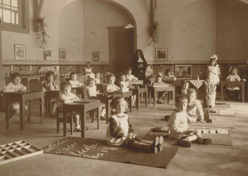
RMIT
DESIGN
ARCHIVES
JOURNAL
VOL 11 Nº 1 | 2021
PIETER HUVENEERS
VOL 11 Nº 1   PIETER      Guest Editor        Journal            Editorial Board                                      Contact                           We acknowledge the people of              Cover                       Below
                                                                                                                                                        the eastern Kulin Nations on              Layout for Australia        Shelf of corporate identity
2021          HUVENEERS   Noel Waite          Editor             Suzie Attiwill       rmit University                 rmitdesignarchives@rmit.edu.au
                                                                                                                                                        whose unceded lands we conduct            Post Corporate Identity     style guides designed by
                                              Harriet Edquist    Michael Bogle        Sydney, nsw                     www.rmit.edu.au/designarchives    our business and we respectfully          Manual, designer            Pieter Huveneers.
                                                                 Mauro Baracco        Baracco + Wright Architects                                       acknowledge their Ancestors and           Pieter Huveneers,           Unknown photographer.
                                              Assistant
                                                                 Nanette Carter       Swinburne University                                              Elders, past and present.                 RMIT Design Archives,       Courtesy Tanis Wilson.
                                              Editor                                                                                                                                              ©Australia Post.
                                                                 Liam Fennessy        rmit University                                                   issn 1838-7314 | Published by rmit
                                              Ann Carew
                                                                 Christine Garnaut    University of South Australia                                     Design Archives, rmit University.         Previous Page
                                              Design             Philip Goad          University of Melbourne                                           Text © rmit Design Archives, rmit         Post Office Savings Bank,
                                                                 Brad Haylock         rmit University                                                   University and individual authors.        ‘Savings Will Shape His
                                              letterbox.net.au                                                                                          This Journal is copyright. Apart          Future’ (1954), designer
                                                                 Robyn Healy          rmit University                                                   from fair dealing for the purposes        Pieter Huveneers.
                                                                 Andrew Leach         University of Sydney                                              of research, criticism or review as       RMIT Design Archives.
                                                                 Catherine Moriarty   Brighton, uk                                                      permitted under the Copyright Act         (Detail).
                                                                 Michael Spooner      rmit University                                                   1968, no part may be reproduced,
                                                                                                                                                        stored in a retrieval system or
                                                                 Laurene Vaughan      rmit University                                                   transmitted by any means without
                                                                                                                                                         the prior permission of the publisher.

              CONTENTS    04             10                                           38                              50
                          Editorial      Huveneers: From Dutch Poster Artist          Setting a Standard              Little Symbols: The Typographic
                          Noel Waite     to International Design Consultant           Dominic Hofstede                Landscape of Pieter Huveneers
                                         Noel Waite                                                                   Stephen Banham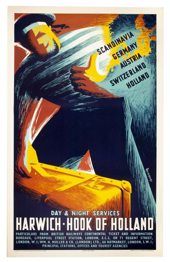
EDITORIAL PIETER HUVENEERS It was May 2018 when I received an email
from Ian Morrison, Heritage Librarian at
LINC Tasmania, about Pieter Huveneers’
design archive, which Morrison described
at the time as ‘a truly stunning collection
of national and possibly international
significance.’
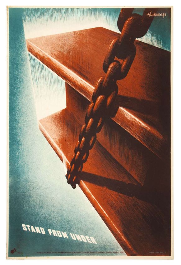
Although only a recent arrival to Australia, I was aware of He resumed his studies in 1946 and, upon graduation in Opposite
Royal Society for the
Pieter Huveneers’ contribution to corporate identity design 1948, immediately began designing posters for art galleries Prevention of Accidents,
through the Re:collection website.1 Harriet Edquist, then and international industrial fairs in the Netherlands. His ‘Stand From Under’
Director of the RMIT Design Archives, and I travelled to ability to translate and communicate across cultures was to (c.1951), designer
Pieter Huveneers.
Launceston to assess the archive in August. Our assessment be an important asset as he embarked on his international Courtesy Tanis Wilson.
confirmed Morrison’s impression of a significant collection career.
that I could only compare to American designer Paul Rand, This special issue of the RMIT Design Archives Journal 1.
the major difference being that Huveneers practised across provides a small insight into the breadth and diversity of Dominic Hofstede,
half a century and three countries and was not resident long Pieter Huveneers’ practice, examining his contribution Peter Huveneers
‘Re:collection’,
enough in any of them to be captured within national design to design in England and his corporate identity design in re:collection website,
histories. For the next year, Edquist worked with Tanis Australia from 1970 to the present day. ‘Huveneers: From accessed July 1, 2021,
Wilson, the widow of Pieter Huveneers, to sort and prepare Dutch Poster Artist to international Design Consultant’
https://recollection.com.
au/biographies/pieter-
the archive, after which Tanis donated it to the RMIT examines his rapidly developing reputation as a graphic huveneers.
Design Archives. designer in England between 1950 and 1964, where
What was also apparent when reviewing his archive was he established enduring relationships with leading
that Pieter Huveneers was a collector himself, in that he practitioners of the day, and contributed to the growing
had not only retained his childhood Montessori colouring- field of corporate identity, as private companies and
in book, but also copies of almost all of his commercially national public services sought new ways to communicate
printed posters designed in England between 1950 and internally and externally. His poster designs were frequently
1964, as well as product prototypes and packaging from his reproduced in leading graphic design journals throughout
time as a design consultant at Smiths Clocks (England). his time in the United Kingdom, and demonstrated the
His collection also included process work and client increased status and growing importance of the design
presentations for his corporate identity work in Australia, profession within business and government services.
as well as small collections of mechanical gears, the ordered Dominic Hofstede provides a case study of Huveneers Pty
forms of which clearly appealed to his astute eye. In his Ltd’s successful tender for Australia’s largest corporate
retirement in Sydney’s Blue Mountains and Tasmania, he identity system, as the Postmaster General was separated
also remained an active painter, who clearly took pleasure into the postal and telecommunications organisations,
in the graphic arts he had developed across his lifetime. Australia Post and Telecom in 1972. These essential
Petrus Hubertus Huveneers was born in Utrecht on 3 April communication services needed to be accessible and
1925, second of three children of Jan Joseph Huveneers efficient, and Hofstede shows how engagement with all
(1893–1967) and Hubertina-Josephina-Margaretha van levels of the organisations was vital in the research phase to
Helden (1891–1968). He completed high school in 1941, adequately understand the corporate image required and
and enrolled in the College of Arts & Crafts, Arnhem develop the requisite corporate identities. The program
(now part of ArtEZ University of the Arts) in what was then was then developed into comprehensive corporate identity
the German-occupied Netherlands. After starting his first manuals, and senior executives were embedded in the
year, he was transferred to a labour camp from which he studio so that the respective corporate identities would be
soon escaped and spent the remainder of the war as a comprehensively understood and implemented throughout
farm labourer and interpreter for the Allied forces. these two complex organisations. Such a comprehensive
blueprint for change took over five years to develop and
implement to the exacting standards set by its architect,
Pieter Huveneers.
5
rmit design
archives journal
Vol 11 Nº 1 (2021)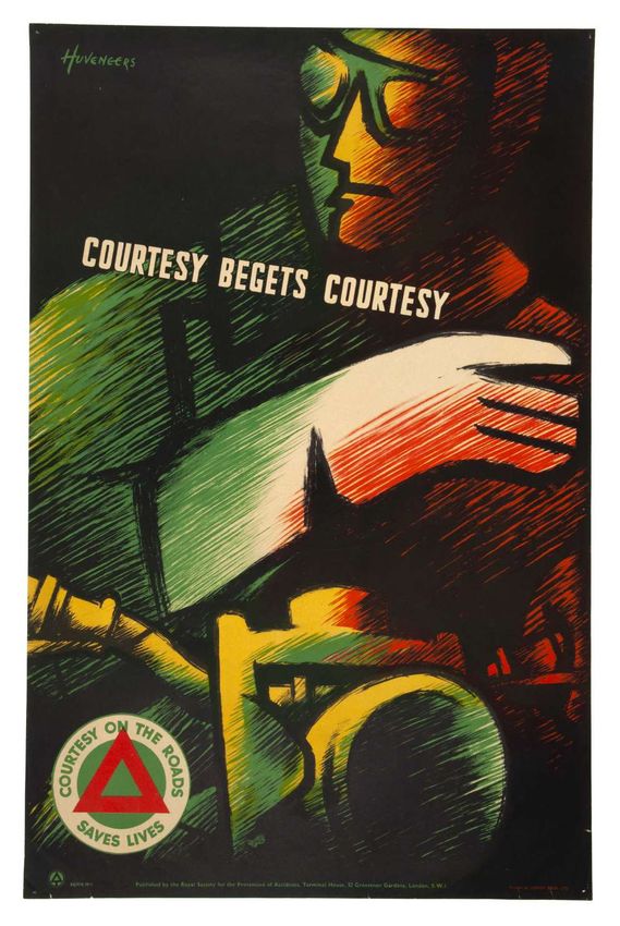
EDITORIAL                      PIETER HUVENEERS

Opposite                       Stephen Banham provides a case study of a different kind,     Tony Golsby-Smith describes this expanded practice in
Huveneers Pty Ltd,
colour specification           walking two central city blocks in Melbourne to show how      the following way:
pages from the Telecom         the many ‘little symbols’ created by Pieter Huveneers and       The fourth order designer moves the boundary of the
Corporate Identity             his international team of designers become inscribed in our
Manual. c. 1975, RMIT                                                                          task out to encompass the issues of “Why are we doing
Design Archives.               streetscape and daily lives. From Wales Corner and post         this task?” and, in answering this question, “What does
©TelstraCorporation2021        boxes above ground to underground telecommunication,            it tell us about our identity and value?” Similarly, the
                               Huveneers’ totalising approach to the infrastructure of         fourth order designer also will move the scope of the task
2.                             communication design extends into performance art               out to encompass connected systems and activities; to
Richard Buchanan,              and the disrupted consumerism of Myer and Target.               achieve integration so that the product does not operate
“Wicked Problems
in Design Thinking,”
                               These enduring legacies, which are repeated across cities       as a fragment in the world, but within useful and viable
Design Issues vol. 8, no.      and towns across Australia, remind us that the complex          patterns. Finally, the fourth order designer widens the
2 (1992): 5–21. https://       intangible processes of design constantly require our
doi:10.2307/1511637.                                                                           scope of this practical task to include the people involved
                               attention if we are to be rewarded with its tangible and        in creating and using the product (i.e., the product
3.
Tony Golsby-Smith,             sustaining contribution to the places where we live our         decisions are not taken in isolation; nor are they driven
“Fourth Order                  lives.                                                          primarily by the creative lone voice of the designer) but
Design: A Practical
Perspective,”Design Issues     In his article ‘Wicked Problems in Design Thinking’ (1992),     are developed in discussion with a sense of growing
vol. 12, no. 1: 16, https://   Richard Buchanan outlined the four orders of design to          purpose and commitment. 3
doi:10.2307/1511742.
                               explain how extensively design affects contemporary life.2    It was this strategic mindset that Pieter Huveneers
                               These are symbolic and visual communication, the design       brought to Australia, as he sought to discover and visually
                               of material objects, the design of activities and organised   communicate the identities and values of long established
                               services, and the design of complex systems. Buchanan         national organisations through in-depth research into the
                               reflects how design has developed historically across         internal operations of a company, as well as the evolving
                               the twentieth century, moving from the simpler first and      needs and desires of customers. His ability to listen to and
                               second orders to the more complex third and fourth orders,    communicate with a range of stakeholders enabled him to
                               developing from a craft practice to a profession and a        integrate the art of design and the culture of business. As
                               discipline. However, Buchanan is also at pains to point out   always, there remains more research to be done to fully
                               that specific design professions should not be delimited      comprehend the contribution of Pieter Huveneers, but I
                               to each area, and this is the case with Pieter Huveneers,     am very grateful for the donation by Tanis Wilson and the
                               who, while he was an accomplished communication               efforts of the RMIT Design Archives to preserve and make
                               and product designer, was offering a service as a design      accessible such a truly international design history.
                               consultant within a decade of graduating. His breadth of
                                                                                             Noel Waite, Guest Editor
                               experience with both private companies seeking to expand
                               internationally and national public services in growing
                               demand laid a foundation for the complex systems of a
                               multinational company like Philips.

6
rmit design
archives journal
Vol 11
    10Nº
       Nº12(2021)
            (2020)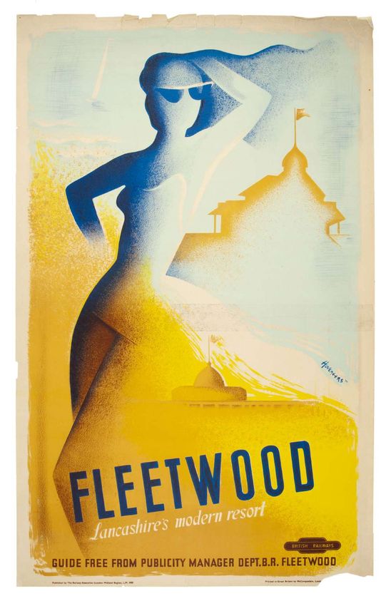
8                                      9
rmit design                rmit design
archives journal     archives journal
Vol 11 Nº 1 (2021)    Vol
                       Vol1011Nº
                              Nº21(2020)
                                   (2021)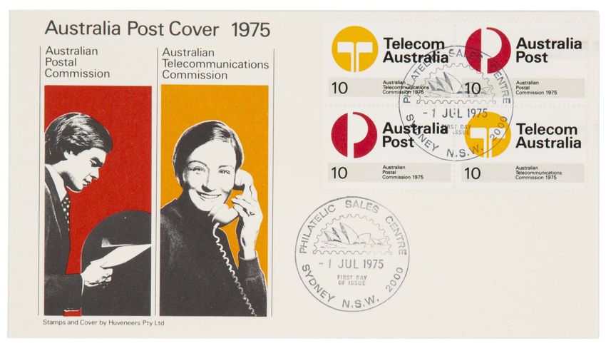
Huveneers: From Dutch Poster Artist                                                                                                      peer
                     to International Design Consultant                                                                                                     reviewed
                                                                                                                                                              essay
                     Noel Waite

                     abstract
                     Between 1950 and 1964, Pieter Huveneers established             His poster designs for British Railways, British Aluminium,
                     himself as one of the leading graphic designers in Britain.     the General Post Office and the Royal Society for the
                     His independent practice relentlessly sought novels ways        Prevention of Accidents were frequently reproduced in
                     to communicate essential services or national products to       leading graphic design journals for more than a decade
                     an expanding domestic and international market, and was         and demonstrated the increased status and growing
                     marked by his unique accent, which was internationalist         importance of the design profession within business and
                     in outlook. He developed enduring relationships with            government services. Through teaching graphic and
                     leading designers of the day, such as Tom Eckersley,            industrial design, he expanded his community of practice,
                     Abram Games, Lewit-Him and F.H.K. Henrion, and                  establishing himself as a design consultant for Schweppes,
                     contributed to the growing field of corporate identity,         Scott Furniture and Smiths Clocks. His diverse and prolific
                     as private companies and national public services sought        practice in Britain set the foundation for his subsequent
                     new ways to communicate internally and externally.              consolidation of Philips’ global corporate identity and his
                                                                                     major contribution to the corporate landscape of Australia
                                                                                     from 1970.

                     In a short interview with the Postal Museum in 2012, an 87-year-
                     old Pieter Huveneers recalled his favourite design for the British
                     Post Office as being the 1955 ‘Post Office Guide’. This featured
                     an open Post Office Guide being perused by a bowler-hatted and
                     moustachioed gentleman, whose eye and head line consisted of
                     a question mark. The integration of these three simple elements
                     succinctly ‘supplies all the answers’ to the needs of his client and
                     their customers. When asked how he created such images, he
                     modestly replied ‘The image you want to create should be in line
                     with the service offered’.1

                     However, by 1955, after five years in England and seven         still continuing the Montessori principle’.2 He also learned    Previous Page
                                                                                                                                                     Pieter Huveneers
                     years since graduating from the Academy of Art & Design         from his elementary school neighbourhood environment,           (front boy on floor)
                     in Arnhem, the Netherlands, Huveneers had established           skipping school to sit with an old bicycle restorer, or         at Montessori school,
                     himself as a leading graphic designer in the United             observing local shop signage: ‘You know where the baker         Utrecht, unknown
                                                                                                                                                     photographer.
                     Kingdom. This was recognised when he was elected a              is because it says “Bakery”, and you try to remember the        Courtesy Jos de Hoop.
                     Fellow of Royal Society for the Encouragement of Arts,          letters and so you see how society is really living’.3 He
                                                                                                                                                     Opposite
                     Manufactures and Commerce in 1965, and his design ranked        frequently drew cards and also assisted a sign painter          General Post Office,
                     with Abram Games, Tom Eckersley, F.H.K. Henrion and             making oil sign boards, learning how to make signs made         Post Office Guide (1955),
                                                                                                                                                     designer Pieter Huveneers.
                     Hans Schleger in its breadth and reputation with leading        of several panels to fit the scale of a large wall. These       RMIT Design Archives.
                     public and commercial services of the day. His decision to      experiences led him to enrol in the Art Academy in Arnhem,
                     return to the Netherlands to take up a position as Creative     where classes were taught in Dutch, French German and
                     Director at Philips in 1964, and his subsequent success         English, to study Advertising and Propaganda Art. While
                     as a corporate identity designer in Australia from 1968         this was an applied program, it provided a broad arts
                     overshadowed his design identity in Britain, but it certainly   education including mathematics and geometry, history,
                     set the foundation for those later achievements.                anatomy and a considerable amount of figure drawing.
                     In a 2005 interview, Pieter Huveneers acknowledged the          However, his studies were interrupted by the war,
                     value of his early Montessori education and its emphasis        when he was sent to a labour camp in Heerenveen. He
                     on individual creative discovery. He recalls being given        managed to escape and was sheltered on a farm, from
                     a coloured mat to sit on as a three-year old, and likens        where he worked with the resistance, eventually using
                     this childhood experience to the collective thought of his      his English language skills to act as interpreter for British
                     design practice: ‘You still plan what you do. You think it      and American paratroopers around Arnhem, before
                     out, then you apply it. When you work for yourself, you are     completing his interrupted studies between 1946 and 1948.
10                                                                                                                                                                                11
rmit design                                                                                                                                                          rmit design
archives journal                                                                                                                                                archives journal
Vol 11 Nº 1 (2021)                                                                                                                                                Vol 11 Nº 1 (2021)
huveneers:
  from dutch foster
artist to international
  design consultant
       Continued

  Left
  ‘De Stichsche Tuin’
  [The Beautiful Garden]
  (1946), designer
  Pieter Huveneers.
  RMIT Design Archives.

  Right
  British Railways,
  ‘Harwich Hook of
  Holland’ (1950), designer
  Pieter Huveneers.
  RMIT Design Archives.

  Opposite
  British Railways,
  ‘Fleetwood – Lancashire’s
  Modern Resort’
  (1950), designer
  Pieter Huveneers.
  RMIT Design Archives.

                              This contribution to the war effort enabled him to travel         in 1949, and certainly contributed to the bestowal of the
                              to England through the International Friendship League.           sobriquet, ‘The Dutch Artist’. It integrates an iconic Dutch
                              In 1948 he gathered letters of recommendation, nearly all         windmill with a chain motif and upward-pointing anchor
                              of which mentioned his posters for the flower festivals,          featuring both countries’ national flags. It was to be the first
                              including two letters from organisers of the Royal Dutch          of four ‘Harwich Hook of Holland’ posters he would design
                              Industries Fair: ‘We gladly declare that the gentleman            over the next 15 years, but this early poster also stands out
                              has made various designs for us and has left us with the          from his later works due to its painterly background, and
                              impression that he is an artist of goodwill and has shown         hand-drawn aesthetic. A further commission for British
                              through his work that he can be artistic for artistic purposes.   Railways in 1950, promoting ‘Fleetwood – Lancashire’s
                              We are furthermore aware that he has also created designs         Modern Resort’, is far more stylised and modern. The
                              for others, including a poster for a flower exhibition that       silhouette of the female sunbather dominates the
                              has particularly made a significant impact’.4 Similarly, an       composition, leaning into the centre of the poster, creating
                              Arnhem wholesale cleaning company commended his                   movement with the grainy sands of Marine Beach, and
                              innovative approach to advertising, which had increased           the iconic Mount Pavilion appearing under her right arm.
                              sales, and an optician recommended his originality as a           The flowing outlines are combined with a subtle gradient
                              window display artist.5 These testimonials also included          which integrates people and place, while the asymmetric
                              a letter from the Chairman of the Exeter branch of the            typography of ‘Fleetwood’ extends upward. This two-
                              International Friendship League, and one from Graham              colour Double Royal (40 x 25 inches) lithographic poster
                              Woodmansterne, who met Pieter Huveneers in Arnhem in              seamlessly blends a compelling image of a prospective
                              1947, when Pieter agreed to translate a lecture on India for      visitor and suggests Fleetwood may be a fine alternative
                              him. Woodmansterne presciently wrote: ‘Mr Huveneers               to the French Riviera. Huveneers’ distinctive signature
                              appeals to me as a very earnest and industrious fellow,           flows through the sea, abutting the coastline. These posters
                              with ideas of his own and ambitions. I wish him every             appeared in railway stations and the Underground, on
                              success in his career, which I am sure will be moulded by         buildings and by the roadside to encourage people to use the
                              his international interests’.6 Along with his references, he      integrated national transport system and promote domestic
                              also brought the actual size finished art for his flower show     tourism.
                              posters, which had been stretched and dried to look like          The centrality of people can also be seen in his poster for
                              printed posters.                                                  the British Rail ‘Holiday Guides, 1952’ which, while it is
                              His first poster design was for British Railways and              required to list all five areas covered on a dark background
                              ‘Harwich Hook of Holland’ (1950) was appropriately for            extended from the man’s suit, is still dominated by the head
                              the overnight ferry which had brought him to England              of a Guide reader, who also appears to be imagining himself
  12                                                                                                                                                                               13
  rmit design                                                                                                                                                           rmit design
  archives journal                                                                                                                                                 archives journal
  Vol 11 Nº 1 (2021)                                                                                                                                                 Vol 9 Nº 2 (2019)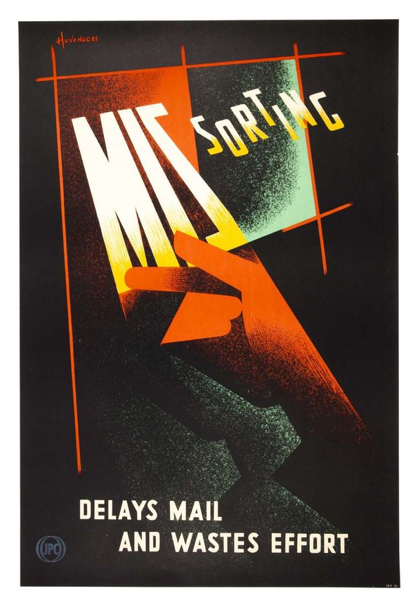
huveneers:
  from dutch foster
artist to international
  design consultant
       Continued

  14                                       15
  rmit design                  rmit design
  archives journal        archives journal
  Vol 11 Nº 1 (2021)        Vol 11 Nº 1 (2021)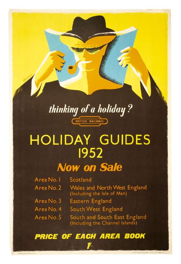
huveneers:
  from dutch foster
artist to international
  design consultant
       Continued

                          Previous Pages               Above Left                   Above Middle                Above Right
                                                       British Railways,            British Railways,           British Railways,
                          Left                         ‘The West Country Car        ‘The Continental Car        The Highlands Car
                          British Railways,            Sleeper to Exeter            Sleeper’ (1956), designer   Special to Inverness’
                          ‘Holiday Guides’ (1952),     St. David’s’ (1956),         Pieter Huveneers.           (1956), designer Pieter
                          designer Pieter Huveneers.   designer Pieter Huveneers.   RMIT Design Archives.       Huveneers. RMIT
                          RMIT Design Archives.        RMIT Design Archives.                                    Design Archives.
                          Right
                          British Railways,
                          ‘Harwich Hook of Holland’
                          (1954), designer Pieter
                          Huveneers. RMIT Design
  16                      Archives.                                                                                                          17
  rmit design                                                                                                                    rmit design
  archives journal                                                                                                          archives journal
  Vol 11 Nº 1 (2021)                                                                                                          Vol 11 Nº 1 (2021)
huveneers:
from dutch foster
artist to international
design consultant
Continued
sunbathing on the beach. Similarly, Huveneers’ second
‘Harwich Hook of Holland’ Double Royal poster from 1954
shows a giant sailor bestriding Europe and carrying the
passenger’s suitcase with his thumb pointing to the five
destinations listed. The simpler two-colour British Railways
posters for the Car-Sleeper and Car Special successfully
highlight the seamless integration of car, train and a relaxing
passenger to entice people to take advantage of these new
overnight rail services, and the same image is deployed
nationally and internationally. As Charles Rosner observed
with regards the best poster design, ‘It is the underlying
human element which gives strength and conviction to
these posters and their great simplicity in composition and
directness of expression cannot help but act as an impetus
on the “man in the street”’.7
The 1950 ‘Harwich Hook of Holland’ poster caught the
attention of British Aluminium, who asked Huveneers
to join their team of designers. In a profile of the British
Aluminium Company in the 1954 issue of Gebrauchs Graphik,
Rudolf Conrad explained how the company focussed
on prestige advertising directed towards management
and technical staff, as well as the challenge of increased
production of aluminium and having to recapture pre-war
markets. The company adopted a policy of employing
‘outstanding industrial artists’, restricted to a small elite
group with considerable freedom of graphic expression, who
could provide ‘sufficient contrast of styles to give variety
[and who] will feel it worthwhile to devote continuous
thought to the problem of marketing aluminium’. Conrad
identified Abram Games, F.H.K. Henrion, Pat Keely, James
Hart, Edward Bawden and Huveneers. All were ‘encouraged
to express specific subjects in his own style and the main first design to be featured in the 1950/51 issue of Modern represented by six posters, Keely by five, and Schleger, Both posters were reproduced in the International
responsibility of the Company staff is to ensure that the artist Publicity, featuring an illustrated dove and intertwined Lewitt-Him, Henrion and Mount by four. The only five Poster Annual 1952 and Modern Publicity (1951 and 1956
is adequately briefed’.8 hands. The second was for the 1950 Intra-European ‘English’ designers represented by reproductions in the respectively), and ‘Courtesy Begets Courtesy’ featured in
Cooperation for a Better Standard of Life Poster Contest. catalogue were Lewitt-Him,12 Eckersley, Henrion, Games Tom Eckersley’s 1954 Poster Design textbook, where he
Left Writing in ‘Posters for London Transport’ (1952), Harold
Over 10,000 posters were submitted on the theme of and Havinden. Huveneers and Eckersley remained close noted Huveneers’ ‘powerful treatment’ of the close-up of a
Poster for Paris Fashion Hutchinson explained that posters were ‘designed
exhibition, titled Modes, cooperation and economic recovery, and judged by a panel friends from this time. All the posters demonstrated the courteously waving motorcyclist, concluding the poster gets
to stimulate the public and be a valuable part of the
(1950), designer Pieter of 12 graphic artists, each representing a different Marshall key feature Charles Rosner described in his catalogue ‘right down to the crux of the subject and impel[s] the mind
Huveneers. Courtesy architecture of stations and a worthwhile contribution to
Plan country. The posters were designed to promote the essay ‘The Changing Background of the Poster’: ‘It was to fly straight to the point’.15 These both demonstrate a more
Tanis Wilson. the amenity of the public street’,9 and that all art-work was
idea of Western Europe cohesion and integration, with a breaking-up of subjects into components and a placing considered integration of the public service message texts
Middle commissioned outside the organisation from established
the removal of trade barriers and inter-governmental together again, creating a new complete image, of which than his earlier posters, demonstrating Eckersley’s advice
Entry in competition artists, as well as newcomers like Huveneers. Although
design for 1950 Intra- institutions to aid in trade. While the winning design, the pictorial elements and the text were equal partners’.13 that ‘lettering can sometimes be used to suggest perspective,
Hutchinson was clear that ‘Autolithography by the artist
European Cooperation for ‘All Our Colours To The Mast’ by Dutch designer Reijn According to Paul Rennie, RoSPA challenged orthodox or to give an effect of space and distance’.16 This is especially
a Better Standing of Life we do not encourage–we believe that the craftsman
poster, (1950), designer Dirksen, depicted a 19th-century ship made up of the word views of British Modernism in the way it used graphic so with the vertiginous ‘CARE’ above a small child crouched
lithographer and the original artist should each complement
Pieter Huveneers. ‘EUROPE’, with sails made of flags from each country, design to provide a coherent framework for worker behind an ominously large car tyre. This poster was also
Courtesy Tanis Wilson. the other’.10 This opportunity to work with established
Huveneers’ design featured a more expansive global world education in health and welfare. During the Second featured in Gebrauchs Graphik (1952), alongside another
lithographic printers is evident in the ‘Fleetwood’
Right consisting of meridian lines, with three inter-connected World War, it had been co-opted by Ernest Bevin, head RoSPA poster ‘Stand From Under’, where a heavy red steel
Competition design poster, but Huveneers was clearly impressed with the
workers supporting a factory. A similar spiralling line links of the Ministry of Labour and National Service, who girder threatens anyone who fails to heed the warning far
for United Nations opportunities of this public gallery for graphic design: ‘So
Organisation Poster people and nature in both of Huveneers’ posters, and they was a friend of Frank Pick of London Transport, and below.
then you get the posters in England, they are 16-sheeters,
(UNO), 1950, designer display a distinctive integrated approach which drew the understood the value of an integrated communication
Pieter Huveneers. things on the Underground, it is really an exhibition spot. Jeremy Aynsley has described Gebrauchsgraphik (Gebrauchs
attention of the British design community. strategy. Tom Eckersley was a member of the Publicity
Courtesy Tanis Wilson. All the people stand there on the platform and then you get Graphik after the Second World War) as an important
where the train rolls in and there you have the wall behind Huveneers credited Henrion for selecting his ‘Modes’ Committee, along with Ashley Havinden, who used his early graphic design journal, ‘innovative in its focus
for the posters and you put your name on the posters and poster for Paris fashion in an exhibition in Hampstead, experience as a creative director to put together a roster on advertising design,’ 17 when it was first published
sign them all. So that is how it happened and then it must as well as Tom Eckersley’s selection of his Royal Society of designers. According to Paul Rennie, ‘The list is notable in Germany in 1924. This new generic term of graphic
have been different to me. It wasn’t different but, to them, for the Prevention of Accidents (RoSPA) poster, ‘Care’ in for the inclusion of many young émigré talents who might functionalism encompassed design for publication,
it was a different approach, so in no time I got recognition’.11 the International Poster Exhibition, as part of the Festival reasonably be identified as “outsiders”’.14 Huveneers advertising and typographic design. Its editor, Professor
of Britain in 1951. Huveneers’ poster was one of twelve was one of these talents, and he designed two posters H.K. Frenzel, was a founding member of the Association
Huveneers’ international outlook can best be seen in two
RoSPA posters featured, alongside designs by Robin Day, for RoSPA’s road courtesy campaign, ‘Courtesy Begets of German Commercial Graphic Designers (or Bund
early posters he designed for international competitions.
Pat Keely, Leonard Cusden, Reginald Mount and Abram Courtesy’ and ‘Care Before Reversing or Restarting.’ Deutscher Gebrauchsgraphiker), who worked tirelessly
The ‘UNO’ (United Nations Organisation) poster was his
18 Games. Games, Eckersley and Ashley Havinden were all 19
rmit design rmit design
archives journal archives journal
Vol 11 Nº 1 (2021) Vol 11 Nº 1 (2021)huveneers:
from dutch foster
artist to international
design consultant
Continued
20 21
rmit design rmit design
archives journal archives journal
Vol 11 Nº 1 (2021) Vol 11 Nº 1 (2021)huveneers:
from dutch foster
artist to international
design consultant
Continued
to improve German advertising and define and promote
the work of designers for industry. Gebrauchsgraphik
distinguished itself from avant-garde arts periodicals in that
it ‘carried an underlying assumption of a ready acceptance
of capitalist application of design for improved economic
performance.’ 18 It also maintained an internationalist
outlook through Frenzel’s connections in the United States,
and Europe, which included contributions to the Penrose
Annual and Modern Publicity. His aim with the journal was
stated in 1927 ‘to circumscribe a circle covering what can
be regarded as good present day graphic art.’ 19 Journals like
Gebrauchsgraphik and Graphis (from Switzerland in 1944)
not only raised the standard of advertising art, but built
and confirmed graphic design reputations. They were also
instrumental in setting an internationalist agenda for global
trade in the post-war world, and providing access to a more
diverse community of practice who sought to develop trans-
national dialogue.
The 1952 issue of Gebrauchs Graphik featured a four-page
spread on ‘P.H. Huveneers, England’. Ludwig Ebenhöh
began his profile by noting that ‘European commercial
graphic art is beginning to become more and more
internationalised’.20 Despite the fact Huveneers had only
been working in Britain for two years, Ebenhöh concluded:
‘Though he cannot deny in his works his personal note in
Previous Pages origin, he, nevertheless, has adapted considerably his artistic
Left form to present English commercial art, a fact easy to
Royal Society for the
Prevention of Accidents
understand, as he is an experienced collaborator of many a
(RoSPA) ‘Courtesy leading British concern’. 21 The profile featured eight posters
Begets Courtesy’ and a prospectus cover for engineering firm Babcock, which
(c.1950), designer
Pieter Huveneers. also appeared at the 1951 Festival of Britain. Three posters
RMIT Design Archives. were designed for the General Post Office, two for RoSPA, peak of 110 million at Christmas, and that one of its primary
Previous Pages and one each for British European Airways (BEA), British purposes was to ‘persuade the public that it is so efficient
Right Aluminium and British Railways. Babcocks, BEA and and so alive to the needs (both physical and emotional)
Royal Society for the British Aluminium were clearly international in outlook,
Prevention of Accidents of the people it serves’. 24 Black went on to observe that
‘Care’ (c.1951), designer and Huveneers chose to represent them as progressive ‘The messages of most Post Office posters are not only
Pieter Huveneers. global companies leading with technology, with very little simple but as well known by the public to whom they are
RMIT Design Archives.
resort to nationalist tropes. addressed as other nursery rhymes in the cradle. ‘Post early
Left
General Post Office,
In GPO Design Posters, Paul Rennie observed that ‘After for Christmas’, ‘Please pack parcels very carefully’, ‘Books
‘Telegrams are Urgent 1945, a new type of communication began to express of stamps save time’: only ‘Send your overseas parcels by air
Messages’ (1952), designer values that were part of the post-war agenda of social mail’ has even a flavour of the anxious and novel’. 25 These
Pieter Huveneers.
RMIT Design Archives. democratic reconstruction’.22 The foundations for these messages needed to be repeated on a regular basis to ensure
communications had been laid in the inter-war period the efficient operations of the Post Office, and so provided
Right
General Post Office, at the General Post Office (GPO), initially to deal with regular and frequent work for designers, which required ‘a
‘Mis-Sorting’ (c.1951), the telephone operations, but increasingly focussed on combination of skills based on modernist design formation
designer Pieter
publicity on all Post Office services. As GPO Public Relations and also an “outsider’s” eye attuned to the quirky and seeing
Huveneers.
RMIT Design Archives. Manager from 1933, Stephen Tallents adopted a strategy things differently’.26 Huveneers clearly had such an eye for
of using posters to carry information from the Post Office the quirks of English culture, or as he put it, his own design
to the public. These were initially displayed on railway accent: ‘I found all the work in England was really easier,
hoardings and in the London Underground, including the because of coming from another country, you’re unknown,
’16-sheet’ poster sites admired by Huveneers on his arrival, you do not realise your own slight difference of approach
as well as sent to schools as educational resources. From to a problem. It’s like language itself. You have a different
1935, they were also displayed in Post Offices, and consisted language so whatever you say, even if you translate it into
of ‘Prestige’ and ‘Selling’ posters. ‘Prestige’ posters were English or whatever other language, there is an accent and
designed to be eye-catching rather than persuasive, whereas that accent in design also may have helped me to be chosen,
‘Selling’ posters persuaded customers to buy a product or more frequently to execute the campaign’. 27 Huveneers
use a service. Posters were variously produced in Quad recalled, for example, that he was approached by Pepsi
Royal size (40 x 50 inches), Double Royal (40 x 25 inches), Cola to produce a 16-sheet poster, because they were
Quad Crown (30 x 40 inches), Double Crown (20 x 30 seeking to attract a younger public, and this led to work
inches) and Crown Folio (10 x 15 inches).23 with Schweppes. While Huveneers was certainly a young
In an article on ‘Post Office Printing’ in the 1954 Penrose designer, his designs were also infused with a celebratory
Annual, Misha Black reported that the British Post Office optimism, which was well suited to a country emerging
delivered 25 million letters and parcels per day, up to a from post-war austerity. He also sought a unique approach
22 23
rmit design rmit design
archives journal archives journal
Vol 11 Nº 1 (2021) Vol 11 Nº 1 (2021)huveneers:
from dutch foster
artist to international
design consultant
Continued
Opposite Left Above Left
for each client and increasingly emphasised people’s Modern Publicity of that year featured seven of his posters, Post Office Savings Bank, General Post Office,
activities and experiences in his posters, rather than merely and his poster for British Rail appeared for the first time ‘Savings Will Shape His ‘Speak Clearly-Always!’
announcing the product or service. in Graphis and, again, in the International Poster Annual Future’ (1954), designer (1957), designer Pieter
Pieter Huveneers. Huveneers. RMIT
Huveneers’ initial designs for the Post Office in 1951 were of that year. A series of four posters for the Post Office RMIT Design Archives. Design Archives.
informational, including internal communications such as Savings Bank, which were reproduced in Modern Publicity
Opposite Right Above Right
‘Mis-sorting Delays Mail and Wastes Effort’ and ‘Telegrams in 1957 and 1958, focuses on the value of thrift through a Post Office Savings General Post Office
are Urgent Messages - Treat Them as Such’. The extruded subtle balance between children at play and more serious Bank, ‘Out To Build ‘A Pleasing Tone-Always!’
A Future For Himself’ (1957), designer Pieter
perspective of ‘MIS’ and the scattering of the letters of personal financial futures. ‘Savings will Shape his Future’ (c.1954), designer Huveneers. RMIT
‘sorting’ off a single baseline reinforce the message of the shows a small boy with a bucket, whose shadow is that of a Pieter Huveneers. Design Archives.
importance of sorting the mail, which is connected through businessman he might be, while ‘Out to Build a Future for RMIT Design Archives.
the postal sorter’s hand. A more abstract hand conveys Himself’ shows how playing in the sandpit might lead to a Left
path to becoming a builder. A girl dresses up as a debutante, Post Office Savings Bank,
the speed and urgency of telegrams, and both posters ‘Whatever their Income
demonstrate Tom Eckersley’s advice to poster designers: with a savings book in her gloved hand, while another girl Group, Teach Them to
‘Because of their tremendous versatility and means of climbs out of the frame, but has her savings as ‘Something Save Regularly!’
(1959), designer
expression, hands have been used to advertise every kind of to Fall Back On’. These are in sharp contrast to two later
Pieter Huveneers.
product and service in the world at some time or another. posters (from 1959 and 1960), which actually feature an RMIT Design Archives.
It is their flexibility and graphic simplicity that makes them illustration and a photograph of Pieter Huveneers and his
the answer to a designer’s prayer’.28 A 1951 public-facing young family. With the growth of television advertising,
poster cleverly combines two directories into the shape of a photographic reproduction was increasingly favoured in
Post Office building to communicate its sales message, but posters by the end of the decade, but, from Huveneers’
the diagonal typographic movement and thumbed covers point of view, this came at the expense of ‘the personal
combine to suggest this prosaic index is essential reading. and more painterly touch’. 30 As well as these external
promotional posters for the Post Office, Huveneers was
By 1956, Huveneers was earning almost £3000 per year from
also commissioned to design posters for internal use
his design (almost six times the average salary of the time),
by the telephony department, although two posters
or as he put it: ‘It wasn’t just a shower it was a downpour and
designed in 1957 were unfavourably received and ended
I was charging more than all the others because the only way
up being withdrawn. The Chairman of the Post Office
to slow it down is to increase your fee’.29
Internal Relations Panel/Joint Production Council argued
24 Huveneers was ‘trying to illustrate an idealised notion of 25
rmit design rmit design
archives journal archives journal
Vol 11 Nº 1 (2021) Vol 11 Nº 1 (2021)huveneers:
from dutch foster
artist to international
design consultant
Continued
the impression made by a telephonist who speaks clearly’,
whereas female telephonists believed that the ‘Speak
Clearly’ illustration gave ‘such a strong impression of a
vacuous mind’ that ‘it reflected adversely on their attitude to
their jobs’.31
More successful were Huveneers’ designs for the ‘Post Early
for Christmas’ campaign, which was an annual competition
he won several times. The posters were produced in
different sizes and formats - both landscape and portrait -
for display within Post Offices and on the side of delivery
vans. There was also room at the bottom of the poster to
include additional dates for cards, letters and packages, as
well as the alternative slogan ‘Travel Early, Shop Early, Post
Early’. His 1956 series answered the age-old question: Why
did the chicken cross the road? It showed a rooster with a
package on its back and a letter in its beak speeding to the
iconic red pillar box in the distance. The landscape poster
for vans has the bird at full stretch and almost in flight. His
1957 series featured jaunty pillar boxes singing Christmas
carols, ranging from a trio for the portrait poster to a quartet
and quintet for the landscape and van poster, and were
effective in encouraging people to post early. 32
Huveneers’ final series for the Post Office Savings Bank
perhaps exemplifies his mischievous visual sense of humour
and confirms Charles Rosner’s claim a decade before: ‘To
relieve, even temporarily the onlooker’s mood from his
problems, by giving him a welcome change and good cheer
seems to be one of the answers for the successful publicity
artist of today’. 33 This series of four posters, ‘Whatever Else
You May Have …’ features a pelican, an ostrich a dinosaur
and a giraffe, two posters featuring men, and two featuring
women, and suggests something of the consumer optimism
as Britain moved from post-war austerity. The giraffe
poster along with ‘Holiday Luggage Ahead’ for British Rail
Services (Parcels) both featured in International Poster
Annual 1966, the year after Huveneers had departed Britain
for his new position as international Creative Director for
Philips in his home country of the Netherlands. It seems
somehow appropriate that these two options, of a car racing
left with a cigarette-smoking driver and a giraffe in the back
to the Post Office, or a man with his bags packed, pointing
right to the sea and a seagull with his bags pack were the
Opposite Top Middle Left
last two reproductions of Huveneers’ designs in, and for
Post Office Savings Bank, Post Office Savings Bank, General Post Office, British public services. In 1964, he had had two job offers:
‘Whatever Else You May ‘For a Secure Background’ ‘Post Early’ (1956), one from the Canadian Ambassador in London to direct
Have … Have a Post Office (1960), designer Pieter designer Pieter
Savings Bank Account Huveneers. RMIT Huveneers. RMIT the communication of Canadian export industries, and the
As Well’ (1963), designer Design Archives. Design Archives. other from N.V. Philips directing communication through
Pieter Huveneers.
Middle Right Bottom 164 countries. He chose the latter, citing ‘Demands on
RMIT Design Archives.
General Post Office, British Railways, design due to languages and climates, as well as the levels
‘Post Early’ (1956), ‘Holiday Luggage
designer Pieter In Good Hands’
of development in differing countries attracted me and
Huveneers. RMIT (c.1963), designer promised to be intriguing.’ 34
Design Archives. Pieter Huveneers.
RMIT Design Archives. By the mid-1950s, Huveneers had expanded his practice
into industrial design, designing a range of cane furniture
for G.W. Scott & Sons which was sold through Harrods.
From 1958-1965 he was retained as a consultant by Smiths
Clocks and Watches to design a range of clocks, including
their packaging, advertising and display, for which he
also received royalties. One of his first designs was for a
Television Light Clock in 1958, of which the Marketing
26 27
rmit design rmit design
archives journal archives journal
Vol 11 Nº 1 (2021) Vol 11 Nº 1 (2021)huveneers:
from dutch foster
artist to international
design consultant
Continued
Right Manager, L.J.H. Parker concluded in a note to Huveneers: Design, describing how much he enjoyed discussions with
Post Office Savings Bank, ‘the design you have prepared for the Television Light them about ‘design and how to communicate and reach
‘Whatever Else You May
Have … Have a Post Office Clock is quite exceptional in my view, and introduces the population which is not just British, but comes from
Savings Bank Account a completely new line of thought in clock design’.35 He all the British possessions or overseas visitors’.40 It is clear
As Well,’ (1963), designer
Pieter Huveneers.
also designed displays at Ideal Home exhibitions and that Huveneers recognised the need to take account of a
RMIT Design Archives. magazine advertising, gave a number of lectures on sales more diverse and international audience brought about by
Opposite Left
and marketing and the importance of design to staff, and increased trade within Europe and with Commonwealth
Post Office Savings Bank, trained industrial apprentices. In a 1963 testimonial, Rex nations, which was made possible by increased peace-time
‘Whatever Else You May Smith wrote: ‘I always found him most helpful and consider prosperity and mobility.
Have … Have a Post Office
Savings Bank Account his ability as a designer excellent. It was due to his fresh Huveneers also noted that these associations with this
As Well,’ (1964), designer outlook which he applied to the design of our clocks, which signal graphic design programs ‘give you publicity as
Pieter Huveneers.
I am sure has resulted subsequently to increased sales’.36 well, without you trying to get it, but it automatically is
RMIT Design Archives.
Pieter Huveneers also began teaching part-time from referred to in print’. 41 Drawing on his experience with Scott
Opposite Top Right
Post Office Savings Bank, 1950 because, in his own words, ‘I like to be involved with furniture and Smiths clocks, his final foray into teaching
‘Whatever Else You May people.’ 37 He initially taught Advertising Design one night was at West Sussex College of Arts and Crafts in Worthing,
Have … Have a Post Office
Savings Bank Account
per week at the Willesden School of Arts & Crafts, which where he added industrial design to graphic design and
As Well,’ (1964), designer increased to four nights over the following nine years. In display design. This included car styling for Austin and
Pieter Huveneers. a testimonial written in 1962, the Principal, A.E. Jeffery Morris cars. Huveneers recalled ‘Styling was used rather
RMIT Design Archives.
wrote: ‘As an artist who earned his living by free-lance work, than design, and … there were very few people trying to
Opposite Top Left he brought into his teaching a freshness and vitality and get into the styling of cars. It’s a very difficult thing to do
British Railways,
‘Harwich Hook of authority which the students greatly appreciated; so much because you are dealing with double curvature, the side
Holland’ (1963), designer, so, in fact, that many felt themselves greatly stimulated.’ 38 of a car, a wing or what and it curves in different planes,
Pieter Huveneers.
RMIT Design Archives.
Huveneers also created advertisements in London for the so how do the ratios vary and following a flowing line’.42
London School of Printing and Graphic Arts and judged This seamless transition from the flowing lines of his early
student awards at the invitation of Tom Eckersley, who posters to product and packaging design and car styling
described Huveneers as ‘a graphic designer of distinction’.39 within a decade belies the prodigious work ethic that
He also met with students at the Central School of Art and sustained Huveneers’ practice during his time in London, as
28 29
rmit design rmit design
archives journal archives journal
Vol 11 Nº 1 (2021) Vol 11 Nº 1 (2021)huveneers: Endnotes
from dutch foster
artist to international
design consultant
Continued
he sought an ideal solution in line with the service offered. Preliminary list of periodicals reproducing Huveneers’
His transition from accomplished national poster artist to graphic design created in the United Kingdom: 1 Anon, ‘An Interview with Pieter Huveneers.’ The British Postal 31 Anna Flood, ‘A Pleasing Tone Always …’ The British Postal Museum
Museum & Archive (blog), January 30, 2012 https://postalheritage. & Archive (blog), September 15, 2011. https://postalheritage.
international Gebrauchs Graphik artist to design consultant Modern Publicity 1950–51 ‘UNO’: 37. wordpress.com/2012/01/30/an-interview-with-pieter-huveneers/ wordpress.com/2011/page/5/
was complete.
Modern Publicity 1951 ‘Courtesy Begets Courtesy’ 25. 2 Anon. Interview with Pieter Huveneers, 2005, RMIT Design 32 Ronald Carter, ‘Huveneers’ Design for Industry vol. 66, no. 396,
Writing in 1986, Adrian Forty provides a valuable case study Archives, Pieter Huveneers Collection, 0011/2019.0004.1-21, 2 June (1959): 39.
Gebrauchs Graphik 5 (1952) ‘Babcock Steam’, ‘Mis-Sorting’:
of London Transport, which demonstrated how important 3 Anon, Interview with Pieter Huveneers, 2005, RMIT Design 33 Charles Rosner, ‘The Changing Background of the Poster’
28; ‘Harwich Hook of Holland’: 29; ‘Care’, ‘Now on Sale’,
a unified corporate identity was for this organisation Archives, Pieter Huveneers Collection, 0011.2019.0004.1-21, 5 International Poster Exhibition London 1951. (London: Council of
‘Stand from Under’: 30; ‘BEA: Great Britain via London’, industrial Design): 6
in the inter-war years in ‘making the identity of the 4 Testimonial from Koninlijke Nederlandsche Jaarbeurs Royal Dutch
British Aluminium … For Tropical Roofing’, ‘Telegrams are Fair, April 15, 1948. RMIT Design Archives, Pieter Huveneers 34 ‘1970s CV’, RMIT Design Archives, Pieter Huveneers Collection,
company apparent to the employees, and advertising the
Urgent Messages’: 31. Collection, 0011.2019, Box 5, File 1 ‘1940s CVs’. 0011.2019, Box 5, File 4.
company’s special characteristics to the public’.43 London
Transport’s success influenced both public services and International Poster Annual 1952 ‘Care’: 48. 5 RMIT Design Archives, Pieter Huveneers Collection, 0011.2019, 35 L.J.H. Parker, Letter to Pieter Huveneers. April 3, 1958. ‘Smith
Box 5, File 1 ‘1940s CVs’. Clocks England’, RMIT Design Archives, Pieter Huveneers
private companies in the post-war period in Britain, and Modern Publicity 1952/53 ‘Mis-Sorting’, ‘Now on Sale’: 42. Collection, 0011.2019, Box 7, File 11.
6 In fact, six years later Huveneers would design an identity,
Huveneers was well placed to contribute to a remarkable Modern Publicity 1953 ‘Care’:.26; ‘Harwich Hook of advertising and production system for Woodmansterne 36 Rex Smith, Letter to Pieter Huveneers. 19 November 1963.
range of these identities during his 15 years there. Pieter Holland’: 34; ‘Stand from Under’: 55; ‘Woodmansterne Colourslides, which was reproduced in the 1956 issue of Modern ‘1960s CV’, RMIT Design Archives, Pieter Huveneers Collection,
Huveneers’ independent practice was marked by his own Colour Slides & Films’: 105. Publicity, along with six of his posters. 0011.2019, Box 5, File 3.
unique accent, which was internationalist in outlook 7 Charles Rosner, ‘The Changing Background of the Poster’ 37 Anon. 2005. Interview with Pieter Huveneers. RMIT Design
International Poster Annual 1953/4 ‘Now on Sale’: 60
and relentlessly sought novels ways to communicate International Poster Exhibition London 1951, (London: Council Archives, Huveneers Collection, 0011/2019, Box 5.
essential services or national products to an expanding Modern Publicity 1954 ‘4d is the Minimum Foreign Letter of Industrial Design, 1951), 6. 38 A.E. Jeffery. Testimonial for Pieter Huveneers. March 29, 1962.
domestic and international market. His witty designs Postage Rate’: 50; ‘Packaging Exhibition Number’: 105 8 Rudolf Conrad, ‘British Aluminium Company Limited’ ‘1960s CV’ RMIT Design Archives, Pieter Huveneers Collection,
Gebrauchs Graphik (1954): 27. 0011/2019, Box 5, File 3.
communicated a youthful optimism which resonated Gebrauchs Graphik 1954 ‘British Aluminium: 27.
with the developing post-war consumer confidence, and 9 Harold F. Hutchinson, ‘Posters for London Transport’ 39 Eckersley, T. Letter to Pieter Huveneers. 23 June 1964. ‘1960s CV’
Eckersley, Tom. Poster Design 19 54 ‘UNO’: 39; ‘Courtesy International Poster Annual 1952, 10. RMIT Design Archives, Pieter Huveneers Collection, 0011/2019,
he continued to seek new opportunities to expand his Begets Courtesy’: 62. Box 5, File 3.
10 Hutchinson, ‘Posters for London Transport’, 11.
design practice in new directions. His widening circle of
Modern Publicity 1955 ‘Harwich Hook Of Holland’: 38; 11 Hutchinson, ‘Posters for London Transport’, 11. 40 Anon, Interview with Pieter Huveneers, 2005, RMIT Design
activities and communities of practice were developed Archives, Pieter Huveneers Collection, 0011.2019.0004.
‘Send Your Overseas Parcels by Air Mail’: 66. 12 The Lewitt-Him graphic design partnership of Jan LeWitt (1907-
through enduring relationships with leading designers of 41 Anon, Interview with Pieter Huveneers, 2005, RMIT Design
Graphis July/Aug 1956 (vol. 12) ‘To the Provinces-Back In 1991) and George Him (1900-1981) was formed in Warsaw in 1933,
the day, many of whom would contribute to the growing moving to Britain in 1937 before their partnership dissolved in 1955. Archives, Pieter Huveneers Collection, 0011.2019.0004.
field of corporate identity. This growing peer recognition is A Day’: 336. 42 Anon, Interview with Pieter Huveneers, 2005, RMIT Design
13 Rosner, ‘The Changing Background of the Poster’, 5.
evidenced by the publication of his work in leading design The Penrose Annual 1956 ‘Send Your Overseas Parcels Archives, Pieter Huveneers Collection, 0011.2019.0004.
14 Paul Rennie, ‘RoSPA’s WWII safety posters challenge orthodox
periodicals of the time, and also demonstrates the increased by Air Mail’: 57. views of British Modernism.’, Eye: The International Review of 43 Adrian Forty, ‘Design and Corporate Identity,’ Objects of Desire:
status and growing importance of the design profession Modern Publicity 1956 ‘Savings Will Shape His Future’: 37; Graphic Design, http://www.eyemagazine.com/feature/article/ Design and Society since 1750. (London: Thames & Hudson, 1986),
within business and government. The transformation social-vision 223.
‘GEC Switchgear’: 51; ‘Block Letters Throughout Please’: 61;
from poster artist to international design consultant was 15 Tom Eckersley, Poster Design, (London: Studio Publications, 1954), 44 Anon, Interview with Pieter Huveneers, 2005, RMIT Design
‘Pop in for A Pepsi’: 68; ‘British Aluminium’: 84; ‘GEC in the Archives, Pieter Huveneers Collection, 0011.2019.0004
fuelled by a genuine interest in people and their response Forefront of Development’: 126.
63.
to his practice, as well as a sustained curiosity about 16 Eckersley, Poster Design, 33.
International Poster Annual 1956 ‘Block Letter Throughout
design and its application in creative communication and 17 Jeremy Aynsley, ‘ “Gebrauchsgraphik” as an Early Graphic Design
Please’: 46; ‘Out to Build a Future for Himself’: 55. Journal, 1924–1938’ Journal of Design History 5. no. 1, (1992): 53.
business contexts. His extensive body of work in Britain
demonstrates the growing importance and complexity of Modern Publicity 1957 ‘Good Sets Fit Mullard The Master 18 Aynsley, ‘ “Gebrauchsgraphik” as an Early Graphic Design Journal,
corporate identity design, as national concerns became Valve’: 27; ‘Motoring Holidays on the Continent’: 48; 1924-1938’: 54.
international businesses with growing consumer markets. ‘Preparing for the Future’: 54; ‘Fleetwood-Lancashire’s 19 Quoted in Aynsley, ‘ “Gebrauchsgraphik” as an Early Graphic Design
Modern Resort’: 64. Journal, 1924-1938’: 55.
The expanding networks of his graphic and industrial arts,
and his grasp of the inter-relationship between internal and 20 Ludwig Ebenhöh, ‘P.H. Huveneers, England’ Gebrauchsgraphik:
Modern Publicity 1958 ‘Post Early’: 42; ‘British Aluminium …
International Advertising Art 23 no.5, (1952): 30.
external communication design provided an architectonic For Tropical Roofing’: 49; ‘Something To Fall Back On’,
21 Ebenhöh, ‘P.H. Huveneers, England’: 30.
understanding of design as a coordinating activity. His ‘It is Safer in The POSB and You Get Interest Too’: 59;
22 Paul Rennie, GPO Design Posters. (Woodbridge: Antique Collectors
simple confirmation that ‘I’ve always strongly believed ‘British Aluminium’: 76. Club 2011), 31.
identifying the job you do with your name on it’ 44 is Design For Industry June 1959 ‘British Aluminium’, 23 Postal Museum, The Royal Mail Archive https://catalogue.
evidenced by his distinctive signature on every poster, ‘Preparing for the Future’: 38; ‘Harwich Hook of Holland’: postalmuseum.org/collections/getrecord/GB813_P_110_1 Poster
but also suggests the exacting standards he set for himself. 39. sizes were also set out in Tom Eckersley, Poster Design. (London:
With his design identity established, Huveneers was well Studio Publications 1954), 21-25.
placed to turn his attention to the global corporate identity Modern Publicity 1961 ‘Sitting Pretty’: 49.
24 Misha Black, ‘Post Office Printing’ Penrose Annual: A Review of
of Philips, and then the corporate landscape of Australia. International Poster Annual 1963/64 ‘Holiday Luggage Graphic Arts 50, (1956): 57.
in Good Hands’: 31. 25 Black, ‘Post Office Printing’: 59.
International Poster Annual 1966 ‘’Whatever Else You 26 Rennie, GPO Design Posters, 32.
May Have’ [giraffe]: 46; ‘Holiday Luggage Ahead’: 49. 27 Anon. Interview with Pieter Huveneers, 2005, RMIT Design
Archives, Pieter Huveneers Collection, 0011.2019.0004.
28 Eckersley, Poster Design, 36.
29 Anon. 2005. Interview with Pieter Huveneers, 2005, RMIT Design
Archives, Pieter Huveneers Collection, 0011.2019.0004
30 Anon, ‘An Interview with Pieter Huveneers.’ The British Postal
Museum & Archive (blog), January 30, 2012 https://postalheritage.
wordpress.com/2012/01/30/an-interview-with-pieter-huveneers/
30 31
rmit design rmit design
archives journal archives journal
Vol 11 Nº 1 (2021) Vol 11 Nº 1 (2021)You can also read