Graphs with logarithmic axes distort lay judgments
←
→
Page content transcription
If your browser does not render page correctly, please read the page content below
finding

Graphs with logarithmic
axes distort lay judgments
William H. Ryan & Ellen R. K. Evers

                                                   abstract           *

                                                   Graphs that depict numbers of COVID-19 cases often use a linear or
                                                   logarithmic scale on the y-axis. To examine the effect of scale on how the
                                                   general public interprets the curves and uses that understanding to infer
                                                   the urgency of the need for protective actions, we conducted a series of
                                                   experiments that presented laypeople with the same data plotted on one
                                                   scale or the other. We found that graphs with a logarithmic, as opposed
                                                   to a linear, scale resulted in laypeople making less accurate predictions of
                                                   how fast cases would increase, viewing COVID-19 as less dangerous, and
                                                   expressing both less support for policy interventions and less intention
                                                   to take personal actions to combat the disease. Education about the
                                                   differences between linear and logarithmic graphs reduces but does not
                                                   eliminate these effects. These results suggest that communications to the
                                                   general public should mostly use linear graphs. When logarithmic graphs
                                                   must be used, they should be presented alongside linear graphs of the
                                                   same data and with guidance on how to interpret the plots.

                                                   Ryan, William H., & Evers, Ellen R. K. (2020). Graphs with logarithmic axes distort lay
                                                   judgments. Behavioral Science & Policy. Retrieved from https://behavioralpolicy.org/
                                                   journal_issue/covid-19/

a publication of the behavioral science & policy association                                                                            1
I
n responding to the public’s hunger for infor- When presenting data on disease growth, scien-
mation about the global COVID-19 epidemic, tists generally use either a linear or a logarithmic
policymakers, public health experts, and jour- y-axis. A linear axis is divided into equal incre-
nalists need to decide how to present data on ments, going, say, from 100,000 cases at the
the growth rate of infections in a way that lay first tick mark to 200,000, then 300,000, and
audiences can understand easily. Even though so on. A logarithmic y-axis tracks the logarithms
the objective reality described by the data may of values—which means that each interval on
be identical in different presentations, the choice the graph corresponds to an order of magni-
of the scale used on the y-axis can greatly influ- tude increase in values rather than to a fixed
ence interpretations of how quickly the number increment. Thus, a jump from 100 (102) to 1,000
of cases is changing. Being aware of the way (103) COVID-19 cases near the bottom of an axis
that scale influences these interpretations is and the jump from 1,000 cases to 10,000 (104)
critical, because incorrect understandings can cases a little higher up will be represented by
affect the public’s beliefs about the urgency of the same vertical rise on a curve, even though
the need to take precautions to protect them- the numbers of cases represented by that spatial
selves and others.1 range differs enormously. See Figure 1 for an
Figure 1. Linear & logarithmic graphs of COVID-19 cases in the United States as
of May 1, 2020
Confirmed cases (linear scale)
1,200,000
1,100,000
1,000,000
900,000
800,000
700,000
600,000
500,000
400,000
300,000
200,000
100,000
0
Confirmed cases (logarithmic scale)
1,000,000
500,000
100,000
50,000
10,000
5,000
1,000
500
100
Note. These graphs, from the data-visualization website https://91-divoc.com, demonstrate the difference in the appearance
of curves when identical data is plotted using a linear versus a logarithmic y-axis. Titles have been added above plots and the
x-axis labels have been revised for clarity. Data displays from the 91-DIVOC website have been shared virally online and used in
briefings by the governors of Kentucky13 and Washington.14 The linear graph is adapted from “An Interactive Visualization of the
Exponential Spread of COVID-19,” by W. Fagen-Ulmschneider, May 1, 2020 (https://91-divoc.com/pages/covid-visualization
/?chart=countries&highlight=United%20States&show=highlight-only&y=both&scale=linear&data=cases&data-source=jhu&xaxis
=right#countries). CC BY 4.0. The logarithmic graph is adapted from “An Interactive Visualization of the Exponential Spread of
COVID-19,” by W. Fagen-Ulmschneider, May 1, 2020 (https://91-divoc.com/pages/covid-visualization/?chart=countries&highlight
=United%20States&show=highlight-only&y=both&scale=log&data=cases&data-source=jhu&xaxis=right#countries). CC BY 4.0.
2 behavioral science & policyillustration of the difference between a linear on active computation, people often use intu-
and a logarithmic graph. itive, so-called system 1–like, judgments, which
are more likely to be biased (that is, systematically
Logarithmic axes can be useful because they incorrect in one direction or another).8 Because of
make it easier to compare exponential growth this intuitive processing, their judgments can be
rates and to see whether case rates in different influenced by design choices.9 For example, iden-
places are accelerating or decelerating simi- tical growth data in the same type of graph can
larly over time. They are also helpful when yield different inferences regarding growth rates if
comparing countries with cases that are an the aspect ratio of the graph is changed to make
order of magnitude different from one another. a curve’s slope appear more or less steep.10,11 Even
If one country, for example, has 10,000 cases many experts can misunderstand graphs that use
and a second country has only 100 cases, the nonstandard design approaches.12 Such findings
curve for the second country would be so tiny suggest that consumers of COVID-19-related
on a linear graph as to be unreadable. Linear data may tend to misjudge the severity of the
graphs present case counts more directly, pandemic when those data are presented using
however, which can make them easier to grasp. a logarithmic scale.
In the studies presented in this article, we asked In spite of the challenges posed by logarithmic
whether the general public is more likely to graphs, government leaders and media outlets
misconstrue data presented on a logarithmic use both types of graphs in communicating with
scale than data presented on a linear scale. the public about COVID-19, as seen in presen-
We explored this possibility in part because we tations given by the governors of Kentucky13
know of at least two cognitive processes that and Washington.14 In a further example, when
could contribute to such misunderstandings. we reviewed graphs in three major newspa-
pers—the Financial Times, The New York Times,
First, individuals are notoriously bad at numer- and The Wall Street Journal—we found that
ical thinking in general—that is, at interpreting although linear scales were most common in
probabilities and other mathematical infor- articles, all three publication also used loga-
mation. Numerical thinking is often measured rithmic scales. Notably, the Financial Times
using a test known as an objective numeracy presented its primary COVID-19 tracker in a
scale, which includes math problems such as logarithmic format. In addition, logarithmic
the question, “Which of the following numbers graphs are omnipresent in online scientific
represents the biggest risk of getting a disease: communications, which laypeople are increas-
1 in 100, 1 in 1,000, or 1 in 10?” In one study, ingly accessing directly via social media and
16%–20% of participants failed to answer the preprint services 15—such as the medical site
simplest questions correctly. 2 This difficulty can medRxiv, which saw its number of visitors
carry over to the interpretation of logarithmic increase 100-fold between December and April.
scales, because people tend to be less familiar
with logarithmic than linear scales and less able In this article, we present four studies investi-
to extrapolate from the slopes they see, partic- gating the accuracy of predictions made by
ularly when confronted with the exponential participants on the basis of each type of graph.
growth often found in data describing the Collectively, the studies assessed participants’
numbers of people afflicted by a disease.3,4 perceptions, after viewing the graphs, of the
danger posed by COVID-19 and the importance
Second, even if individuals are able to correctly of governments’ and individuals’ taking action
interpret logarithmic scales, they may not be against the spread of the disease. Overall, we
motivated to do so, instead preferring to avoid found that people are reliably less accurate in
numeric computations—a tendency demon- their predictions of the growth rate and believe
strated by an experimental tool known as the that COVID-19 is less dangerous when data
subjective numeracy scale.5–7 Studies using this are presented using a logarithmic rather than
instrument have found that rather than relying a linear scale. Additionally, this belief correlates
a publication of the behavioral science & policy association 3with less inclination to support protective Study 1A was completed by 266 people (mean
behaviors recommended or mandated by age = 38 years; 40% were female). Study 1B was
governments and less inclination to adopt such completed by 403 people (mean age = 36.7
behavior oneself. The Supplemental Material years; 37% were female).
provides additional details on these studies’
methods and results, supplementary analyses, Procedure. Both studies involved two condi-
and information about three additional studies tions: one using a linear scale and one using a
we conducted; also see note A. logarithmic scale. The graphs were similar to
those in Figure 1. In Study 1A, each participant
was shown a graph indicating case numbers up
Studies 1A & 1B: Effects on to the present for a succession of four countries
Predictions of Future Cases (the United States first and then three others in
Overview random order). In Study 1B, participants saw a
In Studies 1A and 1B, we tested whether the use graph for one hypothetical country. In both
of logarithmic or linear scales affected the accu- studies, after participants viewed the graphs,
racy of individual’s predictions of the future rate they predicted the number of cases that would
of growth of a disease. In Study 1A, participants be seen one, three, five, and 10 days from the
saw graphs displaying total COVID-19 cases in present for each country shown.
real countries and extrapolated to predict case
counts in the future (see note B). Because it was In Study 1B, we also measured judgments of the
possible that a country could change the criteria danger posed by COVID-19. Studies 2 and 3 also
for counting cases during the course of a study, address this judgment; details of the measures
we also ran Study 1B: a conceptual replication used are included later in this article and in the
in which we presented participants with hypo- Supplemental Material.
thetical growth data for an imaginary disease
and compared their predictions of future case Results
counts with the number of cases that the equa- Overall, the mean absolute error in participants’
tion behind the graph would predict. predictions was higher in the logarithmic condi-
tion than in the linear condition in Studies 1A
Method and 1B (see Figure 2).
Participants. Participants were U.S.-based
Mechanical Turk workers, who are paid to The results of Studies 1A and 1B suggest that
participate in research or do other online tasks. logarithmic scales tend to make laypeople’s
Figure 2. Errors in predicting cases one, three, five, & 10 days ahead, in Studies 1A & 1B
Scale Condition: Linear Scale Logarithmic Scale
A Study 1A: Mean Absolute Prediction Error by Condition B Study 1B: Mean Absolute Prediction Error by Condition
Note. In both studies, for each prediction, the error is greater in the logarithmic condition. Here and in the following figures, error bars are calculated as the
population-level standard error for the measure.
4 behavioral science & policyjudgments about growth more variable than the the basis of people’s predictions of future cases.
judgments induced by linear graphs and thus For instance, some individuals’ judgments may
less accurate. The greater variance could stem be more affected by the total number of cases
from the lower granularity in the logarithmic they foresee in the near future, whereas others
scale. At values above 10 cases, a given phys- may be more affected by anticipated growth
ical distance on the curve often corresponds rates. In addition, if some people overestimate
to a greater absolute change in cases when future numbers considerably but most people
the y-axis is logarithmic rather than linear. This underestimate the numbers slightly, the group
feature may make it more difficult to accurately average may suggest that people are making
infer the number of cases higher up on the accurate judgments when in fact most people
logarithmic scale. are underestimating the future trend and are
therefore inclined to underreact to the threat of
Average variance is not the only way to measure COVID-19.
the accuracy of participants’ interpretations.
One could also ask whether presenting the data Method
in a logarithmic format creates systematic over- Participants. The study was completed by 891
or underestimation in the logarithmic group U.S.-based Mechanical Turk workers (mean age
by biasing most people’s interpretations in one = 37.9 years; 48% were female).
direction or the other. We tested this possibility
but did not find a consistent pattern. We also did Procedure. The participants were presented with
not find that the extent of people’s inaccuracy true disease data for the United States and then
in predicting future case counts correlated well disease data for three other countries in succes-
with their judgments of danger. It is possible that sion in either linear or logarithmic formats
such a correlation exists but that we lacked the and were asked questions about future case
statistical power to detect it. Additional details numbers in each country. Because it is possible
on the accuracy analyses for these and the that individuals make more accurate projections
following studies can be found in the Supple- when data are embedded in a larger context,16
mental Material. we also varied whether participants saw data of
the case prevalence of only a single country or
saw a country’s data on one graph that included
Study 2: Influences on the data for 10 additional countries.
Beliefs & Attitudes
Overview To assess participants’ inferences about the
Of course, laypeople are not usually asked to growth rate of COVID-19 cases, we asked them
predict the spread of a disease. What is most to indicate how much they expected the rate
important for policy and for communicating to change using a scale ranging from Decrease
with the public about COVID-19 is how the significantly to Increase significantly. The
scale of linear and logarithmic graphs affects perceived threat was measured by having partic-
people’s perceptions of threat and need for a ipants rate COVID-19 on a scale ranging from
response. In Study 2, we looked more directly Not at all dangerous to Extremely dangerous.
at how the choice of scale in data displays influ- To measure views of what governments should
enced participants’ judgments of not only the do, we had participants use a scale ranging from
COVID-19 growth rate but also the threat posed Disagree strongly to Agree strongly to indicate
by the disease and whether these judgments agreement with the statement that the country
influenced attitudes regarding how individuals depicted in the graph “should ban public gath-
and governments should respond. erings, close non-essential businesses, and ask
all citizens to stay at home unless they are going
We deemed these direct measurements of views to work or carrying out necessary errands.” We
of the threat posed by COVID-19 and of the also asked participants to consider all the efforts
need for action to be critical because, as Study people were taking to combat the coronavirus in
1B suggested, it is not safe to infer such views on each depicted country and to indicate whether
a publication of the behavioral science & policy association 5the people were exerting the right amount of adherence to social distancing. (See Figure 3 for
effort; participants used a scale ranging from the numerical ranges of the scales.)
Significantly decrease to Significantly increase
to indicate how they thought people should Results
adjust their efforts. In addition to that item, we Judgments of growth rate, danger, appropriate
had participants indicate whether, on the basis policy response, and required individual effort
of what they saw on the graphs, they would to combat COVID-19 were all lower when
increase or decrease their own mask use and logarithmic scales were used, regardless of
Figure 3. Differences in data interpretations, attitudes, & behavioral intentions, Study 2
Scale Condition: Linear Scale Logarithmic Scale
Note. The plots show mean responses to questions answered on the basis of viewing graphs of COVID-19 cases in multiple or single countries. Regardless of the
number of countries represented on the graphs, use of a logarithmic versus a linear scale led to lower judgments of the future growth in COVID-19 cases (A), the
danger posed by the disease (B), the need for policy response by governments (C), and the need for individual effort (D); it also resulted in lower intentions to use
masks (E) and socially distance (F). The questions and range of replies follow: Except for B, all answers used a 7-point scale ranging from −3 (at the bottom of the
axis) to 3 (at the top). A. “How do you expect the growth rate of cases, i.e. the number of new cases per day, to change in [COUNTRY]?” Range: from −3 =
Significantly fewer new cases/day to 3 = Significantly more new cases/day. B. “How dangerous do you believe Coronavirus is to [COUNTRY] and its citizens?”
Range: from 1 = Not at all dangerous to 7 = Extremely dangerous. C. “How much do you agree with the policy: [COUNTRY] should ban public gatherings, close
non-essential businesses, and ask all citizens to stay at home unless they are going to work or carrying out necessary errands?” Range: from −3 = Disagree
strongly to 3 = Agree strongly. D. “Think of all the efforts the people in [COUNTRY] may be doing to try to stop the disease, such as social distancing, wearing face
masks, and avoiding non-essential travel. Based on this graph, how do you think people in [COUNTRY] should change the amount of effort they put into these
actions?” Range: from −3 = Significantly decrease effort to 3 = Significantly increase effort. E and F (relating to U.S. data): “Based solely on this graph, do you see
yourself wearing a mask more or less often than you do now?” (E) and “Based solely on this graph, do you see yourself being significantly more or less careful
about social distancing relative to now?” (F). Range: −3 = Significantly less often to 3 =Significantly more often.
6 behavioral science & policythe number of countries presented, as Figure Results
3 shows. Alarmingly, relative to the reports The results are depicted in Figures 4 and 5.
of participants in the linear condition, those Informing participants about the pitfalls of
who saw logarithmic graphs indicated that logarithmic graphs reduced the difference in
they would wear masks less often and be less perceptions of growth and danger; however,
committed to social distancing. Presenting those who saw logarithmic graphs still perceived
additional countries for context reduced the lower growth and less danger than did those
perception of the danger posed to the target who saw linear graphs. That is, education helped
country in both conditions, probably because
the additional countries shown all had high case Figure 4. Effects of education in graph reading, Study 3
counts, making the target country’s case count
seem smaller in comparison. Scale Condition: Linear Scale Logarithmic Scale
A Intervention Effect on Growth Ratings by Graph Scale
Study 3: Education’s Ability
to Reduce Prediction Errors
Some media outlets have begun educating their
audience about how to correctly interpret loga-
rithmic graphs. In Study 3, we evaluated whether
this instruction brings interpretations of disease
growth rates and the threat posed by COVID-19
made on the basis of logarithmic graphs in line
with the interpretations made on the basis of
linear graphs.
Method
Participants. This study was completed by 739
Mechanical Turk workers (mean age = 40.3
years; 50.2% were female).
Procedure. We divided the participants into B Intervention Effect on Danger Ratings by Graph Scale
two groups. One group saw linear graphs
and the other group saw logarithmic graphs
showing COVID-19 case data for four coun-
tries in succession. Before viewing the graphs,
half of the participants in each group watched
a “debiasing” video explaining how to correctly
interpret linear and logarithmic graphs, and
the other half of the participants—those in the
control condition—watched an unrelated video
of equal length about painting. The debiasing
video was a 1 minute 45 second clip from the
second section of a Vox Media video (available
at https://youtu.be/O-3Mlj3MQ_Q?t=65.) After
viewing the videos and the graphs, participants
used the same scales as in Study 2 to indi-
cate how much they expected growth rates to
Note. A and B show mean responses to the same questions asked about growth and danger in
change and how dangerous COVID-19 seemed Study 2. Education about how to interpret logarithmic and linear graphs reduced differences in
to them. growth and danger ratings by those who viewed logarithmic graphs but did not eliminate the gaps.
a publication of the behavioral science & policy association 7Figure 5. Summary results from Studies 1B, 2, & 3 situation when data were presented using a
logarithmic scale as compared with a linear
Scale Condition: Linear Scale Logarithmic Scale scale. Logarithmic scales also led participants
to believe the pandemic was less severe and
A Growth Ratings by Condition and Study
less dangerous than linear scales did. Figure
5 summarizes the growth ratings and danger
perceptions reported in Studies 1B, 2, and 3.
Individuals presented with logarithmic graphs
were less supportive of government policies
aimed at reducing the growth in cases and less
likely to take individual actions such as mask
wearing and social distancing.
We also explored whether a couple of interven-
tions would minimize the misleading influences
of seeing logarithmic graphs. Providing data on
multiple countries did not reduce the differ-
ences between the effects of the two types of
graphs, and educating participants about how
to read the graphs reduced but did not eliminate
the differences. We did not establish that inac-
curacy in predicting future cases on the basis of
B Danger Ratings by Condition and Study seeing logarithmic plots led directly to behavior
change meant to limit COVID’s spread. These
two effects of reading the graphs might be
independent, but researchers conducting future
work should examine this issue in more detail.
We did not extensively test whether the actual
growth of the outbreak could influence differ-
ence in interpretations of the two types of
graphs, but we conducted one test of the
possibility (as is described in Appendix Study
1 in the Supplemental Material.). To under-
stand how the actual numbers might have an
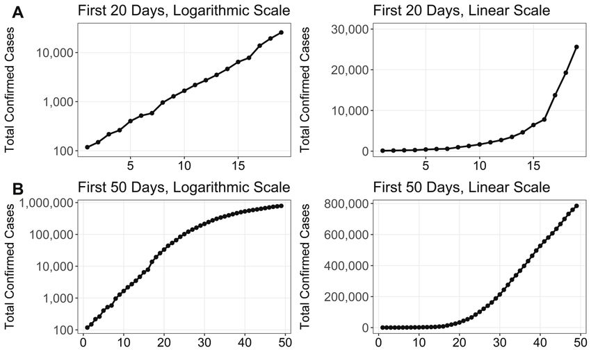
effect, consider Figure 6, which illustrates the
differences between the looks of the curves
depicting the first 20 days versus the first 50
days of the outbreak in the United States. Row
Note. The bars show mean responses to the growth and danger survey items. The logarithmic A shows the first 20 days of the outbreak in
scale led to lower estimates of growth and danger in all three studies. The growth and danger logarithmic and linear formats, and row B adds
questions were the same in all three studies.
in the next 30 days. The logarithmic and linear
graphs look more similar in row A, when growth
to decrease the effects of logarithmic scales on rates are still climbing, than they do in row B,
judgment but did not eliminate them (see Note C). when the rates have stabilized or decreased. To
test whether the actual pattern of the outbreak
could moderate the effects documented in this
General Discussion article, we ran a simple conceptual replication of
In the studies reported in this article, we found the growth and danger components of Study 2,
consistent evidence that the public formed less only this time we chose countries whose growth
accurate impressions of the current COVID-19 rates fit one of the two patterns in Figure 6. We
8 behavioral science & policyFigure 6. Total confirmed cases of COVID-19 in the United States by the
number of days since 100 cases were confirmed
Note. These graphs illustrate why using a logarithmic scale to plot the growth of cases can lead the public to make lower
predictions of growth than a linear-scale plot would. In row A, from early in the pandemic, both graphs give the visual
impression that cases are rising, but the linear scale (right) more intuitively conveys that the rise is becoming steeper at day 15.
In row B, from later in the pandemic, the linear scale (right) again gives the impression of a rise, but the logarithmic scale now
appears to be starting to curve downward—which could lead some people to mistakenly assume that the number of cases is
about to decline. In both cases, the logarithmic scale may lead to lower judgments of growth.
found that the logarithmic axes led to underes- should depend on the needs of the audience.
timation of growth and threat regardless of the Comparing growth rates between countries
slope of the actual growth. is certainly important for epidemiologists and
politicians who are in a position to implement
In two of our studies, we conducted added and evaluate high-level policies. For them,
analyses to examine whether various indi- logarithmic graphs may be most useful. For
vidual differences could influence the degree to the general public, however, graphs should be
which people struggle with logarithmic graphs. designed to enable viewers to accurately esti-
Surprisingly, we found that greater objective mate risk and respond accordingly. Indeed,
facility for working with numbers did not result when we ran a test in which we expected loga-
in increased accuracy in interpreting logarithmic rithmic graphs might result in laypeople making
scales relative to linear scales. In fact, some- more accurate interpretations of growth rates,
times more numerate individuals fared worse we found that the claimed advantages of loga-
than others who were less numerate. (See the rithmic graphs did not appear: for a lay audience,
Supplemental Material for a fuller discussion of logarithmic graphs did not improve accuracy of
the individual differences we measured.) comparative growth judgments. (See Appendix
Study 2 in the Supplemental Material.)
The skeptical reader may argue that we stacked
the deck against logarithmic scales by concen-
trating on their influence on impressions of Recommendations
risk and danger rather than on their value for Overall, our findings make it clear that officials’
highlighting differences in the growth rates of and media’s decision to use either logarithmic
cases. We argue that the choice of graph type or linear axes in graphs can influence public
a publication of the behavioral science & policy association 9response to COVID-19. When people are end notes
presented with graphs with logarithmic instead A. Full materials, preregistrations, and data for the
of linear axes, they make less accurate predic- studies described in this article and for additional
tions of future growth; view COVID-19 as less studies we conducted can be found at https://osf.
of a threat; and, accordingly, are less supportive io/zqut5/?view_only=3aa66d592dd2495ca508b4f
of governmental and individual action against a8729381a.
COVID-19. Education can reduce these effects, B. In Study 1A, actual case counts were derived from
but it cannot eliminate them. the COVID-19 data repository maintained by the
Center for Systems Science and Engineering at
John Hopkins University, available from https://
Logarithmic graphs still have significant value
github.com/CSSEGISandData/COVID-19.
for presenting scientific data. However, on the
basis of our research, we recommend using C. It is conceivable that people who judge COVID-19
to pose a low degree of danger on the basis of
them for the general public only when they are
seeing logarithmic graphs are more accurate
truly the most reasonable option. And when
in their threat assessment than are people who
they are used, presenters should spend signifi-
view the same data on linear graphs. We do not
cant time explaining how to read the graphs and think that they are more accurate, however. When
should supplement the logarithmic graphs with people are taught how to read logarithmic graphs,
linear displays of the data. their sense of danger does not fall; rather, it rises.
supplemental material
• http://behavioralpolicy.org/publications
• Methods & Analysis
author affiliation
Ryan & Evers: University of California, Berkeley.
Corresponding author’s e-mail: wryan@
berkeley.edu.
10 behavioral science & policyreferences
1. Chapman, G. B., & Coups, E. J. 9. Zacks, J., & Tversky, B. (1999).
(2006). Emotions and preventive Bars and lines: A study of graphic
health behavior: Worry, regret, communication. Memory & Cognition,
and influenza vaccination. Health 27, 1073–1079. https://doi.org/10.3758/
Psychology, 25, 82–90. https://doi. bf03201236
org/10.1037/0278-6133.25.1.82 10. Beattie, V., & Jones, M. J. (2002).
2. Lipkus, I. M., Samsa, G., & Rimer, The impact of graph slope on rate of
B. K. (2001). General performance change judgments in corporate reports.
on a numeracy scale among highly Abacus, 38, 177–199. https://doi.
educated samples. Medical Decision org/10.1111/1467-6281.00104
Making, 21, 37–44. https://doi. 11. Cleveland, W. S., & McGill, R. (1987).
org/10.1177/0272989x0102100105 Graphical perception: The visual
3. Wagenaar, W. A., & Sagaria, S. D. decoding of quantitative information
(1975). Misperception of exponential on graphical displays of data. Journal
growth. Perception & Psychophysics, of the Royal Statistical Society,
18, 416–422. https://doi.org/10.3758/ Series A, 150, 192–229. https://doi.
bf03204114 org/10.2307/2981473
4. Wagenaar, W. A., & Timmers, H. 12. Fischer, H., Schütte, S., Depoux, A.,
(1979). The pond-and-duckweed Amelung, D., & Sauerborn, R. (2018).
problem; Three experiments on the How well do COP22 attendees
misperception of exponential growth. understand graphs on climate change
Acta Psychologica, 43, 239–251. https:// health impacts from the fifth IPCC
doi.org/10.1016/0001-6918(79)90028-3 assessment report? International
Journal of Environmental Research and
5. Schwartz, L. M., Woloshin, S., Black,
Public Health, 15, Article 875. https://
C., & Welch, H. G. (1997). The role of
doi.org/10.3390/ijerph15050875
numeracy in understanding the benefit
of screening mammography. Annals of 13. Beshear, A. [Governor Andy
Internal Medicine, 127, 966–972. https:// Beshear]. (2020, April 5). Update on
doi.org/10.7326/0003-4819-127-11- COVID-19 in Kentucky—4.5.2020
199712010-00003 [Video file]. Retrieved from
https://www.youtube.com/
6. Zikmund-Fisher, B. J., Smith, D. M.,
watch?v=gSzUuOTzGE8&feature=youtu.
Ubel, P. A., & Fagerlin, A. (2007).
be&t=1595
Validation of the Subjective Numeracy
Scale: Effects of low numeracy on 14. Inslee, J. [GovInslee]. (2020, March 26).
comprehension of risk communications GovInslee was live [Video file]. Retrieved
and utility elicitations. Medical Decision from https://twitter.com/GovInslee/
Making, 27, 663–671. https://doi. status/1243237794895413249
org/10.1177/0272989x07303824 15. Yan, W. (2020, April 14). Coronavirus
7. Peters, E., Hibbard, J., Slovic, P., & tests science’s need for speed limits.
Dieckmann, N. (2007). Numeracy The New York Times. Retrieved from
skill and the communication, https://www.nytimes.com/2020/04/14/
comprehension, and use of risk-benefit science/coronavirus-disinformation.
information. Health Affairs, 26, 741–748. html
https://doi.org/10.1377/hlthaff.26.3.741 16. Wagner, S. H., & Goffin, R. D. (1997).
8. Frederick, S. (2005). Cognitive Differences in accuracy of absolute and
reflection and decision making. comparative performance appraisal
Journal of Economic Perspectives, methods. Organizational Behavior and
19(4), 25–42. https://doi. Human Decision Processes, 70, 95–103.
org/10.1257/089533005775196732 https://doi.org/10.1006/obhd.1997.2698
a publication of the behavioral science & policy association 11You can also read