Visualization and Analysis of Wearable Health Data From COVID-19 Patients - arXiv
←
→
Page content transcription
If your browser does not render page correctly, please read the page content below
Visualization and Analysis of Wearable Health Data From
                                                                      COVID-19 Patients
                                                                                                  A preprint

                                                      Susanne K. Suter∗               Georg R. Spinner∗                Bianca Hoelz†              Sofia Rey∗

                                                         Sujeanthraa Thanabalasingam‡                       Jens Eckstein§                  Sven Hirsch∗
arXiv:2201.07698v1 [cs.HC] 19 Jan 2022

                                                                                               January 20, 2022

                                                                                                A BSTRACT
                                                    Effective visualizations were evaluated to reveal relevant health patterns from multi-sensor real-
                                                    time wearable devices that recorded vital signs from patients admitted to hospital with COVID-
                                                    19. Furthermore, specific challenges associated with wearable health data visualizations, such as
                                                    fluctuating data quality resulting from compliance problems, time needed to charge the device
                                                    and technical problems are described. As a primary use case, we examined the detection and
                                                    communication of relevant health patterns visible in the vital signs acquired by the technology.
                                                    Customized heat maps and bar charts were used to specifically highlight medically relevant patterns
                                                    in vital signs. A survey of two medical doctors, one clinical project manager and seven health data
                                                    science researchers was conducted to evaluate the visualization methods. From a dataset of 84
                                                    hospitalized COVID-19 patients, we extracted one typical COVID-19 patient history and based on
                                                    the visualizations showcased the health history of two noteworthy patients. The visualizations were
                                                    shown to be effective, simple and intuitive in deducing the health status of patients. For clinical staff
                                                    who are time-constrained and responsible for numerous patients, such visualization methods can be
                                                    an effective tool to enable continuous acquisition and monitoring of patients’ health statuses – even
                                                    remotely.

                                         Keywords Wearable vital signs · COVID-19 patients · visualizations

                                         1       Introduction
                                         1.1     Patient Monitoring Using Real-Time Wearable Devices

                                         Wearable devices have received increasing interest from hospitals as they allow clinical decisions to be based on
                                         continuous measurements instead of a few measurements acquired by trained clinical staff [27, 26, 32, 30, 31, 15].
                                         During hospitalization, health data is usually obtained manually at single points in time by health care providers, who
                                         then enter the data into the hospital’s clinical information system at a later point in time if no automated infrastructure is
                                         present. This procedure is time consuming for the care team and often results in sparse data with inaccurate timestamps.
                                         Wearable devices offer a convenient, comfortable and affordable means of acquiring patient health data on an automated
                                         real-time 24/7 basis, both during hospitalization and beyond.
                                         Remote or unattended patient monitoring can be especially beneficial in the context of highly infectious diseases such
                                         as COVID-19 [33, 31, 28] where traffic between infected patients needs to be minimized and at the same time frequent
                                         documentation of vital signs is required. Acquiring disease relevant vital signs using wearable sensors enables real-time
                                         remote monitoring of patients’ health and at the same time reduces the number of contacts with infected patients.
                                         Moreover, the use of wearables is a simple and an inexpensive approach to meeting any increased short-term demand for
                                         patient monitoring during pandemics. High temporal resolution, wearable health data has the potential to provide fast
                                             ∗
                                               Zurich University of Applied Sciences (ZHAW), Computational Health Lab, Waedenswil, Switzerland
                                             †
                                               University Hospital Basel (USB), D&ICT and CMO Office, Basel, Switzerland
                                             ‡
                                               University Hospital Basel (USB), Internal Medicine, Basel, Switzerland
                                             §
                                               University Hospital Basel (USB), Internal Medicine and D&ICT, Basel, Switzerland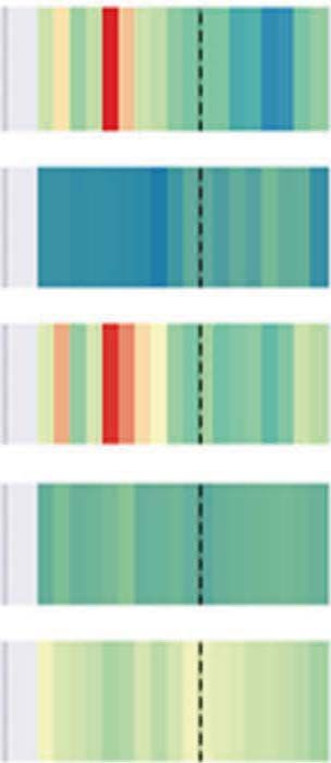
Wearable Data From COVID-19 Patients                                       A preprint

real-time notifications of alarming patient conditions. It is important to understand that the simultaneous documentation
of multiple vital signs produces a vast amount of information that cannot be reviewed by the care team alone with the
resources available to them. On an intensive care unit, with a comparable density of data, a physician is responsible for
only a few patients. However, in a regular ward a physician takes care of numerous patients at a time. Therefore, the
data has to be processed and presented in a way that can be rapidly and reliably interpreted.
Monitoring of vital signs is a clinical routine with known challenges [2]. In contrast, real-time monitoring of patients
using wearables is not yet established and adds a set of unique challenges to medical time series analysis and visualization.
Aigner et al. [2] presented six challenges for visual analytics in healthcare that are relevant to this work: (1) scale and
complexity of time-oriented data, (2) intertwining patient condition with treatment processes, (3) scalable analysis from
single patients to cohorts, (4) data quality and uncertainty, (5) interaction, user interfaces, and the role of users, and (6)
evaluation. In addition to addressing challenges (1), (4) and (6), this study focused on the communication of noteworthy
patient health patterns recognized through visual analysis from continuous wearable data. The fluctuation of data quality
due to compliance, battery charging, improper use or technical issues is especially relevant for wearable health data.
Further visualization challenges of medical time series arise from the fact that vital sign values, such as heart rate, are
patient specific, while others such as temperature, are physiologically similar for all patients. Additionally, vital signs
such as the heart rate are bi-directional in nature, i.e. values that are too high and too low are both alarming, while
others, such as arterial oxygen saturation, are one-directional, i.e. the lower the value, the greater the cause for alarm.
There are other specific challenges for wearable data. Only a few manufacturers offer real-time wearable devices that
are certified medical products [7, 17, 1]. In addition, most manufacturers certify only a subset of device parameters,
such as heart rate or arterial oxygen saturation [7], which have been validated on small and mostly healthy populations.
Furthermore, device manufacturers calculate derived signals based upon proprietary algorithms that are not medically
certified, e.g. respiration rate or core body temperature. It is important that the assessment of the patient condition is
not compromised by unreliable sensory data. Therefore, it is particularly important to consider data quality. To this end,
some device manufacturers, e.g. [7], offer data quality estimates of selected vital signs that can be used to clean the data.
Alternatively, quality indices could potentially be computed from raw data [24, 20].

1.2   Intuitive Visualization of Wearable Health Data

As humans are skilled at recognizing visual patterns [34, 36], visualizations can be used to quickly spot missing data or
unusual health patterns during patient monitoring and treatment optimizations [2]. Effective means of data exploration
save busy health care providers time by effectively spotting relevant changes in patient health trajectories. In return, this
leads to a faster understanding of complex information and potentially reduces the number of human mistakes. However,
because of the high rates at which wearable health data is recorded (1–50Hz), it is helpful to condense the information
contained in the data, such as by reducing the temporal resolution or by reducing the number of vital signals displayed.
There are numerous visualization methods for time-oriented data available, especially for linear vs. cyclic time
and single time points vs. time intervals [3, 4]. Classic time-oriented visualizations are line plots that display the
position of variable values along the time axis. Bar charts with upward and downward bars are used to depict relative
changes in magnitude, where upward bars represent values above and downward bars represent values below a typical
value. Additional variables can be encoded in visualizations using shapes, textures or colors. Advanced time-oriented
information visualizations methods [3, 4] include: SpiralGraphs, which allow periodic patterns to be visualized;
ThemeRiver graphics, which are used to display thematic changes in a given variable collection; and Midgaards, which
allow representations to be resized to varying levels of detail. However, these advanced methods were not considered
since, based on initial discussions with the clinical staff, they were deemed to be too complex.
To visualize wearable health data over the course of a day, Frink et al. [19] implemented hourly circular pie charts for
health data recorded from mobile applications, resulting in a circular form of data visualization similar to SpiralGraphs.
Another wearable health visualization study [6] developed a visual dashboard depicting aggregated patient activity as
hours per days (and minutes per hours) using color-coded upward pointing bar charts. We visualized hourly wearable
data, as this is a natural level of granularity that quickly provides an overview for visual pattern detection. However,
unlike previous studies, we evaluated perceptually motivated heat maps and color-coded upward and downward pointing
bar charts.
Specifically, our contributions are:

       • Evaluation and improvement of compact and easy to read visualizations to communicate noteworthy clinically
         relevant patterns from wearable health data via visualizations.
       • Analysis and specification of the typical challenges of using wearable health data in clinical settings.
       • Exploration of a wearable health dataset collected from 84 hospitalized COVID-19 patients.

                                                              2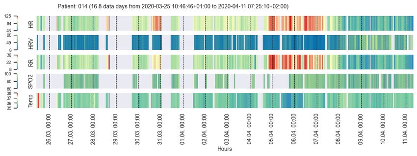
Wearable Data From COVID-19 Patients A preprint
2 Application Domain: Patient Monitoring Using Wearables
2.1 Clinical Use Case
In this study, the primary use case was the communication of prominent patient health patterns between clinical staff
and data scientists using visualizations. Clinical staff frequently ask for support in developing models or algorithms
to automate the detection of abnormal health patterns or to derive bio-markers. In order to develop a robust model
for this use case, it is important to work with high quality data that captures relevant clinical events. Clinical staff
need to explain to data scientists what typical or atypical data readings may look like. Moreover, in the course of the
development of a new (predictive) model, it is helpful to visualize algorithm results in order to discuss and explain
computer decisions, for example when using explainable artificial intelligence (XAI) approaches [5].
Other use cases include real-time ward monitoring with technical trouble shooting or real-time detection of patients in
critical conditions. The latter use case requires health care providers to be alarmed when a critical situation is imminent
or is already occurring. In particular, continuously increasing or decreasing trends in signals from a patient should raise
an alarm. For example, a heart rate that is continuously increasing might still be within a normal range, but may already
indicate a cardiovascular problem in the patient. If a change in a vital parameter is automatically detected over time,
interventions can be applied sooner. The results from the primary use case are expected to be transferable to the other
mentioned uses cases.
2.2 Data
Wearable health data was acquired from 84 patients that were hospitalized due to the detection of severe acute respiratory
syndrome coronavirus 2 (SARS-CoV-2) in the COVID-19 ward of the University Hospital Basel, Switzerland, from
March to May 2020. The dataset contains 30 female and 54 male patients (mean age: 60 ± 17 years, range: 17-97
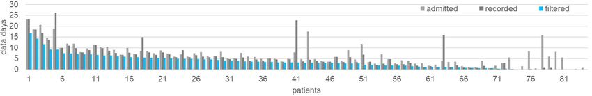
years). On average, patients were admitted for 6.6 ± 4.7 (range: 0.1-23.1) days and data was recorded for 5.6 ± 5.4
(range: 0.0-26.1) days (see Fig. 3). No valid data could be recorded for five of the patients (four females, one male). 19
patients wore the device for less than two days; 24 patients wore the device for between two and five days; 26 patients
wore the device for between five and ten days; and ten patients wore the device for between ten and 30 days.
During heir hospitalization, the patients wore a medically certified Everion 3.06 wearables device from Biofourmis
(formerly Biovotion) [7, 9]. The health data was acquired using the Everion mode that recorded 22 vital signs plus
seven quality signals for selected vital signs at a sampling rate of 1Hz. Of the 22 signals recorded, the clinical staff
considered the following signals to be most relevant for the COVID-19 patients: heart rate (HR), HR variability (HRV),
respiration rate (RR), oxygen saturation (SPO2), and core body temperature (Temp). HRV is derived from the HR
signal and represents the variations in time between heart beats. The Everion device calculates the root mean square of
successive time differences (RMSSD) between heart beats measured in milliseconds. The RR is usually estimated based
on the derived HRV and the core body temperature is usually calculated based on the skin temperature and other signals
(see e.g. [13, 16, 33]). The RR and core body temperature estimation methods used by the Everion are proprietary.
Acquisition of the HR and SPO2 signals has been medically certified for the Everion device.
The clinical staff sporadically tested the reliability of some signals themselves and reported the following subjective
assessment: the HR was a reliable and robust parameter; the RR was mostly reliable but sometimes incorrect; the
SPO2 values were plausible, but only rarely recorded; the core temperature was error-prone and not reliable for medical
purposes. Specifically, it was observed that the temperature signal increased when a patient put their arm below the
blanket. Despite these observations, we still used the core temperature for visual exploration because of its medical
relevance. Nevertheless, this parameter must be considered with caution.
Vital signs from a patient with a COVID-19 infection can be expected to change as follows (see also [14, 33]):
• HR: decreases
• HRV: decreases
• SPO2: decreases with reduced lung function, indicating a worsening patient condition
• RR: increases with severity of COVID-19 symptoms, reflecting a worsening condition of the lungs
• Temp: elevated
Note: The HR was observed to decrease during COVID-19 infections [14], in contrast to a known HR increase for viral
diseases in general [33].
3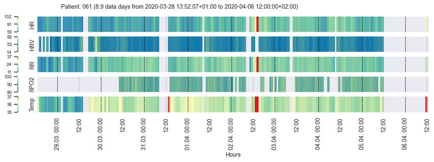
Wearable Data From COVID-19 Patients                                        A preprint

2.3     Typical Challenges of Wearable Health Data

Wearable data quality is typically highly volatile (Sec. 2.3.1–2.3.3). According to Gschwandtner et al. [21], who
developed a taxonomy for “dirty” time-oriented data quality problems, wearable health data is single-source rastered
interval data with a beginning and end, but with data gaps in between. According to their taxonomy, wearable health data
contains missing data (values or tuples) and implausible values (unexpected high/low values). Furthermore, it can be
wrong or unusable [25]. Challenges specific to the visualization of medical time series are outlined in Sec. 2.3.4–2.3.7.

2.3.1    Challenge: Missing Data
Data may often be missing, because patients do not always wearing the device properly or may remove the device
temporarily. The battery duration of the devices depends both on their capacity and on the acquisition mode (raw
data vs. aggregated data). For the COVID-19 patients, the wearable devices were typically charged once a day in the
morning hours after waking.

2.3.2    Challenge: Implausible Values
Another challenge is the heterogeneous data quality of varying signals. Some signals, such as HR, are quite reliable,
while others, such as core temperature, are derived estimates and need to be treated with caution (see Sec. 2.3. For
example, the device might still be recording data such as ambient temperature, even when it has been removed from the
patient (Sec. 2.3.1. As can be noted from the admitted vs. recorded data day numbers in Sec. 2.2, this challenge that is
specific to wearable data was also observed in our data (the average of recorded data days was higher than the average
of admission days); specifically, for 8 patients.

2.3.3    Challenge: Careful Quality Inspection Required
In order to reduce poor-quality data, post-hoc individual data point quality analysis and cleansing is essential for
clinical purposes. In certain situations, it is however difficult to estimate whether a certain data outlier is an artifact or a
dangerous patient situation.

2.3.4    Challenge: Sampling Rate
The typically high sampling rate of acquired information (our data: 1–50Hz) makes it cumbersome to scan through the
data to discover relevant vital parameter changes. Therefore, complexity with respect to temporal resolution and the
number of displayed variables needs to be reduced in order to make data comprehensible.

2.3.5    Challenge: Individual Data Ranges
Data ranges of certain vital signs, such as HR or RR, are highly individual, while other vital signs, such as Temp, are
physiologically similar for all patients. Therefore, upper and lower value bounds need to be individually set for every
patient – either calculated or by clinical personnel.

2.3.6    Challenge: Consistent Color-Coding
The challenge of color-coding the various vital signs in a consistent way is directly connected to the challenge in
Sec. 2.3.5. Certain signals, such as the HR, are divergent in nature, i.e. a patient has a baseline value range where values
above or below have a different medical interpretation. Other signals, such as the SPO2, are sequential in nature where
lower data values correspond to a decrease in condition or vice versa, such as for HRV. This quickly leads to a large
spectrum of colors and meanings for different signals.

2.3.7    Challenge: Spot Irregular Patterns
Clinical staff need to be able to spot irregular health conditions (patterns) at a single glance.

3     Methods

Our method workflow is illustrated in Fig. 1, which will be explained in more detail in this section starting with the
acquired wearable health data as described in Sec. 2.2.

                                                               4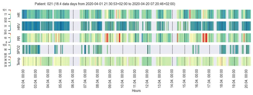
Wearable Data From COVID-19 Patients                                      A preprint

Figure 1: Wearable health data pipeline for the use case of communicating relevant health patterns between clinical
staff and data scientists through visualizations.

3.1   Wearable Health Data Quality Filtering

To address the challenge that wearable data may be available during periods where the device was not worn (during
admission or after discharge, Sec. 2.3.2), we filtered the data according to the heart beat. In other words, we set all of
the signal values to NAN if no HR was detected at a given point in time. We chose this procedure, since the HR is
considered to be a highly reliable vital parameter that can be acquired from wearable devices (Sec. 2.2). In cases where
no HR is recorded, but other data is recorded, it is likely that the device is switched on but not properly attached to the
patient (Sec. 2.3;2.3.2).
Since careful quality inspection is required for wearable health data (Sec. 2.3.3), we cropped the available data by using
the admission dates and quality filtered the data. According to the Everion device documentation [7, 8], vital signs with
a quality of at least 50 percent can be considered medically reliable. The calculation methods for the quality parameters
of the Everion device are proprietary. For simplicity, we filtered the data to keep only signals with 50–100 percent data
quality. More advanced methods to replace missing-values or to filter [24, 20] the data were not considered at this point.
One reason was that the data from the wearables was acquired at a frequency of 1Hz, while the visualizations were
generated using hourly aggregated data.
The data quality before and after quality filtering is shown in Fig. 2. Useful filtered data was available on average for 84
hours or 3.5 ± 3.2 days (range: 0.0-16.8) - excluding time points with missing values. Out of the recorded 5.6 data days,
on average roughly two third of the data was usable. As depicted in Fig. 3, useful quality-filtered data was generated for
up to two days from 27 patients, for two to five days from 30 patients, for five to ten days from 19 patients, and for ten
to 17 days from three patients. No data was recorded from five patients.

Figure 2: Average quality of the selected vital signs for all 84 patients before (left) and after (right) quality filtering.

3.2   Data Aggregation

The clinical staff initially requested only a few values per day (challenge Sec. 2.3.4); however, we concluded that hourly
values were beneficial since they depict daytime and nighttime patterns well, e.g., circadian rhythms (similar to [19, 6]).
The chosen hourly time scale can be naturally read by humans as it represents the 24 hours clock cycle. We aggregated
the acquired vital sign values from seconds to hourly averages using the arithmetic mean of all available non-missing

                                                             5
Wearable Data From COVID-19 Patients                                  A preprint

Figure 3: Admitted patient days (light gray); recorded wearable health data days (dark gray); useful quality filtered
data days (blue), i.e. non-missing values, for all 84 COVID-19 patients.

values. In general, the arithmetic mean works well if data is normally distributed and does not suffer from outliers.
From our raw data we did not observe any significant outliers and hence we chose this method. It was not our focus to
compare alternatives for data aggregation. However, this could be elaborated in more detail in the future. This hourly
scale reduces the initial high raw sampling density and smooths out short-term fluctuations. Longer periods of missing
data or data that was discarded due to unreliability can easily be spotted in the visualizations.

3.3   Visualization Methods

According to Aigner et al. [4] a time-oriented visualization include: what is presented (time and data); why is it
presented (user); and how is it presented (visual representation). In our visualizations, we displayed post-hoc wearable
vital signals over the full course of patient hospitalizations (admission) on the COVID-19 ward of the University
Hospital Basel (Sec. 2.2). Moreover, despite the suggestion by Halford et al. [22] to use four variables at most, we
decided to use five vital signals (HR, HRV, RR, SPO2 and Temp), since they were considered clinically relevant
(Sec. 2.2). The users are data scientists, who initially inspected the data for quality purposes, as well as clinical staff,
who evaluated the data using matching data from the clinical information system. Specifically, we developed heat maps
and bar charts together with a custom-designed plotting layout [35] to make the data intuitively readable (challenge
Sec. 2.3.7), as illustrated in Fig. 4.

                           Cl)
                           C'O    HR
                                  HRV
                                                                                       ·�
                                                                                       ---�
                          'ci)

                                  RR
                                  SP02

                                  Temp

                                 time             dn+1            dn+2   heat map     bar chart
                                 [ h]    12:00   00:00   12:00   00:00   example      example

Figure 4: Left: Customized plotting layout for the visual health data. Right: heat map and bar chart example
visualizations.

The visual structure took into account perceptual mechanisms that allow viewers to orient themselves within the
visualizations and was designed according to Gestalt principles: similarity was used in the design of five parallel bands
of data for the major vital signals that are structured analogously; proximity was used between the slightly separated
major signals to make them appear as one group of data along the same timeline; connection was used along the time
axis where empty data is padded and made clearly visible along one band; continuity and closure were used to mark
general timeline points such as midnight (black dashed lines) and noon (grey dashed lines) on individual signal bands in
order to provide the user with an efficient orientation point. In order to draw the viewer’s attention to specific areas,
visual highlighting mechanisms such as color or size were used. The ordering was performed along the x-axis according
to time and along the y-axis according to alphabetic order of the signal abbreviations. Selective information about
medical events was manually added to these prototype visualizations by the data scientists, which consisted of text
noteworthy with observations.

                                                                  6
Wearable Data From COVID-19 Patients A preprint
As shown in Fig. 4, we indicated major tick labels for days and minor tick labels for hours along the time axis. In our
developed framework [35], the exact date is displayed in the format YYYY-MM-DD. However, for this publication we
use days d1, . . . , dN to remove sensitive patient information. The minor tick labels are formatted as HH:MM starting at
midnight, i.e. 00:00. Depending on the length of the displayed time interval t, we labeled: every hour for t < 24h;
every sixth hour for 1d ≤ t < 6d; every twelfth hour for 6d ≤ t < 10d; and every twenty-fourth hour for t ≥ 10d.
3.3.1 Heat Maps Using Clinical Color-Coding
Heat maps encode the intensity of a value using color. Clinical color-coding conventions can depend on the use case
and context. Generally, red is used to depict an alarming situation and for values that are too high. Blue is used for too
values that are too low. However, for signals such as SPO2, values that are too low are alarming and hence should be
red and blue at the same time. White or green are used for data values in acceptable ranges. Yellow (orange) is used for
ambiguous situations that are not yet alarming, but require investigation. In order to evaluate this color-coding challenge
(Sec. 2.3.6) for the visualization of the hourly wearable health data, we tested various color schemes. Sequential color
schemes are appropriate for data that is ordered from low to high values [10] such as HRV and SPO2. Diverging color
schemes are well suited for data where most of the data is in the mid-range, but contains extreme values near both ends
of the data range [10] such as HR, RR and Temp. Sequential color schemes are usually constructed such that light
colors reflect low data values and dark colors depict high data values [10], e.g., HRV in Fig. 5. However, for SPO2 we
figured that the light colors should reflect high values and dark colors should reflect low values: The lower the SPO2
value, the more alarming the patient’s situation. For diverging color schemes, the low and high extremes are highlighted
with dark values while the central data range is represented using light colors [10], such as for HR in Fig. 6.
a
b
c
d
t
ime[
h]
Figure 5: Sequential color scheme variations, such as for HRV.
a
b
c
d
e
f
t
ime[
h]
Figure 6: Diverging color scheme variations, such as for HR.
We selected the initial color schemes from Colorbrewer [11]: white-red (WR) (Fig. 5d) or yellow-red (YR) for sequential
schemes and red-white-blue (RWB) (Fig. 6f) or red-yellow-blue (RYB) for diverging schemes. After analysing the
color-coding using a survey (Sec. 7), we adapted the Colorbrewer schemes to use green for the central normal range
values (Fig. 5a–c and Fig. 6a–e) and yellow for ambiguous values above the baseline for diverging schemes (Fig. 6c–e).
We did not encode ambiguous values in yellow below the baseline, because it was considered confusing. The decision
to use these colors was taken during a consensus meeting after the written survey had been completed. In addition, we
tested discrete (Fig. 5a and Fig. 6a,b) vs. continuous (Fig. 5b–d and Fig. 6c–f) color schemes. For simple use cases
such as ward monitoring where clinical staff only have to determine whether the recorded data is in a normal range or
not, green-blue (GB) can be used for sequential schemes (Fig. 5a) and red-green-red (RGR) (Fig. 6a) or red-green-blue
(RGB) (Fig. 6b) for diverging schemes.
3.3.2 Bar Charts
Similar to Aigner et al. [3], we used color-coded bar charts with upward and downward bars to depict signal trends,
patterns and relative changes in the patient’s health condition (challenges Sec. 2.3.6–2.3.7). The baseline to separate
upward and downward pointing bars was calculated for each signal as arithmetic mean over the full time period of
the patient hospitalization (admission) on the COVID-19 ward. We chose this approach in order to visualize relative
7Wearable Data From COVID-19 Patients A preprint
changes within a selected time frame independent of the current condition of the patient. Based on the evaluation of the
color conventions by the clinical staff (Sec. 3.3.1), we used a light red-like color for values above the baseline and blue
for values below the baseline with varying hues to render the two colors even more distinct. Additionally, the moving
average over the previous four hours was plotted as a red line (no color-coding applied) to display a smoothed trend.
3.3.3 Individual Patient Data Ranges
Striking a balance between global and individual value ranges is a challenge [4], because the value ranges for many
signals such as HR, HRV or RR are often patient-specific. In contrast, value ranges for signals such as SPO2 or Temp
can be expected to be in a similar range for all patients. In order to address this challenge (Sec. 2.3.6), the signal value
ranges and the baselines for the bar charts were defined in the following way: By default, no value ranges were set
and the minimum, maximum and mean values over the full displayed time period were calculated individually for
each patient. However, these ranges can be configured for each signal, e.g., when clinical staff decide to modify them
manually.
3.3.4 Evaluation of Visualizations
The heat map visualizations were evaluated using a written survey that was answered individually in by three persons
from hospital (two medical doctors and one clinical project manager) and seven health data science researchers, as
detailed in the Sec. 7. The individual survey answers were discussed in a consensus meeting with two clinical staff and
three health data scientists. The written survey contained eight questions related to the chart features, the color-coding,
the usability and suggestions for improvement (see challenges in Sec. 2.3). Two extra questions related to the signal
value ranges and clinical relevance were only posed to the persons working in the hospital. The subjective usability of
the heat maps was assessed via a simplified version of the system usability scale (SUS) [12, 37]. Evaluation of the bar
charts was performed during a review meeting with two clinical staff and three health data scientists.
Using the developed framework [35], we auto-generated heat maps and bar charts for all of the COVID-19 patients.
Two data scientists selected 20 interesting cases where typical and noteworthy patient health condition trajectories were
discovered. These 20 patients were then inspected by clinical staff who matched the visualizations with medical events
recorded in the clinical information system. During this visual examination of the wearable health data, one typical and
two noteworthy COVID-19 patients were selected.
4 Results
4.1 Evaluation Results
4.1.1 Evaluation of Color-Coding and Heat Maps
The results of the evaluation of the color-coding (challenge Sec. 2.3.6) and the heat maps are based on the visualization
survey described in Sec. 3.3.4 and detailed in Sec. 7. In general, the heat maps were considered to be intuitive by
providing an overview (challenge Sec. 2.3.7) of the patient health condition evolution at a glance, showing trends and
critical values. One data scientist pointed out that such visualizations are a useful tool for communicating with clinical
staff and discovering medical events – our primary use case. All three clinical staff clearly stated that the heat map
visualizations were useful for clinical purposes. With respect to the SUS [12, 37] evaluation, seven individuals (six data
scientists, one person from the hospital) stated that they thought that most people would quickly learn how to use these
visualizations. Four individuals reported that they would use the visualizations frequently and three individuals felt
confident in using the visualizations. One individual from the hospital reported that the visualizations were unnecessarily
complex and cumbersome. The two other individuals from the hospital stated that teaching and technical support is
needed for clinical use by care teams – not our primary use case.
Some ambiguity in the color schemes was detected and resolved (Sec. 3.3.1 and challenge Sec. 2.3.6). Five individuals
voted for RWB, four individuals voted for RYB and two persons suggested using green for normal range values and
yellow for ambiguous values. In the end, we decided to use Colorbrewer adapted color schemes as described in
Sec. 3.3.1. Five individuals voted for discrete and continuous color schemes. Since for our primary use case the
communication of patterns is important (challenge Sec. 2.3.7), we decided to adopt a continuous color schemes with
GB for sequential schemes (Fig. 6c) and RYGB for diverging schemes (Fig. 5).
4.1.2 Evaluation of Visualization Plotting Layout
The visualization evaluation led to improvements in the layout and features of the plotted data (challenge Sec. 2.3.7),
which were integrated into the final visualization concept, as shown in Fig. 4 and described in Sec. 3.3. Specifically, the
8Wearable Data From COVID-19 Patients A preprint
d2 d3 d4 d5 d6 d7 d8 d9 d10 d11 d12 d13 d14 d15 d16 d17 d18 d19 d20
00:00 00:00 00:00 00:00 00:00 00:00 00:00 00:00 00:00 00:00 00:00 00:00 00:00 00:00 00:00 00:00 00:00 00:00 00:00
time [h]
Condition: SARS-CoV-2 positive slow recovery gradual improvement; circadian rhythm normalizes
significantly reduced (first week)
general condition
d2 d3 d4 d5 d6 d7 d8 d9 d10 d11 d12 d13 d14 d15 d16 d17 d18 d19 d20
00:00 00:00 00:00 00:00 00:00 00:00 00:00 00:00 00:00 00:00 00:00 00:00 00:00 00:00 00:00 00:00 00:00 00:00 00:00
time [h]
Figure 7: Visualizations of vital signs from a typical COVID-19 patient with annotations of the health condition.
Wearable data was recorded from day 2 to day 20. The bar charts clearly show pattern changes (HR, HRV and RR)
throughout the recovery. The heat maps particularly highlight critical values (in red).
suggested improvements were: major ticks for days and minor ticks for hours; time denoted as HH:MM instead of HH;
signal separation using spacing; a gray background and green for normal range values.
4.1.3 Evaluation of Bar Charts vs. Heat Maps
All three persons working at the hospital felt that the bar charts clearly depict the evolution of the patient’s health
condition, regular vs. irregular patterns as well as circadian rhythms. The heat maps, however, were found to be helpful
in identifying extreme values that might reflect critical patient situations. The clinical staff found both visualization
types easy to use (challenges Sec. 2.3.6–2.3.7), albeit with a preference for the bar charts.
4.2 Analysis of Implausible Values
In terms of the challenge outlined in Sec. 2.3.2, we found that the average core body temperature after quality filtering
of our dataset was around 36°C, which seemed too low for patients suffering from a disease that caused fever, especially
since the expected value for healthy people is 37.5°C (see subjective observations in Sec. 2.2).
4.3 Visual Exploration of COVID-19 Patients’ Conditions
In this section, we examine three COVID-19 patients: one typical COVID-19 patient history; one patient history
illustrating complications; and one patient history that includes a short-time period of stress. For all patients, we
depicted heat maps as well as bar charts to illustrate the value of each visualization type, as described in Sec. 4.1.3.
9Wearable Data From COVID-19 Patients A preprint
d6 d7 d8 d9 d10 d11 d12 d13 d14 d15 d16 d17 d18 d19 d20 d21 d22
00:00 00:00 00:00 00:00 00:00 00:00 00:00 00:00 00:00 00:00 00:00 00:00 00:00 00:00 00:00 00:00 00:00
time [h]
Condition: SARS-CoV-2 positive aspirated (d10); pneumonia subsided
neurological problems developed pneumonia
multimorbid
Treatment: antibiotics started d11
d6 d7 d8 d9 d10 d11 d12 d13 d14 d15 d16 d17 d18 d19 d20 d21 d22
00:00 00:00 00:00 00:00 00:00 00:00 00:00 00:00 00:00 00:00 00:00 00:00 00:00 00:00 00:00 00:00 00:00
time [h]
Figure 8: Visualizations of vital signs from a COVID-19 patient who received medication due to the annotated
complications. Wearable data was recorded from day 6 to day 22. The bar charts clearly show pattern changes (HR,
HRV and RR) throughout the recovery. The heat maps highlight critical values (in red).
4.3.1 Normal COVID-19 Case
The patient history in Fig. 7 shows a typical disease development of COVID-19. The SARS-CoV-2 positive patient was
a 75-year-old man who was admitted to the COVID-19 ward as a result of his significantly reduced general condition.
After a rather slow recovery during the first week, his condition gradually improved from day 8 on (HR during daytime
increased, HRV recovered). His HR was relatively low in the first week (typical for COVID-19 [14]). Then, possibly
due to more activity, his HR increased over the course of his continued hospitalization. The circadian rhythm is clearly
visible in the bar chart visualizations (dashed black lines represent midnight). It can be seen that the circadian rhythm
in the HR, HRV and RR was initially quite irregular, but this normalized during the last three days of hospitalization.
The low HRV at the beginning of the stay, which increased during recovery, is a known sign of a severe infection [23].
Between days 16 and 17, prominent pattern changes are visible. However unfortunately, no information on the patient’s
condition was recorded on the ward during these days.
4.3.2 COVID-19 Patient with Complications
In Fig. 8, the multimorbid 71-year-old man SARS-CoV-2 positive patient is shown, who developed complications
during his infection. The patient was admitted to the COVID-19 ward on day 6. In addition to COVID-19, the patient
had various neurological issues, which resulted in aspiration (stomach contents breathed into the lungs) on about day 10,
after which he developed pneumonia. In the visualization, this corresponds to the initially low HR and HRV (expected
for COVID-19 [14, 29]). After a slow improvement with an increased in HR, his HR rose sharply due to the aspiration,
10Wearable Data From COVID-19 Patients A preprint
d3 d4 d5 d6 d7 d8 d9 d10 d11
00:00 12:00 00:00 12:00 00:00 12:00 00:00 12:00 00:00 12:00 00:00 12:00 00:00 12:00 00:00 12:00 00:00
time [h]
Condition: significantly weak and tired recovered within few days stress patient well, admitted due to quarantine
SARS-CoV-2 positive
Treatment: i.v. fluid (d1-d7); oxygen (d1-d6)
d3 d4 d5 d6 d7 d8 d9 d10 d11
00:00 12:00 00:00 12:00 00:00 12:00 00:00 12:00 00:00 12:00 00:00 12:00 00:00 12:00 00:00 12:00 00:00
time [h]
Figure 9: Visualizations of vital signs from a COVID-19 patient experiencing a stressful short-term situation. The
patient received medication due their initial weak condition, as annotated. Wearable data was recorded from day 3 to
day 11. From left to right, a general trend from lower to higher vital sign values (HR, RR and Temp) is visible. There is
some evidence of periodic HR patterns visible in the bar charts. The stress situation is clearly highlighted in red in the
heat maps and as major peaks in the bar charts.
his HRV fell again and correspondingly his RR increased significantly. After several days, the values normalized again
as a sign that the pneumonia has subsided under antibiotic therapy, which started on day 11. Note: The determination of
the point in time when the pneumonia can be considered to have subsided is ambiguous. It could be defined as once
the symptoms (fever, shortness of breath) had subsided, when the patient became active again or when there were no
pathological findings visibile in X-rays approximately four weeks after the symptoms have receded. Nevertheless,
prominent pattern changes are clearly visible a few days after the antibiotic therapy started.
4.3.3 Stressed COVID-19 Patient
In Fig. 9, the patient history of a 65-year-old man who experienced a stressful situation is illustrated. The patient entered
the hospital in a significantly reduced general condition (very weak and tired). He was first admitted to the emergency
unit before he was transferred to the COVID-19 ward on day 3 as a result of a positive SARS-CoV-2 test. He received
two liters per minute of oxygen through nasal application and intravenous fluid replacement and recovered within a few
days. His HR increased over the course of his recovery, which might be related to the subsiding infection as well as to
an increase in activity after about day 7. The prominent signal increases in HR and RR in the early afternoon of day 7
represent a particularly stressful situation for the patient. This is shown as red in the heat map and as higher bars in the
bar charts. The team on the medical ward documented a difficult discussion with the patient on that day.
11Wearable Data From COVID-19 Patients A preprint
5 Summary
In this study, we evaluated two effective visualizations for the primary use case of communicating relevant health
patterns in wearable data between clinical staff and data scientists through visualizations. In our survey, the customized
heat maps were considered particularly useful for detecting extreme values and for identifying trends (challenge
Sec. 2.3.7); the bi-directional bar charts revealed themselves to be well suited for identifying repeating, changing or
irregular patterns as the patient’s health condition evolved (challenge Sec. 2.3.7). The survey conducted on the heat map
visualizations helped to improve the plotting layout and initiated the usage of bar charts. The final layout effectively
reduced the amount of data displayed by temporally aggregating data for selected vital signals (challenge Sec. 2.3.5),
which were quality filtered (challenges Sec. 2.3.1–2.3.2). The final visualizations clearly depict relevant information
with annotations such as the midnight lines or the time axis labels to quickly identify periodic patterns and recognize
time intervals with missing data (challenges Sec. 2.3.6–2.3.7). A lesson learned was that the carefully designed heat
maps were viewed as overly sophisticated, implying a need to train the care team if applied to other clinical use cases.
Nevertheless, the developed and evaluated visualization layout can easily be transferred to other visualization types.
In the future, it would be interesting to visually explore hypotheses on circadian rhythms, which are clearly visible in
the developed bar charts or to compare our results with SpiralGraphs [3]. Finally, the next steps could be to integrate
interactive elements into the visualizations and to deploy our visualizations to real-time patient monitoring.
The proposed wearable health data pipeline uses elements of visual data history illustrated in the dataset of 84 COVID-19
patients, who were monitored using wearables during the first pandemic wave in early 2020. The developed approach
facilitated communication between clinical staff and data scientists for the purpose of discovering noteworthy patterns
in the evolution of the patients’ health conditions. With the help of this exploratory visual process, we were able to
efficiently select three exemplary COVID-19 patient histories.
Our approach was demonstrated for our primary use case and applied to wearables for which we described the specific
data challenges in visualization. However, the approach can be extended to further clinical use cases such as the
detection of critical patient situations or ward monitoring.
6 Acknowledgments
The icons in Fig. 4 were made by Freepik [18]. The authors thank the participants of the conducted visualization survey,
which resulted in significantly improved visualizations for the given use case. Thanks to Norman Juchler and Darren
Mace for his valuable review on the manuscript.
References
[1] ActiGraph. CENTREPOINT insight watch. https://actigraphcorp.com/cpiw/ [Accessed: 2022-01-19].
[2] Wolfgang Aigner, Paolo Federico, Theresia Gschwandtner, Silvia Miksch, and Alexander Rind. Challenges of
time-oriented data in visual analytics for healthcare. In IEEE VisWeek Workshop on Visual Analytics in Healthcare,
page 4. IEEE, 10 2012.
[3] Wolfgang Aigner, Silvia Miksch, Wolfgang Müller, Heidrun Schumann, and Christian Tominski. Visual methods
for analyzing time-oriented data. IEEE Trans Vis Comput Graph, 14(1):47–60, 2008.
[4] Wolfgang Aigner, Silvia Miksch, Heidrun Schumann, and Christian Tominski. Visualization of Time-Oriented
Data. Springer Publishing Company, Incorporated, 1st edition, 2011.
[5] Alejandro Barredo Arrieta, Natalia Díaz Rodríguez, Javier Del Ser, Adrien Bennetot, Siham Tabik, Alberto
Barbado, Salvador García, Sergio Gil-Lopez, Daniel Molina, Richard Benjamins, Raja Chatila, and Francisco
Herrera. Explainable artificial intelligence (XAI): concepts, taxonomies, opportunities and challenges toward
responsible AI. Inf. Fusion, 58:82–115, 2020.
[6] Michael Aupetit, Luis Fernandez-Luque, Meghna Singh, and Jaideep Srivastava. Visualization of wearable
data and biometrics for analysis and recommendations in childhood obesity. In 2017 IEEE 30th International
Symposium on Computer-Based Medical Systems (CBMS), pages 678–679, 2017.
[7] Biofourmis. Everion device. https://support.biofourmis.com/hc/en-us/categories/
201377109-Everion-Device- [Accessed: 2022-01-19].
[8] Biofourmis. Data glossary, January 2020.
[9] Biovotion. Everion technical data sheet, April 2017.
12Wearable Data From COVID-19 Patients A preprint
[10] Cynthia A. Brewer. Chapter 7 - color use guidelines for mapping and visualization. In ALAN M. MACEACHREN
and D.R. FRASER TAYLOR, editors, Visualization in Modern Cartography, volume 2 of Modern Cartography
Series, pages 123 – 147. Academic Press, 1994.
[11] Cynthia A. Brewer, Mark Harrower, Ben Sheesley, Andy Woodruff, and David Heyman. Colorbrewer 2.0.
http://colorbrewer2.org [Accessed: 2021-08-03].
[12] John Brooke. SUS: A quick and dirty usability scale, 1996.
[13] Mark J Buller, William J Tharion, Samuel N Cheuvront, Scott J Montain, Robert W Kenefick, John Castellani,
William A Latzka, Warren S Roberts, Mark Richter, Odest Chadwicke Jenkins, and Reed W Hoyt. Estimation of
human core temperature from sequential heart rate observations. Physiol Meas, 34(7):781–98, Jul 2013.
[14] Gioele Capoferri, Michael Osthoff, Adrian Egli, Marcel Stoeckle, and Stefano Bassetti. Relative bradycardia in
patients with COVID-19. Clin Microbiol Infect., Aug 2020.
[15] Marcus Dörr, Stefan Weber, Ralf Birkemeyer, Licia Leonardi, Clemens Winterhalder, Christina J. Raichle, Noé
Brasier, Thilo Burkard, and Jens Eckstein. iPhone App compared with standard blood pressure measurement –The
iPARR trial. American Heart Journal, 233:102–108, March 2021.
[16] Patrick Eggenberger, Braid A MacRae, Shelley Kemp, Michael Bürgisser, René M Rossi, and Simon Annaheim.
Prediction of core body temperature based on skin temperature, heat flux, and heart rate under different exercise
and clothing conditions in the heat in young adult males. Frontiers in Physiology, 9, Dec 2018.
[17] Empatica. E4 wristband. https://www.empatica.com/en-gb/research/e4/ [Accessed: 2022-01-19].
[18] Flaticon. Freepik. https://www.flaticon.com [Accessed: 2022-01-19].
[19] Travis M. Frink, Joshua V. Gyllinsky, and Kunal Mankodiya. Visualization of multidimensional clinical data from
wearables on the web and on apps. In 2017 IEEE MIT Undergraduate Research Technology Conference (URTC),
pages 1–4, 2017.
[20] Lukas Geissmann, Miro Käch, Simon Laube, Jia Zhang, and Walter Karlen. Automated data integrity monitoring
for the internet of medical things (ioMT): Real-time quality checks for data from medical biosensors. Poster,
Digital Health Lab Day, ZHAW, October 2020.
[21] Theresia Gschwandtner, Johannes Gärtner, Wolfgang Aigner, and Silvia Miksch. A taxonomy of dirty time-oriented
data. In Gerald Quirchmayr, Josef Basl, Ilsun You, Lida Xu, and Edgar Weippl, editors, Multidisciplinary Research
and Practice for Information Systems, pages 58–72, Berlin, Heidelberg, 2012. Springer Berlin Heidelberg.
[22] Graeme S Halford, Rosemary Baker, Julie E McCredden, and John D Bain. How many variables can humans
process? Psychol Sci, 16(1):70–76, Jan 2005.
[23] Frederick Hasty, Guillermo García, Col Héctor Dávila, S Howard Wittels, Stephanie Hendricks, and Stephanie
Chong. Heart Rate Variability as a Possible Predictive Marker for Acute Inflammatory Response in COVID-19
Patients. Military Medicine, 11 2020. usaa405.
[24] Walter Karlen, K Kobayashi, Mark Ansermino, and Guy Albert Dumont. Photoplethysmogram signal quality
estimation using repeated Gaussian filters and cross-correlation. Physiol Meas, 33(10):1617–29, Oct 2012.
[25] Won Kim, Byoung-Ju Choi, Eui-Kyeong Hong, Soo-Kyung Kim, and Doheon Lee. A taxonomy of dirty data.
Data Mining and Knowledge Discovery, 7(1):81–99, 2003.
[26] Lampros C Kourtis, Oliver B Regele, Justin M Wright, and Graham B Jones. Digital biomarkers for alzheimer’s
disease: the mobile/ wearable devices opportunity. NPJ Digit Med, 2, 2019.
[27] Xiao Li, Jessilyn Dunn, Denis Salins, Gao Zhou, Wenyu Zhou, Sophia Miryam Schüssler-Fiorenza Rose, Dalia
Perelman, Elizabeth Colbert, Ryan Runge, Shannon Rego, Ria Sonecha, Somalee Datta, Tracey McLaughlin,
and Michael P Snyder. Digital health: Tracking physiomes and activity using wearable biosensors reveals useful
health-related information. PLoS Biol, 15(1):e2001402, 01 2017.
[28] Tejaswini Mishra, Meng Wang, Ahmed A Metwally, Gireesh K Bogu, Andrew W Brooks, Amir Bahmani, Arash
Alavi, Alessandra Celli, Emily Higgs, Orit Dagan-Rosenfeld, Bethany Fay, Susan Kirkpatrick, Ryan Kellogg,
Michelle Gibson, Tao Wang, Erika M Hunting, Petra Mamic, Ariel B Ganz, Benjamin Rolnik, Xiao Li, and
Michael P Snyder. Pre-symptomatic detection of covid-19 from smartwatch data. Nat Biomed Eng, Nov 2020.
[29] Aravind Natarajan, Hao-Wei Su, and Conor Heneghan. Assessment of physiological signs associated with
covid-19 measured using wearable devices. NPJ Digit Med, 3(1):156, Nov 2020.
[30] Matea Pavic, Vanessa Klaas, Gudrun Theile, Johannes Kraft, Gerhard Tröster, David Blum, and Matthias
Guckenberger. Mobile health technologies for continuous monitoring of cancer patients in palliative care aiming
to predict health status deterioration: A feasibility study. J Palliat Med, 23(5):678–685, 05 2020.
13Wearable Data From COVID-19 Patients A preprint
[31] Giorgio Quer, Jennifer M Radin, Matteo Gadaleta, Katie Baca-Motes, Lauren Ariniello, Edward Ramos, Vik
Kheterpal, Eric J Topol, and Steven R Steinhubl. Wearable sensor data and self-reported symptoms for COVID-19
detection. Nat Med, Oct 2020.
[32] Jennifer M Radin, Nathan E Wineinger, Eric J Topol, and Steven R Steinhubl. Harnessing wearable device data
to improve state-level real-time surveillance of influenza-like illness in the USA: a population-based study. The
Lancet Digital Health, 2(2):e85 – e93, 2020.
[33] Dhruv R. Seshadri, Evan V. Davies, Ethan R. Harlow, Jeffrey J. Hsu, Shanina C. Knighton, Timothy A. Walker,
James E. Voos, and Colin K. Drummond. Wearable sensors for COVID-19: A call to action to harness our digital
infrastructure for remote patient monitoring and virtual assessments. Frontiers in Digital Health, 2:8, 2020.
[34] Ben Shneiderman. The eyes have it: A task by data type taxonomy for information visualizations. In Proceedings
of the 1996 IEEE Symposium on Visual Languages, Boulder, Colorado, USA, September 3-6, 1996, pages 336–343.
IEEE Computer Society, 1996.
[35] Susanne Suter, Sofia Rey, Samuel Wehrli, and Norman Juchler. Github repository: wearable health data analysis
and visualization. https://github.com/hirsch-lab/mhealth [Accessed: 2022-01-19].
[36] William Thompson, Roland Fleming, Sarah Creem-Regehr, and Jeanine Kelly Stefanucci. Visual Perception from
a Computer Graphics Perspective. A. K. Peters, Ltd., USA, 1st edition, 2011.
[37] U.S. Dept. of Health and Human Services. The research-based web design & usability guidelines, en-
larged/expanded edition. Washington: U.S. Government Printing Office, 2006.
7 Appendix: Visualization Survey Details
7.1 Questionnaire
The following questions were answered in written by three persons from hospital (two medical doctors and one clinical
project manager) and seven health data science researchers:
Q1: Which color scheme do you find most intuitive for the vital signs?
a. Red-white-blue (RWB) [11]
b. Red-yellow-blue (RYB) [11]
c. Other from Colorbrewer 2.0 [11]
Q2: Do you prefer continuous or discrete color schemes for the visualization of the vital signs?
a. Continuous
b. Discrete
Q3: How many discrete color steps do you prefer?
a. 5
b. 7
c. 9
Q4: How useful are the visualizations?
This question was adapted to our visualizations from the system usability scale (SUS) [12, 37]. In contrast to the
original SUS, to save time for the reviewers, we skipped two questions and let reviewers only answer yes or no instead
of using a Likert scale.
a. I think that I would like to use these visualizations frequently
b. I find the visualizations unnecessarily complex
c. I think that I would need the support of a technical person to use this visualization
d. I thought there was too much inconsistency in this visualization
e. I would imagine that most people would learn to use this visualization very quickly
f. I found the visualization very cumbersome to use
14Wearable Data From COVID-19 Patients A preprint
g. I feel very confident using this visualization
h. I needed to learn a lot of things before I could get going with this visualization
Skipped questions:
• I thought the visualization was easy to use
• I found the various functions in this visualization were well integrated
Q5: What labeling of the time axis would be helpful?
Free text answer
Q6: What do you particularly like about the heat maps?
Free text answer
Q7: Where do you see problems with the heat map visualizations?
Free text answer
Q8: What would you improve in the visualizations?
Free text answer
Questions only posed to clinical staff:
Q9: How would you choose the value ranges for the vital signs?
a. Individual absolute min/max values per signal for each patient
b. The same absolute min/max values per signal for all patients
c. If b. what specific range per signal?
Q10: Are the visualizations clinically usable/helpful/relevant?
Free text answer
7.2 Answers
The answers for questions Q1–Q4 are summarized in Tab. 1.
Table 1: Questionnaire answers by clinical persons (CP) and health data scientists (DS).
Q1 Q2 Q3 Q4
background colors scale bar steps SUS
CP RYG discrete 3 b,f
CP RWB discrete 5 a,c,e
CP RWB/RGB continuous 7+ -
DS RWB continuous - -
DS RWB continuous 7 a,e,g
DS RWB continuous 7 a,e,g
DS RYB continuous 9 a,e
DS RYB discrete 5 e,g
DS RYB discrete 7 e
DS RYB discrete 7 e
A5: time axis labeling
Generally, the hourly labels were considered easily understandable. Noteworthy comments:
• Write hours as 12:00 instead of 12
15Wearable Data From COVID-19 Patients A preprint
• Add day information in major ticks (two answers)
• Hours past from admission time point
• More time points, e.g., 00:00, 08:00 12:00, 18:00 (six answers)
• Start visualization at an intuitive time point such as 00:00
A6: what was liked about visualizations
Noteworthy comments:
• Intuitive (four answers)
• Good overview of patient condition over the course of days (two answers)
• Once the heat map visualizations are understood, the vital signs are easily visible at a glance
• Trends and extreme values clearly visible
• Useful to synchronize with medical events, e.g., medication
• Simple representation
• The information density
A7: seen problems/challenges
• Users must be trained – otherwise the visualizations are not helpful
• Understanding color scale bars, since they are individual per signal (two answers)
• The color scale bars must be well matched to their medical relevance
• Loss of information for discrete color steps
• With too many colors the color-coded meaning is not clear
• Difficult to read exact specific values from color bars (two answers)
• For color-blind people it might not be obvious/intuitive to read color-codings – even if the color shades are
distinguishable
• Red color-coding of heart rate variability looks quickly very dangerous – is this really clinically so dangerous?
A8: suggestions
• Make clearly visible where no data was recorded (mid-range white values vs. NAN grey values are difficult to
distinguish)
• Labeling of time axis labels: add days and more time points (see A5)
• Make color scale bars larger
• Use spacing between signals
• Color coding: green=good, yellow=raised, red=critical
• The most important thing is to understand at a glance whether everything is ok. It would be good to have three
colors only for everything is ok, borderline and too high/too low
• Interactive visualizations to display exact numeric values of specific values that a user hovers over
• Sometimes it is not the temporal value of a parameter that is relevant, but the cumulative/integrative effect of
the value progression. For example, short peaks may be less interesting than longer-term deviations from the
nominal value.
A9: value ranges
For values such as heart rate, heart rate variability and respiration rate, the value ranges are heavily dependent on
the individual patient. Additionally, there is a clear change in values during daytime and nighttime. For core body
temperature and oxygen saturation, absolute values could be used. Typically, medical devices allow the expected value
ranges to be configured individually for each patient.
16You can also read