COLOURFUTURESTM 2022 INTERNATIONAL COLOUR TRENDS - Sikkens
←
→
Page content transcription
If your browser does not render page correctly, please read the page content below
COLOURFUTURES 2022
                     TM

INTERNATIONAL COLOUR TRENDS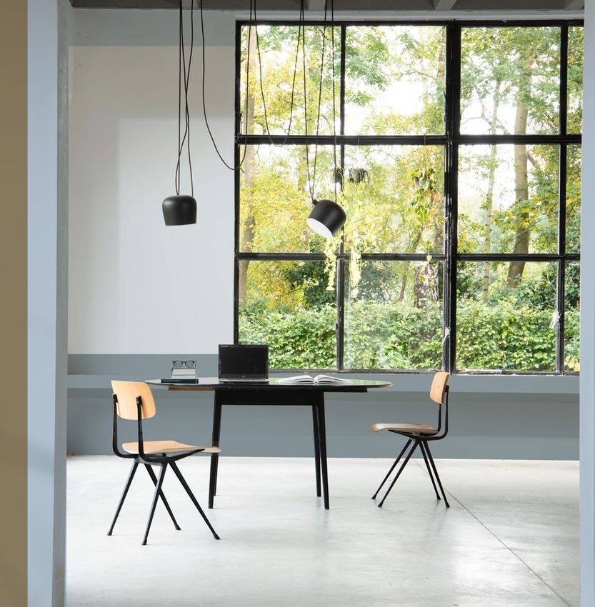
THE EVOLUTION OF COLOUR OF THE YEAR 2022
BRIGHT
COLOUR TRENDS
The Sikkens Global Aesthetic Center is
SKIES
committed to helping specifiers create
better, more comfortable spaces with
TM
credible, on-trend colours. Each year,
it invites a group of design experts to
share their global trend knowledge. Using
these insights and a wealth of colour
expertise, the team then chooses a Colour Sikkens Colour of
of the Year, and builds four new,
easy-to-use paint palettes around it.
the Year 2022 is an airy, light blue
that’s fresh, open and invigorating.
LAST YEAR Reflecting the limitless skies
In 2021, we saw unprecedented global around us, it delivers a flavour
change. This led Sikkens to develop
palettes around a warm, natural tone – of the natural world and brings
Brave GroundTM. Evoking stability, growth
and potential, this harmonious, bolstering
a breath of fresh air to a space.
tone provided a firm foundation and Used alongside a range of
helped to create balanced, restorative and
unifying spaces across all sectors. complementary palettes,
Bright SkiesTM is the perfect colour
THE WORLD TODAY for updating both interiors and
The effects of a global pandemic have
accelerated change in all aspects of our
exteriors across a wide range of
lives and brought key questions into sectors and environments.
sharper focus. When we can work from
home, what should we do with the office?
PALETTES
When nature feels vital to our wellbeing,
how can we keep it close? And, when we
can be digitally available 24/7, how can we
balance the social benefits of connectivity
with our personal need to switch off? Around Bright SkiesTM, we’ve built
four inspiring and adaptable
WHAT DOES THIS palettes that offer a variety of
MEAN FOR COLOR? colour combinations for specific
People want to understand how they can
reinvent their surroundings, making sectors. These easy-to-use palettes
them flexible and adaptable to
accommodate changing needs. They want provide specifiers around the
to know how they can integrate nature
into daily life so its positive benefits
world with a comprehensive suite
can be felt by everyone. They want to of on-trend, credible colours that
Images: Cover top left & bottom right: Unsplash
know how to create soothing spaces
as a restorative escape from everyday can refresh interiors and exteriors
stress. And they want to embrace a across every sector, improving
fresh approach to living, welcoming new
spaces and delivering inspiring
Bottom left: Shutterstock
perspectives and ideas. They need a
colour that brings a breath of fresh air.
results for both clients and users.
Above: our experts consider the trends that will influence the
Sikkens colours for 2022
2 3
INTERIOR PALETTES
    WORKSHOP                                                     GREENHOUSE                                                                                                STUDIO                                                         SALON
    COLOURS                                                      COLOURS                                                                                                   COLOURS                                                        COLOURS
    BRIGHT AND UPLIFTING                                         FRESH AND VITAL                                                                                           SUBTLE AND CONSOLING                                           AIRY AND UNIFYING

ADAPTABLE SPACES                                               VITAL SPACES                                                                                              SOOTHING SPACES                                               OPEN SPACES
Uplifting and refreshing, these are colours that hold their    Feeling connected to nature is good for wellbeing, and                                                    The subtle tones of the Studio palette can add warmth and     The airy, neutral tones of the Salon palette can give a space
own, that look good together and that work perfectly with      these colours bring in the positive feel of the outside world.                                            softness to any space, private or public. Used on their own   a fresh start. Neutral and complementary, Salon colours
Sikkens Colour of the Year. They are ideal for transforming    Taken from nature’s own palette, they can make any space                                                  or set against the freshness of Bright SkiesTM, these airy,   bring lightness and openness to a space, giving a fresh,
hard-working environments that need to perform several         feel fresher. In a rural setting, they can bring in a sense of                                            inspiring tones can maximise daylight and soothe the soul.    forward-thinking feel. Understated natural shades that can
roles at once. Complementary yet contrasting, Workshop         the surrounding landscape; in the city, they can deliver a                                                These are colours that can help to create the feel of a       provide a unified blank canvas for furnishing and
tones can effectively define and single out separate ‘zones’   welcome reminder of green space and fresh air –                                                           consoling retreat – somewhere that can provide respite        decoration, they’re the perfect ingredients for a fresh
in a multipurpose space.                                       something that’s been shown to make people feel better.                                                   from the stresses of daily life.                              approach in any environment.

                 D3.32.55                        B6.05.73                       S9.03.81                         G4.05.81                                                                 G0.10.75                       E4.05.76                       UN.00.86                         GN.01.89
              60YR 31/368                     10YR 57/080                    10BB 73/039                      65YY 71/071                                                              47YY 62/143                    00YY 63/067                    50BB 83/006                      71YY 90/027

                 G4.40.80                         F9.20.70                       J5.03.71                        G0.16.68                                                                 ZN.02.73                      WN.02.77                        T3.03.81                        ON.00.83
              65YY 70/540                      49YY 54/251                   45GY 55/052                      50YY 49/191                                                              40RR 57/045                    24RB 66/037                    30BB 72/040                     13GY 77/016

     COLOUR OF THE YEAR                           J3.14.63                      R1.10.65            COLOUR OF THE YEAR                                                                    W9.03.68           COLOUR OF THE YEAR                         ON.00.76                         FN.02.77
                T0.10.70                      30GY 41/173                    50BG 44/094                       T0.10.70                                                                50RB 48/051                      T0.10.70                     88BG 62/005                      44YY 65/034
            14BB 55/113                                                                                    14BB 55/113                                                                                              14BB 55/113

                 E4.22.49                         F6.55.54                      N1.06.61                         G5.17.58                                                                 B7.10.59                       T4.04.66                       ON.01.70                         E7.10.53
              00YY 26/220                      34YY 31/502                   50GG 40/064                      70YY 34/180                                                              10YR 37/143                    30BB 45/049                    00NN 53/000                      10YY 30/106
                                                                                                                                Images: First from left: Shutterstock,
                                                                                                                                third from left: Unsplash

                 LN.00.87                        S7.19.59                       S0.10.50                         F3.28.38                                                                 C4.30.49                       ZN.02.56           COLOUR OF THE YEAR                           E4.06.35
              11GY 85/016                     06BB 39/179                    87BG 27/077                      30YY 17/209                                                              29YR 27/355                    50RR 32/029                      T0.10.70                       95YR 16/038
                                                                                                                                                                                                                                                   14BB 55/113

4                                                                                                                                                                                                                                                                                                      5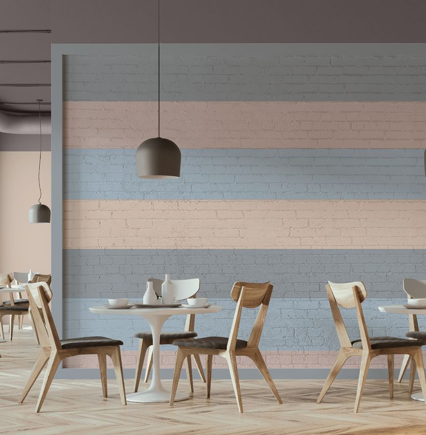
EXTERIOR PALETTES
    WORKSHOP                                                      GREENHOUSE                                                                        STUDIO                                                          SALON
    COLOURS                                                       COLOURS                                                                           COLOURS                                                         COLOURS
    BRIGHT AND UPLIFTING                                          FRESH AND VITAL                                                                   SUBTLE AND CONSOLING                                            AIRY AND UNIFYING

Multicoloured and vibrant, this light, bright palette is        Inspired by the tones of nature, the colours in this palette                      Warm and inspiring, these complementary tones can              These neutral natural shades are ideal for adding a hint of
perfect for adding personality to a building. Its bold,         work naturally together and bring a blast of freshness to a                       soften the feel of an exterior and add visual interest. They   colour to an exterior while maintaining a cohesive, unified
positive colours deliver energy and dynamism, and they          building. They deliver a connection to the natural world                          work well together and deliver an effective tonal balance      and understated feel. Ranging in tone from earthy to airy,
are also ideal for defining separate elements of an exterior.   that’s been shown to be good for people’s wellbeing.                              used alongside Sikkens Colour of the Year.                     they can bring lightness and freshness to a building.

                 D3.32.55            COLOUR OF THE YEAR                           J5.03.71                        G4.05.81                                          G0.10.75           COLOUR OF THE YEAR                         UN.00.86                        FN.02.77
              60YR 31/368                       T0.10.70                      45GY 55/052                      65YY 71/071                                       47YY 62/143                      T0.10.70                     50BB 83/006                     44YY 65/034
                                            14BB 55/113                                                                                                                                       14BB 55/113

                 LN.00.87                         F6.55.54          COLOUR OF THE YEAR                            G0.16.68                                          E4.05.76                        T4.04.66                      ON.01.70                        E7.10.53
              11GY 85/016                      34YY 31/502                     T0.10.70                        50YY 49/191                                       00YY 63/067                     30BB 45/049                   00NN 53/000                     10YY 30/106
                                                                           14BB 55/113

                 E4.22.49                         J3.14.63                       S0.10.50                         F3.28.38                                          C4.30.49                        ZN.02.56          COLOUR OF THE YEAR                          E4.06.35
              00YY 26/220                     30GY 41/173                     87BG 27/077                      30YY 17/209                                       29YR 27/355                     50RR 32/029                     T0.10.70                      95YR 16/038
                                                                                                                               Images: Unsplash

                                                                                                                                                                                                                             14BB 55/113

6                                                                                                                                                                                                                                                                              7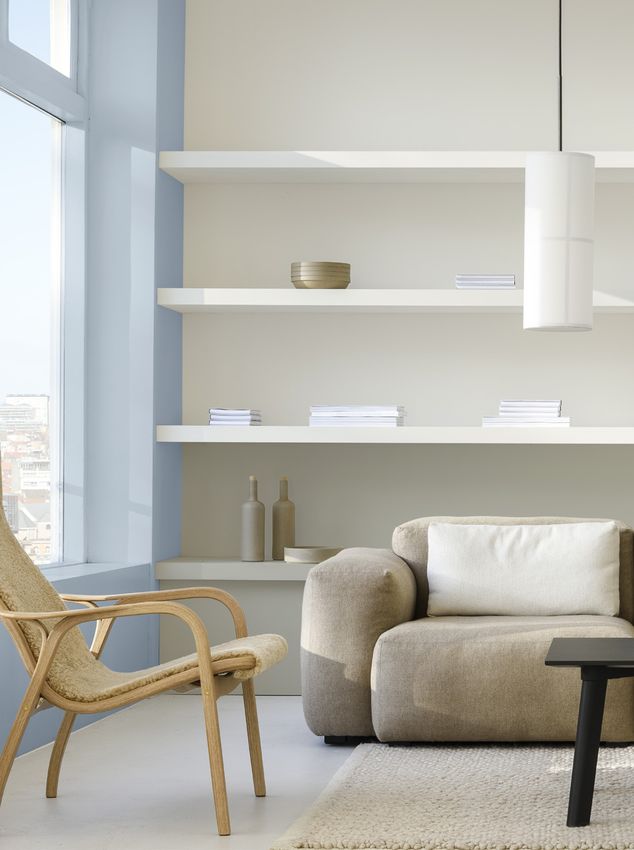
EDUCATION

BRIGHT SKIES
                             TM

AND ITS PALETTES:                                                                    OFFICES
THE PERFECT
INGREDIENTS FOR
FRESH SPACES                                                                         RESIDENTIAL

Sikkens Colour of the Year and its
palettes deliver a ready-made way to
help you improve spaces in any sector
                                                                                     HEALTHCARE
you work with. These on-trend,
credible colours can transform
buildings, both inside and out,
creating comfortable and functional
                                        Images: Top two & bottom two: Shutterstock

spaces that surpass expectations.                                                    HOSPITALITY

8                                                                                                  9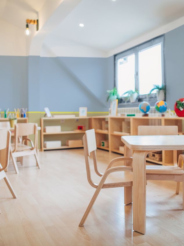
WORKSHOP
COLOURS
1. International Commission on the Futures of Education. 2020. Education in a post-COVID world: Nine ideas for public action. Paris, UNESCO, p15
ADAPTABLE SPACES
Colours: Bright tones bring
positivity and energy to a
learning environment. They
also work as accent colours to
‘zone’ different functional
areas of a space that has to
fulfil more than one role.
Relevance: Post-pandemic,
experts anticipate a need for
EDUCATIONAL SPACES
hybrid forms of teaching and
learning in different spaces1.
Result: A multicoloured
palette works practically and
An uplifting palette of bright, complementary colours creates a sense of emotionally in educational
settings, allowing open spaces
freshness and dynamism that can support the learning process, and that also to be ‘zoned’ into smaller,
provides an effective solution for zoning different functional areas. more approachable areas and
bringing dynamism to the
Images: Getty
space with colour.
D3.32.55 COLOUR OF THE YEAR F6.55.54
10 60YR 31/368 T0.10.70 34YY 31/502 11
14BB 55/113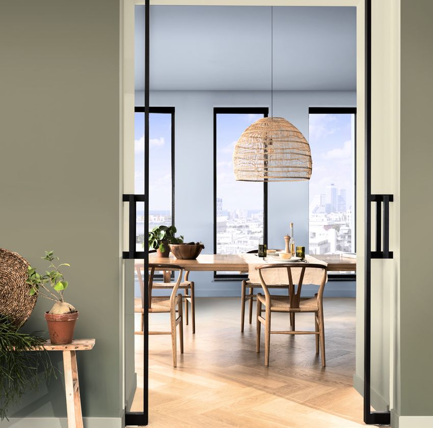
Images: Left: Getty, top right: Shutterstock, bottom right: Unsplash

   LN.00.87   COLOUR OF THE YEAR       G4.40.80      F9.20.70
11GY 85/016              T0.10.70   65YY 70/540   49YY 54/251                                                                          13
                     14BB 55/113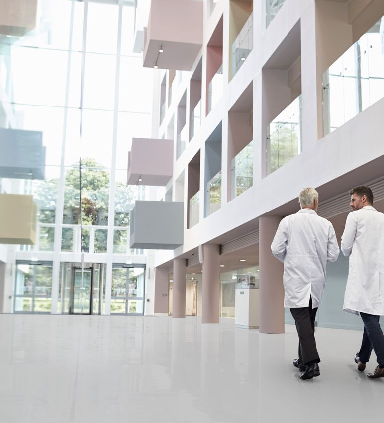
GREENHOUSE
2. 40-second green roof views sustain attention: The role of micro-breaks in attention restoration, K Lee, K Williams, L Sargent, N Williams, K Johnson, Journal of
COLOURS
VITAL SPACES
Colours: Tones inspired by
nature, this palette of greens,
blues, browns and greys can help
bring in the positive feel of the
natural world.
Relevance: Integrating natural
Environmental Psychology, Volume 42, June 2015, Pages 182-189. Copyright © 2015 Elsevier Ltd
Mecanoo
colours into an office can help
employees feel connected to
nature; and time spent in the
OFFICE SPACES
natural world has been shown to
help refocus attention2.
Result: Natural tones can
revitalise an office space, deliver
At home or in the office, today’s workspace needs to be adaptable and a blast of freshness and help
increase a sense of wellbeing.
appealing. An increasingly digitised space, it can benefit from a connection
Images: Top right: Shutterstock
Colours that work together
with the natural world, and a positive, vibrant feel. naturally also provide an
instantly cohesive, easy-to-use
decorative scheme.
F3.28.38 COLOUR OF THE YEAR S0.10.50 S9.03.81
14 30YY 17/209 T0.10.70 87BG 27/077 10BB 73/039 15
14BB 55/113
WORKSHOP

                                          3. ‘In times of uncertainty, flexibility is key. 47% of UK businesses said they envisioned their real estate strategies to include a greater amount of flexible, serviced
     COLOURS
     ADAPTABLE SPACES

     Colours: Bright, contrasting
     tones can add energy, help to
     define different areas of a
     multipurpose space and
     provide effective wayfinding.

     Relevance: People have
     reassessed what they need from
                                          or coworking space.’ Re-occupancy and Re-imagined Workplace Survey, Knight Frank, 2020

     an office and, going forward, will
     want flexible, appealing spaces
     that offer different
     environments, from quiet work
     areas to collaborative zones3.

     Result: Vibrant, complementary
                                          Images: Top right & bottom left: Shutterstock

     tones create an easy-to-use
     palette for zoning different
     areas of an office and can bring
     freshness and visual interest to
     what might otherwise be a
     sterile, tech-heavy space.
                                                                                                                                                                                                                      COLOUR OF THE YEAR       LN.00.87      B6.05.73      G4.40.80      E4.22.49      D3.32.55
16                                                                                                                                                                                                                               T0.10.70   11GY 85/016   10YR 57/080   65YY 70/540   00YY 26/220             17
                                                                                                                                                                                                                                                                                                    60YR 31/368
                                                                                                                                                                                                                             14BB 55/113
GREENHOUSE
4. Spending at least 120 minutes a week in nature is associated with good health and wellbeing, MP White, I Alcock, J Grellier et al. Scientific Reports 9, Article
COLOURS
VITAL SPACES
Colours: Made up of tones that
reflect the world outside, this
palette delivers a sense of
connection with nature and
brings in a positive feel.
Relevance: Spending time in
nature is good for health and
wellbeing4. Integrating biophilic
RESIDENTIAL SPACES
design and natural tones into
the design of a home can help
to make it feel connected to the
world outside.
7730, June 2019, doi.org/10.1038/s41598-019-44097-3
Demands on the home have increased exponentially as people across the Result: A palette of nature-
world have been living and working in them 24/7. Going forward, we need inspired shades can revitalise a
living space, bring in a breath of
homes that can build a connection to nature and that feel airy and open.
Images: Bottom right: Unsplash
fresh air and help people feel in
touch with nature. It also
provides a ready-made cohesive
decorative scheme.
COLOUR OF THE YEAR G5.17.58 G4.05.81
T0.10.70 70YY 34/180 65YY 71/071 19
14BB 55/113SALON
COLOURS
6. Social media users have grown by more than 10% over the past year, taking the global total to 3.96b by the start of July 2020 – Digital 2020, Simon Kemp,
OPEN SPACES
Colours: A combination of airy
neutrals, this palette can create
a subtle and light ‘blank canvas’
in the home.
Relevance: With social media 5. How to break out of your social media echo chamber, Christopher Seneca, WIRED, September 2020
increasingly perpetuating a
single-minded viewpoint5 (and
with social media use
increasing6), people need to be
encouraged to be open to new
perspectives and influences.
Result: The least divisive of all
shades, neutral colours and
Bright SkiesTM can deliver a
feeling of openness, unity and
DataReportal/Kepios, July 2020
inclusivity in the home. An ideal
backdrop for any decorative
scheme, they can also act as a
springboard for new ideas.
FN.02.77 GN.01.89 COLOUR OF THE YEAR
20 44YY 65/034 71YY 90/027 21
T0.10.70
14BB 55/113HEALTHCARE SPACES
In buildings where the focus is on health and wellbeing, patients,
visitors and staff need a psychological escape from stress and anxiety. They
Images: Top Left & top right:
need soothing, restorative spaces that can help them recuperate.
Shutterstock
COLOUR OF THE YEAR E4.05.76 C4.30.49 WN.02.77
T0.10.70 00YY 63/067 29YR 27/355 24RB 66/037 23
14BB 55/113STUDIO
7. ’Viewing our minds and bodies as intrinsically connected, medicine since the time of ancient Greece has claimed that maintaining a positive state of mind can
COLOURS
SOOTHING SPACES
Colours: Warm neutrals, pale
pinks and lilacs, these
contemplative colours are soft,
subtle and soothing.
Relevance: Lockdown
highlighted the need for a
offer the conjoining effect of treating physical disease.’ Barbara Marshall, CF22 Trend Forecast
psychological escape from
stressful situations – something
that’s particularly pertinent in
healthcare environments7.
Warm, calming colours can help
people feel more at ease.
Subtle and consoling Studio colours, used with Bright SkiesTM, can improve Result: Calm, balanced and
Images: Top left and top right: Shutterstock
the atmosphere in healthcare spaces, bringing a feeling of softness, balance easy on the eye, these
restorative colours can add
and comfort to patient rooms and communal areas warmth and softness to a
clinical healthcare environment,
and help patients, visitors and
staff switch off and de-stress.
G0.10.75 E4.05.76 ZN.02.73 B7.10.59 W9.03.68 WN.02.77 T4.04.66 COLOUR OF THE YEAR ZN.02.56
47YY 62/143 00YY 63/067 40RR 57/045 10YR 37/143 50RB 48/051 24RB 66/037 30BB 45/049 T0.10.70 50RR 32/029 25
14BB 55/113STUDIO
8. ‘Where can we turn for comfort and solace, for joy and consolation? What are the consolations that bring peace of mind? It’s what used to be called ‘culture’.
COLOURS
SOOTHING SPACES
Colours: Warm neutrals, pale
pinks, lilacs and Bright SkiesTM,
the contemplative colours of
The arts. Music, theatre, dance, poetry, painting and sculpture, and design.’ Barbara Marshall, CF22 Trend Forecast
the Studio palette are subtle,
soothing and inspiring.
Relevance: Lockdown
heightened our awareness of
the emotional benefits of
creativity and the need for a
HOSPITALITY SPACES
psychological escape from
everyday challenges. Warm,
calming colours can help
create a retreat-like space
Images: Top left and bottom right: Shutterstock
where we feel free to dream.
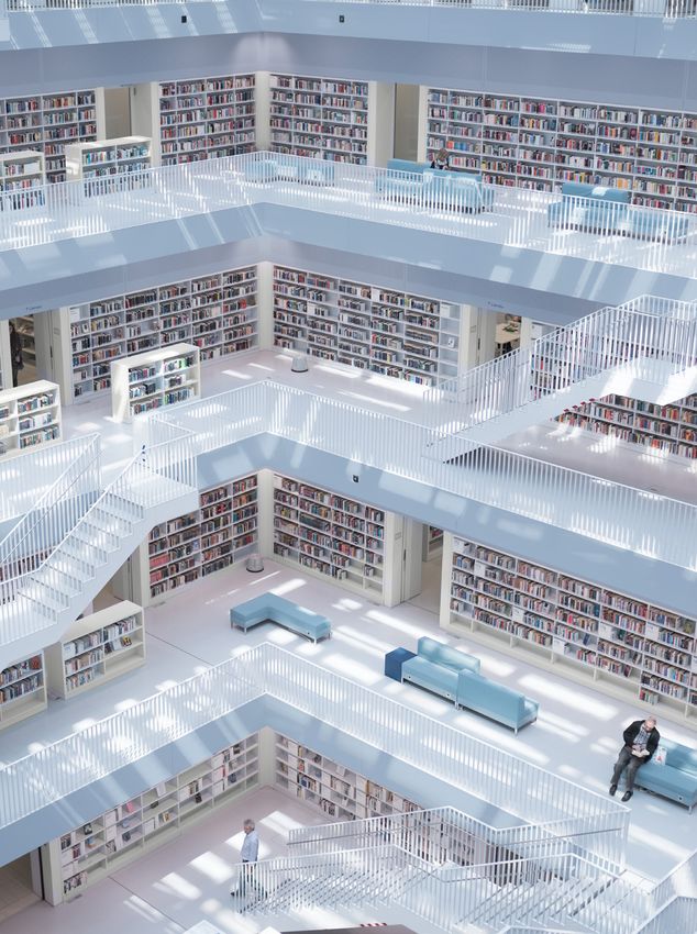
Whether hotel, restaurant or library – hospitality settings can offer us the
Result: This soothing,
opportunity to recharge and look at things from a fresh perspective. We need
transformative palette is
soothing, welcoming and inspiring spaces that give us the chance to dream. perfect for hospitality spaces,
offering people an inspiring
retreat from daily life.
ZN.02.56 T4.04.66 ZN.02.73 COLOUR OF THE YEAR E4.05.76
50RR 32/029 30BB 45/049 40RR 57/045 T0.10.70 00YY 63/067 27
14BB 55/113SALON
COLOURS
9. ’Recent decades have brought about an increased focus on public space as part of building more inclusive and sustainable neighbourhoods and
OPEN SPACES
cities.’ Landman, K. Inclusive public space: rethinking practices of mitigation, adaptation and transformation. Urban Des Int 25, 211–214 (2020).
Colours: Featuring airy
neutrals alongside Bright
SkiesTM, this palette delivers a
feeling of openness and unity.
Relevance: Experts are
increasingly coming to
understand that spaces that
welcome the public should
feel inclusive and open9.
Result: Complementary
neutrals, these light colours
open up a space and, creating
a simple, plain backdrop, they
https://doi.org/10.1057/s41289-020-00136-4
can act as a ‘blank canvas’ for
myriad cultural and social
influences. These are colours
Images: Left: Shutterstock
that won’t date and that can
remain in place even when an
interior scheme is changed.
COLOUR OF THE YEAR UN.00.86
28 T0.10.70 50BB29
83/006
14BB 55/113AkzoNobel Decorative Paints Global Aesthetic Center Amsterdam, The Netherlands Contact: Media.Relations@akzonobel.com Sikkens, Dulux Professional, Dulux Trade, the AkzoNobel logo, the Flourish logo and all distinctive colour names are trademarks of the AkzoNobel Group of Companies© and Database Right 2015. This ColourFuturesTM reference manual is and remains the property of AkzoNobel N.V. and is loaned on condition that it is used solely to specify products manufactured/or supplied by AkzoNobel N.V. (and other companies in the AkzoNobel Group) and on condition that it shall be returned to AkzoNobel N.V. on demand. The contents of this reference manual are for information only. No representation or warranty is given, nor liability accepted, regarding the information given. We have reproduced paint colours as faithfully as printing will allow. However, the shape, size and lighting of a surface can influence the appearance of the final colour. Design – Redwood London, redwoodbbdo.com Content – AkzoNobel Global Aesthetic Center
You can also read