Making Figures Accessible - March 2022 v.1 | Journals Edition
←
→
Page content transcription
If your browser does not render page correctly, please read the page content below
Making Figures
Accessible
March 2022 v.1 | Journals Edition
Contents
Resources								03

The Principles
Use of Colour						      04
Colour Contrast							05
Colour Palette							09
Text Accessibility							10   Quick Links to Cheat Sheets
                              Line Graphs							             16
In Practice                   Grouped Bar Graphs						22
Line Graphs								12         Scatter Plots								27
Grouped Bar Graphs						18    Pie Charts								32
Scatter Plots								23       Diagrams								38
Pie Charts								28
Diagrams								33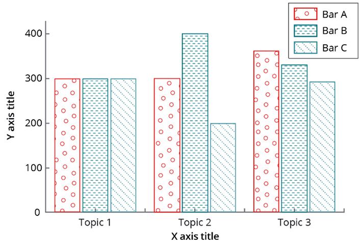
Resources                                                                                            Oxford University Press | Academic Design | Making Figures Accessible   3

This guide seeks to help all those involved with creating and
publishing content to improve the accessibility of any figures
                                                                 Useful Links
produced. Individual projects may still face constraints that
mean that not all guidance can be adhered to.                    Accessible Fonts
For example, the space available within a print format           FS Me Regular / FontSmith website
may mean the size of the labelling cannot be as large as is
recommended. As guidance, research, and understanding of         Source Sans Pro Regular / Google Fonts
accessibility develops, we also intend to update and improve
                                                                 Open Sans Regular / Google Fonts
this guidance.

If you have any feedback on these guidelines, or suggestions
for improvements, please get in touch with us at the address     Colour Blindness Simulator
below:
                                                                 Coblis
Charlotte.Lloyd@oup.com
Head of Design, Academic

                                                                 Colour Contrast Checkers
                                                                 WebAIM Colour Contrast Checker

                                                                 Snook checker

                                                                 Web Content Accessibility Guidelines (WCAG)
                                                                 Introduction and Overview

                                                                 Use of Colour

                                                                 Minimum Colour Contrast Requirements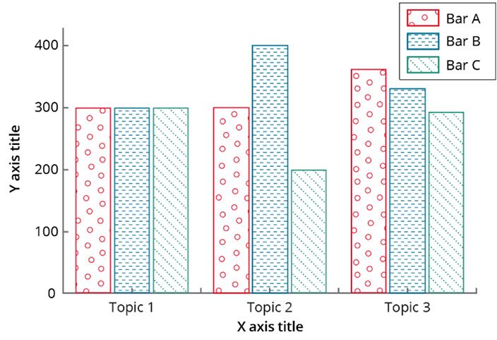
Use of Colour                                                                                        Oxford University Press | Academic Design | Making Figures Accessible      4

Does making colours accessible                                        A N O M A L O U S TRIC HRO M A C Y         D IC HRO M A TIC V IE W           M O N O C HRO MATI C VI EW

just mean avoiding red and green?                                         Protanomaly (red weak)                 Protanopia (red blind)          Achromatopsia (monochromacy)

No—there are many forms of colour blindness, meaning that
colour can be perceived in many different ways.

For example, a typical colour palette is shown below, and the
images on the right demonstrate how this palette may be
perceived by readers with various forms of colour blindness.

                                                                        Deuteranomaly (green weak)             Deuteranopia (green blind)           Blue cone monchromacy

If a manuscript refers to the ‘red line’ or ‘red area’ in a figure,       Tritanomaly (blue weak)                Tritanopia (blue blind)
a reader with protanopia would not be able to perceive
which line/area is being referred to. Therefore, in order to be
accessible:

  • m
     eaning should not be communicated only through
    colour – avoid referring to colour in the manuscript
    as the only cue to meaning
  • u
     se other cues such as text labels, varying pattern
    and/or shapes etc
Colour Contrast                                                                     Oxford University Press | Academic Design | Making Figures Accessible   5

What is colour contrast?                                           HIGH CONTRAST COLOURS                                     LOW CONTRAST COLOURS

Contrasting colours are colours that differ from one another.
Levels of contrast vary from high to low, depending on their
position on the colour wheel. For example, colours that are
directly opposite one another on the colour wheel have the
highest contrast possible, while colours next to one another
have a low contrast.

Partial sight, aging, and congenital colour deficits all produce
changes in perception that reduce the visual effectiveness
of certain colour combinations. Two colours that contrast
sharply to someone with normal vision may be far less
distinguishable to someone with a visual disorder. It is
important to appreciate that it is the contrast of colours
against another that makes them more or less discernible
rather than the individual colours themselves.

Here are three rules for making effective colour choices:

  • E
     xaggerate lightness differences between foreground
    and background colours
    • Avoid contrasting hues from adjacent parts of the circle
  • U
     se a colour contrast checker to validate the success
    of the colour combinations within the Minimum (AA)
    WCAG Contrast and Colour Requirements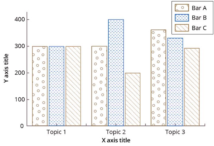
Colour Contrast                                                                Oxford University Press | Academic Design | Making Figures Accessible   6

1 . Exaggerate lightness differences                                                                                      Example 1
 between foreground and
 background colours
Don’t assume that the lightness you perceive will be the
same as the lightness perceived by people with colour                  HIGH                        LOW
deficits. If you lighten your light colours and darken your dark   CONTRAST                        CONTRAST
colours, you will increase the visual accessibility                 COLOURS                         COLOURS
of your design.

2. Avoid using colours of similar                                                                                         Example 2
lightness adjacent to one another,                                 EFFECTIVE
even if they differ in saturation or hue
Hue enables us to identify basic colours, such as blue, green,
yellow, red and purple. People with normal colour vision
                                                                                                         NOT
report that hues follow a natural sequence based on their
                                                                                                         EFFECTIVE
similarity to one another. With most colour deficits, the
ability to discriminate between colours on the basis of hue is
diminished, and it is difficult to discriminate between colours
of similar hue.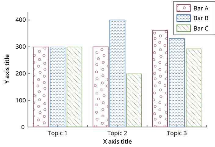
Colour Contrast Oxford University Press | Academic Design | Making Figures Accessible 7
4.71:1
Understanding the Passes in all
Example 1 categories
WCAG “Contrast Ratio”
OUP recommends that colour used in our publications meet
2.77:1
the WCAG minimum (AA) contrast ratios. In WCAG, contrast 1.64:1 Fails in all In Example 1, only the blue on white
is a measure of the difference in perceived “luminance” or Fails in all categories
categories passes the WCAG requirements for
brightness between two colours This brightness difference is
colour contrast. The other colours do
expressed as a ratio ranging from 1:1 (e.g. white on white) to
not pass both with text or non-text
21:1 (e.g., black on a white). There are different requirements
objects. See below for one way this
for non-text and text contrast.
could be fixed.
2.46:1
WCAG 2.1 SUCCESS CRITERION 1.4.11 NON-TEXT CONTRAST Fails in all
categories
The visual presentation of Graphical (non-text) Objects
should have a contrast ratio of at least 3:1 against adjacent
colour(s). If a graphic is needed to understand the content
✗ NOT
ACCESSIBLE
then it should be perceivable by people with low vision or
other impairments without the need for contrast-enhancing
This shade of blue on white (and reverse) does This shade of blue on
assistive technology. not pass (1.6:1). A dark gray border was added white (and reverse)
In Example 2, variations in
to the slice (7:1), and text is set in black (13:1) does not pass (2.3:1).
WCAG 2.1 SUCCESS CRITERION 1.4.11 TEXT CONTRAST layout are added (a dark
which fixes both text and background A dark gray border
Example 2 rule around light non-text
The presentation of text should have a contrast ratio of at was added to the slice
least 4.5:1 for normal text and 3:1 for large text. Large text is (7:1), and text is set background colours) as well
4.6:1 in black (9:1) which as alternating black and white
defined as 14 point and bold or larger, or 18 point regular or
Background fixes both text and text as needed. It is okay to
larger. To give a frame of reference, on a white background: colour and background
treat labels in different ways
text passes
Pure red (#FF0000) has a ratio of 4:1: to ensure they meet contrast
SAMPLE TEXT AT 14 PT This shade of blue requirements.
on white passes as
Pure green (#00FF00) has a very low ratio of 1.4:1 a non-text object, so To create a uniform look, the
SAMPLE TEXT AT 14 PT the background is ok gray border is applied to all
(3.3:1). The reverse, slices, even though it isn’t
Pure blue (#000FF) has a contrast ratio of 8.6:1 (white text on blue) fails
required on Slices C and D.
since it is below 4.5:1.
SAMPLE TEXT AT 14 PT To fix, the text is set in
✓ ACCESSIBLE black (6.2:1)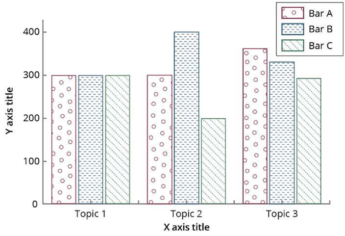
Colour Contrast Oxford University Press | Academic Design | Making Figures Accessible 8
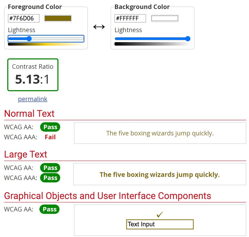
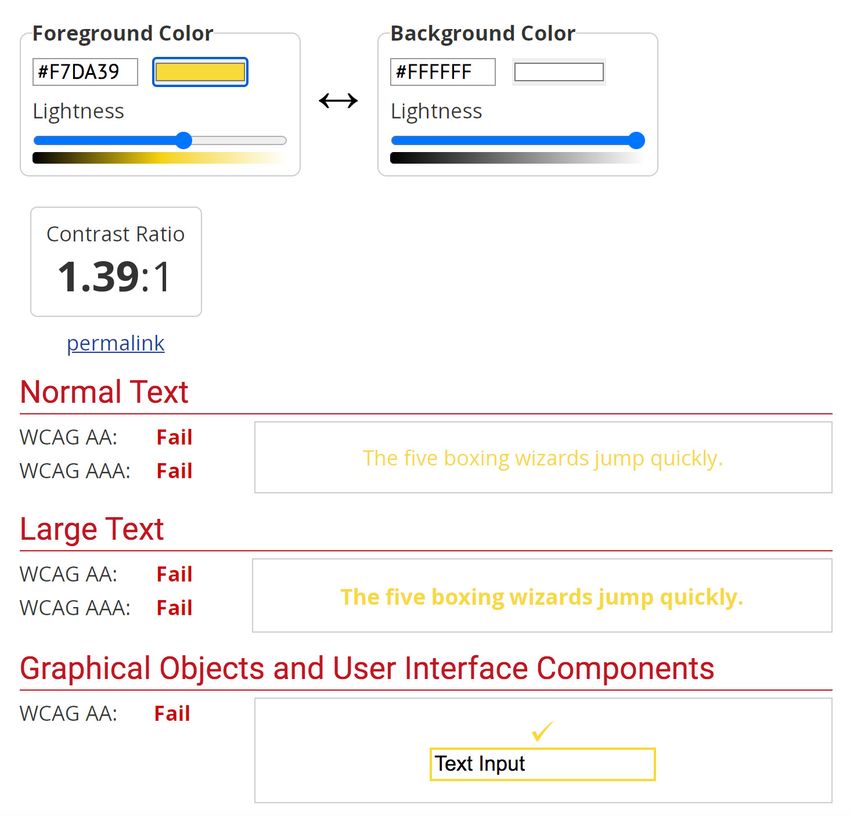
Using an online Contrast Checker
There are many resources online that can help you to validate
the success of colour combinations, such as
WebAim.org (See also the Useful Links section of this
document). Enter a foreground and background colour
in RGB hexadecimal format (e.g., #F7DA39). The Lightness
slider can be used to adjust the selected colour.
Based on the values entered, you will be told if you pass or fail
a Colour Contrast check using the WCAG requirements for:
∙Normal Text (4.5:1)
∙Large Text (3:1)
∙Graphical Objects/non-text (3:1)
In the examples, the yellow on white test has failed in all
categories, as the contrast is well below the 3:1 or 4.5:1
requirements. This combination should not be used for either
text or non-text objects.
To the right of that example, the lightness in the yellow has
been decreased, so it appears more as a dark gold. The gold
on white passes in all categories, as the contrast is above 3:1
and 4.5:1. This combination would work well for both text or
non-text objects.
✗ NOT
ACCESSIBLE ✓ ACCESSIBLE
Colour palettes                                                                                Oxford University Press | Academic Design | Making Figures Accessible        9

1. Example colours tested for non-text                                                    Example colours tested for non-text contrast

contrast
The colour boxes to the right are colours tested for non-text contrast (i.e.
graphical objects) against white to AA Accessibility standard.
                                                                                    ✓    ACCESSIBLE
                                                                                                                                                  ✗    NOT ACCESSIBLE

                                                                               *          *
  • Avoid using colour as the only cue to convey meaning, and do
    not refer to the object by colour                                          *          *              *

  • Colours should be strong and contrast well with surrounding               *          *              *
    areas, and each other when being used to differentiate
                                                                               *          *
  • Where tints are used, use an outline to define the shape so
    that it contrasts with the surrounding background                          *          *

  • Do not use colour for typography unless absolutely necessary
                                                                               *          *
    – it is best to use black text on a white background (not all                                                                                            Be wary of
    colours in the figure specification may be suitable for text use           *                                                                           yellow based
    – those with an * on the right accessible palettes are not)                                                                                           colours – these
  • Yellow should also be avoided for graphical objects – it needs                                                                                        all need to be
    to be dark enough to contrast with the background, meaning                                                                                            stronger/darker
    it becomes more gold, like the examples on the right                                                                                                     to contrast
                                                                                                                                                             sufficiently
                                                                                          *                                                                  on a white
                                                                                                                                                            background

                                                                                          *
                                                                                                                                          Too pale – not
                                                                                                                                         enough contrast
                                                                                           Muted                                            with white
                                                                                                                                           background
                                                                               Brights                   Darks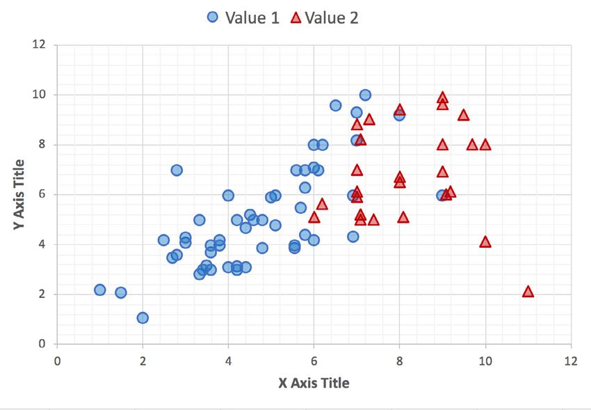
Text Accessibility                                                                                Oxford University Press | Academic Design | Making Figures Accessible   10

What do we need to consider for
text accessibility?
Font type and presentation has a significant impact on                                   Item 9             Item 10
                                                                                           4%                  3%
readability of people with dyslexia. Studies have shown that
sans serif, roman and monospaced font types increased the                       Item 8
reading performance of dyslexic readers. A combination                            6%

of principles regarding typography, readability, legibility,
                                                                      Item 7
and colour will have a significant effect on text accessibility.        7%                                     Item 1
Therefore, in order to be accessible, if possible please:                                                       22%

  • U
     se a font size within figures set to 12-14pt or
                                                                   Item 6
                                                                     9%
                                                                                                                        Item 2
                                                                                                                                   ✗     NOT
                                                                                                                                         ACCESSIBLE
                                                                                                                         14%
    equivalent
                                                                                         Item 5
  • L
     imit the use of font variations such as italic, bold,                               10%
                                                                                                             Item 3
    ALL CAPS or other styles that may make the content                                             Item 4     13%
                                                                                                    12%
    difficult to read
    • Do not use underlines for items that are not links
  • T
     he use of colour should adhere to general colour
                                                                               ✗ Avoid using a serif-font
    accessibility principles. Ideally, place text on single
    colour backgrounds. Avoid background patterns or                           ✗ Using a font-size under 12pt or equivalent is not recommended
    pictures and distracting surrounds.
                                                                               ✗ A
                                                                                  void font variations such as italic, bold, ALL CAPS, or other
                                                                                 styles when possible

                                                                               ✗ Avoid placing text on top of a colour or pattern
Text Accessibility Oxford University Press | Academic Design | Making Figures Accessible 11
Accessible Fonts
OUP recommends using one of the following approved fonts
for your charts and figures. Please find licensing information
Item 9 Item 10
the Useful Links section of this document.
4% 3%
✓ FS Me Regular: designed specifically to improve Item 8
legibility for people with learning disabilities. Every letter of 6%
FS Me was tested for its appeal and readability with a range
Item 7 Item 1
of learning disability groups across the UK.
7% 22%
✓ Source Sans Pro Regular: A Google Font. These
fonts are licensed under the Open Font License. You can
Item 6
9%
✓ ACCESSIBLE
use them freely in your products & projects - print or digital, Item 2
14%
commercial or otherwise. Item 5
10%
Item 3
✓ Open Sans Regular: A Google Font. These fonts Item 4
13%
are licensed under the Apache License, Version 2.0. You can 12%
use them freely in your products & projects - print or digital,
commercial or otherwise.
✓ Uses FS Me Regular
✓ Labels are set at 12.5pt font size
✓ Does not have any styling outside of font type and size
✓ T
ype is placed on a background that meets colour
contrast guidelines, and/or is placed in a white box.Line Graphs Oxford University Press | Academic Design | Making Figures Accessible 12
What do we need to consider A N O M A LOU S T RI C H ROM A C Y DI C H ROM A T I C VI E W M ONOCH R O MA T I C V I EW
for line graphs? Protanomaly (red weak) Protanopia (red blind) Achromatopsia (monochromacy)
A simple line graph is shown below, and the images on the
right demonstrate how this graph may be perceived by
readers with various forms of colour blindness.
Deuteranomaly (green weak) Deuteranopia (green blind) Blue cone monchromacy
In most cases the reader may be able to match the colour in Tritanomaly (blue weak) Tritanopia (blue blind)
the legend to the colour of the plot line, even if not perceiving
the colour as intended. But, there are instances where the
colour isn’t easily discernible, e.g. deuteranopia. Therefore, in
order to be accessible, the plot lines on a line graph need to
either:
• h
ave a label next to the plot line (with or without
leader line, as necessary)
• use different stroke styles (e.g. solid, dashed, dotted)
• use different symbols for data points
❯❯ The next pages show how these techniques ensure the content can be understood by a reader with any form of colour blindness.Line Graphs Oxford University Press | Academic Design | Making Figures Accessible 13
Option 1: A N O M A LO U S TRIC HRO MAC Y D IC HRO MATIC VIE W MO N O C H R O M A T I C V I EW
Labels next to the plot lines Protanomaly (red weak) Protanopia (red blind) Achromatopsia (monochromacy)
Here the line graph has a label next to each plot line, which
ensures the colour isn’t necessary to identify which line is
which – the colour is supplementary. A legend isn’t required.
Deuteranomaly (green weak) Deuteranopia (green blind) Blue cone monchromacy
Where graphs are more complex, and/or placing a label
nearby is difficult, a leader line could be used for clarity: Tritanomaly (blue weak) Tritanopia (blue blind)
400
Line A
300
Line C
Y axis title
200
Line B
100
0
0 1 2 3 4 5 6
X axis titleLine Graphs Oxford University Press | Academic Design | Making Figures Accessible 14
Option 2: AN O MALOU S TRICH ROMA CY D ICH ROMA TIC VIEW MONOCHROMATIC VIEW
Different stroke styles for plot lines Protanomaly (red weak) Protanopia (red blind) Achromatopsia (monochromacy)
These plot lines each have a different stroke/line style, which
ensures the plot line can be matched to the legend without
relying on colour. Colour is a supplementary aid.
Deuteranomaly (green weak) Deuteranopia (green blind) Blue cone monchromacy
Tritanomaly (blue weak) Tritanopia (blue blind)Line Graphs Oxford University Press | Academic Design | Making Figures Accessible 15
Option 3: A N O M A LO U S TRIC HRO MAC Y D IC HRO MATIC VIE W MO N O C H R O M A T I C V I EW
Different symbols for data points on Protanomaly (red weak) Protanopia (red blind) Achromatopsia (monochromacy)
plot lines
The plot lines each have a different symbol to identify data
points, which also aids recognition of which line is which
without relying on colour. Colour is a supplementary aid.
Deuteranomaly (green weak) Deuteranopia (green blind) Blue cone monchromacy
Tritanomaly (blue weak) Tritanopia (blue blind)
N.B. Where graphs are very complex, adding
data points may make the graph overcrowded.Line Graphs Oxford University Press | Academic Design | Making Figures Accessible 16
Cheat sheet
✗ Do not solely rely on colour to identify the plot line from the legend
400
Line A
Line B
Line C
✗ NOT ACCESSIBLE
300
Y axis title
200
100
0
0 1 2 3 4 5 6
X axis title
The plot lines on a line graph need to either:
✓ have a label next to the plot line (with or without leader line, as necessary)
✓ use different stroke styles (e.g. solid, dashed, dotted)
✓ use different symbols for data points
Line A Line A
400 400 Line B 400 Line B
Line A Line C Line C
300 Line C
300 300
Y axis title
Y axis title
Y axis title
200 200 200
100 100 100
Line B
0
✓ ✓ ✓
0 0
0 1 2 3 4 5 6 0 1 2 3 4 5 6 0 1 2 3 4 5 6
X axis title X axis title X axis title
ACCESSIBLELine Graphs Oxford University Press | Academic Design | Making Figures Accessible 17
Other elements to consider
1. Highlighting areas
Any areas to be highlighted need to be easily identifiable, by having sufficient colour
contrast and outline as necessary, and/or pattern. A few examples are shown:
✗ The shaded areas ✓ a
dd an outline/dividing rule to the ✓ u
se a combination of shading, ✓ use pattern
Normal curve
f(x) do not contrast shading outline, and pattern
PDF = NORM.DIST() =
P(X 110) = 0.02275 PDF = NORM.DIST() = P(X 110) = 0.02275
μ = 100 110 X
NOT
ACCESSIBLE
μ = 100 110 X
✓ μ = 100 110
✓
X μ = 100
ACCESSIBLE
110
✓
X
2. Complex graphs/multiple lines
Where a graph is complex, containing multiple plot lines overlaid, it may become more confusing to use stroke styles for
each plot line, and data points and adjacent labels not practical. Therefore you may need to consider other ways to show
multiple plots so that they are not overlaid, if detail is required.
Comparison between normal and t distributions
Normal T2 T4 T10 T30
✗ relies solely on ✓ u
se different stroke styles, but ✓ c onsider an alternative: reducing the number of plots on one graph,
colour, without may be confusing at small sizes and split into a group of graphs if detail is required
Comparison between normal and t distributions Comparison between normal and t distributions Comparison between normal and t distributions Comparison between normal and t distributions
0.4
sufficient colour Normal T2 T4 T10 T30
Normal T2 T4 T10 T30 Normal T2 T4 T10 T30 Normal T2 T4 T10 T30
0.3 contrast of 0.4 0.4 0.4
0.4
0.2
plot lines to 0.3 0.3 0.3
0.2 0.2 0.2
background 0.3
0.1 0.1 0.1 0.1
0.2 0.0 0.0 0.0
✓
0.0 –4.0 –3.0 –2.0 –1.0 0.0 1.0 2.0 3.0 4.0 –4.0 –3.0 –2.0 –1.0 0.0 1.0 2.0 3.0 4.0 –4.0 –3.0 –2.0 –1.0 0.0 1.0 2.0 3.0 4.0
Z or T value Z or T value Z or T value
✗ NOT
–4.0 –3.0 –2.0 –1.0 0.0 1.0 2.0 3.0 4.0 0.1
Z or T value
ACCESSIBLE 0.0 ACCESSIBLE
–4.0 –3.0 –2.0 –1.0 0.0
Z or T value
1.0 2.0 3.0 4.0
✓Grouped Bar Graphs Oxford University Press | Academic Design | Making Figures Accessible 18
What do we need to consider for A N O M A LO U S TRIC HRO MAC Y D IC HRO MATIC VIE W MO N O C H R O M A T I C V I EW
grouped bar graphs? Protanomaly (red weak) Protanopia (red blind) Achromatopsia (monochromacy)
Readers with various forms of vision impairment may have
difficulty telling areas of the grouped bar graph apart.
Bar A
400 Bar B
Bar C
300
Y axis title
Deuteranomaly (green weak) Deuteranopia (green blind) Blue cone monchromacy
200
100
0
Topic 1 Topic 2 Topic 3
X axis title
The accessibility of bar graphs can be improved by:
Tritanomaly (blue weak) Tritanopia (blue blind)
• labelling individual bars so the reader does not need
to rely on perceiving colours in the legend
• u
sing a colour palette with high contrast between
shades (as opposed to using colours that are
different hues but tonally similar)
• using patterns or textures with, or instead of, colour
• e
nsuring there is sufficient contrast between the
bars, and between the bars and the background
❯❯ The next pages show how these techniques ensure the content can be understood by a reader with any form of colour blindness.Grouped Bar Graphs Oxford University Press | Academic Design | Making Figures Accessible 19
Option 1: Labels for each bar ANOMAL OUS T R I C H R OM AC Y D I C H R OM AT I C V I EW M ON OC HR OMATIC VIEW
Protanomaly (red weak) Protanopia (red blind) Achromatopsia (monochromacy)
Where possible, the bars should be labelled, so that a
legend is not required to understand what the different
bars represent.
Bar A
400 Bar B
Bar C
300
Y axis title
200 Deuteranomaly (green weak) Deuteranopia (green blind) Blue cone monchromacy
100
0
A B C A B C A B C
Topic 1 Topic 2 Topic 3
X axis title
Tritanomaly (blue weak) Tritanopia (blue blind)Grouped Bar Graphs Oxford University Press | Academic Design | Making Figures Accessible 20
Option 2: Use a colour palette A N O M A LO U S TRIC HRO MAC Y D IC HRO MATIC VIE W MO N O C H R O M A T I C V I EW
with high contrast Protanomaly (red weak) Protanopia (red blind) Achromatopsia (monochromacy)
Increasing the contrast between the different colours used
in the graph (e.g. using a dark, medium, and light shade as
below), makes the different bars easier for most people to
perceive. This option should be used in combination with
another, such as labelling the bars, so that colour is not solely
relied on to convey meaning.
Bar A
400 Bar B Deuteranomaly (green weak) Deuteranopia (green blind) Blue cone monchromacy
Bar C
300
Y axis title
200
100
0
A B C A B C A B C
Topic 1 Topic 2 Topic 3
X axis title
Tritanomaly (blue weak) Tritanopia (blue blind)
Where any colours used do not have sufficient contrast
with the background (e.g. the pale purple and the white
background) a border in a shade with sufficient contrast Bar A
should 400
be used. Bar B
Bar C
300 The grey border
around the pale
Y axis title
purple ensures the
200
required contrast ratio
between the bar and
100 background is met.
0
A B C A B C A B CGrouped Bar Graphs Oxford University Press | Academic Design | Making Figures Accessible 21
Option 3: Use patterns and textures A NOMALOUS TRI CH ROMACY DI CH ROMATI C VI EW MONOCHR OMATIC V IEW
Protanomaly (red weak) Protanopia (red blind) Achromatopsia (monochromacy)
In this example, the bars are filled with different patterns
or textures. This can be used in combination with colour, or
simply in black and white. This option may be particularly
useful where adding labels is not possible and a legend is
required.
Bar A
400 Bar B
Bar C
300
Deuteranomaly (green weak) Deuteranopia (green blind) Blue cone monchromacy
Y axis title
200
100
0
Topic 1 Topic 2 Topic 3
X axis title
Bar A Tritanomaly (blue weak) Tritanopia (blue blind)
400 Bar B
Bar C
300
Y axis title
200
100
0
Topic 1 Topic 2 Topic 3
X axis titleGrouped Bar Graphs Oxford University Press | Academic Design | Making Figures Accessible 22
Cheat sheet
✗ Do not solely rely on colour to identify the meaning of the bars from the legend ✗ Avoid bars touching—this makes it harder to differentiate when low contrast colours are used
Bar A Bar A
400 Bar B 400 Bar B
Bar C Bar C
300 300
Y axis title
Y axis title
200 200
100 100
0
Topic 1 Topic 2
X axis title
Topic 3 ✗ NOT
ACCESSIBLE
0
Topic 1 Topic 2
X axis title
Topic 3 ✗ NOT
ACCESSIBLE
The accessibility of grouped bar graphs can be improved by:
✓ having a label next to the relevant bar ✓ using a colour palette with high tonal contrast
✓ adding space or a border between each bar ✓ u
sing a border around each bar to ensure there is
sufficient tonal contrast between the bar and the
✓ using textures/patterns for each bar
background (e.g. a light colour on a light background)
Bar A Bar A
Bar A
400 Bar B Bar B
400 Bar B 400
Bar C Bar C
Bar C
300 300
300
Y axis title
Y axis title
Y axis title
200 200
200
100 100
100
0 0
✓ ✓ ✓
A B C A B C A B C 0 A B C A B C A B C
Topic 1 Topic 2 Topic 3 Topic 1 Topic 2 Topic 3
Topic 1 Topic 2 Topic 3
X axis title X axis title
X axis title
ACCESSIBLEScatter Plots Oxford University Press | Academic Design | Making Figures Accessible 23
What do we need to consider for A N O M A LO U S TRIC HRO MAC Y D IC HRO MATIC VIE W MO N O C H R O M A T I C V I EW
scatter plots? Protanomaly (red weak) Protanopia (red blind) Achromatopsia (monochromacy)
A simple scatter plot is shown below, and the images on
the right demonstrate how this graph may be perceived by
readers with various forms of colour blindness.
Deuteranomaly (green weak) Deuteranopia (green blind) Blue cone monchromacy
In most cases the reader may be able to see the correlation
between the x and y axes, even if not perceiving the colour Tritanomaly (blue weak) Tritanopia (blue blind)
as intended. But, there are instances where the relationship
isn’t easily discernible, e.g. overlapping points. Therefore, in
order to be accessible, the scatter graph should either:
• add a trend line where appropriate
• u
se transparency and/or a border to data points
to prevent clustering
• introduce a categorical third value using shapes
❯❯ The next pages show how these techniques ensure the content can be understood by a reader with any form of colour blindness.Scatter Plots Oxford University Press | Academic Design | Making Figures Accessible 24
Option 1: Add a trend line where A N O M A LO U S TRIC HRO MAC Y D IC HRO MATIC VIE W MO N O C H R O M A T I C V I EW
appropriate Protanomaly (red weak) Protanopia (red blind) Achromatopsia (monochromacy)
Here the line graph has a trend line. A trend line is a straight
line that best represents the points on a scatterplot that is
used to show the pattern of the data. This line may show
a positive trend or a negative trend, and if there are any
unusual points that are affecting the computation of the
trend.
Deuteranomaly (green weak) Deuteranopia (green blind) Blue cone monchromacy
Tritanomaly (blue weak) Tritanopia (blue blind)Scatter Plots Oxford University Press | Academic Design | Making Figures Accessible 25
Option 2: Use transparency and/or A N O M A LO U S TRIC HRO MAC Y D IC HRO MATIC VIE W MO N O C H R O M A T I C V I EW
a border on data points Protanomaly (red weak) Protanopia (red blind) Achromatopsia (monochromacy)
Here the scatter plot has both transparency and a border
applied to each data point—additional signals to differentiate
between overlapping or clustered points.
Deuteranomaly (green weak) Deuteranopia (green blind) Blue cone monchromacy
Tritanomaly (blue weak) Tritanopia (blue blind)Scatter Plots Oxford University Press | Academic Design | Making Figures Accessible 26
Option 3: Introduce a categorical ANOMAL OUS T R I C H R OM AC Y D I C H R OM AT I C V I EW M ON OC HR OMATIC VIEW
third value using shapes Protanomaly (red weak) Protanopia (red blind) Achromatopsia (monochromacy)
Here the scatter plot has transparency and a border applied
to each data point, as well as the introduction of a new data
point shape. This acts as additional signal to differentiate
between a third category.
Deuteranomaly (green weak) Deuteranopia (green blind) Blue cone monchromacy
Tritanomaly (blue weak) Tritanopia (blue blind)Scatter Plots Oxford University Press | Academic Design | Making Figures Accessible 27
Cheat sheet
✗ Do not solely rely on colour to identify the relationship between the x and y axes
✗ NOT
ACCESSIBLE
The data points on a scatter plot need to either:
✓ use a trend line where appropriate
✓ use transparency and/or a border to data points to prevent clustering
✓ introduce a categorical third value using shapes
✓ ✓ ✓ ACCESSIBLEPie Charts Oxford University Press | Academic Design | Making Figures Accessible 28
What do we need to consider for A NOMALOUS TRI CH ROMACY DI CH ROMATI C VI EW MONOCHR OMATIC V IEW
pie charts? Protanomaly (red weak) Protanopia (red blind) Achromatopsia (monochromacy)
To understand a pie chart you have to discern each slice of
the pie chart from the others. A simple pie chart is shown
below, and the images on the right demonstrate how this
graph may be perceived by readers with various forms of
colour blindness.
Deuteranomaly (green weak) Deuteranopia (green blind) Blue cone monchromacy
In many cases the reader may be able to see the correlation
Tritanomaly (blue weak) Tritanopia (blue blind)
between the parts of the pie chart. But, there are instances
where the relationship isn’t easily discernible, e.g. small
“slices”, or colours that are not perceived as intended.
Therefore, in order to be accessible, the pie chart should
either:
• add divider lines (and label the parts/slices)
• use patterns instead of just colour
• u
se a table instead of a pie chart, if differences
are marginal
❯❯ The next pages show how these techniques ensure the content can be understood by a reader with any form of colour blindness.Pie Charts Oxford University Press | Academic Design | Making Figures Accessible 29
Option 1: Add divider lines, A N O M A LO U S TRIC HRO MAC Y D IC HRO MATIC VIE W MO N O C H R O M A T I C V I EW
and label the parts/slices Protanomaly (red weak) Protanopia (red blind) Achromatopsia (monochromacy)
Here the pie chart has contrast divider lines, to separate any
touching colours, as the colours are used to differentiate
between categories. Additionally, both the category name
and value are included within or near the “slice” or category
to indicate the differences in data. A legend is not required.
Item 9 Item 10 Deuteranomaly (green weak) Deuteranopia (green blind) Blue cone monchromacy
4% 3%
Item 8
6%
Item 7
7% Item 1
22%
Item 6
9%
Item 2
14%
Item 5
10% Tritanomaly (blue weak) Tritanopia (blue blind)
Item 3
Item 4 13%
12%
N.B. Ensure there is sufficient colour contrast between
the background, the slices, and the labels. In order to
contrast on a white background, the non-text items
(the slices) should have a contrast ratio of at least
3:1. Text should have a contrast ratio of 4.5:1. Under
these circumstances, it is unlikely black text can sit
directly on the slices. In the example above, the labels
are encased in a white box, or if space does not allow,
using a leader line.Pie Charts Oxford University Press | Academic Design | Making Figures Accessible 30
Option 2: A N O M A LO U S TRIC HRO MAC Y D IC HRO MATIC VIE W MO N O C H R O M A T I C V I EW
Use patterns instead of just colour Protanomaly (red weak) Protanopia (red blind) Achromatopsia (monochromacy)
Here the pie chart uses patterns to differentiate between
various groups of data, instead of using colour. Patterns and
texture are well-established alternatives to colour coding
areas. A legend could be used instead of data labels, if the
chart is simple, but the patterns in the legend would need to
be recognizable.
Deuteranomaly (green weak) Deuteranopia (green blind) Blue cone monchromacy
Item 3
17%
Item 1
50%
Item 2
33%
Tritanomaly (blue weak) Tritanopia (blue blind)
N.B. Patterns could pose a scalability challenge. When
patterns are used, the sections should be outlined in a
1px stroke to ensure the patterns are recognizable.Pie Charts Oxford University Press | Academic Design | Making Figures Accessible 31
Option 3: Use a table instead TABLE TITLE
of a pie chart, if differences are CAT EGO R Y V AL U E
marginal
Category A 1.5
Here the pie chart shows several values with marginal
difference in value. Even if the previous options were applied Category B 1.5
(divider lines, data labels, and patterns), it would be difficult
Category C 2.0
to read, especially if the categories have long titles. In some
cases, presenting raw numbers via a table will be easier for Category D 2.5
readers to comprehend.
Category E 2.5
Category F 2.5
Category G 2.75
Category H 3.0
Category I 3.25
Category J 3.50
Category K 5.00
Category L 10.00
Category M 25.00
Category N 35.00Pie Charts Oxford University Press | Academic Design | Making Figures Accessible 32
Cheat sheet
✗ NOT
ACCESSIBLE
✗ Do not solely rely on colour to identify
the differences between categories
The pie chart needs to either:
✓ use divider lines (and label the parts/slices)
✓ use patterns instead of only solid colour
✓ u
se a table instead of a pie chart, if differences in data values are marginal
Item 9 Item 10
4% 3%
Item 8
6%
Item 3
17%
Item 7
7% Item 1
22%
Item 6
Item 1
9% 50%
Item 2 Item 2
14% 33%
Item 5
10%
Item 3
Item 4 13%
12%
✓ ✓ ✓ ACCESSIBLEDiagrams Oxford University Press | Academic Design | Making Figures Accessible 33
What do we need to consider for
diagrams and figurative diagrams? Littoral
zone
Limnetic zone
In both cases, it is important that:
• m
eaning should not be communicated only through
✗ NOT
ACCESSIBLE Phothic
zone
Profundal
(aphotic)
colour – if items need to be grouped, consider other Benthic zone
zone
ways of achieving this, such as layout/headings
• t ext labels and leader lines refer to areas of the
diagram as necessary, and labelling is clear so that
it contrasts sufficiently with any background – avoid
placing labels across parts/edges of the diagram ✗ colours don’t contrast sufficiently
Littoral
zone
Limnetic zone
Phothic
zone
✓
Profundal
(aphotic)
Benthic zone
ACCESSIBLE zone
✓ use colours that give greater contrast and
add outlines to define shapes
❯❯ The next pages show how these techniques can be applied to improve the accessibility of diagrams.Diagrams Oxford University Press | Academic Design | Making Figures Accessible 34
figure label
figure
label figure label
Scalenus medius
Attachment for
Groove left by
scalenus medius
brachial plexus
T1 and subclavian
✗
Brachial plexus artery
NOT Attachment for
scalenus anterior
ACCESSIBLE Subclavian artery
Scalenus anterior
Groove left by
Subclavian vein subclavian vein
FIGURE LABEL FIGURE LABEL
(A) figure
label
✗ c olours don’t contrast sufficiently and labelling is unclear— ✗ colours don’t contrast sufficiently
it is difficult to tell what part of the diagram all the labels are
referring to and the legibility of the text is impaired because
it overlaps with the illustration
Figure label
1 Figure label text that
appears in an
Attachment for Figure
annotation bubble
scalenus medius label
Scalenus medius
Groove left by
brachial plexus 2 Figure label text that
Brachial plexus and subclavian appears in a much
T1 longer annotation
artery bubble as shown in
Subclavian this example here.
artery Attachment for
✓
Text that is longer as
scalenus anterior shown here.
Scalenus anterior
ACCESSIBLE
Subclavian vein
Groove left by
subclavian vein
FIGURE HEADING FIGURE HEADING
(A) Figure
label
✓ a
dd outlines to define shapes and move labels ✓ a
dd outlines to define shapes and
so they are clear increase colour contrastDiagrams Oxford University Press | Academic Design | Making Figures Accessible 35
NO3 (+5)
Dentrification Nitrification
A
NO3 (+5)
NO (+5)
A+C A+B
✗
NO3+ (+5)
NOT NO (+5)
Assimilation
natrate
reduction
All
ACCESSIBLE ANAMMOX
C B+C B
NO (+5)
NO3+ (+5)
Nitrogen fixation
Glutomine and other
amino acids
✗ c olours don’t contrast sufficiently
✗ c olour is used to link content with each other or the background
to a label
NO3 (+5)
Dentrification Nitrification
A
NO3 (+5)
NO (+5)
A+C A+B
NO3+ (+5)
✓ All
Assimilation
NO (+5) natrate
reduction
ACCESSIBLE ANAMMOX
C B+C B
NO (+5)
NO3+ (+5)
Nitrogen fixation
Glutomine and other
amino acids
✓ e
ither increase the colour contrast,
✓ use varying stroke styles or add outlines to define the shapesDiagrams Oxford University Press | Academic Design | Making Figures Accessible 36
Primary bronchi
Larynx Secondary bronchi Larynx
Tertiary bronchi
Trachea Smaller bronchi Trachea
Right primary Left primary
bronchus bronchus
✗ NOT
ACCESSIBLE
✓
ACCESSIBLE
Right
secondary
bronchus
Right tertiary
Left
secondary
bronchus
bronchus Left tertiary
bronchus
Right lung Left lung Smaller Smaller
bronchi Primary bronchi bronchi
Secondary bronchi
Tertiary bronchi
Smaller bronchi
✗ c olour is used to link the ✓ u
se an alternative
label to areas of the diagram layout/labellingDiagrams Oxford University Press | Academic Design | Making Figures Accessible 37
V1 Ophthalmic division
V1
C2 Maxillary division Trigeminal
V2 Mandibular divisionV2
KEY
Mastoid branch, C2,C3 Superficial
Brachial plexus C3
V3 Great auricular branch, C2,C3 V3cervical plexus
Lumbar plexus
Occipital, C2
Sacral plexus
C4 Occipital, C3 Dorsal
C3 Occipital, C4 C3
branches
C5
C4 T2 Occipital, C5–C8 C4
T2 T3 Supraclavicular, C3, C4 T2
T3 C5 T4 T3 C5
Axillary T4 Axillary
T5 Dorsal rami of thoracicT4nerves
Intercostobrachial T5 Intercostobrachial
T6 T5
Cutaneous branch of axillary
Medial cutaneous T6 Medial cutaneous
T7 Lateral cutaneous branches
T6
Musculocutaneous Musculocutaneous
T8 of intercostal nerves
T7 T7
Medial and lateral cutaneous br. of radial
Posterior T8 C6 & C7 Brachial T9Posterior T8 C6 & C7
cutaneous T1 C7 cutaneous Medial cutaneous T1
plexus
Radial T9 Radial T10 Intercostobrachial
T9
Superficial Superficial
T11
Musculocutaneous
T10 T11
branch T10 T11 T12 branch
Superficial branch of radial
T1 L1
T12 L2 T12
Median Median L3
L1 L1
Ulnar C7 S3 Ulnar C7
C6 & C7 C8
S4
S5 Gluteal branch of 12th intercostal
Iloinguinal L2 Iloinguinal Lateral cutaneous br. ofL2 iliohypogastric
Genitofemoral Genitofemoral Lateral branches of dorsal
Lateral cutaneous Lateral cutaneous lumbar and sacral rami
Lumbar
Anterior plexus L3 Anterior Medial branches of dorsal rami, L.1–S.6
cutaneous L3 cutaneous L3
Femoral rami S1 Femoral rami Perforating branch of Pudendal
Saphenous Saphenous Posterior cutaneous plexus
S2
L4 L5 Lateral cutaneous L4 L5
Lateral cutaneous Lateral cutaneous Obturator Lumbar
nerve of calf nerve of calf Medial cutaneous Femoral plexus
L4
Saphenous
Superficial and Sacral Superficial and Posterior cutaneous
Sciatic deep peroneal S1 plexus Sciatic deep peroneal S1
Superficial peroneal Common
Sural peroneal Sacral
Sural Sural plexus
Tibial
Medial plantar S1 Medial plantar Lateral plantar
✗ NOT
ACCESSIBLE
✗ c olour is used to
group labels
✓ ACCESSIBLE
✓ g
roup the labels
with headingsDiagrams Oxford University Press | Academic Design | Making Figures Accessible 38
Cheat sheet
✗ Avoid using colours that do not meet contrast guidelines ✗ Avoid relying on colour solely to link content to a ✗ Avoid using colour to link the label to areas of the
NO3 (+5)
Primary bronchi
Littoral Larynx Secondary bronchi
zone Dentrification Nitrification
Limnetic zone Tertiary bronchi
NO3 (+5)
Trachea Smaller bronchi
NO (+5)
Phothic
zone
Profundal
(aphotic) NO3+ (+5)
Assimilation
Benthic zone NO (+5) natrate
zone reduction
ANAMMOX
NO (+5)
NO3+ (+5)
✗ Nitrogen fixation
Glutomine and other
amino acids
✗ Right lung Left lung
✗
The accessibility of diagrams can be improved by:
✓ u
sing colours that give greater contrast and add ✓ u
sing an alternative layout such as grouping or labels
outlines to define shapes instead of relying on colour to link the content to areas of
the diagram
✓ using varying stroke styles
Larynx
NO3 (+5)
Trachea
Dentrification Nitrification
NO3 (+5)
Right primary Left primary
Littoral
zone
bronchus bronchus
Limnetic zone NO (+5)
Right
Left
secondary
secondary
bronchus
bronchus
Assimilation
NO3+ (+5) Right tertiary
NO (+5) natrate bronchus Left tertiary
Phothic
zone reduction bronchus
Profundal
ANAMMOX
(aphotic)
Benthic zone
zone
NO (+5)
Smaller Smaller
bronchi Primary bronchi bronchi
✓
NO3+ (+5)
✓
Secondary bronchi
✓
Nitrogen fixation
Tertiary bronchi
Smaller bronchi
Glutomine and other
amino acidsYou can also read