Modeling for Cornell's Fall 2021 Semester
←
→
Page content transcription
If your browser does not render page correctly, please read the page content below
Modeling for Cornell’s Fall 2021 Semester
The Cornell COVID Modeling Team
Updated Sep 19

Summary
This document describes modeling performed at the start of the fall semester to incorporate new
information that had just become available and to support new interventions brought to bear
against cases in the student population at that time: more frequent surveillance testing for
students affiliated with greek-life organizations; stronger measures improving compliance with
student surveillance testing; increased staffing allocated toward contacting positive individuals
and performing contact tracing; and a more robust adaptive testing program. Case trajectories
since these interventions were put into place have tracked between the nominal and optimistic
scenarios developed at the time. While significant uncertainty remains about cases going
forward and work continues to understand and combat the spread of virus, modeling suggests
that these interventions played a significant role in reducing student case counts. We also briefly
discuss the health outcomes associated with cases among vaccinated individuals, observing
that the protection against severe disease offered by vaccination causes 1000 cases in
vaccinated students to be roughly comparable in terms of significant illness to 60 cases in
unvaccinated students.

1. Introduction
This document describes modeling of undergraduate student infections performed at the end of
August and in early September, as the semester was beginning. This work updated earlier
analysis conducted June through early August to incorporate new information as it became
available: new estimates of vaccine effectiveness that had just appeared in the literature and
prevalence estimates based on arrival positivity at the start of the semester. It also included a
new analysis of the elevation in undergraduate student contact relative to the 2020-21 academic
year.

This analysis was undertaken as part of a broader effort to combat infections detected as
surveillance began at the start of the semester: Cornell daily cases rose during the week
preceding the semester from 5 on 8/23 to 57 on 8/28, and remained above 30 cases through
Sep 2, later falling to current levels after this analysis was completed. These case counts were
due, in part, to students infected before arrival, but also due to spread among the
undergraduate student community before and during the week of 8/23. In that broader context,
this analysis was delivered in pieces as it was completed to those in operational roles fighting
the pandemic, to help them direct their efforts and to know what to expect moving forward.
The analysis made projections for undergraduate student cases under the interventions in place
at the time, and the potential for new interventions to reduce cases. It specifically examined the
benefits of:
 ● more frequent surveillance testing and whether, in view of limits on testing capacity, this
 testing should be enhanced for certain sub-segments of the student population;
 ● reducing the time from collecting a sample in surveillance to acting on it through isolation
 and quarantine; and
 ● improving the effectiveness of contact tracing.

Supported by this analysis, several interventions were put into place over the weekend of 8/28-
8/29:
 ● An elevation in the surveillance testing frequency for students involved in greek-life
 organizations
 ● Interventions to improve compliance with surveillance testing (gating of access to
 Canvas, university buildings, and university internet for students out of compliance).
 ● Increased staffing provided by Cornell’s Masters in Public Health Program to shorten the
 response time from receiving a positive test result in surveillance to contacting and
 isolating positive students and (where appropriate as per health department guidance)
 quarantining close contacts, and to allow more time to be spent contact tracing positive
 cases;
 ● A more robust adaptive testing effort focusing on small cohorts with temporarily elevated
 positivity, typically based on housing, membership in a sports team, or greek-life chapter
 membership. We have also experimented with adaptive testing based on classroom
 attendance when positivity in a classroom is high, but have not yet found this to be
 effective at identifying new positives.

The analysis focused on students because (1) this was the population in which the vast majority
of cases were appearing at the time of the analysis, and (2) past analysis and data suggest that
transmission from infected students to other individuals is quite rare, making its order of
magnitude difficult to estimate. We do not, however, believe that the rate of transmission from
infected students to other individuals is 0. With each student case, there is the potential, which
we believe to be small, for an infection among other individuals. We believe this scales
approximately linearly in the number of students infected. For example, if the number of
secondary cases collectively in staff, faculty and the community is 1/100 for each student
positive (this includes both the person infected by a student, the people they infect and so on),
then we would expect 20 student-sourced cases in staff, faculty and the community if there are
2000 student cases during the semester. If the number of secondary cases is actually 1/1000,
then we would expect 2 student-sourced cases in staff, faculty and the community resulting from
2000 student cases. While separate theoretical and empirical analyses both suggest that the
chance of infecting a faculty member in a classroom is small, and most other interactions with
staff and faculty during the work day appear to also be low-risk, there are some interactions that
are higher risk, e.g., coaches accompanying a sports team on a camping trip. There is much
that we do not know about the risks created by students’ other interactions with non-students,
though our experience from the 2020-21 academic year is that very few infections result from
this pathway.

Under the new interventions put into place starting on 8/28, substantial uncertainty remained in
the projections. While the nominal scenario called for approximately 2,000 infections in the
student population over the course of the fall semester, the optimistic scenario (with pessimism
level 10%, explained below) called for just under 500 infections. Comparing these predictions to
our experience so far, since the onset of regular surveillance testing and additional interventions
that were put in place near the end of August, the daily (real) case numbers have fallen to the
point where our real case numbers fall substantially below our nominal prediction, closer to our
optimistic prediction. We believe that this is because the parameters governing reality, in
particular vaccine effectiveness and the rates of student contact, are better than assumed in our
nominal scenario. The initial surge in real cases was close to, but higher than, in our nominal
scenario, likely because the additional interventions assumed in the nominal scenario had not
yet been put into place, counteracting the conservatism in the parameters chosen for the
nominal scenario. Observed trajectories may also be below the nominal scenario, in part,
because our modeling does not include the effect of adaptive testing.

The effectiveness of these new interventions is encouraging, though work continues.
Surveillance testing and case counts give us the ability to monitor the situation and support the
design of additional interventions. Work has specifically continued to improve the effectiveness
of adaptive testing and contact tracing, to further shorten the delay between sampling and
isolation, and to continue to improve our understanding of how virus spreads within the Cornell
community and beyond.

In contemplating case number predictions for the fall semester, it is important to keep in mind
that the vast majority of our population is vaccinated and the vast majority of our students are
young and very healthy. Indeed, the vast majority of vaccinated COVID-positive Cornell students
have been asymptomatic or have had only mild symptoms. Vaccination substantially reduces
the possibility that an individual COVID-positive patient will become seriously ill. Indeed,
considering a vaccine whose estimated efficacy is 95% in preventing serious illness (see, e.g.,
Rosenberg et al. 2021), one needs 1/(1-.95) = 20 cases in vaccinated individuals to create the
same expected number of cases with serious illness as 1 case in an unvaccinated individual.
Using this conversion, 1000 student cases in a 99%-vaccinated student population (Greek-life
affiliated undergrads are currently vaccinated at a rate of 99.2%, compared to 99.8% of the rest
of the undergraduate population) would be expected to result in a comparable amount of
serious illness as 60 cases in an unvaccinated population. We summarize literature below
suggesting that each infected student has a chance of requiring hospitalization of between
0.036% and 0.072%, suggesting that 1000 student cases would be expected to result in fewer
than 1 student hospitalization. At the same time, while student cases so far have exhibited
extremely mild symptoms, variability across individuals in their ability to fight infection creates
the potential for a significant negative health outcome.
2. Methods
In describing the modeling performed, we first describe the overall modeling setup, and then
describe in detail how ranges for uncertain parameters were chosen.

2.1 Modeling Framework
We use the same modeling setup and student groups used in our analysis of fall 2020 data
reported in February 2021. Additional details are also available in this document. In particular,
we considered 3 student groups: undergraduate students affiliated with greek-life organizations
and varsity athletics, other undergraduates, and graduate + professional students.

The modeling of student infections is performed without a detailed model for other individuals
(staff, faculty, the local community, and travel outside of Tompkins County). Instead, we model
infection from these populations into the student population by modeling a constant rate of
infection into the student population from outside (the “outside infection rate”). We have already
commented above on infections from the student population into these other populations.

Most parameters are taken directly from the analysis of fall 2020 data linked above. The
following adjustments have been made:
 1. Delta adjustment: We increase the transmissibility of the virus by a factor of 2.5 because
 of the delta variant. This factor is estimated based on the estimated R0 of 5-7 for the
 delta variant [Nunes-Vaz and Macintyre, 2021] and the estimated R0 of 2.5 for the
 original strain [CDC, 2021]. Taking the middle value of the R0 range for the delta variant
 and dividing it by the R0 for the original strain gives 2.4. We use a slightly more
 pessimistic value of 2.5 as our estimate.
 2. Initial Prevalence: we estimate the initial prevalence in each student group as described
 below.
 3. We assume that 95% of students are vaccinated. This is lower than the student
 vaccination rate in steady state during the bulk of the semester, once student
 vaccinations upon arrival are complete. Vaccination decreases the probability that a
 person becomes infected when exposed and also decreases the rate at which they
 infect others when infected. The precise effect of the vaccine is uncertain and is
 controlled through two parameters described below.
 4. The outside infection rate and number of contacts per day are increased relative to fall
 2020 because of a relaxation in pandemic restrictions and changing attitudes to risk.
 5. Contact tracing effectiveness (the number of positives isolated per contact trace) is
 altered because of a change to quarantine & isolation protocols (asymptomatic
 vaccinated close contacts are not quarantined) and because of the challenges presented
 to contact tracers by relaxation of social distancing and the increase in contacts it
 creates.

We assume a one day delay between collecting a sample and isolating the individual. Before
the interventions initiated 8/28, this was two days but has since been reduced to 1 day. We
discuss these delays below.

Based on arrival testing data at the start of the fall 2021 semester, we estimated the following
values for the prevalence in each of the three student groups at the start of the semester.

 Group Initial Prevalence

 UG Greek / Athlete 0.3%

 UG Other 0.3%

 Grad / Professional Student 0.1656%

Unless otherwise noted we set parameters to their values estimated in the analysis of fall 2020
data. The additional parameters mentioned above are modeled with the following ranges for
uncertainty. These ranges are discussed further in Section 2.2 below.

 Parameter Definition Uncertainty Range
 (Lower Bound, Upper Bound)

 Vaccine Susceptibility In an interaction with an (9.8%, 94%)
 Multiplier infectious person, if the
 exposed person is vaccinated,
 what is the reduction in risk of
 becoming infected?

 Vaccine Transmission In an interaction with a (25%, 100%)
 Multiplier susceptible person, if the
 source is vaccinated and
 infectious, what is the reduction
 in risk of their becoming
 infected?

 Close Contact Multiplier Relative to Fall 2020, how much (0.9x, 2.7x)
 more physical contact are
 students having with others?
 This is realized both through
 interacting with more people
 and through reduced masking
 (which exposes others to more
 respiratory particles). 1x
 corresponds to the same
 amount of transmission per day
 as Fall 2020. The effect of the
 delta variant is modeled
separately.

 Outside Infection Rate Relative to Fall 2020, how often (1x, 5x)
 Multiplier do we expect cases to be
 imported from the outside
 community (Ithaca and
 beyond)?

 Contact Tracing & Adaptive Relative to Fall 2020, how many (0.5x, 1.5x)
 Tracing Multiplier positive individuals are we
 finding and preventing from
 infecting others per student
 found via surveillance or
 symptomatic self-reporting?
 This implicitly includes the
 effect of both contact tracing
 and adaptive testing.

We set our nominal scenario so that parameter values are equal to the middle of this range.

We set our pessimistic scenario from these uncertainty ranges via a methodology described
below that first appeared in a paper we submitted for publication and are currently revising for
resubmission. In brief, we use the above ranges to identify a probability distribution that
describes the relative likelihoods of the input parameters. The center of that probability
distribution corresponds to our nominal scenario. We then identify the pessimistic and optimistic
scenarios from that probability distribution through a trade off of how unlikely the scenarios are
with the number of cases that result.

In more detail, we think of each uncertainty range as the 95% credible interval for a Bayesian
prior distribution on that parameter and then form a joint Bayesian prior over all parameters in
which each parameter is independent. We then construct a 1-dimensional family of parameter
configurations of increasing pessimism, where the nominal scenario corresponds to pessimism
level q=0.5. Using a linear approximation to the function that maps input parameters to median
simulated student infections, the scenario with pessimism level q (between 0 and 1) is the most
likely configuration under the prior for which median infections is equal to the q-quantile of
infections under the prior, assuming that infections for a given parameter configuration are given
by the previously fitted linear model. The two pessimistic scenarios are those with pessimism
levels 95% and 90%. The two optimistic scenarios are those with pessimism levels 5% and
10%. The simulation used to calculate this family of scenarios tests vax students 1x/week and
unvax 2x/week.

The pessimistic scenario with pessimism level 95% is illustrated below in Figure 1.

Figure 1: The pessimistic scenario, representing a 95% level of pessimism, i.e., a scenario
where the median student infections are higher than those of 95% of the scenarios under the
prior. From left to right are the Vaccine Susceptibility Multiplier, Vaccine Transmission Multiplier,
Close Contact Multiplier, Outside Infection Rate Multiplier, and the Contact Tracing & Adaptive
Tracing Multiplier. The y-axis gives the value of the parameter scaled to the uncertainty ranges
given above, with a red dot at the upper bound corresponding to a value at the upper end of the
confidence range, and similarly for values at the center (dashed line) and lower bound.

We do not explicitly include adaptive testing in our analysis, but past experience points to its
effectiveness and indeed the university has an aggressive adaptive testing policy in place.

Our modeling assumes that isolation, contact tracing, and notification and quarantine of close
contacts (when applicable) is as effective as in Fall 2020. This is likely optimistic: changing
policies prevent quarantining asymptomatic vaccinated contacts and the initial large caseload
associated with student return has sometimes slowed isolation and notification of contacts. At
the same time, fast isolation of positive cases remains a powerful tool and indeed the university
has reduced the time from testing to isolation of positive cases from 2 days to 1 day.

2.2 Parameter Range Discussion

2.2.1 Vaccine Susceptibility & Transmission Multipliers
We assume vaccination provides protection against infection with efficacy 50% for susceptible
individuals
● We collect estimates from the literature, including 42% [Puranik et al. 2021], 79%
 [Sheikh et al. 2021], 88% [Bernal et al. 2021], 40% [Pouwels et al. 2021] for Pfizer and
 76% [Puranik et al. 2021], 66% [Fawlkes et al. 2021] for Moderna.
 ● We aggregate these estimates using a mixture model, accounting for the number of
 observations and uncertainty reported for each of them.
 ● The aggregated vaccine efficacy for protection is 52%. We use 50% as the nominal
 value in our simulation.
 ● This estimate is optimistic in the sense that some of these results are measured shortly
 after vaccination, while Pouwels et al. 2021 observed that the protection provided by
 vaccination decays over time.
 ● This estimate is conservative in that the studies above were performed on general
 populations. Cornell has a larger fraction of young people, and vaccine efficacy was
 observed to be higher for younger people and lower for older [Pouwels et al. 2021].
 However, there is not sufficient evidence in the literature to support further investigation
 of age-stratified vaccine efficacy.

We assume vaccination results in a 0%-50% reduction in the viral load of a source case.
 ● The literature reports varying results, ranging from a 2.8-4.5 fold reduction in viral load
 [Levine-Tiefenbrun et al. 2021], 40%-50% reduction of transmission risk [Harris et al. 2021]
 to no reduction in viral load [Brown et al. 2021] or peak viral load [Pouwels et al. 2021].
 ● Given the significant uncertainty around this parameter, we use 0% reduction as a
 pessimistic estimate and 50% reduction as an optimistic estimate.

2.2.2 Close Contact Multiplier
We use the SafeGraph foot traffic data [http://www.safegraph.com] to estimate the mean close
contact multiplier modeling the elevation in contacts due to loosening social distancing
interventions. We find that the foot traffic in Ithaca Collegetown in Fall 2019 is 80% higher than
that in Fall 2020. Assuming that people's physical contact in Fall 2021 returns to the same level
seen in Fall 2019 and foot traffic is a reasonable proxy for physical contact, we estimate that the
mean close contact multiplier is 1.8.

We estimate an upper bound for the close contact multiplier by comparing the transmission of
COVID-19 in the US in fall 2020 to its basic reproduction number R0.

The R0 for the original strain of COVID-19 is best estimated to be 2.5 [CDC 2021]. The effective
reproduction number (Rt) in fall 2020 is lower bounded by 0.9 [covidestim.org].

Assuming that reduction in transmission above results from social distancing interventions, we
can estimate that loosening social distancing interventions leads to an increase in contacts by a
factor of 2.5 / 0.9 = 2.7. This estimate is considered to be the upper bound for the close contact
multiplier because it ignores the effects of other interventions such as contact tracing in reducing
transmission and therefore overestimates the elevation in contacts due to loosening social
distancing interventions.
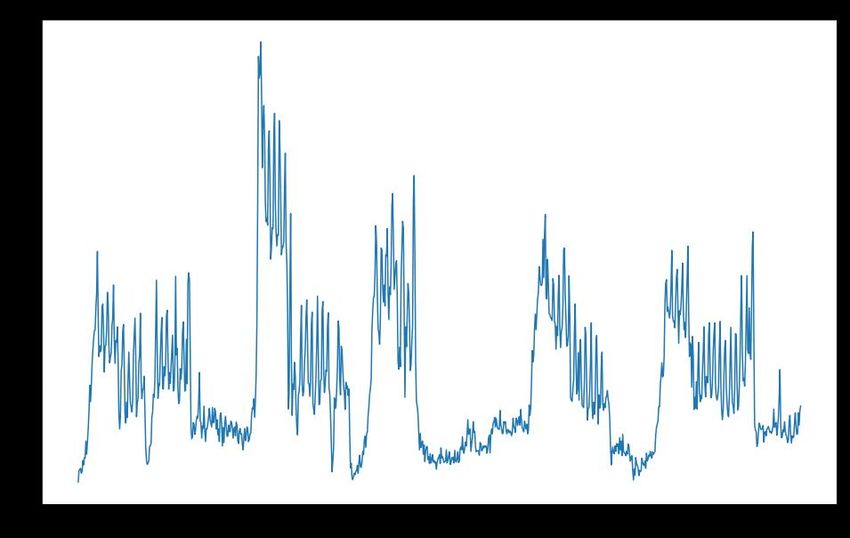
We then set the lower bound by assuming a symmetric credible interval centered at 1.8. This
provides a lower bound of 1.8 - (2.7-1.8) = 0.9. Thus we use (0.9, 2.7) as the (lower bound,
upper bound) range for the close contact multiplier.

2.2.3 Outside Infection Rate Multiplier
Our modeling of outside infection rate relative to Fall 2020 (the “outside infection rate multiplier”)
depends on two factors: the change in prevalence and the change in mobility.

Prevalence Multiplier
We will use the count of daily cases in New York State (Figure 2) to approximate the increase in
outside prevalence between Fall 2021 and Fall 2020.

Figure 2: A time series plot of daily cases in New York State based on data published by the
New York Times [https://github.com/nytimes/covid-19-data].

We compare the average number of weekly cases from 7/24/2021 - 8/24/2021 to the average
number of weekly cases in the Fall 2020 semester to obtain the prevalence multiplier for this fall
(0.79).

Mobility Multiplier
As social distancing requirements relax, we anticipated an increase in outside infections from
activities around campus compared to Fall 2020. We approximate this increase using
anonymized cellular location data provided by SafeGraph [http://www.safegraph.com]. Using
SafeGraph data, we can count the number of visits to restaurants, bars, stores and other points
of interest (POI) around Cornell’s campus (Figure 3).

Figure 3: A plot of the number of visits to POIs in collegetown per day for the past 2 years.

We use the time period from 8/16/2019 to 9/14/2019 as a proxy for the back-to-normal activity
that we will expect this fall. We compare this to 8/16/2020 to 9/14/2020, the activity that
occurred when strict social distancing measures were implemented. A plot with these two time
periods overlaid is shown below in Figure 4.
Figure 4: The number of visits to POI in Collegetown from 8/16/2019 to 9/14/2019 and from
8/16/2020 to 9/14/2020.

Taking the ratio of total visits in 2019 over the total visits in 2020 in this time period gives us the
estimate for the mobility multiplier for this fall (1.45).

To obtain our outside infection rate multiplier, we multiply our prevalence multiplier with our
mobility multiplier to obtain 0.79 x 1.45 = 1.145.

2.2.4 Contact Tracing & Adaptive Tracing Multiplier
Each time a new positive is found through surveillance or symptomatic self-reporting that is not
part of an existing contact trace, we model this as initiating contact tracing and potentially also
adaptive testing. This has several effects in reality:
 ● Unvaccinated and symptomatic vaccinated close contacts are quarantined.
 ● Close contacts are alerted that they have been exposed and asked to reduce social
 contact.
 ● Testing of close contacts and others identified in adaptive testing occurs.
This prevents some positive individuals from infecting others.

The “Contact Tracing & Adaptive Tracing Multiplier” determines the number of such positive
individuals contained per contact trace relative to Fall of 2020. In constructing a prior on this
parameter, there are two countervailing effects:
 ● The amount of contact is larger, which leads to more close contacts.
● Health department policies on quarantine have changed and close contacts are not
 quarantined if they are vaccinated and asymptomatic.

Given that we have significant uncertainty about this multiplier, we set the range to (0.5 to 1.5),
reflecting a prior belief that the number of positives contained per contact trace is within the
range of 50% to 150% of the fall 2020 number with 95% probability.

2.2.5 Hospitalization

To provide context for the case count predictions, we estimate the probability of hospitalization
for a vaccinated individual who is infected as follows.

 (ℎ | , )
 (ℎ | )
 * ( | )
= (ℎ | ) ( | )
 * (ℎ | , )

In deriving this expression, we use that hospitalization (for COVID-19) implies infection. Thus,

 ( | ) * (ℎ | , ) = (ℎ |
 )

and the denominator in the first term cancels the numerator in the second term and the third
term. On the right-hand side we are left with

 (ℎ | ) / ( | )

which is equal to the left-hand side, (ℎ | , ).

To calculate this expression:

 ● The first term is estimated to be 18% based on Sheikh et al. 2021, Puranik et al. 2021,
 Israel Ministry of Health 2021, and Rosenberg et al. 2021.
 ● The second term is the inverse of the vaccine susceptibility multiplier, whose nominal
 value is 50%. Thus, the second term is 2.
 ● We calculate the third term as follows:
 ○ The existing studies of which we are aware focus on the hospitalization rate
 among recorded cases, rather than all infections. We believe that this is because
 it is difficult to identify asymptomatic cases in most populations because large-
 scale surveillance testing is seldom implemented.
 ○ Thus, we calculate the third term by taking the product of two subterms:
 (ℎ | , , and
 )
 ( | , ).
 ○ Both subterm probabilities vary across age groups. For the first subterm, Figure 4
of Papst et al. 2021 presents age-stratified hospitalization risks among recorded
 infections before vaccinations were available. Using their source data, we
 assume the following values for
 (ℎ | , , ):
 ■ 0.5% - 1% for those aged 18-30
 ■ 2% - 3% for those aged 40-50
 ■ 10% - 20% for those aged 65-75
 ○ For the second subterm, Poletti et al. 2021 reported age-stratified symptomatic
 rate among close contacts of confirmed infections before vaccinations were
 available. Based on their analysis, we assume the following values for
 ( | , ):
 ■ 20% for those aged 18-30
 ■ 30% for those aged 40-50
 ■ 50% for those aged 65-75
 ● Combining these estimates, we obtain the following values for the hospitalization
 probability of a vaccinated infected individual:
 ○ 0.036% - 0.072% for those aged 18-30
 ○ 0.22% - 0.32% for those aged 40-50
 ○ 1.8% - 3.6% for those aged 65-75
 ● The risk to other age groups is between the ones given above. The risk to those aged
 50-65 is between the risk to the 40-50 and 65-75 groups; the risk to those aged 30-40 is
 between the risk to the 18-30 and the 40-50 groups.

Two observational studies reported Prob(hosp | infection, vaccination) directly and either do not
stratify by age, or only provide coarse stratifications.

 ● Griffin et al. 2021 (Los Angeles County, May 1 - July 25)
 ○ Percentage of fully vaccinated persons infected with SARS-CoV-2 that were
 hospitalized was 3.2%.
 ○ The dataset is 43,127 reported SARS-CoV-2 infections in Los Angeles County.
 ○ This number is towards the upper end of our estimates above, which could be
 explained if older individuals had a higher vaccination rate in the dataset.
 ● Rosenberg et al. 2021 (NYS, May 3 - July 25)
 ○ This paper reports vaccine effectiveness against hospitalization well in excess of
 90% over several age groups.
 ○ The dataset is the entire population of New York state (9675 cases among
 vaccinated adults, 38505 among unvaccinated).
 ○ This number is not stratified by age; figures in the report show that the
 hospitalization rate among infected in the older population is significantly higher
 than the younger, but the report does not contain hospitalization numbers broken
 down by age.
 ○ The reported values in this paper for vaccine effectiveness against hospitalization
 are in line with those we have assumed above.

The estimated hospitalization rates for students we estimated above are consistent with our
experience to date at Cornell. As of Sep 1 (Sep 12), we have had 325 (486) student infections
and to the best of our knowledge none of these infections has resulted in a hospitalization.
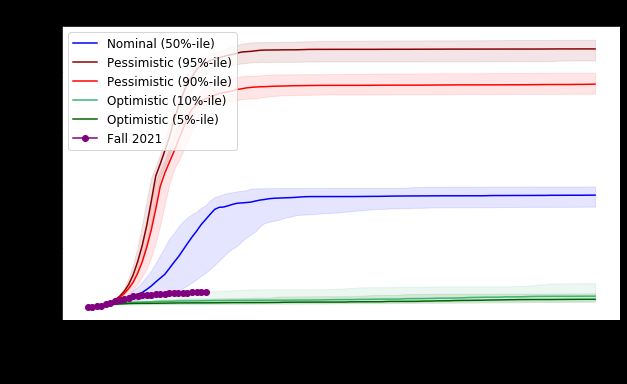
These estimates of hospitalization rates are subject to much uncertainty. Indeed, it is very
difficult to estimate small probabilities accurately, simply due to the rarity of the events in
question. This leads to uncertainty in the estimates, which is compounded by limited
understanding of the disease and vaccine effectiveness over time on the one hand, and
variation of methodologies and subjects in the existing literature on the other hand.

3. Results
Section 3.1 reports projected trajectories for the semester and observed cases to date. Section
3.2 explores the impact of interventions. Our simulation results only show student infections. To
place these numbers in context it is useful to keep in mind that we have estimated the
probability of hospitalization for each infection to be on the order of 0.036% to 0.072%, i.e., on
the order of 1 in 2,000.

3.1 Trajectories
The simulation starts on Aug 23rd and the corresponding cumulative cases are shown. We use
initial prevalences corresponding to our estimates from before the semester began.

The testing frequency in Figure 5 below is: 2x/week for students in greek organizations, varsity
athletes and unvaccinated students, 1x/week for vaccinated students. The nominal scenario fits
the early portion of the observed data very well, and then the trajectory of real cases becomes
closer to the optimistic scenarios. This may be because the parameters governing reality are
more in line with the optimistic scenario, but the full set of interventions simulated in this figure
did not move into place until the weekend of 8/28-8/29. These two effects may have canceled
each other for the early part of the semester until the full interventions took effect.

Figure 5: Number of student infections projected under the optimistic, nominal and pessimistic
scenarios over time. Each shaded region contains 80% of simulated trajectories under that
scenario. Overlaid is the observed number of student cases. Up to Sep 1, the trajectory tracks
the nominal curve, although the observed trajectory was not used to calibrate the nominal
scenario. After Sep 1 the trajectories diverge with a smaller number of observed cases.

Below in Figure 6 is a longer view of this trajectory.

Figure 6: Number of student infections (the same data as Figure 5) over the full semester.
Cases are projected to level off by the end of September as infections in high-transmission
subgroups are slowed through a combination of interventions and immunity after infection.

Figure 7 below breaks out infections by student group under the nominal scenario. In the
simulation, students in greek organizations and varsity athletes become infected at a much
higher rate than others. The nature of the simulated outbreak is that it spreads primarily through
the cohort modeled as having a higher transmission rate in the simulation (greek-life students
and athletes) and less aggressively in the other undergraduates. In the simulation, we
hypothesize that the growth rate of cases slows substantially in late September because
infections in high-transmission subgroups are slowed through immunity after infection and
simulated interventions. The combination of vaccination and interventions, even in the face of
the delta variant, ensures that the effective R 0 is lower than for circa-2020 SARS-CoV-2 without
interventions. Thus the number of infections stops growing at a level of immunity that is lower
than the 70% figure quoted at the start of the pandemic.

Reality differs from Figure 7 in several ways. First, while we have observed a significantly higher
rate of transmission among students associated with greek life than among other students, this
rate has been slow enough that 2x / week testing has prevented the rapid growth seen in the
nominal scenario. Second, while we have observed some transmission among varsity athletes
and have sometimes brought adaptive testing to bear, the rate of transmission in this population
appears smaller than among students affiliated with greek life organizations. Nevertheless,
Figure 7 is important for understanding that a higher transmission-rate cohort can contribute
significantly to viral spread in a population.
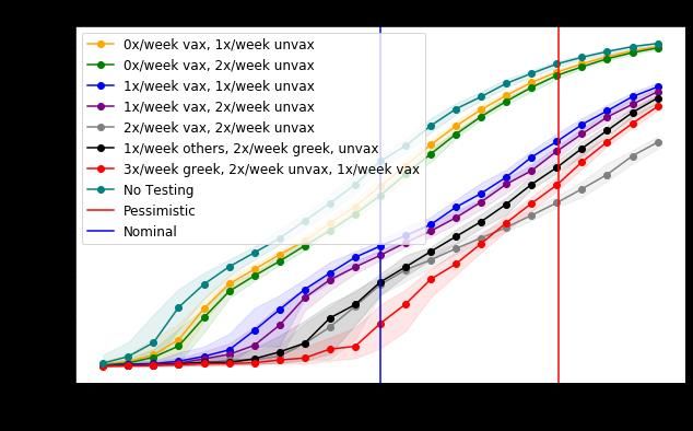
Figure 7: Number of simulated infections by student sub-population over time under the
nominal scenario. As above, each shaded region contains 80% of simulation trajectories for that
sub-population. Infections grow rapidly in the greek + athlete population because they are
modeled as having more social contact, and then tail off as discussed in the text. Infectious
individuals in this population as well as secondary transmission also infect other undergraduates
and a small number of graduate and professional students. Reality has proven to be closer to
the optimistic scenario in terms of transmission rates and 2x / week testing has been sufficient
to provide substantial infection control for students affiliated with greek life.

2.2 Interventions

In the following graphs the x-axis varies the “pessimism level”, which controls the level of
pessimism in the simulation runs. The nominal scenario corresponds to a pessimism level of
50%, the two pessimistic scenarios correspond to pessimism levels of 90% and 95%, and the
two optimistic scenarios correspond to pessimism levels of 5% and 10%.

Testing Frequencies
In Figure 8, we see the effect of varying the testing frequency for different groups. We see that
elevating the testing frequency for the greek / athlete population modeled as having higher
transmission rates substantially reduces infection under the nominal scenario, and under a
broad range of pessimism levels. There does not appear to be substantial benefits to testing
other student groups more frequently for pessimism levels below 0.95. This is because it is only
the high-transmission population that experiences exponential growth in infections under these
pessimism levels, and it is among these students that an additional intervention that slows the
spread of virus provides the most value.
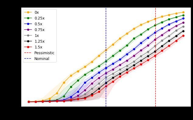
Figure 8: The effect of varying testing frequencies for different student groups. The nominal
scenario appears on the x-axis at pessimism level 0.5. The y-axis gives total student infections
over the course of the semester.

This analysis suggests that increasing the testing frequency for vaccinated students affiliated
with greek-life organizations was an important step toward reducing viral prevalence. Testing
frequency remains 1x / week for vaccinated varsity athletes because viral spread has not been
as pronounced in this population and because adaptive testing has remained an effective tool
for containing the spread of virus in this group.

Contact Tracing Effectiveness
Figure 9 varies the effectiveness of contact tracing, i.e., how many additional positives are
isolated or quarantined, thus preventing additional infections, by each contact trace, relative to
the effectiveness estimated in the fall of 2020. The nominal scenario assumes that contact
tracing effectiveness is equal to that in fall 2020. We see that if the contact tracing effectiveness
is 0, i.e., no additional positives are prevented from infecting others, then infections grow to
roughly 7000, even under the nominal scenario. This suggests that providing additional staffing
from the Masters in Public Health program to support isolation, quarantine, and contact tracing
efforts was a critically important intervention in late August.
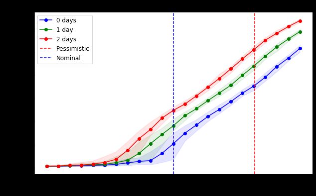
Figure 9: The effect of varying contact-tracing effectiveness. The nominal scenario appears on
the x-axis at pessimism level 0.5. The y-axis gives total student infections over the course of the
semester.

Testing + Isolation Delay
Figures 10 and 11 below show the effect of increasing the delay between sampling and isolating
positives. There is a significant benefit to reducing the delay between sampling and isolation.
The addition of staffing for isolation, quarantine and contact tracing from the Masters in Public
Health program at the end of August reduced this delay from 2 days to 1 day, providing
significant infection control.
Figure 10: The effect of varying the delay from testing to isolation/quarantine.

Figure 11: The effect of varying the delay from testing to isolation/quarantine for different
student groups. The nominal scenario appears on the x-axis at pessimism level 0.5. The y-axis
gives total student infections over the course of the semester.
You can also read


